
Talk:MediaWiki/Homepage redesign/Design Document
| MediaWiki Homepage Redesign |
|---|
The scope of mediawiki.org + highlighting Wikipedia[edit]
In my opinion a big problem of the mediawiki.org homepage (and the site) is the fact that here we do and coordinate a lot more things than what can be deduced by a newcomer. All things MediaWiki need to be in place, sure. However, it is important to stress that no less than Wikipedia is based on MediaWiki, newest MediaWiki versions and many new features are tested there first. We won't solve here the deeper problem "MediaWiki" vs "Wikimedia tech", but we can't miss this chance to use the Wikipedia card, and get more downloads, contributors and reputations thanks to it.--Qgil (talk) 19:44, 18 December 2013 (UTC)
- I believe that show the environment and benefits of using MediaWiki is more important than showing technical requirements and show Wikipedia as a use case is more than necessary but we need show others cases, too. --monteirobrena (talk) 03:44, 19 December 2013 (UTC)
How to contribute[edit]
This is an open source project and it is important that any visitor realizes that it is also possible to contribute in many ways. See How to contribute.--Qgil (talk) 19:46, 18 December 2013 (UTC)
The sidebar[edit]
We are limited by MediaWiki itself and by the Vector skin, and therefore we will keep the same structure of the page. However, we have flexibility in the design of the left column with the sidebar. We should check at its content, and we could also consider what can we do with CSS alone to highlight some items. Currently I don't think anybody is paying much attention to it.--Qgil (talk) 19:49, 18 December 2013 (UTC)
- I agree about the highlight some items. I as a new user of MediaWiki, I failed to notice that the sidebar is the same on every page and upload the option was there. --monteirobrena (talk) 03:28, 19 December 2013 (UTC)
- I've added another note about the skin in case it is useful. heather walls (talk) 18:35, 31 December 2013 (UTC)
- Just linking to a draft I started some months back, not to forget about it: User:Qgil/mediawiki.org sidebar. Honestly I don't remember much about it. If it is useful as starting point, fine. If not let's just ignore it.--Qgil (talk) 16:43, 2 January 2014 (UTC)
- I propose a new groups of links to sidebar. --monteirobrena (talk) 15:48, 20 January 2014 (UTC)
- Mockup updated with proposed sidebar. --monteirobrena (talk) 14:26, 21 January 2014 (UTC)
- The sections of the sidebar can be either collapsed or expanded by default. The mockup should reflect the default status that an anonymous user would find the first time they land in mediawiki.org. We definitely don't want to show a sea of options by default, therefore I would say that all sections are collapsed by default, unless we have a good reason to expand just one.--Qgil (talk) 18:08, 22 January 2014 (UTC)
- Ok, the sidebar expanded was just to show all subitems proposed but I'll collapsed in the next version of mockup. --monteirobrena (talk) 18:48, 22 January 2014 (UTC)
- I'm thinking if we really need a collapsible menu. Perhaps a succinct menu with just a few links to key pages will be enough. What do you think? --monteirobrena (talk) 16:21, 3 February 2014 (UTC)
- The sidebar can be edited directly at MediaWiki:Sidebar. You can focus on the styling of the sidebar, not bothering about the content, which is a separate discussion that I'm sure some contributors will like to join.--Qgil (talk) 22:40, 5 February 2014 (UTC)
- Monteirobrena has started to work on the sidebar, since the homepage itself is requiring less from his time these days. See File:Sidebar_mockup.png. Brena, I think the mockup should include the tree behaviors that you can see in the mediawiki.org sidebar: direct links (Main Page, Get MediaWiki...), headers collapsed/expanded (Support, Development...), and then items only visible when the sections are expanded. Also, it is unclear what is the intention behind the "?" icons. Are they supposed to define an icon that would be on every singe navigation item? That would be excessive. Even in the headers only, I don't think icons are needed at all, and they are probably not easy to implement in the sidebar. Please assume text only.--Qgil (talk) 22:10, 5 March 2014 (UTC)
- I updated the sidebar with original texts and removed the icons. Please take a look and give me your opinion. Thank you. --monteirobrena (talk) 21:28, 6 March 2014 (UTC)
The benefits[edit]
I searched for a description of the benefits that we can take when using MediaWiki but not found. I appreciate if anyone has this information and can share here. --monteirobrena (talk) 15:25, 19 December 2013 (UTC)
I found this informations Manual:Before installing, Possible uses of MediaWiki and Comparison of wiki software --monteirobrena (talk) 16:09, 19 December 2013 (UTC)
- True that is. As far as I know we don't have a ready-made pitch for MediaWiki. We will need to create one (and this is beyond your scope, in my plate). One idea is to search online "why MediaWiki?" to see how others are pitching our software. Anyway, for this document what is important is to stress that the homepage needs to highlight the top n benefits, but if we haven't nailed down the list it is fine at this point, I think.--Qgil (talk) 05:46, 20 December 2013 (UTC)
 Done. This question will be discussed here. --monteirobrena (talk) 14:05, 17 January 2014 (UTC)
Deprecating the RFC "MediaWiki.org Main Page tweaks"[edit]
Please let me know when you are confident that any relevant point at Requests for comment/MediaWiki.org Main Page tweaks is reflected in the design document. Then we can organize a small review to agree on the deprecation of that document. Once Heather, you, and me agree, you will request the closure of that RFC, ok?--Qgil (talk) 06:00, 20 December 2013 (UTC)
- I tried to extract and compile all relevant points and add in Design Document, for me sounds like enough to our review. --monteirobrena (talk) 15:02, 20 December 2013 (UTC)
- OK, let's wait to have a solid design document, and then we (meaning you) :) will propose the deprecation of that RFC.--Qgil (talk) 16:41, 2 January 2014 (UTC)
- Done. I think in this moment we could declare that RFC is deprecated. The Design Document covers the main points and ideas of RFC "MediaWiki.org Main Page tweaks". --monteirobrena (talk) 20:20, 13 January 2014 (UTC)
Clearer priorities[edit]
Something to be improved in this document is a clear definition of priorities. The section Rationale, Main problems of current homepage, and Contents suggested by the community show many points, and it is easy to lose the attention. The sorting matters, and even a visual distinction between very important points and the rest would be welcome. Now it looks like the the lack of harmonization in colors is a big problem, while perhaps not many eyes will arrive to the important questions that this homepage is not answering. Prioritization is a key aspect of design and project planning. Don't be surprised if you end up spending more time reordering and deleting than writing. That is good.--Qgil (talk) 06:07, 20 December 2013 (UTC)
- I agree that the lack of harmonization in colors is a big problem but I think this is almost the last thing that will fix because it depends on the content and structure of the page. --monteirobrena (talk) 15:42, 23 December 2013 (UTC)
- I still think that that structure of the document doesn't reflect what we want to do and why. Also the amount of text in the intro and Rationale doesn't help getting quick to the point. You might have lost many potential stakeholders / contributors lost already at that point. "Questions" is almost at the end and, in fact, captures the essence of what really matters. If we agree on the questions that the MWO homepage should answer then we have a good start. If we agree on those questions then we can see which ones the current homepage is answering, and how effectively, and which ones are totally missing. Once the list of questions/answers is agreed, we could start working on details.--Qgil (talk) 19:42, 30 December 2013 (UTC)
- This is a good point. We should set up this discussion and ask community to participate. (Meaning, we should probably set up another RFC rather than expect people to show up to the old one.) heather walls (talk) 20:27, 30 December 2013 (UTC)
- Done. I analyzed and answered the questions which the current page is responding. --monteirobrena (talk) 15:53, 2 January 2014 (UTC)
Most viewed pages in mediawiki.org[edit]
File:25 most viewed articles 201304.png could be replaced by a table in real text. At the end it just shows text, and it would be more readable and editable as text. Also we should link to the page. Note that the data of the bot is from April 2013, and we don't even know whether it is counting the full month or not. Maybe the statistic now are different... One question, why are you giving this prominence to this list of viewed pages? Just asking. Perhaps the current homepage influences that list. In any case it would be useful to understand what are these pages and group them somehow. For instance, "Extension:DPLforum" is not that relevant but it is relevant to know that users go to mediawiki.org to do something (what?) with information about MediaWiki extensions.--Qgil (talk) 06:17, 20 December 2013 (UTC)
- I not found the summary of the latest statistics. I found this but the search must be page by page. I'm sure the current homepage influence on the statistics. I highlight this list to reflect if these pages are what we want to be the most accessed. And if not, what we can do to bring more access to the pages we want.--monteirobrena (talk) 16:34, 20 December 2013 (UTC)
- Done. The statistics gave an idea about the pages that need to receive highlight, but the data are outdated and will not be considered in this Design Document. --monteirobrena (talk) 20:48, 13 January 2014 (UTC)
Copy text[edit]
In Questions & answers I think the questions make total sense in this document but I'm less sure about the answers. Heather will know better, but do we need to get in such detail in the text, almost feeling like aiming to be final copy text? I just fear that these sentences can attract to much attention and arguments, while the big important and also more abstract points of the document are almost ignored. At this point it is not very relevant why exactly we want to use MediaWiki. What matters is that we want the homepage to answer this question. Etc.--Qgil (talk) 06:23, 20 December 2013 (UTC)
- You are absolutely right. At this point, we don't need worry about answering these questions. --monteirobrena (talk) 15:11, 20 December 2013 (UTC)
- Actually I think the document is exactly for writing out all of your thoughts. Part of the way we create a design solution is to first answer the questions in text or diagram and discuss them. I do agree that matters of importance need to be prioritized while "other issues" can be moved to a catch-all section. I think the rest of the document would benefit from further explanation of the list elements. heather walls (talk) 20:23, 30 December 2013 (UTC)
- I tried to answer the questions in another version of the document. Do you think is relevant put it back? --monteirobrena (talk) 15:54, 2 January 2014 (UTC)
- Done. This question will be discussed here. --monteirobrena (talk) 11:58, 11 February 2014 (UTC)
- I tried to answer the questions in another version of the document. Do you think is relevant put it back? --monteirobrena (talk) 15:54, 2 January 2014 (UTC)
- Actually I think the document is exactly for writing out all of your thoughts. Part of the way we create a design solution is to first answer the questions in text or diagram and discuss them. I do agree that matters of importance need to be prioritized while "other issues" can be moved to a catch-all section. I think the rest of the document would benefit from further explanation of the list elements. heather walls (talk) 20:23, 30 December 2013 (UTC)
Duplicated process[edit]
MediaWiki/Homepage_redesign/Design_Document#Steps and MediaWiki/Homepage_redesign#Deliverables largely overlap. Do you need this information in the design document? Yes or no, at the end there would be one list in one place, and then as many links as needed pointing to it.--Qgil (talk) 06:27, 20 December 2013 (UTC)
- Done. Actually the Deliverables is about my activities on OPW and I move it for my page. The Steps section refers to the iterative process that will be used in the construction of the project and I think it's better to keep it on MediaWiki/Homepage_redesign#Steps. --monteirobrena (talk) 15:47, 20 December 2013 (UTC)
Internal links, external links, references...[edit]
I'm not sure about your use of references. This is a working document, not an encyclopedia article or an academic work. I would say that the use of links directly is more clear and efficient. Remember to link properly to internal pages and interwiki pages. See Help:Links.--Qgil (talk) 06:30, 20 December 2013 (UTC)
- Done. Moved references to links directly. --monteirobrena (talk) 18:41, 8 January 2014 (UTC)
The Download Button[edit]
While I like the placement of the download button in the new layout draft, I do think that underneath it, right above the "Or try and contribute" link, there should be links to download the previous two releases, in the event that someone wants to download MediaWiki but doesn't want the latest version or whatever. Similar to how php.net has three versions listed. That's just my opinion. --GeorgeBarnick (talk) 16:21, 24 December 2013 (UTC)
- That is contradictory point. In Requests for comment/MediaWiki.org Main Page tweaks some people said that prefere keep just one download link that redirect to page where has links to download the previous three releases. We currently have links to the last three release notes, the table below has amount of accesses in the last 30 days. Perhaps this statistic can help us decide if we should keep them. I personally prefer something more succinct like the Firefox. --monteirobrena (talk) 16:23, 26 December 2013 (UTC)
Page Amount of accesses Download 120873 Release notes 1.22 4853 Release notes 1.21 4324 Release notes 1.19 3308
- We can discuss this further when the right time comes. At this point what matters is whether "How can I get MediaWiki?" is a question the homepage should answer, and I m sure we all agree that yes, it is an important question. :) --Qgil (talk) 20:04, 30 December 2013 (UTC)
- Done. This question will be discussed here. --monteirobrena (talk) 13:29, 16 January 2014 (UTC)
Good lessons and inspiration[edit]
Here are some good lessons observed in other websites that we can get some inspiration. The most sites of software highlights the benefits and qualities to awakening interest to get and use the tool. We can see this in sites like Ubuntu, AngularJS, Fedora, Firefox and Gnome. The site OpenOffice classifies information into categories that facilitate and direct the users to find what they want. Sites as Android and Joomla show the amount of instances being used around the world. The Git and Play Framework show who are using. GitHub's site show some screenshots and describe why user will love use it. Monteirobrena (talk • contribs) 10:49, 27 December 2013 (UTC)
- This collection of sites is very good. Let's find a way to include it in the design document itself, either as a declared list of source of inspiration, good examples... and/or or embedded in the plan, for instance "The homepage should be also cleaner to be more XYZ, see for instance (links to appropriate examples).--Qgil (talk) 16:27, 2 January 2014 (UTC)
- Done. Collection embedded in the plain, were also added other good examples. Thanks for the tip ;) --monteirobrena (talk) 23:02, 7 January 2014 (UTC)
Language selector[edit]
The current box to select language on homepage occupy much space. I test the Extension:LanguageSelector and use it sounds better to me. I think we could use LANGUAGE_SELECTOR_AS_PORTLET selector but this configuration would apply for all pages and I doubt if this is acceptable. --monteirobrena (talk) 12:19, 30 December 2013 (UTC)
- Let's not challenge the current bars at the top of the page (English, Create account... and "MediaWiki.org, Discussion...). They follow default MediaWiki, they are deployed this way in all Wikimedia wikis, and if we try to touch them it might be technically complex and a source of unnecessary controversy.--Qgil (talk) 19:46, 30 December 2013 (UTC)
- Ok, but this extension can add language selector under on sidebar not on top. --monteirobrena (talk) 11:32, 31 December 2013 (UTC)
- Ok, I won't fight this at this point, since at this stage it is an implementation detail. I like your willingness to challenge different areas!--Qgil (talk) 16:34, 2 January 2014 (UTC)
- Done. Ok, this time we will keep the box language. --monteirobrena (talk) 16:06, 9 January 2014 (UTC)
- Sorry, in fact I interpreted your suggestion wrongly. I thought you were referring to the language selector in the header, when in fact you refer to the huge box of languages on top of the footer. That box is indeed big and filled. I'd say let's remove it from now. In an ideal world the language selector at the top should be enough. Also think that users with browsers in non-English should get the homepage in their language by default. Is that true in mediawiki.org though? Have you tried with a browser configured in Portuguese? In any case I just found Bug 30047 - Language selection does not change the Content-language which is very relevant to this discussion.--Qgil (talk) 22:09, 9 January 2014 (UTC)
- I tried with my browser configured in Portuguese and I didn't get the homepage in my language by default. --monteirobrena (talk) 10:47, 13 January 2014 (UTC)
Questions from Main problems of current homepage and possible solutions[edit]
- Barely tapped space. - Can you say more about this and what it means? What would some solutions be?
- Does not transmit any feeling to visitors. - What feeling do you think it should transmit? What could be changed to make that happen?
Thanks! heather walls (talk) 20:16, 30 December 2013 (UTC)
- I think the homepage has gaps in "Current version" and "New opportunities" boxes. The language and category boxes occupy unnecessary space too.
- We could:
- remove current version and use just a download button
- merge boxes "News" and "New opportunities" to "News & Opportunities"
- fix the limite of items to show on "News & Opportunities" box
- move language selector to sidebar
- Alacrity. The homepage needs to convey how warm and active community is working hard to make an incredible software. Also can pass how the powerful and reliable is MediaWiki.
- We could:
- add a video that show how community works, something like this
- use colors more atractive and happy photos
- add showcases, testimonials, logos of organization that use MediaWiki
- show the amount of downloads and instances using MediaWiki
- The list of problems would benefit from prioritization and grouping, just like you did with the Questions. We have problems related with the message (unanswered questions, lack of feelings, organization by people/actions, duplicated links, download versions, technical words, statistics, core/extensions, sidebar), look & feel (colors, icons, images), layout (white spaces, language selector, user box in header).
- We also need to identify the problems we agree that are important and the solutions we agree that should be implemented. Then we can also list other problems someone has report but either lack agreement on the solution or the problem itself.
- Please work on these points. Then we can start go through each problem and agree on our current understanding.--Qgil (talk) 23:33, 6 January 2014 (UTC)
- Done. The problems were categorized and prioritized, are ready to identify the problems that we agree to resolve. --monteirobrena (talk) 15:05, 14 January 2014 (UTC)
Moiz and Jared have started a proposal to create BarebonesMediaWiki, a version of MediaWiki without the usual interface elements around the frame. I wanted to point this out in case it is helpful to your design development or final project. heather walls (talk) 18:32, 31 December 2013 (UTC)
- This project is very interesting. I'm sure will be helpful. We could gain more space to work if we use it. Thank you. --monteirobrena (talk) 10:54, 2 January 2014 (UTC)
- That project is indeed interesting, and I didn't know about it. Thank you! However, it is in a very early stage, and even if it would be deployed and available for mediawiki.org tomorrow, I would expect a lot of backlash for any proposal willing to implement it here. The project itself says that it is a solution targeted to "microsites", which mediawiki.org is definitely not. Also note that mediawiki.org is probably supposed to showcase MediaWiki itself in its full potential (Is it? If so, we should add this point to the design document). Having a mediawiki.org site that doesn't look like a MediaWiki site kind of defeats the purpose. As commented in other places, I would not challenge the existence of the current MediaWiki navigation bars in mediawiki.org. Instead, I would try to improve them as much as technically possible using plain MediaWiki features like custom CSS and definition of the items we want there.--Qgil (talk) 16:32, 2 January 2014 (UTC)
- Done. Ok, this moment we will make the mockups without considering BarebonesMediaWiki project. --monteirobrena (talk) 23:13, 7 January 2014 (UTC)
About the Rationale[edit]
Currently the main paragraph of the Rationale basically says:
- the community has been discussing about the homepage, reporting problems and enhancements (but we don't specify any)
- there is an overall agreement on the need to redesign the homepage (but we can't point to such agreement)
- the homepage leaves some major questions unanswered (but we don't specify which)
- the homepage must help visitors choosing MediaWiki instead of other alternatives (ok, this is an argument)
This sounds like a vague rationale for a homepage redesign. What about something in these lines:
- the mediawiki.org homepage should do A, B, C
- however, currently it only does 1, 2, 3 because of X, Y, Z
- the community has tried to discuss, agree and implement improvements since 2012 with little results.
- solving these problems requires a general plan, a coordinated action that this design document describes.
"A, B, C" are the top priorities of the homepage, Which are they? "1, 2, 3" explains how far the current homepage is from the top priorities. "X, Y, Z" describes the main problems of the current homepage.
What do you think?--Qgil (talk) 22:18, 2 January 2014 (UTC)
- I think this is a good struct to rationale and I tried keep it there. Thank you ;) --monteirobrena (talk) 15:44, 3 January 2014 (UTC)
- I have tried to simplify and sharpen the text of the Rationale (and also the first paragraph). Feel free reverting or modifying at will, of course. With this, I will dive to the Problems section.--Qgil (talk) 23:12, 6 January 2014 (UTC)
- Done. Much better now. Thank you. --monteirobrena (talk) 23:18, 7 January 2014 (UTC)
About the Questions[edit]
I think the current list of Questions is good, but perhaps has still some room for improvement. Also, the picture could be clearer by grouping those questions.
These try to convince new adopters:
- What is MediaWiki?
- What problem it solves?
- Why would I want to use it?
- Who uses it?
- How can I get it?
- Why we adore MediaWiki? (needs rephrasing)
As we can see, this front is pretty much covered but I would still add:
- How can I customize and extend MediaWiki?
This one focuses on current users (editors and sysadmins, very different profiles)
- How can I use it?
I would add
- Where can I get help?
- Where can I report a problem?
And this one focuses on contributors:
- Why to contribute to MediaWiki?
I would add
- Who makes MediaWiki?
- How to start contributing?
All these might be too many questions to answer in a homepage. If you think so then we need to be selective.--Qgil (talk) 22:46, 2 January 2014 (UTC)
- Ok, I see that you liked the idea. :) One last comment, about "What problem it solves?", "Why would I want to use it?", and "Why we appreciate MediaWiki?" Aren't these more or less the same? It is clear that we need to explain #The benefits, but maybe we can solve these three questions at once.--Qgil (talk) 22:23, 6 January 2014 (UTC)
- I agree that "Why would I want to use it?" and "Why we appreciate MediaWiki?" are likely to be answered by the benefits, but I think the answer to "What problem it solves?" needs to be very clear. --monteirobrena (talk) 23:51, 7 January 2014 (UTC)
"Improvements and contents suggested by the community"[edit]
The content of this section should be simply merged as problems & solutions. I know you did this to highlight the proposals coming from previous community discussions, but the design document is the place to merge old and new discussions into a single plan. A current problem is equally relevant, regardless of who reported it and how long ago.--Qgil (talk) 23:17, 6 January 2014 (UTC)
- Done. That's correct. The content of this section was merged. --monteirobrena (talk) 23:21, 7 January 2014 (UTC)
The video (that we don't have)[edit]
There are several references of a video showing how great our community is. I agree, such video would be great (and in fact I added it to my backlog not to forget about this idea). The fact is though that we don't have it, neither I expect us to have it any time soon. Therefore, it is better not to count on it.--Qgil (talk) 20:44, 7 January 2014 (UTC)
- I think the video can be replaced by other media as a photo that pass the same idea. --monteirobrena (talk) 23:23, 7 January 2014 (UTC)
- On a second thought, having an area in the content dedicated to a featured video might be a good idea. Just not the ideal community showcase video (that we don't have) but videos showcasing upcoming features or interesting meetings (we produce those regularly, and in fact they would welcome more audience). We could update this video module whenever there is a better video available.--Qgil (talk) 18:56, 10 January 2014 (UTC)
- Done. Let's keep the placeholder for the video. --monteirobrena (talk) 15:39, 21 January 2014 (UTC)
Popular pages[edit]
In the relation to the missing questions, the document recommends to "Add "Popular Pages" or "Frequently Accessed/Requested Pages" box (preferably with automatic update)." I don't see how this relates to the questions, though. Popular pages can be popular (meaning that can score high in page visits) for many reasons unrelated to these questions. One of the detected problems of the current homepage is the proliferation of links. And let's not forget, we still have the sidebar. For all this, I believe we don't need "Popular pages", even less provided automatically.--Qgil (talk) 21:01, 7 January 2014 (UTC)
- This idea appeared in Requests for comment and has been discussed without reaching a resolution. I think the new layout can have the necessary links and spread across the page without a box to keep them. --monteirobrena (talk) 16:32, 8 January 2014 (UTC)
- Done. Removed recommendation: "Add "Popular Pages" or "Frequently Accessed/Requested Pages" box (preferably with automatic update)." --monteirobrena (talk) 19:12, 8 January 2014 (UTC)
Showing statistics[edit]
In relation with the missing questions, the document suggests to "Show statistics about MediaWiki (preferably with automatic update)." Which statistics, though? Do we have references of websites that are showing off (reliable) statistics in their homepages? I mean, we could provide a couple of numbers, like "more than 3000 extensions", "about 700 contributors"... but is there any specific idea for more detailed stats, updated automatically?--Qgil (talk) 21:11, 7 January 2014 (UTC)
- Under the point about transmitting feelings there is another mention to stats: "Show the amount of downloads and instances using MediaWiki, see for instance: Android and Joomla." These numbers are tricky: people get MediaWiki from different sources, many MediaWikis are private intranets... https://wikiapiary.com/ has some numbers we can trust, e.g. number of extensions. Still, I woul ask ourselves what number do we need to inject those feelings. I know that when I installed my first MediaWiki I cared very little about the number of instances out there. I knew there were "many" and my simple math was that "if it works for Wikipedia it must work for me".--Qgil (talk) 21:19, 7 January 2014 (UTC)
- This is a good point. In fact the exploration of showcases can be more effective than statistics to awaken interest of new users. --monteirobrena (talk) 17:05, 8 January 2014 (UTC)
- Done. Let's keep the focus on providing and highlight the showcases. --monteirobrena (talk) 16:25, 9 January 2014 (UTC)
About bucketing developers[edit]
The document says "Bucketing people makes more difficult to find information " but then in the same point it actually recommends to "Split developers into "Core" and "Extensions"". I actually believe that the best approach is to have a single and prominent call to all developers in the homepage, channeling them to another page e.g. Developer hub. Next to this there should be another call to get involved (open to any contributors, not just developers), pointing to How to contribute.--Qgil (talk) 21:34, 7 January 2014 (UTC)
- I agree it is very contradictory keep the two ideas. In my opinion, we could have one call to developers instead divide into two parts. I also think we should have a prominent call to contributors. --monteirobrena (talk) 17:25, 8 January 2014 (UTC)
- Done. Removed recommendation: "Split developers into "Core" and "Extensions". --monteirobrena (talk) 19:06, 8 January 2014 (UTC)
Link to live demo[edit]
I like the idea of offering a link to a MediaWiki live demo. However, where should this link point to? Unless I have missed it, we don't have a pure MediaWiki live demo, offering what a user gets after installing plain MediaWiki (like e.g. http://installatron.com/mediawiki/demo does). Even in that case, plain MediaWiki doesn't contain most of the interesting features nowadays (Echo, VisualEditor, Scribunto...) which make think that perhaps a(n additional) possibility would be to expose https://test2.wikipedia.org/ a bit more. Maybe MarkAHershberger has better ideas?--Qgil (talk) 21:54, 7 January 2014 (UTC)
- It is important use the environment that has the most recent features and using the test of the Wikipedia could be very positive. . --monteirobrena (talk) 17:55, 8 January 2014 (UTC)
- Done. Let's keep the link to live demo. --monteirobrena (talk) 16:10, 21 January 2014 (UTC)
- I've frequently heard that stock installs of mediawiki frequently get overrun with spam, due to some extensions not being installed by default, this could lead to a negative experience for people using the demo, since the site itself is a live demo…of…itself, is this needed? Jaredzimmerman (WMF) (talk) 02:43, 23 January 2014 (UTC)
- In fact we have removed the link to the live demo in the last versions, just to keep the homepage as simple as possible. The idea of the live demo might still be good, and featured at the Get MediaWiki page. There are things like http://installatron.com/mediawiki/demo that we could link to. Another idea could be to have an instance in Labs reinstalled automatically once a day with a predefined configuration and list of extensions (I should file a request about this). Anyway, not a priority in the context of this exercise now.--Qgil (talk) 07:45, 23 January 2014 (UTC)
- I've frequently heard that stock installs of mediawiki frequently get overrun with spam, due to some extensions not being installed by default, this could lead to a negative experience for people using the demo, since the site itself is a live demo…of…itself, is this needed? Jaredzimmerman (WMF) (talk) 02:43, 23 January 2014 (UTC)
- Done. As discussed the link/button for live demo was removed. --monteirobrena (talk) 10:53, 23 January 2014 (UTC)
News & New opportunities[edit]
About "Merge boxes "News" and "New opportunities" to "News & Opportunities"", I agree that there is a problem with these boxes but I don't think merging them is the solution. They are different things. New opportunities is in fact synced with Project:Calendar and, if we want to show feelings and community, it probably should stay since it points to occasions to meet the community online or face to face.--Qgil (talk) 22:07, 7 January 2014
- In this case we could give more highlight to "New opportunities" and perhaps think in another title to this box as "Find us" or "Join/Approach the community". --monteirobrena (talk) 18:35, 8 January 2014 (UTC)
News is more problematic, since it takes such a big portion of the homepage and it is basically unmaintained and neglected (mea culpa). We have m:Tech/News and we have https://blog.wikimedia.org/c/technology/ , both Wikimedia-centric but (if you ask me) better than nothing. We could improve based on that. Oh, and we also have the MediaWiki accounts in Social media.--Qgil (talk) 22:07, 7 January 2014 (UTC)
- About the "News" I think that a prominent link to blog or/and Tech/News could be enough. --monteirobrena (talk) 18:35, 8 January 2014 (UTC)
- On a related note, you might be interested in how the Italian Wikipedia is now automatically showing the latest tech newsletter on their community portal. This is done by using labeled section transclusion from the page where we post the newsletter. It's trivial to replicate it here, simply by using
{{#lst:FOO|technews-{{CURRENTYEAR}}-W{{#time: W | now }}}}), where FOO is a page where we can post the newsletter. Given how easy it is to set up, I think it might be worth trying out in one of your proposals, even if only for the sake of discussion. guillom 12:58, 15 January 2014 (UTC)
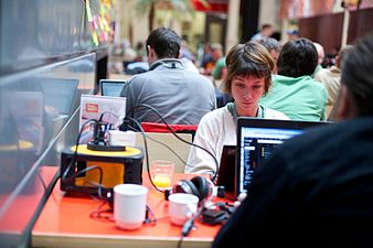
- In terms of visually showcasing the community, I really like this photo, suggested by Monteirobrena. I'll try to incorporate it in my mockup. Additionally, what do you think about replacing this image with photos from other, recent community events from time to time in the future?. --Courier New (talk) 20:42, 27 January 2014 (UTC)
- What about adding the potential assets we find at MediaWiki/Homepage_redesign/Design_Document#Assets?--Qgil (talk) 23:17, 27 January 2014 (UTC)
- Added a new gallery to potential assets. Thank you.--monteirobrena (talk) 13:39, 28 January 2014 (UTC)
Color palette[edit]
A bit of context to be considered for the color palette:
- It would be useful to document the palette used currently, if only to see where are we starting from
- It is also good to be aware of Wikimedia Foundation Design/Color usage. mediawiki.org doesn't aim to be fully aligned with the Wikimedia palette and must have an own personality. Still, it cannot harm to be aware of that palette
- About the MediaWiki logo... I would be a bit careful. It is one of the oldest logos around and its color schema doesn't even try to be a reference of anything. If it is still there untouched it is because nobody has got the guts to challenge it. :) It makes sense to make the palette of a site consistent with its logo, but in that case I think we could take into consideration the color choices of File:Mediawiki logo reworked 2.svg, which already look a lot better
- Finally, should mediawiki.org display the default appearance of a MediaWiki installation or should it aim to differ? http://drupal.org and http://wordpress.org have similar looks to a default install (in terms of color schema). Then again plain Drupal and Wordpress install do look better than a plain MediaWiki install... Food for thought.
Monteirobrena, I'm looking forward to seeing how you start applying the palette to elements of the page. :) --Qgil (talk) 22:49, 9 January 2014 (UTC)
- I like this proposal for the logo and I tried starting a new draft of logo but I assume that isn't my strongest. About the color scheme of the default installation is hard to say, because we only have a predominance of gray and white. --monteirobrena (talk) 13:35, 10 January 2014 (UTC)
- Believe me, you don't want to touch the logo. That is a different battle and you have more than enough pushing a new mediawiki.org homepage. Touch the homepage palette instead. :) --Qgil (talk) 18:53, 10 January 2014 (UTC)
- Yes, I know. It was just a little idea that I wanted to share. Don't worry ;) --monteirobrena (talk) 15:57, 13 January 2014 (UTC)
- Let me insist on "It makes sense to make the palette of a site consistent with its logo, but in that case I think we could take into consideration the color choices of File:Mediawiki logo reworked 2.svg, which already look a lot better." I think that combination of blue - yellow - brown works better and feels more MediaWiki than the one currently proposed, even if that one (with the orange) is more accurate to the picture of the sunflower. However, I can't really comment more about the palette until I see it applied to a mockup. As a pure palette it is too abstract, as there is no indication of what color i supposed to be used for what.--Qgil (talk) 22:44, 21 January 2014 (UTC)
- Brown is a very dangerous colour to be using for this sort of thing. Yellow, too, but the yellow here is orange enough that it should be fine. Hopefully. Thing is, on computer screens yellows and browns (which are just darker yellows, really) aren't real colours. They're about halfway between red and green, and they can come out all manner of differently on different screens, and when you have a whole lot of yellow, especially as a flat colour, it tends to look really weird. It's like we recognise it as yellow, but our brain still sees something not quite right about it. Brown is even worse because it's less of the colour (more black/no colour), and also because there are quite a few negative things we tend to associate with it just in general - bad cooking and earthworms being somewhat more dinner-friendly examples.
- Avoid brown, please. -— Isarra ༆ 00:05, 30 January 2014 (UTC)
- Isarra, I was not sure about using the brown color and I removed it. I tried the orange before but I'm still in doubt. Could you suggest some color to complete the palette? Thank you. --monteirobrena (talk) 10:34, 30 January 2014 (UTC)
- From logo and skin, you've got yellow, blue... more blue. Another blue. Some grey. That's a decent pallet already, if you want to be bold with it. If that don't work, throw in some red. Dark. Like the blood of our fallen enemies! Bwahahah— wait, sorry, forgot where I was for a moment. -— Isarra ༆ 00:53, 6 February 2014 (UTC)
- Isarra, I was not sure about using the brown color and I removed it. I tried the orange before but I'm still in doubt. Could you suggest some color to complete the palette? Thank you. --monteirobrena (talk) 10:34, 30 January 2014 (UTC)
- Done. Thank you, I'm trying put a bit of red to see how it goes. --monteirobrena (talk) 12:54, 11 February 2014 (UTC)
Structure of the page[edit]

Let's see if we can start consolidating a structure of the page, based on the experiments done so far. All of them bet on horizontal sections of the page, which provides flexibility to add/remove/sort. The last mockup has these sections:
- intro + download
- basic destinations + contribute
- benefits/features
- testimonials
- community (videos + join us)
Here is a proposal for (I believe) a simpler and more consistent organization:
- keep intro + download
- continue with benefits/features, which is part of the intro.
- continue with community
- Finish with testimonials / featured logos of users, since this is quite a standard e.g. Git.
This also means:
- Get rid of basic destinations + contribute. One section less.
- Integrate the basic destinations in #The sidebar, that should be enhanced with CSS.
- Merge Contribute with Join us.
What do you think?--Qgil (talk) 20:26, 14 January 2014 (UTC)
- The proposal of "Join us" section is the same of current "New Opportunities", show what the community is doing and invite the people to participate. I think we can merge the sections adding a button "Contribute" in this section. I agree with testimonials as the last section like Git, but I'm not sure about change basic destinations to sidebar. I think this items (image + text + link) help the new users to find information more fast and I still believe that need highlights. --monteirobrena (talk) 12:50, 15 January 2014 (UTC)
- Mockup updated. --monteirobrena (talk) 15:39, 15 January 2014 (UTC)
- MMmok, but even in that case it is good that we start working on the content of the sidebar, and its design. Currently we are relying on the default look&feel of a MediaWiki sidebar but we can do more than that.--Qgil (talk) 22:58, 15 January 2014 (UTC)
- I still think that those "basic destinations" add cruft to a crowded homepage. If they are properly highlighted in the sidebar then they are basically repetitive in the body content.I'm liking the evolution of the mockup. In the last iteration these basic destination stand between the intro and the features. Not good. If you are not yet convinced, can you please at least have a parallel version of the mockup omitting these fours basics destinations, so we can compare? Thank you.--Qgil (talk) 22:51, 21 January 2014 (UTC)
- I agree it's repetitive with the proposed in sidebar and I removed the "basic destinations" to compare. --monteirobrena (talk) 01:46, 22 January 2014 (UTC)
- Good progress! What about this sorting:
- screenshot with big "Edit"
- "MediaWiki is a collaborative publishing platform for" (left, justified) + "Get MediaWiki" (right)
- Embed (left) + Discuss (right)
- Translate + Extend
- On the go + Freely
- That's it, no extra titles "MediaWiki, Proud to be free...". Below the community section would continue, but let's leave that for later. What do you think?--Qgil (talk) 23:23, 22 January 2014 (UTC)
- Done. Right! I updated the first two sections of the mockup and now I'll focus on realistic mockup of a default page/view. Thank you. --monteirobrena (talk) 00:13, 23 January 2014 (UTC)
Sites using MediaWiki[edit]
Besides the Wikipedia which other sites we want to highlight? I think we could use the sites on Testimonials page but on Sites using MediaWiki should has a good cases, too.
- Let's draft/decide this at MediaWiki/Homepage redesign/Texts.--Qgil (talk) 22:56, 15 January 2014 (UTC)
- Done. This question will be discussed here. --monteirobrena (talk) 13:34, 16 January 2014 (UTC)
Suggestions received by the mailing list[edit]
To share, discuss and document the suggestion received on mailing list:
- Two thoughts about Courier New's mockup: thank you for your interest in contributing to Wikimedia!, I think we can agree that the mediawiki.org site should showcase MediaWiki's appearance instead of hiding it. Customizations to header, sidebar, and footer are welcome and needed, but imho removing them is not an option.--Qgil (talk) 19:05, 18 January 2014 (UTC)
- Hi, thank you for taking the time to give feedback on my proposal. I can see how removing the default mediawiki ui can seem rather drastic. I agree that some elements, such as the logo, should be kept and MediaWiki's interface should be showcased in some way (screenshots could be an option). However, I don't understand how the default header, footer and sidebar help us solve the problems, and answer the questions laid out in the design document. IMHO, removing them helps drawng attention to the main content tell our story. best, --Courier New (talk) 20:12, 18 January 2014 (UTC)
- I'll try to explain better. mediawiki.org is powered by a MediaWiki using the Vector skin (makes sense). mediawiki.org is the first showcase of MediaWiki. This setup provides the header and sidebar for all pages, and offers the default look&feel of a MediaWiki instance. Your proposed design basically removes all the specifics of the MediaWiki UI. Also, what happens when you click any link leading to another mediawiki.org page? Is the user landing in a page that looks like this one here, or are you also proposing to use the same structure for all the pages of the site?--Qgil (talk) 22:27, 21 January 2014 (UTC)
- Thank you for making that clear. I understand that we're not changing the look of MediaWiki itself here, and my proposals only apply to the homepage. However, I'd strongly recommend basing design decisions like this on the list of questions, rather than anything else. At the moment, it's not clear to me how the default ui answers any of those questions. --Courier New (talk) 12:20, 22 January 2014 (UTC)
- Well, the first question is "What is MediaWiki?". A good way to help answering this question in the mediawiki.org homepage is to display the distinctive MediaWiki homepage setup that (thanks to Wikipedia) everybody is familiar with.--Qgil (talk) 15:42, 22 January 2014 (UTC)
- I see your point. In my opinion though, while being very helpful at showing what an installation of MW looks like, the header and sidebar do not fully explain what MW is. We'd still need explaining text to do that. And to show off the look of MW, a big, nice screenshot (perhaps of a user who's logged in and everything) might be more effective than a live interface that most visitors won't be able to interact with anyways (Because they're not logged in / don't have accounts on mediawiki.org / don't know how the interface works yet)
- In addition to that, we still have the separate live demo to show the interface in action. --Courier New (talk) 16:16, 22 January 2014 (UTC)
Telling a story[edit]
There are many open and non-opensource CMS platforms that we can look to for inspiration of what to do and what not to do.
Best in Class
Patterns to avoid
Extension specific
If you look through the best in class examples, the common thread among them is telling a story rather than talking about features, I'd love to have us focus more on what mediawiki means as far as flexibility (who uses it) and the developer community around it.
I'm happy to work with heather walls and anyone working on the proposal to review designs and offer feedback on any proposals.
Jaredzimmerman (WMF) (talk) 19:45, 17 January 2014 (UTC)
- But why? Why are these good and bad? What's the underlying reasoning? Instead of 'do/don't do X', 'Don't do X because the coding conventions recommend against it' is so much more verbose and useful, for example. -— Isarra ༆ 20:42, 17 January 2014 (UTC)
- I like your point about telling a story, but those stories are written based on a good knowledge of the features that make the product strong compared with other alternatives. All this to say that in any case we need to do our homework, draft a list of features and bet for the ones we want to push. Then a story a can be defined based on that list.--Qgil (talk) 22:05, 17 January 2014 (UTC)
- Jaredzimmerman (WMF) I have started drafting the underlying elements of the MediaWiki story.--Qgil (talk) 23:18, 17 January 2014 (UTC)
- Done. I agree that structure the homepage telling a story is a good way to redesign. I created a new version of mockup to start the new structure. --monteirobrena (talk) 13:50, 20 January 2014 (UTC)
mediawiki.ui and agora styles[edit]
I'd love to try to stay closer to the new mediawiki.ui / agora styles for this which means colors, spacing, typography, controls, and behaviors.
Jaredzimmerman (WMF) (talk) 19:45, 17 January 2014 (UTC)
- Yes, at #Color palette I had also recommended to keep in mind Wikimedia Foundation Design/Color usage and I'm all for relying on mediawiki.ui / Agora. --Qgil (talk) 22:08, 17 January 2014 (UTC)
- Done. Please, take a look at new version of mockup. I replaced the screenshots by icons that use Agora styles and the buttons was updated, too. --monteirobrena (talk) 10:59, 7 February 2014 (UTC)
Going for a mobile-first design approach[edit]
Considering more and more people are accessing the internet via smartphones, tablets and stuff, I'd strongly recommend going for a responsive, mobile-first design. Doing this would require us to move away from mockups (for a while) and think about the design in a more abstract way: Which colors are we going to use? What will the typography look like? Imho, using the agora styleguide as a starting point will be very helpful in this regard.
While this seems reasonable from a designer's perspective, I do not know about possible technical limitations that might come in our way MediaWiki when we implementing a responsive design. BarebonesMediaWiki looks like it could help us out, though.
Going for a responsive design will definitely take more effort, but from my point of view the long-term benefits make it worth. What do you think? --Courier New (talk) 20:07, 20 January 2014 (UTC)
- Currently mediawiki.org is using Extension:MobileFrontend for its mobile view, and we are basically limited by that functionality. There are plans to develop a fully responsive skin for MediaWiki, and when that happens we could use that approach. I agree with you that the desktop site must take into consideration the mobile experience and be conditioned by it, but creating a responsive skin is out of scope in this homepage redesign.--Qgil (talk) 22:32, 21 January 2014 (UTC)
- Thanks for your response. I understand that developing an entire responsive skin is far out of scope. But why shouldn't we go ahead and make at least the homepage responsive? From what I understand, we are able to add our own CSS, and really that's all we'd need to implement a responsive design. If that isn't possible though we should, in my opinion, start thinking about the "mobile view", before going over to the big screens. --Courier New (talk) 10:59, 22 January 2014 (UTC)
- In the current setup it doesn't matter what styling are you applying to the default (desktop) view. When accessing the site from a mobile device, MobileFrontend will take over and will re-draw everything. Challenging this technical setup is out of scope in this project / iteration.--Qgil (talk) 15:31, 22 January 2014 (UTC)
Huge images[edit]
The current design bets a lot on 3 + 1 huge images that are identified as screenshots. Maybe the 3 screenshots for the intro will work, but we need to decide and produce these images. I'm less sure about the big image at the center of the Features section. What magic image would that be? And doesn't a second big centered image compete with the images in the intro? What about having a smaller image next to each feature? I think it can work well especially after removing the basic destinations.--Qgil (talk) 22:58, 21 January 2014 (UTC)
- I like the idea to have a smaller image next to each feature and I applied in the new version of mockup. Thank you. --monteirobrena (talk) 01:44, 22 January 2014 (UTC)
- Good! I'm still thinking about the kind of images we should use for the big format. Screenshots... MediaWiki is not particularly attractive, and a single screenshot won't attract much attention. Then again we have zero budget for e.g. creative pictures, although I wonder if there is something interesting in huge Commons... I just browsed a bit looking for inspiration and I found this:


- Interesting backgrounds... I also had the opposite thought: getting rid of the big images in the intro and put a huge "Edit" with a nice free font as illustration, next to the intro text.
- Just brainstorming. :) --Qgil (talk) 07:30, 22 January 2014 (UTC)
- I agree that screenshots of MediaWiki might not be the best option. I guess a typography-centered design would could very well, especially since the MediaWiki experience and brand are quite focused on text. Just adding huge images for the sake of having huge images doesn't seem like the best idea to me. --Courier New (talk) 10:54, 22 January 2014 (UTC)
- Perhaps we can add a single screenshot like this and put a huge "Edit" in the center. --monteirobrena (talk) 14:52, 22 January 2014 (UTC)
- For the sake of trying out things, please take a screenshot of VisualEditor in action avoiding to show any Wikipedia/Wikimedia/MediaWiki specific brand. Don't spend too much time producing this screenshot, I'm sure we will have more ideas when we see it in the mockup in its context. Looking forward to see a first result!--Qgil (talk) 18:34, 22 January 2014 (UTC)
- I put some small pictures for each feature but maybe some good icon to represent them would be better. Just an idea. --monteirobrena (talk) 12:20, 30 January 2014 (UTC)
- Done. Replaced the small screenshots by icons. --monteirobrena (talk) 11:03, 7 February 2014 (UTC)
Realistic mockup[edit]
Take a look at the initial draft of the realistic mockup here. All feedbacks are very welcome ;) --monteirobrena (talk) 20:58, 27 January 2014 (UTC)
- By realistic mockup I still meant a mockup, 100% graphic, not based on wikitext yet. Please propose first a mockup with your preferred graphics design tool, including the actual look & feel you want for the content, the sidebar, etc. When we agree on the mockup then we will start working on the HTML/wikitext. Sorry for the confusion.--Qgil (talk) 23:10, 27 January 2014 (UTC)
- No problem. I'll do it ;) --monteirobrena (talk) 00:35, 28 January 2014 (UTC)
- If you're working on something intended for a MediaWiki page, I would like to point out that MediaWiki is actually an excellent graphics design tool. -— Isarra ༆ 00:08, 30 January 2014 (UTC)
- Done. The realistic mockup was being discussed in the sections below. --monteirobrena (talk) 11:13, 7 February 2014 (UTC)
Brochure-style site[edit]
I welcome a redesign.
I designed the old home-page, and whilst it has served us well I agree that it is now feeling a bit dated. However, I feel quite strongly that the new design should not be a kind of 'store-front' page, with a big banner image and so on. This really doesn't work inside a wiki page, with all the various toolbars and links around the outside. It's a strange collision of styles, trying to install a brochure-style website into a wiki-style frame. If a brochure style site is what is required, it would be much better to implement a separate website for that. However, a better thing would be to ditch the brochure idea and to come up with a design which is sympathetic to the general wiki aesthetics. Also, it is very important that the design works whichever skin you are using. Any design that looks great in Vector but rubbish in Monobook has failed.
I think there is also a problem with the visual mock-up, whereby there are screenshots of MediaWiki inside MediaWiki, with no distinction. The white of the screenshots blends into the page. This makes things very messy and hard to read. All screenshots should have some form of border to distinguish them from the actual text content.
On a more positive note, based on a quick glance only, I like the content suggestions that have been made. It is just the visual design that I am not keen on.
--HappyDog (talk) 12:34, 5 February 2014 (UTC)
- HappyDog, thank you for your opinion, it is very important in this part of the project and we are not getting enough opinions to discuss and move on. I truly appreciate your considerations and would ask you to see the other versions of mock-ups and tell us the points you agree and like. Some good examples are very welcome, too. --monteirobrena (talk) 15:34, 5 February 2014 (UTC)
- Thanks HappyDog for taking the time to make these points. Here's my opinion:
- I agree on the screenshots issue. The do indeed look a bit lost on the page, though I'm not sure if just adding a border would solve the underlying problem you talked about. Personally, I believe that the live demo might be more effective at showing off the MediaWiki interface, and taht a single, big screenshot might be enough for the homepage.
- I do not agree when it comes to the design having failed if it doesn't look right with a certain skin. Keep in mind that the primary focus of the homepage is to educate new users, who most certainly won't have an account on mediawiki.org, and therefore won't have any custom skins enabled. Additionally, I don't think a skin like monobook would make the page look 'rubbish'. Sure, it might look a little funky, but considering our target audience, that seems acceptable to me. --Courier New (talk) 18:54, 5 February 2014 (UTC)
- I also disagree with "needing to look good in monobook" and other styles. There are too may considerations to worry about every skin interaction - particularly very old and rarely used ones. We might even get a whole new look from the design team *crosses fingers* and any matching with vector would be irrelevant. (In fact, there is almost no way to make a "front page" look good with all that clutter and mismatching/aligning.) heather walls (talk) 20:43, 5 February 2014 (UTC)
- Hi HappyDog! It is great to have you here, and I hope your experience with the previous redesign (that lasted so long and is serving us still today) can help. The mediawiki.org homepage is not a typical wiki page, in the sense that we don't expect it to be edited by everyone. About wiki aesthetics, imho if MediaWiki can handle it then it is a wiki page. :) More HTML than wikitext is expected. It is a homepage for newcomers, therefore for anonymous users, therefore for users of the Vector skin. Once you know how to change the skin in your profile you don't need that homepage anymore. On the other hand, I don't see why it should be rubbish in other skins, since most of what we are planning to change fits in the content area.
- I agree with you on the problems with the screenshots. The small ones will be substituted by icons (see #Icons), while the big one deserves an own discussion (see #Section 1 - screenshot).--Qgil (talk) 23:12, 5 February 2014 (UTC)
- To be honest, the compatibility concern wasn't necessarily a comment about the current design proposals, but rather something I wanted to make sure wasn't forgotten in all of this. However, I disagree with the disagreers! :-) There is a reason why those skins weren't removed from MediaWiki in the most recent cull, and why they are still active on MW.org, and that is because people use them. I think it would be madness to design a home-page that might look bad to a proportion of our user-base. The current home-page looks fine in all four skins that are currently enabled on MW.org and I would rather keep that style (with an appropriate content refresh) than have something that looks bad under certain software configurations.
- Any reasonably skilled and intelligent designer should be able to accomplish this. All they need to do is be sympathetic to the software and design something that suits it, rather than starting with a design and then trying to work out how it would fit it into the site. Anyone saying we don't need to have a homepage that supports our own software should not be working on this.
- Re: Courier New's comment: "I don't think a skin like monobook would make the page look 'rubbish'" - well, that is all I ask! :-)
- My more general point is that a modern brochure-style home page won't look so great in any MW skin. Why? Well, you can't centre stuff, for a start. There is always the left-hand side-bar, and therefore any image that is centred in the content section is not centred on the page. We also can't have a prominent navigation bar with strong calls to action ('download', 'support' etc.) being arrayed along the top of the page due to the existing wiki controls, and we can't have the nice wide margins with a centred content section and neat horizontal divisions because of the constraints of the skins and sidebar. All of these are key elements of the modern style which is very fashionable at the moment, and which is used on *all* of the example sites that are listed in the design document. In short, all of the design features that make a modern site modern are not really options for us. That's what I meant when I said that if a brochure website is desired, it should be a separate website, not shoe-horned into the wiki.
- I know that some of the driving behind the redesign is an attempt to appeal to newcomers, but I think it would be foolish to think that established users don't use the home-page. I know that most sites I visit I type in the domain name, which gets filled from my autocomplete and takes me to the home page. I then navigate onwards from there. These users will be the most vocal if they don't like the changes, so they must not be ignored!
- I think the crux of the matter (and this is the take-home thought) is that people do not, in general, build websites using MediaWiki. They make information resources using MediaWiki. It is possible to get MediaWiki to look like a modern website, if you have an information resource that you want to promote in that way [1], but only by building a dedicated skin, not by editing content alone. And it is a lot of work (see how the styling is broken/unfinished on some pages despite all the good design work done for the main content pages [2] [3]).
- It seems like the prevailing mood here is to design a MediaWiki website, rather than trying to design a sensible landing/signposting page for the MediaWiki documentation and development resource. If the former is wanted, then it should be a separate project and not dealt with as a home-page redesign.
- I hope that helps explain my point a bit better. I will try to find some time over the next few days to look at some of the more content-orientated discussion as well.
- --HappyDog (talk) 00:08, 6 February 2014 (UTC)
- I would like to emphasise the importance of everything HappyDog just said.
- Also, as a random side note, building a skin actually isn't all that hard if you can get past the complete lack of any meaningful documentation... maintaining it, on the other hand, can be utterly awful. I had to completely reimplement one the other day so it would still work when upgrading a wiki from 1.16. But wikiHow just upgraded from 1.12... -— Isarra ༆ 03:57, 6 February 2014 (UTC)
- I agree with the idea that the mediawiki.org homepage should look good in the four skins supported by MediaWiki out of the box, and not just Vector. Well said. Let's look at the Wikivoyage homepage, mentioned by Heather earlier. It renders in Vector, Monobook, Modern, and CologneBlue. The content area is consistent across the four skins. They seem to get exactly what they want out of wide images, centered text, margins, and so forth. I haven't looked at the templates used but I guess they deal with standard HTML that renders equally under any skin. They are surrounded by the stock MediaWiki header, sidebar, and footer, yet they manage to offer an attractive homepage that looks like a wiki. If you look at the structure of that page, it is not that different from what we want to do here. Can we agree then that there is a way to combine wiki and brochure?
- If one day we get to the level of the Wikivoyage homepage and we still think that it is worth getting rid of the sidebar etc there, then we can look at the Twnmainpage extension used at http://translatewiki.net (which doesn't even seem to have a doc page here in mediawiki.org) and see whether it can provide what we need.--Qgil (talk) 21:41, 6 February 2014 (UTC)
Icons[edit]
Hi! I see your note on #mediawiki but your link is to some older icons. Echo would be a good start for some icons, language, and colors. heather walls (talk) 00:48, 28 January 2014 (UTC)
- I'm seeing the Echo icons but all already have the specific recommendations of use and I'm not sure if we could use them to represent the other options like proposed items on sidebar. --monteirobrena (talk) 12:58, 30 January 2014 (UTC)
- If there are not any icons you can use directly, you can use the same styles/language - make them with similar line weights and corners and complexity - and colors to create your own. You can even take the many available icons on Commons and revise them a little to fit in the same "family". heather walls (talk) 20:24, 5 February 2014 (UTC)
- The good starting point is Project:Visual identity. From there we already extracted a collection of icons that we are using at How to contribute. You can start substituting the 6 small screenshots by just any icons in that list. Then we can find the right icons in Commons or at The Noun Project (must be CC0 license). I just did a very quick search, to get you an idea: Embed, Discuss, Translate, Extend, On the go, Freely. When we deployed those block icons in mediawiki.og some people commented that they were too black and serious. Agora palette to the rescue? --Qgil (talk) 22:58, 5 February 2014 (UTC)
- I choosed some icons on the Project:Visual identity and The Noun Project to use in "The most complete wiki" section. I also took the opportunity to make them more colorful. --monteirobrena (talk) 11:50, 7 February 2014 (UTC)
Discussion suggestion[edit]
I am still finding it hard to navigate this discussion. When you want people to comment on a particular thing, one idea would be to create a section header and ask for specific feedback, perhaps with subsections outlining features or the parts of the design. It would also be handy to start and then close a section when you have moved on to another revision. Unless there is commentary going on elsewhere (and please point me to it) I will try to start something similar with my current comments. Thanks for the reminder! heather walls (talk) 20:48, 5 February 2014 (UTC)
MediaWiki Homepage Mockup Graphic 4 February 2014[edit]

Fonts and colors[edit]
Please review Agora specs as suggested by Jared. heather walls (talk) 21:25, 5 February 2014 (UTC)
- About the typeface, font size, etc, mediawiki.org CSS will take care of most of that as soon as we start moving to an actual wiki page. We shouldn't try to deviate from the defaults (also, there is an ongoing discussion about changing these defaults, but yu don't need to worry about this). In the meantime, please use DejaVu Sans in your mockups.--Qgil (talk) 22:12, 5 February 2014 (UTC)
- Done. I updated the font to DejaVuSans and I used the Helvetica Neue Bold only in the buttons as Agora specs. --monteirobrena (talk) 12:14, 7 February 2014 (UTC)
- Qgil: So I realized that I probably should've asked this weeks ago: Are we even able to use our own custom html and css, or is wikitext all we can use? --Courier New (talk) 14:09, 13 February 2014 (UTC)
- Courier New, we can use anything MediaWiki can digest by editing the hamepage, related templates, MediaWiki:Common.css, and MediaWiki:Common.js. This includes some HTML, CSS and, if needed, JavaScript.--Qgil (talk) 18:27, 18 February 2014 (UTC)
- Qgil: So I realized that I probably should've asked this weeks ago: Are we even able to use our own custom html and css, or is wikitext all we can use? --Courier New (talk) 14:09, 13 February 2014 (UTC)
Visual context - "what stays the same"[edit]
You might as well stick with the existing framing (logo and such) and consider redesigning that to be out of your scope. Qgil, please let me know if I am wrong. One thing not to worry about! :) heather walls (talk) 21:25, 5 February 2014 (UTC)
- Yes, we won't touch the logo with the realistic sunflower, although we could use this SVG version to make it look better. We can style the Sidebar as long as all th changes can be done by editing only MediaWiki:Common.css. The rest will be the same as now.--Qgil (talk) 22:37, 5 February 2014 (UTC)
- As heather said, how would you do this differently if the normal mediawiki chrome wasn't there, what different choices would you make? think about translatewiki.net and how they've made the decsion not to user the normal mediawiki chrome on their main page, does it stregthen or weaken their message, how would if be different if they'd used it? Things to think about and consider. Jaredzimmerman (WMF) (talk) 23:12, 5 February 2014 (UTC)
- We have 5 weeks of Brena/OPW left. We have discussed and agreed that, at least for the current iteration, we would showcase the usual MediaWiki UI in the MediaWiki homepage. If later we decide that we want to remove the chrome, then we can do that without much hassle.--Qgil (talk) 23:23, 5 February 2014 (UTC)
- I put the logo as requested by Qgil and I put back the current skin on sidebar. I think the new layout of sidebar should be suspended for now, if you agree. --monteirobrena (talk) 12:33, 7 February 2014 (UTC)
- I still think it is worth styling the sidebar (something that can be done via CSS without touching the skin). However, for the sake of focus let's agree to leave it aside (literally) :) while we solve the rest.--Qgil (talk) 17:08, 7 February 2014 (UTC)
Section 1 - screenshot[edit]
I don't think a screenshot within a screen is working. It is confusing to tell what is what. I am also not sure what the edit button is supposed to mean as it implies that perhaps I should begin editing the main page (and I don't think you want that). It is also the largest "call out" - meaning - the most obvious function one would see first, and I don't even know if it's a function. heather walls (talk) 21:25, 5 February 2014 (UTC)
- I think the concept is good, but the execution fails at this point. The concept comes from the list of "Best in Class" sites proposed by Jaredzimmerman (WMF) at #Telling a story. Many of these sites start with basically a big image and a very short title, as a starting point to tell a story. The short message we have agreed so far is "Edit". The image agreed so far was some kind of showcase of VisualEditor.
- I agree it currently doesn't work. "Edit" should be perceived as a message, not as a button. The image doesn't need to be a full screenshot, it could be an artistic detail of the UI or maybe an even more creative interpretation of the concept of WYSi\IWYG editing in a wiki, something that MediaWiki can feature like no other wiki.
- What I would do is to agree first on whether we want that setup big image + short title, so we can reserve the space for it. If we agree in this, then we can work on the execution, maybe with direct help from the UX team, because it takes a lot of MediaWiki/Wikimedia culture to get that right. In the meantime, Brena could polish the rest of the homepage and start working on the code for a real wiki page.--Qgil (talk) 22:26, 5 February 2014 (UTC)
- A few suggestions, If we want to start with something big an inspirational, I don't know that a screenshot gets us that, EDIT is certainly a thing you do with the CMS but its a means to an end, I would say the the goal is "Collaborate" or "Collaboration" not editing as a means an end. Perhaps we could experiment with imagery, perhaps photographic that means collaboration rather than trying to to user a screenshot and directly tell the audience it with the explicit text. Jaredzimmerman (WMF) (talk) 22:51, 5 February 2014 (UTC)
- Heatherawalls, Jaredzimmerman (WMF), would you like to drive the execution of that big rectangle? As said, I really believe it takes a lot of MediaWiki culture and mileage here to get it right. Sharing an office, we can progress a lot faster than Brena remotely. Brena, myself and others will be able to provide feedback and suggest improvements, but having you driving this would definitely help.--Qgil (talk) 23:27, 5 February 2014 (UTC)
- Jared makes an excellent point which is probably the crux of taking things to the next level (telling a story). I also like the idea of expressing the humanity behind MediaWIki closer to the top of the page. There are some more nice photos from this hackathon that might be a good start. They include people working on MediaWiki, which is thematic, though maybe not as visually inspiring to collaboration as mountain climbing or something. What sort of imagery were you thinking? heather walls (talk) 06:44, 6 February 2014 (UTC)
-
 Wikimedia Hackathon 2013
 -
 Alpinistes Aiguille du Midi
 -
 spacey and kind of irrelevant but it looks awesome
 -
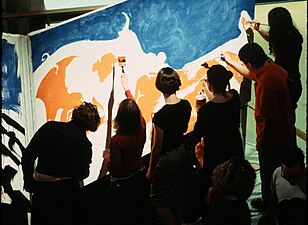 Participants help paint one of the frames of The 1 Second Film's animation.
 -
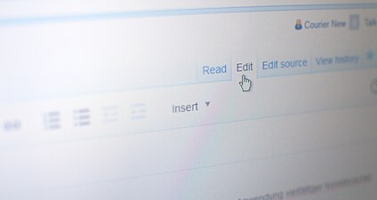 Quick photo I took, highlighting the word 'edit'
.jpg)


- What do you think of a compromise like this http://cdpn.io/yJFmc ? I think a picture from a hackathon or something could work as well, though. --Courier New (talk) 14:12, 6 February 2014 (UTC)
- That's an easier to understand implementation of a screenshot although the text is hard to read at points. I wonder if the design team has developed any standards for using (or not using) opacity and overlays. heather walls (talk)
- The picture-screenshot here is the type of image I had in mind. For the sake of incremental work, we could add it as image for now, combined with the "(collaboration)" string. Then we can either keep polishing that concept (the image itself contains many little elements that should be changed in a final image) or go for a different concept, as soon as someone provides a good alternative. Courier New, could you please upload the image alone here, so Brena and others can use it? Thank you.--Qgil (talk) 17:20, 7 February 2014 (UTC)
- That's an easier to understand implementation of a screenshot although the text is hard to read at points. I wonder if the design team has developed any standards for using (or not using) opacity and overlays. heather walls (talk)
- What do you think of a compromise like this http://cdpn.io/yJFmc ? I think a picture from a hackathon or something could work as well, though. --Courier New (talk) 14:12, 6 February 2014 (UTC)
- Brena, in order to organize your work I recommend you to reserve a mockup-style gray rectangle with an X, with the word "(collaboration)" inside. All this to make explicit that what is inside that rectangle is not final content or design. Then we can have an own discussion to fill that rectangle correctly, while we keep working on the rest of details.--Qgil (talk) 21:55, 6 February 2014 (UTC)
- Ok, I'll wait for the image. In addition, the image could be of some people working together and on the monitor screen a page of MediaWiki, just an idea. --monteirobrena (talk) 12:53, 7 February 2014 (UTC)
Section 2 - intro[edit]
Again, please check out the button styles in Agora. More equal margins might be nice. heather walls (talk) 21:25, 5 February 2014 (UTC)
- Just reinforcing what Heather says, while "Edit"must not be confused with a button, "Get MediaWiki" must be immediately recognized as a button willing to be clicked. Also, the lines of that text are too wide. All in all it looks like the button should be more prominent, and the text more compact. If my current copy is too long then we can cut. In a homepage, design wins over copy text. :) --Qgil (talk) 22:30, 5 February 2014 (UTC)
- Applied Agora style on the "Get MediaWiki" button and compacted introduction text. --monteirobrena (talk) 14:07, 7 February 2014 (UTC)
- While I know it feels like we want to have the download action earlier on the page, we've not actually sold the audience on why they'd want mediawiki yet. I'd suggest this section actually move below the current 3rd section. The text is also an issue, its super small and way too much, I think we need to get the value proposition down to 1 or two shorter sentences. Jaredzimmerman (WMF) (talk) 22:55, 5 February 2014 (UTC)
- Interesting and worth trying.--Qgil (talk) 23:29, 5 February 2014 (UTC)
- Moved the download action to below the "The most complete wiki" section to try Jared's idea. --monteirobrena (talk) 14:07, 7 February 2014 (UTC)
Section 3 - summaries/links[edit]
1. The biggest issue I see here is that the flip-flopping of images and text is not adding anything to the visual, there is enough complexity - just make them all the same. heather walls (talk) 21:25, 5 February 2014 (UTC)
- Yes, I have waited to see whether I got used to the flip-flopping, but I don't. In fact, I consider this to be the most distracting element currently in the page. I agree with Heather, icon (not screenshot) on the left and text on the right might just work.--Qgil (talk) 22:00, 5 February 2014 (UTC)
2. The margins and borders between parts are not lining up. Make the parts (one part = image/title/text) line up vertically and horizontally. heather walls (talk) 21:25, 5 February 2014 (UTC)
3. The margins in the whole page should line up (unless they don't for a reason) at the moment they seem to vary but without a purpose. heather walls (talk) 21:25, 5 February 2014 (UTC)
- Again, lots, lots, lots of text, I'd reccomended you take a look at this and this to get a good idea of what a more editorial layout could look like for this section. At a high level, bigger pictures, less, but larger text, more whitespace, narrower margins. Its ok if these things make this section longer, if it makes the individual ideas easier to understand. Also we should avoid using images that are primarily of more text, it can look weird sent next to actual text. Jaredzimmerman (WMF) (talk) 22:59, 5 February 2014 (UTC)
- We can probably cut text, but we will need some. I agree that there is no need to compact everything so much. Interesting and worth trying.--Qgil (talk) 23:32, 5 February 2014 (UTC)
- Replaced screenshots by icons, aligned the elements (icon left, text right) and reduced texts. --monteirobrena (talk) 14:18, 7 February 2014 (UTC)
Section 4 - community[edit]
I don't understand the role of the light-blue/green background. Is it necessary? heather walls (talk) 21:25, 5 February 2014 (UTC)
- Same thought. Also, perhaps it is better to have the wide picture right below the title? Both will be quite static. Then video and whatever content we have on the right will be updated with certain frequency. About the video, please post a video window that looks like the ones provided by Wikimedia Commons, not like a YouTube video. See for instance Lua/Tutorial. Finally, that wide picture looks really good, but I wonder how will it work with flexible width. Just curious, I would keep it anyway.--Qgil (talk) 21:57, 5 February 2014 (UTC)
- Wiki Voyage main page has image scaling, we could employ similar techniques, yes? heather walls (talk) 22:02, 5 February 2014 (UTC)
- Maybe the two main elements could be switches, right now the panorama feels like its is its own section, consider bringing the section text into the image, and have it open the section rather than ending it. If this section is dynamic (shows upcoming community events, how do I learn more about these? are there more than just the ones listed? as an organizer how do I add my event? Jaredzimmerman (WMF) (talk) 23:04, 5 February 2014 (UTC)
- I removed all background colors and changed the image to look like video provided by Wikimedia Commons. I also changed the position of community picture right below the title. --monteirobrena (talk) 16:39, 7 February 2014 (UTC)
Section 5 - mediawiki users[edit]
1. These larger logos and summaries should align and have the same font size. heather walls (talk) 21:25, 5 February 2014 (UTC)
- Agreed. 25% - 50% - 25% is a good proportion. Please use File:Wikimedia Foundation RGB logo with text.svg instead. Since the logos contains the name of the organization, we don't need to repeat those names. Logo and text is enough. The final text will be probably shorter. Justified better than centered?--Qgil (talk) 21:50, 5 February 2014 (UTC)
- Done. Updated the proportion of logos and fonts. Replaced the Wikimedia's logo as recommended. --monteirobrena (talk) 16:49, 7 February 2014 (UTC)
2. We need to talk to Legal about this section. The logos at the bottom should be closer to the same size as each other, that's the normal agreement in using other people's logos. We would also need to check whether we have rights to use them and whether we would even want to identify MediaWiki so closely with them. I think we only allow companies who share our values to appear as something we are advocating. heather walls (talk) 21:25, 5 February 2014 (UTC)
- What matters at this point is that we want to have logos of MediaWiki users there, and with which look & feel. This mockup is already good enough to check with the Legal team. I will do that. Then, as soon as we really think the mediawiki.org homepage will be changed, we will decide which logos we are aiming for, and we will contact everybody before listing their logo.--Qgil (talk) 21:45, 5 February 2014 (UTC)
- In general I think this is mostly going the right direction, you're already touching on it, but I think we should establish a rule as to how we highlight other companies using the CMS, with one level being use of the software is core to their product, (wikimedia foundation, wikia, wikihow, semantic mediawiki) and companies that use mediawiki, but not as a core part of their business, rather mostly for documentation (KDE, openstreetmaps, etc) Jaredzimmerman (WMF) (talk) 23:09, 5 February 2014 (UTC)
I'd like to second what Heather said about the logos, but take it a bit further. Listing logos like this, especially with some more prominent than others, is as much a form of promotion as anything else. And what gets one company/organisation promoted over another? Is Wikia paying us to put them up so prominently? Is Curse stiffing us, hence not being listed? Where are wikiHow, Orain, ShoutWiki, Uncyclopedia, and so many others who are not just based on the software, but who share the Wikimedia movement's ideals? And what of things like ArchWiki, which, while technically 'only' a documentation/resource for the OS itself, is significant enough that pretty much every other distro points their users there too? Where do you cut that off?
Really, I'm not so sure this is a good idea at all, in practice. There are too many users, primary and secondary (or what Jared described), and too diverse. MediaWiki is everywhere. Look at vmware. You see them touting everyone what uses their shiny on their front page? Of course not. The product isn't defined by random third party users; it stands on its own merits. -— Isarra ༆ 01:31, 6 February 2014 (UTC)
- Mmmok. It is true that we have a risk of having endless discussions about which logos should appear there. An idea could be to have Wikimedia (first and biggest developer), SemanticMediaWiki (the second player, with a well defined platform and community), and https://wikiapiary.com/ as a way to discover the rest of the MediaWiki universe. That's it, no little gray logos. What do you think?--Qgil (talk) 21:18, 6 February 2014 (UTC)
- Sounds good. And those three could be featured a little more in-depth, with a little quote and whatever - More than a tiny grey logo. What do you think about the approach I took here http://codepen.io/awesomephant/full/yJFmc (scroll down to the 'used by millions' section). Of course the actual logos should be included somewhere, and this still needs some visual polish. --Courier New (talk) 21:29, 6 February 2014 (UTC)
- As a Wikimedia project, the standard practice regarding a Wikimedia link is to note that it is a Wikimedia project and to link to the sister projects. That's what we should have here. Pretty much all of the projects but mw.org have a sisterprojects template on their mainpage, and most of them do include this as a sister project. They're all styled differently, but Commons and Wikivoyage have what are probably some of the better examples.
- Why SemanticMediaWiki? It's a big project, but it is still basically just an extension with a community. What makes it more important than all the other extensions, especially when none of the others are apparently worth mentioning at all? (Though that might be something to consider doing, mentioning a couple of examples somewhere to show how extensible mw is as a platform - and smw would be a good example for that.)
- WikiApiary is definitely a good idea, but its relevance here is what information it holds, not any status of prominence it may or may not have. -— Isarra ༆ 00:30, 7 February 2014 (UTC)
After a lot of thinking I believe the simplest solution is to get rid of the Users section altogether. Our discussions here can be just the beginning of endless discussions if/when those logos get deployed in an actual homepage. If we want to add them later on we can always do it.--Qgil (talk) 21:44, 19 February 2014 (UTC)
MediaWiki Homepage Mockup Graphic 6 February 2014[edit]

Section 1 - screenshot[edit]
Discussion is in prior section
- What's this for? It's certainly is quite large. -— Isarra ༆ 23:19, 10 February 2014 (UTC)
- This image is just a placeholder for the final image. I agree it is quite large and in the last version I reduce its height. --monteirobrena (talk) 11:52, 11 February 2014 (UTC)
- But why? What's the functional purpose of having a huge image at all? -— Isarra ༆ 17:47, 18 February 2014 (UTC)
- This image is just a placeholder for the final image. I agree it is quite large and in the last version I reduce its height. --monteirobrena (talk) 11:52, 11 February 2014 (UTC)
Section 2 - summaries/links[edit]
Section 3 - mediawiki[edit]
Section 4 - community[edit]
Section 5 - mediawiki users[edit]
Discussion is in prior section
MediaWiki Homepage Mockup Graphic 10 February 2014[edit]

Section 1 - screenshot[edit]
Of course the picture and text used in the screenshot is not the final version, but which needs to be validated is reduction its size. --monteirobrena (talk) 13:21, 11 February 2014 (UTC)
- Can you add the text from the mockups to one of these design pages so it can be worked on by everyone? Some of the grammar could use a little tweaking and groups can be good for that. Thank you! heather walls (talk) 15:43, 19 February 2014 (UTC)
- The texts of the mockups are already on this page ;) --monteirobrena (talk) 15:52, 19 February 2014 (UTC)
- Haha of course, thanks! heather walls (talk) 16:05, 19 February 2014 (UTC)
- The texts of the mockups are already on this page ;) --monteirobrena (talk) 15:52, 19 February 2014 (UTC)
Section 2 - get mediawiki[edit]
The text of intro was a little reduce and the download button received the Agora style with proportional increase. --monteirobrena (talk) 13:21, 11 February 2014 (UTC)
- Nice! I think you need to move away from justified text - it's making the summaries a little hard to read. heather walls (talk) 15:36, 19 February 2014 (UTC)
Section 3 - summaries/links[edit]
We still need more whitespace like Jared mentioned. More space between the images and the summaries, and between them. heather walls (talk) 15:41, 19 February 2014 (UTC)
Section 4 - community[edit]
The title of the section was moved to over picture and has saved more space. --monteirobrena (talk) 13:21, 11 February 2014 (UTC)
Somewhere near the News block we could have social media icons linking to our MediaWiki accounts in Facebook, Twitter, and Google+.--Qgil (talk) 21:41, 19 February 2014 (UTC)
Section 5 - get started[edit]
This section was included to try answer the questions such as:
- How can I use it?
- How can I customize and extend MediaWiki?
- Where can I get help?
- Where can I report a problem?
- How to start contributing?
See more about this discussion. --monteirobrena (talk) 13:21, 11 February 2014 (UTC)
Section 6 - mediawiki users[edit]
Discussion is in prior section
Beyond The Main Page[edit]
I've just remembered what the biggest problem is here. I say remembered, because I've thought it before, and no doubt raised it during previous redesign discussions.
It is a problem that - despite my original attempts to avoid it - exists with the current home page, and is a problem that will continue to exist with the new home page unless it is addressed. My feeling with the wire-frames/mockups is that they exacerbate the issue by removing a bunch of the current home-page content aimed at sign-posting existing users (editors, administrators and developers) in favour of appealing to new users. However, perhaps with a few clear and obvious links, and some proper consideration about what lies beyond the main page, we can retain that focus without sacrificing usability for existing users.
Beyond the main page. That is the thing.
I tried to do this with our existing main page. (if you want to see the original version, here it is - it has not been edited a lot since then, but some edits were definitely not improvements...! Also, ignore the massive news section - this has conditional includes so is always huge when viewing the template.) There are three strong box-outs targeting the three main target audiences of this wiki: editors and on-wiki administrators (those actually using MediaWiki), system administrators (those who install, configure and maintain a MediaWiki installation) and developers (those who are working on MediaWiki directly and those extending it in a variety of ways). Note that we don't separately target new users. New editors are handled by the main links in the editors box, new system administrators by the install and configure links in the sysadmins box, and new developers get a prominent 'become a MW hacker' link.
Beyond the main page lie three hubs, each targeting one of these groups:
I had a good go at making these pages well targeted, with good links to useful information, but they were never really given the attention they deserved. In order to work effectively, they need to be given the same level of design-work and organisation as the main page itself. As it was, they basically became link lists that ended up somewhat daunting, and - particularly once the bit-rot started to set in - pretty off-putting to their target audiences! I doubt many people use them because of that. However, if they are redesigned and made more useful, easier to navigate and clearer in intent and scope, and are well sign-posted from the home page, I still believe they would provide valuable launch-pads to the rest of the wiki.
Saying 'we can worry about that afterwards' is probably not going to result in a good redesign - the site needs to be considered a little more holistically than that. I'm aware it might seem like a lot of work, but a consolidated design that takes this into account from the start should minimise this. For example, in my design I found three complementary icons that described the three types of user, and these same icons are used on a nav bar in the individual hubs, plus in larger form in the page itself. Not a massive bit of design work, but it gave some consistency between the different areas (though that has been somewhat eroded, due to images being replaced in some places but not others, with alternatives that are a completely different style, and due to the crass way the language bar was moved from the bottom to the top of these pages so it kind of overlaps everything).
Note that I'm not advocating leaving things are they are - I am strongly in favour of a redesign and love that people are enthusiastic about that. I'm just trying to explain some of the thinking that went into the current design, and trying to pass on my experiences in a way that will, hopefully, help make sure any new design is properly awesome.
-- HappyDog (talk) 01:32, 7 February 2014 (UTC)
- I agree that revamping the homepage without revamping the hubs is not an ideal scenario but it's the one we have now. An improvement is still an improvement, and improving the homepage is very much needed. About the targeted links you mention, I agree they are important but we can used the sidebar and appropriate styles to make them visible and relevant. Is it only me thinking that the current sidebar is pretty useless? It has plenty of links, and most of us don't see it anymore.--Qgil (talk) 17:12, 7 February 2014 (UTC)
- I agree that the homepage should be useful for both (new and current) users. The initial idea was to maintain links to pages that were the beginning of help but after we change this links to sidebar. We already was discussed about group this links by actions instead bucketing people and perhaps these groups could be maintained if the links back to the homepage:
- Get started
- Help & Support
- Install & Configure
- Develop & Customize
- Contribute
- --monteirobrena (talk) 17:30, 7 February 2014 (UTC)
- It's not really about 'revamping the hubs', per se, it is more about making a decision that we are going to keep the hub structure (in which case these should be prominently reflected in the home-page design, which they currently are not), or that we are going to use some other structure (in which case the second tier of navigation needs to be properly considered and those landing pages created).
- If we used Monteirobrena's list as the second-tier then we will probably need to create pages as destinations for these links. I don't think we can, for example, simply point the 'Install & Configure' link to Manual:Installation guide. That page is doing something quite different to what a newbie-friendly 'get started' page needs to do, and we have a need for both. Therefore changing the structure will require a bit more planning than simply putting together a links list, but it's worth it I think, if there is a feeling that it will give a better user experience and make content easier to find.
- If the hubs are retained then I agree that updating them to work in concert with the home-page can be a secondary task which can happen once the home-page has been updated, so long as the longer-term plan (beyond the main page) has been properly thought out. I dearly hope that the enthusiasm and industriousness that I can see here is carried over to the second-tier of pages, whatever they may be, once the initial redesign has been completed. It would be a great shame if the energies harnessed here didn't carry forward, leaving us with the job half done.
- --HappyDog (talk) 16:12, 8 February 2014 (UTC)
- Perhaps we can keep a group of links to each type of action until resolve if we decide make a second-tier and then keep just a link ;) --monteirobrena (talk) 13:07, 9 February 2014 (UTC)
- I have just proposed four existing destinations that are acting already as landing pages, following Brena's last design: Documentation - Support - Development - Get involved. The Developer Hub is linked under Development, even if that page is probably the next needing a revamp after the homepage. I believe the other three candidates are more relevant and better maintained than the User and Sysadmin hubs, the main contents of which can be found through the Documentation anyway. These candidates are good enough for a start, don't you think? If better candidates appear, we can substitute them as soon as we have a nice label and pic for them.--Qgil (talk) 21:29, 19 February 2014 (UTC)
Moving to a wiki page[edit]
Looking the last version of the realistic mockup and considering that we have only two weeks left of Monteirobrena's internship, I think it is time to move the work to a real wiki page. There are still things to improve, but I believe we have all the basics in place for a solid proposal to be fined tuned through real edits.
- Done Brena is now prototyping at MediaWiki/Homepage redesign/Preview.--Qgil (talk) 19:21, 21 February 2014 (UTC)