
Design/Archive/Wikimedia Foundation Design/Color usage
 | This page is obsolete. It is being retained for archival purposes. It may document extensions or features that are obsolete and/or no longer supported. Do not rely on the information here being up-to-date. |
This page describes 2012 guidelines for the use of color within projects run by the Wikimedia Foundation.
2012 Agora Color Palette:

Philosophy
[edit]It should be noted that while Wikipedia (and her sister sites) are ostensibly tools for information retrieval, they should not be designed as such. Social software patterns are to be used to direct the user's attention and workflow where required.
In Wikimedia Foundation applications, the overall color palette shall generally be monochromatic greyscale for all "chrome" elements. Chrome elements are designed to float to the background of the user's consciousness and require little thought or attention.
Within interfaces, color should be used primarily for two things:
- Attract attention to specific elements, generally affordances, and
- Convey information to the user
Accordingly,
- Attraction colors shall be vibrant and intense;
- Information colors shall be weighted according to their function (e.g., a warning may be intense, while showing an 'okay' status may not be).
Note that color alone should rarely be the only indicator of a state (owing to various accessibility concerns). Texturized and pattern color is acceptable, but should be used sparingly.
Decision Rationales
[edit]Two colors are not included in the palette: yellow and purple.
Lack of Yellow
[edit]The color yellow is a very difficult color to work with.
- Computer screens do not have yellow pixels. All "yellows" shown on a computer are actually browns with a great deal of white thrown in for good measure (typically done by firing red and green pixels in tandem).
- Yellow is generally a "weak" color when used sparingly. For best effect it requires large fields, which is great if the design is primarily yellow-based.
- Yellow is a generally "inflexible" color. It is difficult to create several shades (as are required in a palette) because adding too much white to the color will pale to the point of uselessness and adding too much black to it will cause it to appear dingy and unappealing.
- Physiologically, yellow is the most stressful color on human eyes because of the amount of light it reflects. This means it generally has to be offset with similarly strong colors.
- Psychologically, yellow is normally used to express newness (good) but also is associated with cowardice in some cultures.
While adding a yellow (for spot usage) could be desirable, it was decided that we should not include it because we would rather not arm people with a color that is difficult to use well. If no yellow shades exist in the palette, then there will be fewer chances to use it incorrectly.
Lack of Purple
[edit]Purple was not included in the primary palette because there are few color semantics that utilize it and there was a desire to keep the palette smaller rather than broader. Since the primary accent for purple is yellow, and yellow is not included, working with purple then becomes more difficult. When used with high saturation, purple is beautiful, but its value can easily be replaced with blue tones.
Purple does show up within the school of various link colors. In this case it is appropriate.
General palette
[edit]For discussion:
- Red #CC0000
- Dark Blue #3366bb
- Green #27AA65
Functional Colors
[edit]Color Coding/ What Colors Represent
[edit]Red is used to call attention when there are problems or something needs your attention. It should be used sparingly to retain effect:
- Errors/Warnings
- Notifications
- Missing Information
- Destructive actions.

Blue is used for information Design. It represents actionability & continuity/ keep going.
- Actionable items such as links
- Buttons: Emphasized Actions
- Buttons: Actions associated with 'Continue'
- Selected State Background Fill
- Information Design (Bolding, calling attention to important but not critical state elements)
- Information icons

Green is used for:
- Positive Action
- Positive Emotion
- Confirmation


Parking Lot (Undetermined)
- Vitality/ Star Ratings
- Watch this article
- Section Headers (Currently carrying Blue Fills)
- Added Removed Bits
Link Colors
[edit]- Active link
- Local link
- External link
- Red link (missing/wanted page)
- Visited Local link
- Visited External link
- Visited Red link
- Review Button[clarify]
Panel Color
[edit]- Content Panel
- Control Panel
- Modal Overlays
Alert Colors
[edit]- Notice
- Warning
- Error
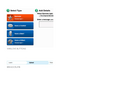
Calls-to-Action
[edit]- Primary action
- Secondary action
- Side-effect/Danger action - Non-recoverable activity
- Disabled/Inactive action
Skin/Chrome
[edit]Audit
[edit]- Existing usage/coding of colors in the system
-
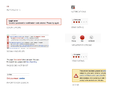 Current Usage of RED
 -
 Current Usage of YELLOW
 -
 Current Usage of GREEN
 -
 Current Usage of BLUE
 -
 BLUE..contd


