novembre 2023: Visual changes, more deployments, and shifting focus
Before (?vectorzebradesign=0)After (?vectorzebradesign=1)
New styling inspired by Zebra prototype
As part of Zebra #9 prototype, which we wrote about in the last two updates, we introduced two kinds of visual changes: color-based area separation, and other CSS modifications.As we reported previously, the A/B test didn't prove that the color-based separation was an improvement.We focused on the other CSS modifications instead, and we're implementing these changes now.To preview the difference, you may use URL parameters: ?vectorzebradesign=0 (without the changes) and ?vectorzebradesign=1 (with the changes).The changes are:
Dropdown menus (the sidebar, table of contents, user menu, and tools menu when not pinned) have a lighter outline and drop-shadow.
The "sposta nella barra laterale"/ "nascondi" buttons in the dropdown menus have a gray background instead of the square brackets.
The main menu no longer has a gray background when it is placed in the side column (when it's pinned). Instead, all menus have the same appearance when placed in the side columns.
The left and right columns have equal width.
Due to the change above, the content width gets slightly narrower when menus are pinned in both columns.
The gap between the table of contents and content area is smaller.
In mid-November, we shipped these changes to the following Wikipedias: French, Catalan, Hebrew, Polish. We are planning on introducing these changes across all the wikis within 2-3 weeks. These will enable future modifications, like the Accessibility for reading menu.
Continuing deployments of the Vector 2022 skin
A video about Vector 2022
Since our last update, we have changed the default skin on a few Wikipedias: Dutch, Hindi, Hungarian, Norwegian (bokmål), and Swedish. We have also released a short video about the skin. In addition, after receiving all logos from our Design team, we were also ready to continue the wide-scale deployments on sister projects.
The Vector 2022 skin is now the default on all non-English Wikibooks, Wikinews, Wikiquotes, Wikiversity, as well as on Meta-Wiki.
We are continuing conversations and scheduling deployments to the remainder of sister projects, beginning with non-English Wikisource, Wiktionary, and Wikivoyage.
Some of these projects may need adjustments, like default settings for limited/full-width at namespaces unique to Wikisource.Gadgets or user scripts may need to be updated, too.We gladly make fixes or assist in making them, depending on whether changes need to be made in the skin itself or a community-controlled code.Reach out to us on the Desktop Improvements talk page or write directly to SGrabarczuk (WMF) if you have any questions or requests for further changes.
Focusing on further desktop and mobile readability improvements
The team has shifted focus onto the Accessibility for reading project. We will work on improvements in typography and introduce dark mode to the Vector 2022 and Minerva skins. Please visit the project page for more details and information on how to get involved.
Altri aggiornamenti
settembre 2023: Results from the Content separation (Zebra #9) A/B test
In June 2023, we ran an experiment which compared different content separation layouts of the interface.
This prototype shows the tested design; we're calling it "Zebra".The goal was to improve readability and focus on the content of the page.The experiment tested the prototype design and compared it to the current all-white Vector 2022 design.The results of the experiment showed:
A 3% increase in pageviews per session in the treatment group attributed to Zebra
A 3.4% decrease in edits per session in the treatment group attributed to Zebra
A 17% decrease in the click rate of the table of contents
An 87% increase in the page tool pins per session
After reviewing the settings of our test, we did not find any issues that would result in data inconsistencies.Next, we studied other factors which might affect the results of the test.We noticed that a significant amount of the decrease in edits and pageviews came from screen sizes narrower than 1200 px.We combined these results with the results of our user tests.
These did not indicate significant differences in readability between the test and control designs.
Our conclusion was that the prototype did not, in its tested form, improve readability and could negatively affect edits.
We decided not to proceed with the deployment of this prototype in its tested form.Instead, we plan to improve readability and focus on the content through the following:
Introducing changes to the typography, focused on improving readability and content comprehension.This is the goal of the new project, Accessibility for reading
Introducing improvements to Zebra, optimizing for narrower screens, and repeating the tests.
maggio 2023: continuiamo a lavorare su Vector 2022, facendo programmi per il nuovo anno fiscale
Abbiamo continuato a concentrarci sul portare avanti le distribuzioni sui wiki rimanenti, realizzando esperimenti per ulteriori migliorie. Abbiamo anche fatto alcuni programmi per progetti futuri.
Lanci. Vector 2022 è ora il tema di default delle Wikipedie in spagnolo e polacco, e di Wikinews in francese. Stiamo anche discutendo con la comunità della Wikipedia in cinese. Un ringraziamento speciale a tutti coloro che che aiutano sia noi che gli editor a capire meglio le discussioni, trovare e risolvere bug, e a spiegare le decisioni. Se la comunità del tuo wiki vuole che la nuova interfaccia diventi quella di default, contattaci!
Esperimento: selettore di larghezza. Abbiamo lanciato un esperimento che introduce un indicatore per segnalare la presenza del selettore della larghezza fissa del contenuto. Questo per assicurarci che i lettori siano al corrente della posizione del selettore (toggle) e capaci di passare dalla larghezza fissa a quella a pagina intera all'occorrenza. (T335307)
Test A/B della separazione delle aree (Zebra #9). Faremo un test per comparare diversi layout di separazione delle diverse zone della pagina per l'interfaccia (basato su questo prototipo). Il test sarà effettuato a maggio su di un gruppo di 10 Wikipedie di grande e media taglia. Una volta concluso il test, analizzeremo i dati e continueremo il processo di selezione del miglior layout della pagina. Per saperne di più sul test sui wiki clicca qui. Per maggiori informazioni consulta la nostra documentazione sul precedente test utente. Grazie mille a tutti coloro che hanno lasciato commenti a questo proposito sulla pagina di discussione del progetto, sugli altri wiki, o ancora nei nostri incontri on line! (T333180, T335972)
Progetti per il futuro. Nel prossimo anno fiscale della Fondazione lavoreremo a nuovi progetti. Ti invitiamo a leggere la bozza del piano annuale della Fondazione Wikimedia, section Infrastructure, Bucket: Wiki Experiences. Leggi anche la descrizione più dettagliata "WE2: Reading and media experience". Questa è la parte su cui si concentrerà il nostro team. Tra le altre cose, il dark mode e le liste di articoli da leggere sono menzionati tra gli esempi di possibili progetti. Saremo felici di leggere i vostri commenti sulle pagine di discussione delle pagine linkate su Meta. Scrivi pure nella tua lingua! La scadenza è il .
marzo 2023: Vector 2022 su più wiki e altri aggiornamenti
Durante gli ultimi mesi il team ha preparato e modificato l'aspetto delle Wikipedie più grandi. Vector 2022 è diventato il tema di default per tutti gli utenti connessi e non connessi sulle Wikipedie in ceco e in inglese.
Da allora abbiamo continuato a discutere con le comunità di ulteriori miglioramenti dell'aspetto. A seguito di queste discussioni e rielaborando i piani precedenti abbiamo apportato molti cambiamenti. Tra questi figurano:
La persistenza e disponibilità del selettore della modalità a tutto schermo (toggle). Il selettore della modalità a tutto schermo (disponibile in fondo alla pagina) è ora persistente sia per gli utenti loggati che non loggati. Questo vuol dire che continuano a vedere la larghezza del contenuto da loro scelta nonostante l'aggiornamento della pagina o l'apertura di una nuova pagina. Il toggle è disponibile anche sui monitor di piccole dimensioni.
Permette di distinguere gli strumenti relativi alla navigazione all'intero del wiki in generale dagli strumenti relativi ad una pagina specifica. Nel primo gruppo troviamo, ad esempio, Pagina principale e Una voce a caso. Nel secondo gruppo ci sono, ad esempio, Puntano qui, Modifiche correlate e Cita questa voce. Inoltre, il nuovo menu riunisce gli strumenti specifici della pagina in un unico posto. Prima, alcuni di questi link si trovavano nel menu principale (barra laterale) o nel More Menu (di fianco alla Cronologia). Il nostro proposito è che i nuovi lettori e i nuovi contributori possano capire più facilmente a cosa servano questi link. Oltretutto, gli utenti possono scegliere se fissare (appuntare) o meno il nuovo menu. Maggiori informazioni sono disponibili sulla pagina del progetto.
Con questo cambiamento si ha anche il vantaggio che l'indice è mostrato più in alto sulla pagina. Così succede solo di rado di dover scorrere la pagina per poter consultare l'indice. Questa è una delle preoccupazioni a cui abbiamo dato ascolto negli ultimi giorni e speriamo che questo risolva la questione.
Abbiamo spostato il link per effettuare l'accesso fuori dal menu a tendina per gli utenti non collegati. Questo cambiamento permette di accedere più rapidamente al link per connettersi, senza obbligare gli utenti non collegati di aprire il menu a tendina.
Aumentare l'altezza dell'indice. Questo permetterà all'indice di apparire più lungo, quindi a più sezioni di essere visibili (T319315).
Dove si arriva cliccando su un link dell'indice (T314419). Ci è stato detto che l'indice si apre troppo a ridosso dell'inizio della sezione, senza lasciare spazio per il titolo e la sezione precedente. Questo cambiamento aumenterà questo spazio, rendendo più confortevole la navigazione.
Soglia per considerare attiva una sezione, segnalata come tale nell'indice (T317661). Ci è stato anche detto che una sezione è da considerarsi attiva solo dopo che l'utente abbia fatto scorrere la sezione precedente fuori dalla sua visuale. Questo ha portato a una certa confusione su quale fosse lo stato attivo. Questo cambiamento permetterà di mostrare prima quale sia la sezione attiva, quando la maggior parte della sezione è visualizzata sullo schermo.
Navigando direttamente tramite link a una sottosezione ed espandendo la sezione parente relativa se in partenza era mostrata chiusa (T325086). Alcuni commenti sono relativi al modo in cui le sottosezioni appaiono sulla pagina. Ci è stato detto che le sottosezioni devono apparire più coerente quando sia necessario. Questo cambiamento garantisce che le sottosezioni siano aperte quando l'utente apre un link diretto verso quella sottosezione.
Prossimi cambiamenti ed evoluzioni
Attualmente stiamo lavorando su questi cambiamenti:
L'impaginazione (layout) della pagina. Volevamo affrontare una delle principali preoccupazioni emerse grazie ai commenti sul tema Vector 2022 nel corso del tempo. Riguarda la separazione del contenuto e la luminosità dell'interfaccia. Abbiamo sviluppato un prototipo su cui ci piacerebbe conoscere la vostra opinione. Come dovremmo misurare i potenziali cambiamenti rispetto al layout attuale? Abbiamo pubblicato maggiori informazioni e domande specifiche nella pagina di discussione. Ci sono diverse sezioni per discutere nelle diverse lingue. Non esitare ad aggiungervi le tue domande e i tuoi commenti!
Configurazione dell'indice. Abbiamo l'intenzione di rendere l'indice più configurabile. Per fare in modo che i contributori possano decidere quando l'indice ha bisogno di essere aperto o chiuso di default, e quante sezioni dell'indice dovrebbero essere presentate di default. Questo riprodurrà la funzionalità di alcune "parole magiche" usate nell'indice. Sarà utile in particolar modo su pagine quali il Bar generale o le pagine di coordinamento nel namespace Wikipedia (T317818).
dicembre 2022: Più distribuzioni, selettore della larghezza a tutto schermo, strumenti della pagina, altri aggiornamenti
Nel corso degli ultimi mesi siamo stati occupati a discutere delle distribuzioni su diversi grandi wiki.
Tra cui la Wikipedia in lingua inglese.
La sua comunità ha accettato Vector 2022 come tema di default sotto certe condizioni.
Ne abbiamo tenuto conto.
Attualmente stiamo discutendo le prossime tappe con la comunità della Wikipedia in inglese.
Abbiamo anche cambiato il tema della maggior parte delle Wikipedie.
Attualmente, oltre ~300 Wikipedie hanno Vector 2022 di default.
La settimana scorsa il tema è diventato di default sulle Wikipedie in arabo e in greco.
Contiamo di applicarlo a tutte le Wikipedie entro la fine di febbraio 2023.
A partire dai feedback che abbiamo ricevuto abbiamo apportato ulteriori cambiamenti alla skin in sè:
Larghezza limitata
Abbiamo messo a punto una preferenza per gli utenti loggati che permette di impostare una larghezza e conservarla visitando le pagine e passando da un wiki all'altro. La preferenza è disponibile nella sezione "Preferenze temi" della linguetta "Aspetto" delle "Preferenze" ("Abilita la modalità con larghezza limitata"). Può anche essere impostata come preferenza globale.
Abbiamo messo a punto un selettore per gli utenti loggati e non loggati. Il selettore è disponibile su tutte le pagine se si dispone di un monitor da 1600 pixel o più. Cliccando sul selettore la larghezza della pagina aumenta.
Strumenti della pagina
Spostamento degli strumenti della pagina a destra della pagina. Questa modifica consiste nel raggruppare gli strumenti della pagina e nel separarli dai link di navigazione del wiki. Questa modifica risolve anche la questione della posizione del sommario. Rende la barra laterale (il menu di sinistra) più corta, e di conseguenza il sommario è visibile più in alto sulla pagina.
Speriamo di rendere disponibile il menu degli strumenti aggiornato entro la fine di dicembre 2022. Se vuoi seguire lo sviluppo della funzionalità osservando come funziona in anteprima aggiungi ?vectorpagetools=1 (se già usi Vector 2022) o ?useskin=vector-2022&vectorpagetools=1 (se non stai usando Vector 2022).
La gente è più propensa a portare a termine le modifiche che ha iniziato usando l'header fisso rispetto alle modifiche iniziate usando altri pulsanti id edizione sulla pagina.
Le modifiche iniziate e completate cliccando sul pulsante di modifica nell'header fisso sono state annullate meno spesso rispetto a quelle iniziate usando altri pulsanti di modifica sulla pagina.
settembre 2022: Progetti e conversazioni sulla distribuzione sui wiki Wikimedia
Un'adesione elevata nei wiki early adopter. Secondo un recente studio del team Product Analytics, l'87% dei contributori attivi sui wiki adottanti precoci utilizza Vector 2022. Con "contributori attivi" intendiamo gli utenti che hanno fatto almeno 5 edit tra il 1° novembre 2021 e il 31 agosto 2022. Grazie!
Rifiniture grafiche. Abbiamo terminato la lista delle Rifiniture estetiche. Abbiamo pianificato di concluderla prima della distribuzione su ulteriori wiki. Questi cambiamenti includono il lavoro sul colore dei link, le icone, l'aspetto generale e l'atmosfera di Vector 2022. Per ognuno di questi cambiamenti i feedback e le domande sono i benvenuti. Scrivici nella pagina di discussione del progetto.
Decisione della comunità della Wikipedia in inglese attraverso una Richiesta di commenti (Request for Comments o RfC) Nel corso degli ultimi due mesi, abbiamo discusso con la comunità della Wikipedia in inglese. I wikipediani anglofoni hanno identificato dei nodi che bloccano la distribuzione du Vector 2022 sul loro wiki di riferimento. Hanno anche chiesto che la decisione sulla distribuzione venga presa attraverso il processo della Request for Comments. La nostra bozza ormai è pronta. Abbiamo previsto di lanciare la RfC mercoledì 21 settembre. Se modifichi la Wikipedia in inglese, ti invitiamo a partecipare!
Il piano della distribuzione sugli altri progetti. Stiamo pianificando le conversazioni su tutti gli altri progetti Wikimedia. Inizieremo dai wiki più piccoli. Con "più piccoli" intendiamo più piccoli delle principali 30 comunità attive più grandi. Speriamo di concludere questa fase durante la prima settimana di ottobre 2022. Quindi, inizieremo le conversazioni con i wiki di medie e grandi dimensioni. Le date dipenderanno dal consenso nelle singole comunità.
Altre attività al servizio della comunità
Abbiamo pubblicato un nuovo post sul blog Diff. Si intitola Prioritizing equity within Wikipedia's new desktop. Il post spiega come e perché diversi gruppi di utenti sono stati rappresentati durante il processo di costruzione di Vector 2022.
Abbiamo pubblicato una pagina più approfondita delle Domande frequenti. Dacci un'occhiata e dicci se la trovi utile. Presto, renderemo possibile tradurla.
Stiamo anche proponendo dei banner per incoraggiare a provare Vector 2022. I banner sono visibili solo per gli utenti connessi che hanno attivato il Vector Legacy (2010), l'attuale tema di default.
agosto 2022: Wikimania, rifiniture grafiche, e altri cambiamenti
Terminati i cambiamenti strutturali delle funzionalità, stiamo finendo di sviluppare Vector 2022. In particolare:
Stiamo lavorando sulle rifiniture grafiche. Cambieremo gli stili, i colori dei link, la taglia del font, la larghezza dell'area del contenuto, e altro ancora. Basandoci sui risultati e feedback ricevuti nel corso dell'ultimo test del prototipo.
Stiamo pubblicando gli aggiornamenti dell'indice basandoci sui feedback che abbiamo ricevuto dalle comunità. Questi aggiornamenti renderanno l'indice più facile da usare sugli schermi più piccoli o più grandi. Sarà possibile personalizzare più di prima. Nel corso delle prossime settimane, vedrai prodursi i seguenti cambiamenti:
Sarà possibile ridurre l'indice sugli schermi di qualsiasi dimensione.
Una volta ripiegato, l'indice sarà disponibile in cima alla pagina, affianco al titolo dell'articolo, così come nell'header fisso.
L'Editing Team, che si sta concentrando sul miglioramento delle pagine di discussione, ha aggiunto un pulsante "Aggiungi argomento" all'header fisso delle pagine di discussione. In questo modo sarà più facile iniziare un nuovo argomento in una pagina di discussione a partire da qualunque punto della pagina, senza dover scorrere fino in cima. Dai un'occhiata alla loro pagina di progetto per maggiori informazioni su questo cambiamento e sul progetto nel suo insieme.
Abbiamo anche continuato le discussioni su come rendere Vector 2022 di default con altre comunità. Il vostro fededback ci sta aiutando a rendere l'interfaccia migliore. Lo apprezziamo. Incontriamoci di nuovo! Sabato 13 agosto, avremo una sessione on line a Wikimania, e a seguire una riunione separata per le domande e le risposte.
luglio 2022: Inversione tra la barra del titolo della pagina e la barra delle linguette
Stiamo distribuendo uno dei nostri ultimi aggiornamenti.
La pagina del titolo sarà mostrata al di sopra delle linguette tipo Discussione, Leggi, Modifica, Cronologia, o Altro.
Con questa modifica, stiamo migliorando due aspetti.
Innanzitutto, stiamo rendendo chiaro che gli elementi delle linguette sono collegati alla pagina che si sta guardando.
Questo diventa palese quando mettiamo il titolo della pagina per primo.
Questo cambiamento renderà più facile selezionare la lingua.
Sposta il pulsante delle lingue in una posizione più preminente in cima alla pagina.
Approfondisci su Phabricator.
Abbiamo introdotto questo cambiamento a piccoli passi.
A partire dalla fine di giugno era disponibile per tutti gli utenti che avevano optato per il tema Vector 2022 e per alcuni wiki early adopter.
Durante la settimana del 4 luglio il cambiamento diventerà visibile su tutti i wiki early adopter.
Inoltre, il nostro prossimo incontro on line (Office Hours) si terrà il 26 luglio anziché il 12 luglio.
Ci permetterà di preparare la comunicazione per rendere Vector 2022 di default su altri wiki.
Stiamo lavorando anche su un migliore supporto linguistico per i futuri incontri con il team.
Prossimamente maggiori informazioni!
aprile 2022: Table of Contents is available
We have deployed the new table of contents.It makes it easier to gain context of the contents of a page and navigate the page without needing to scroll to the top.
It is currently available to three groups of users.First, all who use Vector 2022 and are not on our pilot wikis.Second and third - 50% of logged-in users of Hebrew and Basque Wikipedias.Next week, we will be A/B testing the table of contents across the rest of our pilot wikis.We would like to check if there's a decrease in the need to scroll to the top of the page.
Before all that, we prepared a series of prototype tests with both readers and editors.To read more about how we worked on the feature based on feedback, please see the project page.
Now, we are working on the feature based on the feedback from users mentioned in the second paragraph.In particular:
ToC on narrower screens.We have increased the threshold for which the ToC currently hides to 1000px.(See T306904 for more context).This was to make it more comfortable to read on narrower screens.This is a temporary fix, though.The conversation about the best solution will continue in T306660.By the end of April/early May we hope to have clear next steps on our preference of the options presented there.
We are beginning the work on reducing the margins for screens between 1000px - 1200px.This will make the table of contents smaller and create more space for text.We will track this in T307004 and will probably have the implementation ready within a few days.
marzo 2022: Development of the Table of Contents
The results of our 3rd prototype testing showed an overwhelming support for the proposed table of contents.Based on that, the team focused on developing this feature.The new table of contents will be persistent - users will have access to it at all times.It will also make it easier to understand the context of the page.In addition to that, it will be possible to navigate to different parts of the page without having to scroll all the way back to the top.We are expecting to deploy the new table of contents to our pilot wikis in the first half of April.
marzo 2022: Page tools feedback
The team is beginning work on page tools (sometimes referred to as article tools).Our goal is to make it easier to distinguish the purpose of individual items within the sidebar.We are currently collecting feedback on our proposed prototype.We look forward to hearing your thoughts!Please go to our prototype testing page and fill out the form.
marzo 2022: Sticky header confirmed to decrease the need to scroll to the top of the page
From January 5 to January 31, 2022, we ran an A/B test.We wanted to assess the impact of deploying the sticky header.The test ran on 22 of our pilot wikis.Logged-in users who were assigned to the treatment group with the new skin version saw the sticky header.Users in the control group saw the old feature.
The primary goal of the AB test was to test our hypothesis.We had been expecting that the sticky header would decrease the need to scroll to the top of the page.Overall, we saw an average 15% decrease in scrolls per session by logged-in users on the 15 pilot wikis in the treatment group (with the new sticky header), compared to the control group (without the sticky header).On the remaining 7 pilot wikis, there was too little activity and we excluded them.The results indicate that our hypothesis was correct.Adding the sticky header to the page reduced the need to scroll to the top of the page significantly.Read the full report.
gennaio 2022: More pilot wikis
The Desktop Improvements are default on twelve more wikis.These are, above all: Moroccan Arabic, Indonesian, Thai, and Vietnamese Wikipedias, French Wikiquote, Portuguese and Polish Wikinews, Vietnamese Wikibooks, and MediaWiki wiki.In addition to these, we have enabled the changes on the Wikimedia Foundation-related wikis: Wikimedia Foundation Governance wiki, Collab wiki, and Strategy wiki.Currently, there are almost 30 pilot wikis.Among them, there are wikis of different scripts and sizes, written on all continents, and run both by the communities and the Foundation.We hope that soon, at least one Wikisource will be added to that list.
dicembre 2021: Sticky header developments
Sticky header for logged-in users
The team has been working on building a sticky header.It will allow logged-in users to have access to important functionality (search, talk pages, history pages, language switching, and more) throughout the page.We have completed the development of the first version of the sticky header.Now, we are expecting to deploy an A/B test to the pilot wikis by the end of January.The header was based on the results of our user testing and volunteers' answers to the prototype testing.
dicembre 2021: Language switching iteration
Earlier this year, we moved the language button to a more convenient location at the top of the page.However, the results of our A/B test indicated that the new location of the button might be difficult to discover in the following cases:
For users that are accustomed to the previous location of the language switching functionality
For users that tend to switch languages across multiple wikis. In the latter case, this created a situation where the language switching functionality was available in different locations depending on the wiki used and whether that wiki was a part of the pilot wikis.
To improve on these issues, we are changing the new language button.Our goal is to make it easier to find across all scenarios.We hope to release these improvements in January 2022.
dicembre 2021: Prototype testing for the table of contents
Over the next few months, our main focus will be on making the table of contents persistent.Currently, the table of contents is available only at the top of the page.It is difficult to gain context on an entire article or page, or to navigate to individual sections, when outside the top of the page.We hope to make the table of contents easier to navigate through a page, as well as to understand its context.
The user menu is now available for all users opted into Desktop Improvements.This menu makes it easier for new editors and readers to identify which links are related to their personal tools.These tools are: user page and talk page, watchlist, etc.It also allows for visual cohesion at the top of our pages.
We are monitoring how the change impacts the number of clicks to these links.Based on the results, we may decide to improve the menu.In addition, volunteers have commented on the position of the watchlist link.We are working on this.Details are available on Phabricator.
luglio 2021: New language switching functionality
Changes to language switching capabilities on the vector skin
Over the past few months, the team has focused on improving the language switching functionality for our projects.Previously, the language links were available at the bottom of the sidebar menu and were difficult to find for readers and new editors.We have made a change that allows the language switching functionality to appear at the top of the page via a button.We have built this functionality based on the input of editors and readers from our prototype and other user testing.
The functionality was deployed to 50% of logged-in users in June of 2021 to allow for the performance of an A/B test that will compare usage to the previous location.Currently, the A/B test is completed and all users on pilot wikis should be able to see the new language switching functionality.
In May and June of 2021, the team requested feedback from 30 different language communities on a prototype of the latest feature ideas for the project.These were the user menu that will allow for users to have their personal links all in one place, and a fixed “sticky” header that gives the ability to access features (e.g. edit, access to history and talk pages) all the time.Both of these were previously only available at the top of the page.Overall, we received 305 replies from logged-in users on their experience with the prototypes.
The large majority of participants indicated positive experience with the prototype.However, we also received some feedback around the behavior of the sticky header.In particular, there were requests to make it persistent throughout the experience rather than triggered only when scrolling.We are currently implementing these suggested changes.
A full report on the analysis of the feedback we received will be published later this month.
maggio 2021: User testing report now available
In early 2021, the Web team and Design Research team contracted three independent research groups to study the usage of two proposed features: a fixed "sticky" header and a persistent table of contents.Our goal was to allow frequently used functionality to be available throughout the page, thus reducing the time people scrolled up and down the page looking for the tools they need.We tested new readers, casual readers, and editors in three different countries - Ghana, Indonesia, and Argentina and three different languages - English, Bahasa Indonesia, and Spanish.This report shows the findings of our studies.Overall, both of the proposed features were positively received by the study participants.
marzo 2021: New search widget live on pilot wikis, A/B test in progress for logged-in users
We are happy to announce that our new search widget is now available on all of our current pilot wikis by default.The new search functionality optimizes the search experience by providing context on search results, such as images and descriptions, making it easier to find the correct results.
We are also performing an A/B test on pilot wikis, for logged-in users only.The A/B test provides the new widget for 50% of logged-in users and compares it to the old search for the remaining 50%.The results of the test will allow us to measure the success of the feature and to identify areas for improvement and iteration.The test will run for 2 weeks, after which, we will analyze and publish the results.
gennaio 2021: New search widget and other general updates
Over the past few months, we have been working on the new search widget, which will optimize the current experience by providing context, such as images and descriptions, for searches. While we have experienced some delays with this deployment, we are currently scheduled to deploy some time in February.
We have also begun reviewing some of the data on the Desktop Improvements project as a whole, as well as on individual features. We have published a report on the usage of the collapsible sidebar.According to the data, logged-out users are more likely to keep the sidebar collapsed than logged-in users.These results gave us confidence that our eventual default will be keeping the sidebar open for logged-in users and closed for logged-out users.
In addition, we also have begun looking at the rates at which logged-in users are opting out of the desktop improvements on our pilot wikis.The average opt-out rates for all logged-in users were between 1.78% on euwiki and 4.09% on hewiki.For active editors, the range was between 5% and 14%. We will be looking at this data in more detail in the weeks to come.
Finally, we wanted to give a quick timeline of the next few months:
February 2021 - new search widget deployed to pilot wikis. The pilot wiki list will expand to include Portuguese Wikipedia, Turkish Wikipedia, Korean Wikipedia, Serbian Wikipedia, and German Wikivoyage.
February 2021 - Second round of prototypes for logged in users. We will be running a second round of prototypes for the sticky header and user menu with logged-in users over the month of February. We encourage everyone to review these and give us feedback!
March 2021 - We are currently focused on improving our language switching capabilities. We plan on deploying the new functionality this March to our pilot wikis.
settembre 2020: New location of search bar now available on all wikis
We have deployed the new location of the search functionality to all projects. The new location is available by default for anonymous users on our early adopter wikis, and by preference for all other users.
We are also performing an A/B test of the new location with logged-in users on our early adopter wikis. 50% of logged-in users are seeing the new experience, while the other 50% are seeing the old experience. This test will last two weeks. Our hypothesis is that the group with the new experience will search more frequently. Results will be available in approximately one month.
luglio 2020: barra laterale comprimibile, larghezza massima e nuova intestazione ora disponibili per tutti gli utenti su euwiki, fawiki, frwiktionary, euwiki e ptwikiversity
Wikipedia in basco, persiano ed ebraico, così come Wikizionario in francese e Wikiversità in portoghese hanno ora ricevuto la nuova versione del tema Vector per impostazione predefinita. Per ora, queste modifiche includono la barra laterale pieghevole, la larghezza massima e la nuova intestazione. Per feedback e domande - vai alla nostra pagina di discussione.
luglio 2020: barra laterale pieghevole, larghezza massima e nuova intestazione ora disponibili come preferenza per tutti i progetti
Ora abbiamo distribuito la nostra barra laterale pieghevole, la larghezza massima e la nuova intestazione a tutti i progetti come preferenza dell'utente. Per iscriversi, vai alla scheda Aspetto nella pagina delle preferenze e deseleziona l'opzione "Legacy Vector". Una volta attivato, riceverai tutti gli aggiornamenti futuri non appena saranno pronti. Per feedback e domande - vai alla nostra pagina di discussione.
La nostra prima modifica, una barra laterale comprimibile, consente agli utenti di comprimere il lungo menu sul lato sinistro della pagina. Riteniamo che questo cambiamento migliori l'usabilità consentendo alle persone di concentrarsi sul contenuto stesso, sulla lettura, la modifica o la moderazione.
La nostra seconda modifica introduce una larghezza di riga massima per i nostri contenuti su pagine come pagine di articoli e pagine di discussione.
Studies have shown that limiting the width can lead to better retention of content, as well as a decrease in eye strain.(please review our FAQ for a list of the literature reviewed)
giugno 2020: barra laterale comprimibile su officewiki, nuova intestazione e descrizioni delle funzioni
Abbiamo implementato la nostra barra laterale pieghevole su officewiki e testwiki. Puoi vederlo accedendo a uno di questi progetti o aggiungendo il parametro url ?useskinversion=2 all'URL di qualsiasi progetto.
marzo 2020: User Research with Readers - phase 1 report
Starting in January 2020 we have been working with Hureo, a user research firm based in India, to perform a user study on how new and casual readers use the desktop interface of Wikipedia.The outcome of the first phase of the study is a report detailing their observations from 24 user interviews.Read more
marzo 2020: Full results from prototype feedback
In December, 2019 we published a prototype of the first few features of the desktop improvements project for community feedback.We received detailed, thoughtful feedback from over 200 logged-in users, across five languages.We have published a report which highlights the main points raised, both positive and negative, and our plans going forward in response to this feedback.The prototype presented a collapsible version of the sidebar, a fixed-width layout, and a more prominent location for the language switcher.The feedback was mostly positive, with the majority of users seeing the proposed changes as an improvement over the current design.However there were also some areas of concern.Many of the issues raised were due to bugs in the prototype (particularly with the language switching menu), while others exposed areas for improvement that we will iterate on and/or keep an eye on during development.
febbraio 2020: Update on initial features and overall feature sequence
We have began building the opting-in and opting-out structure for the project.
The setting for turning the improvements on will be within the user preferences list for logged-in users.For test wikis, the improvements will be on by default, but logged-in users will be able to turn them off anytime via their preferences or a button in the sidebar.Please see the Opting in and Release Plan page for more details and mockups.
As we will be testing each individual feature prior to building, this list is subject to change based on the feedback we receive.
febbraio 2020: Feedback Round 1 Summary
We have finished our first round of feedback for the prototype of the first few features of the desktop improvements project: the new header, collapsible sidebar, and improved language switching.So far, the results have been mostly positive, with the majority of users seeing the changes as a significant improvement over the current design.However, we also found a few areas for improvement that we will iterate on and consider during development.Here are a few highlights of the results so far:
A majority of the editors who tested the prototype really liked the new location of the language switcher.
A few editors raised concerns around internationalization and the ability to switch languages using one click.
A majority of the editors liked the collapsibility of the sidebar, especially for readers
There were some concerns around the amount of white space introduced with a collapsible sidebar and fixed-width layout
We saw many requests for a dark/night mode for the site
We are currently running the second feedback round on English and Polish Wikipedias.If you haven’t had a chance yet, please let us know your thoughts on the prototype page.Once both feedback rounds are completed, we will be publishing a more in-depth report.
gennaio 2020: Language Switching Users Tests
In December we did some usability testing to compare the current placement of the Universal Language Selector (in the sidebar) with the proposed location in the article header.We tested a prototype with 21 users in order to determine if people have an easier time switching languages given the new location of the language switcher.The results of the test confirmed our hypothesis — participants in the test group (new location) were able to switch languages more quickly than participants in the control group (old location).Based on these results we plan on continuing to explore moving the language selector to this location as a part of the desktop improvements project.
dicembre 2019: Prototype testing
Between December 2019 and February 2020, we will be performing tests on a prototype for the first few features of the desktop improvements project.We will be gathering feedback from a variety of test wikis by encouraging editors to participate using a central notice banner.We ran the banners and received feedback from the majority of our test wikis during December 2019.In February 2020, we will continue running the banners on English and Polish Wikipedias.So far, the feedback we have received is mostly positive but we have also identified some areas of our prototype that we will iterate on based on the feedback.We will be publishing the results of the first round of feedback over the next few weeks, and of the second, sometime in February.In the meantime, we encourage you to give us feedback (if you haven't yet) on the prototype page.
ottobre 2019: Technical Research pt 2
We have published the results of our technical research in preparation for beginning the work on the project.In particular, we have focused on gathering more information on the following:
During Wikimania 2019, we interviewed editors with the goal of sharing the plans for our upcoming Desktop improvements project, and collecting valuable feedback on a number of preliminary design ideas.Our research consisted of user interviews, a free-form feedback exercise, and a presentation with breakout groups for more focused discussion.We have published a report and a PDF summary (in English) of the feedback we received.Overall, we received positive feedback on the focus areas selected, as well as the individual prototypes for ideas.However, we were also able to identify areas for improvements.
We will be iterating over this feedback over the next few weeks and plan on developing a prototype that we can test with a wider audience across wikis.
In the slideshow below is a sample of 19 of the ideas we tested.For more context, please read the full report and then give us feedback on the talk page!
Collapsible sidebar prototype for the Desktop improvements project
A sketch of collapsible sections within the sidebar for the Desktop improvements project
Language switcher in article header prototype for the Desktop improvements project
Sketch of emphasized language switching options for Desktop improvement project
Sketch of emphasized language switching options on a scrolled page for Desktop improvement project
Sketch of full language panel in new location for Desktop improvements project
Search prototype for the Desktop improvements project
Sketch of search results with images and descriptions for Desktop improvements project
Sketch of a minimized search in the site header for Desktop improvements project
Table of contents prototype for Desktop improvements project
Sketch of table of contents off article title for Desktop improvements project
Sketch of table of contents as a sidebar for Desktop improvements project
Consolidated user tools prototype for Desktop improvements project
Sketch of user tools with watchlist and contributions as icons outside of the menu
Article tools prototype for the Desktop improvements project
Sketch of page tools as a pin-able menu for the Desktop improvements project
Sketch of page tools as a pin-able menu (scrolled page) for the Desktop improvements project
Post-its with feedback on a mockup for the Desktop improvements project
Updated Wikipedia desktop interface sketch for Wikimania poster
settembre 2019: Desktop usage and behavior data analysis
As a part of our research process, we wanted to learn more about the way people currently use the site.In particular, how often they use available functionality such as links in the sidebar, language switching, and search.We have published our results.Overall, usage of sidebar links is low - only about 0.5% of all logged out users and 1.6% of all logged-in desktop users clicked on one of the pages linked in the sidebar.Language switching usage varied, generally based on the size of the wiki, with smaller wikis switching languages more often.
agosto 2019: Research and brainstorming at Wikimania
Slides used in the Wikimania session
Wikimania provided us with the opportunity to speak with experienced members of our communities.Over the five days of the conference we were able to share the plans for the project, and collect valuable feedback on a number of design ideas.Our research consisted of user interviews, a free-form feedback exercise, and a presentation + brainstorming session (you can see the slide-deck we used at the side).We will soon be publishing the summary of the feedback, as well as interview session results.
agosto 2019: Technical Research
To explore different technical possibilities for the project, the team spent a week hacking on different approaches to a single problem - how to enable the sidebar in the desktop experience to be collapsible. We are hoping to use the results from these experiments to determine the technical architecture for the improvements, as well as the skin we would like to build these improvements within. Here is a list of the experiments themselves:


 Collapsible sidebar prototype for the Desktop improvements project
 A sketch of collapsible sections within the sidebar for the Desktop improvements project
 Language switcher in article header prototype for the Desktop improvements project
 Sketch of emphasized language switching options for Desktop improvement project
 Sketch of emphasized language switching options on a scrolled page for Desktop improvement project
 Sketch of full language panel in new location for Desktop improvements project
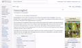 Search prototype for the Desktop improvements project
 Sketch of search results with images and descriptions for Desktop improvements project
 Sketch of a minimized search in the site header for Desktop improvements project
 Table of contents prototype for Desktop improvements project
 Sketch of table of contents off article title for Desktop improvements project
 Sketch of table of contents as a sidebar for Desktop improvements project
 Consolidated user tools prototype for Desktop improvements project
 Sketch of user tools with watchlist and contributions as icons outside of the menu
 Article tools prototype for the Desktop improvements project
 Sketch of page tools as a pin-able menu for the Desktop improvements project
 Sketch of page tools as a pin-able menu (scrolled page) for the Desktop improvements project
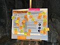 Post-its with feedback on a mockup for the Desktop improvements project
 Updated Wikipedia desktop interface sketch for Wikimania poster


_for_the_Desktop_improvements_project.png)


