Latest comment: 2 years ago4 comments4 people in discussion
Hello,
I’m not sure how far you are in the development of the new table of content functionality, but I was looking at this prototype and noticed a potential problem. Here the ToC is on the side and that’s a good thing, but the ToC in the text have also been deleted and that’s not much a good thing. When there is a big infobox, the in-text ToC compensate partly or totally for it, hence the page arrangement take it into consideration for the position of the images. Now if you delete it, all the text will go up, along with the images, but the images can’t always follow, because the infobox, so the right-aligned images are going to pile under it, while the left-aligned will reduce the text to a very small column between them and the infobox. On fr:wp, infoboxes are very widely used, so deleting the in-text ToC is going to break the page layout of most articles (and rather probably upset the community). So I’d suggest that, whatever you do with the ToC, to not delete the in-text ToC until there is also a functionality to move the infobox outside the text too (that would be great by the way, as infoboxes always cause difficulties with page layout). --Runi Gerardsen (talk) 09:30, 7 February 2022 (UTC)Reply
I would like to add myself as having this same concern about images. At present, image placement in many articles was determined by this factor of the TOC being inline, sometimes offsetting the issues of long infoboxes and allowing the first image in the first section to be right-justified (like anyone with any experience in professional publishing, I really hate left-justified lead images as they break up the flow of the text by interposing themselves between heds and text. Similarly, I try to maintain alternation in the justification of images since that mirrors the sweep of our vision and makes text with images easier to read (but of course you don't do this when it creates other layout issues).
When this is deployed, a lot of articles are going to suddenly have image placement issues at the top that didn't previously. And this will probably make a lot of people very angry.
I can see the need for the sticky TOC but I think it would still be better as something that could be toggled there from its current position while reading depending on how the user prefers it in an individual article. Daniel Case (talk) 05:50, 29 April 2022 (UTC)Reply
What if we kept both the inline/in-text ToC and the sticky/sidebar ToC, but only display the latter when the user's scrolled past the former? A user preference could be added that forces the latter to always (or never) be displayed. I agree that the situation with images is a PITFA, but I really don't want to give up the sticky ToC either… OmenBreeze (talk) 00:43, 6 July 2022 (UTC)Reply
I'm not sure, but until I manually switched back to "Vector legacy (2010)", then again to "Vector (2022)", ToC section was absent completely (neither new-style nor old-style). Also maybe, like with the language switcher, there should be [temporary] notice about ToC having moved to the left where it was previously? _Vi (talk) 17:57, 20 May 2022 (UTC)Reply
Latest comment: 2 years ago8 comments4 people in discussion
@SGrabarczuk (WMF): Thank you for the invitation I received for tomorrow's videcall since I was an interface admin and a developer! but sadly I cannot participate since I don't use Google Docs or Zoom for security reasons (partially related: [1][2]).
I don't know if it could be useful but maybe in the future you may consider to land the doc on the wiki itself, or using Etherpad [3] when realtime is needed.
Hello @Valerio Bozzolan. I understand your concerns and thank you for the language you use. I do appreciate that. As you may have realized, it isn't without a reason why we use these particular tools/platforms.
Google Docs are used by the Foundation as the default tool for making internal notes and docs. We might, for the purposes of the office hours, replace it with Etherpad. There's a problem with the translations, though. Asking translators to update just one word, and waiting until they've done that, could be troublesome. This is why I can only commit to replace this if we make more changes to the announcement. (By the way, the announcement is fully standardized and translated into 16 languages, some of which use declination or are not written in the Latin script.)
We need our office hours to be technically (platform-wise) predictable. Although Jitsi is open source and Zoom is not, the latter is more effective. It has been widely used for online meetings in the movement. It's been used by the WMF for office hours with the CEO, Maryana; it's been used by affiliates. There are hundreds of Wikimedians who at least once have participated in a Wikimedia meeting on Zoom. We know how to provide live translations there. Jitsi, on the other hand, is less popular, and we'd have to learn how to support live translations, including more trainings organized specifically for our meetings.
We may consider having office hours on IRC. Frankly, I have a feeling that since the migration from Freenode, IRC has been more and more marginalized, but we could give it a try.
Just asking for an understanding that Google Form and Zoom are a bug, not a feature, to participate in a Wikimedia project. A bug that deserves a long-term fix. Valerio Bozzolan (talk) 15:57, 7 May 2022 (UTC)Reply
I appreciate these are standard across parts of the Foundation. And agree w/ Valerio this is a bug, not a feature. Perhaps it's time to revisit this across the org. :) We should be using tools that can be constantly used and deployed by communities for events, workshops, office hours, talks without sending traffic through commercial servers.
Text: Google makes some very wiki-spirited tools (they did absorb JotSpot back in 2006) so it's stayed around for a while. But we simply must stop using it as a crutch that keeps us from using and being delighted by notetaking on our own platform. Our collaborative platform for drafting and discussing documents. Our versioned, searchable platform.
Video: I too have to use Zoom sometime, but I'm always surprised and a bit dismayed when a Wikimedia meeting uses it! Jitsi is stable, widely used + repackaged, easily modded and forked, and we host a lovely instance on the WM cloud. [We also regularly use BigBlueButton for larger audiences.] It makes it easy to name a persistent rooms, embed it it in other places or tools (see Jitsi-as-a-service + Brave Talk these days), &c. We should be thinking about how to better use video streams in our projects, and using this framework as we do so. Sj (talk) 12:54, 14 May 2022 (UTC)Reply
First of all, I really hear what you're saying. Perhaps you're right, Google and Zoom may be bugs - it's definitely not up to me to decide. "Perhaps it's time to revisit this across the org. :)" - I'm grateful that you specifically used the words "across the org". That's way wider than just Olga and me (people who organize our office hours), or Community Relations ("technical liaisons" so to speak), or Movement Communications alone. If it's about the standard, then it needs a broad agreement.
@SJ, do Jitsi or any open-source alternatives provide the speech-to-text functionality and parallel voice tracks for live translators (interpreters)? I'm asking because each time we have a meeting, there are people who need the speech-to-text functionality . Unfortunately, we haven't been able to provide the live translation support yet. We're still working on it, and it seems we may have found a solution.
1. We should change the standard [though there seem to be many even within one org!], but I only mentioned that to suggest that none are set in stone. :) As this thread is about these particular discussions, I hope we can try a different standard for these sessions, or understand what prevents such a change. If it is purely a matter of accessibility features, that would make a phabulous ticket even if it is not yet known who could set them up.
2. Yes they do! Other collaborative orgs w/ similar issues of language equity use jitsi regularly. There are solutions or workarounds for both. [also, to the point of "supporting essential infrastructure for free knowledge", our engagement would certainly help make them better for all.]
speech to text: Google Voice integration seems to be there, and a number of open-source s2t services that are not quite comparable. You can see the range of Summer of Code projects + community submissions scratching their own itches in the jigasi repo.
remote simultaneous interpretation: the most recent solution (for a single language, letting you tune in or out of the raw audio and into a translator's audio channel) is use by May First (which we should work more closely with on choosing technology stacks, frankly) and is maintained here. There are improvements, and pushes to integrate into jitsi core, both of which could be facilitated by small technical bounties or large expressions of interest [like Wikimedia indicating this is a crucial feature for us]. Sj (talk) 02:37, 7 July 2022 (UTC)Reply
@SGrabarczuk (WMF), I will not participate in any forum that is not public. Why the wmf foundation wants to share information via Zoom, a for-profit corporation which provides no guarantee of privacy, is anyone's guess. We have been using wiki-code for discussion since 2001, why this change?
Latest comment: 2 years ago4 comments4 people in discussion
ga.wp random article screencap - Vector 2022ga.wp random article screencap - current Vector
Hi there. I'm w:ga:User:Alison - admin and bureaucrat on the Irish language Wikipedia. I'd be remiss in not providing feedback, I think, so here goes.
I see other folks pointing out the massive amount of whitespace / padding in the left side navbar which is squeezing out the actual article text on the right. On our wiki, it really seems significant. IMO, article is all, and we seem to be sacrificing actual content real-estate for ... what, exactly? Yes, it looks 'less cluttered', but there's actually less content - especially for those of us who both browse and edit on laptop screens.
On the top tab section (which is otherwise quite nice), you can see the Plé (Talk) and Léigh (Read) are scrunched together with no separation. I18n bug, maybe?
The main image and title have lost their localization and now show "Wikipedia" instead of "Vicipéid" - this could just be an image localization / config issue. Could someone point me in the right direction, maybe? I did the original, later-font localization for our wiki, some years back, so happy to dip in and fix :)
multilingual Wikipedians: during redesigh include current non-english desighs for evaluation, including spanish, french and german. They have good ideas and bad ideas... 0mtwb9gd5wx (talk) 01:10, 23 June 2022 (UTC)Reply
The "PléLéigh" issue looks like it's T309223, a known issue. Until it is fixed in MediaWiki, try updating your browser(s) – the issue occurs if your browser doesn't support a certain relatively new feature. Rummskartoffel (talk) 21:59, 23 June 2022 (UTC)Reply
Hey there! Regarding logos https://phabricator.wikimedia.org/T244486 is what you are looking for - basically every logo needs to be recreated. You can request one on that ticket to be prioritized higher or find information about creating new ones.
Regarding sidebar whitespace I am not sure I understand. The extra padding is for the table of contents underneath the sidebar. You say it's squeezing article text on the right but in your screenshots the Vector 2022 screenshot shows more of the article text. I can see the description section heading for example.
I can confirm the PléLéigh issue is a bug and will hopefully be fixed soon.
Latest comment: 2 years ago4 comments2 people in discussion
After upgrading to MediaWiki 1.38.1 from 1.36.1, the wordmark no longer appears next to the icon in the upper left. If the window is wide enough, the 150px space for the wordmark is reserved but is empty. When you make the window wider past a certain width, the coloring behind the sidebar also vanishes. This happens with Vector 2010 in both legacy and non-legacy mode and in Vector 2022. The wordmark image is an svg that has not moved and still has correct permissions Queernix1028 (talk) 19:43, 22 June 2022 (UTC)Reply
Latest comment: 2 years ago3 comments2 people in discussion
I've enabled the new theme (Vector 2022) globally on all wikis. I generally like the new interface. However when I am on wikidata, previously the interlanguage links were on the right. (Where an infobox usually goes on a wikipedia page) Now they are right at the bottom of the page! Some wikidata pages are massive, and having to scroll all the way down to the bottom of the screen to do the thing I do most frequently on wikidata (add new language links) is a real pain. Please can you move the language links on wikidata back to the top (top right) of the page? - Rooiratel (talk) 14:25, 23 June 2022 (UTC)Reply
Hello @Rooiratel. Thanks for your opinion. Are you talking about the desktop view? What's the resolution of your screen? I've tried to narrow my window down and change its width, and it seems that the width thresholds when the interwiki links go from the bottom to the right are the same. Is there any setting you use that may make your experience different? SGrabarczuk (WMF) (talk) 23:50, 27 June 2022 (UTC)Reply
Hi @SGrabarczuk (WMF): this is for the desktop view. I am seeing this behaviour on my 1080p laptop screen and my 1440p desktop screen. I haven't used the mobile view, so can't comment on that. - Rooiratel (talk) 06:32, 28 June 2022 (UTC)Reply
Infobox element alignment is mangled in mobile view
Latest comment: 2 years ago4 comments3 people in discussion
Maybe I'm doing something wrong, but when I click on "Mobile view" with Vector 2022, many of the infobox elements are misaligned. Many elements that should be centered are left-aligned, and many elements that should be left-aligned are centered. At least that's what it looks like for me in Chrome for Mac OS at this page. Jonesey95 (talk) 02:57, 24 June 2022 (UTC)Reply
Wow, that looks odd. Thanks @Jonesey95 for reporting this. Right now, I only have one question - why do you use the mobile view and Vector 2022 mixed together? Minerva is dedicated for mobile, and Vector 2022 is dedicated for desktop. Having these two at the same time is bold and original :) SGrabarczuk (WMF) (talk) 23:08, 27 June 2022 (UTC)Reply
I was just doing some very beginner-level QA testing. Editors do all sorts of ridiculous things, so I try to do some QA testing by doing ridiculous things. If you want editors to use Vector 2022 for desktop-only and Minerva for mobile-only, then make the "Mobile view"/"Desktop view" link at the bottom of the screen switch between the skins. Meanwhile, I'll be over here in legacy Vector where I can fill my browser window with content.... Jonesey95 (talk) 01:15, 28 June 2022 (UTC)Reply
Using the mobile domain with the Vector skin invokes a special mode with lots of odd behaviour. It's not part of this project but will hopefully get fixed some day. Jdlrobson (talk) 02:30, 28 June 2022 (UTC)Reply
Latest comment: 2 years ago4 comments2 people in discussion
I do not see the "Related articles" section at the bottom of the mobile view. I don't really care, but since the "Principles" section of this page says "We do not remove any functionality", I thought I'd mention it. It makes me wonder what other functionality has been removed, and whether this principle is really being followed in a systematic way. Jonesey95 (talk) 03:02, 24 June 2022 (UTC)Reply
RelatedArticles appears to be working fine to me. I see it on Minerva. What do you mean by "at the bottom of mobile view"? The scope of this project is the desktop site so no changes to the mobile domain have been made.
I think this is my mistake. I was comparing this (default mobile view on en.WP) with this (Vector 2022 mobile view) and assuming that the default mobile view used some version of the Vector skin, but I think that is not correct. Jonesey95 (talk) 16:38, 24 June 2022 (UTC)Reply
Ah okay. This mode is only accessible by a special URL and is not being worked on as part of this project. Thanks for taking the time to explain! Jdlrobson (talk) 02:28, 28 June 2022 (UTC)Reply
Please evaluate CJK characters' font size in Vector 2022
For your infomation, the Chinese Wikipedia already has a gadget that increases the font size for a better Chinese reading experience. Japanese and classical Chinese Wikipedia also have such kinds of gadgets. Diskdance (talk) 08:19, 25 June 2022 (UTC)Reply
It would be nice if we could integrate these gadgets into new Vector skin directly. This would benefit other CJK and multilingual wikis. Diskdance (talk) 08:20, 25 June 2022 (UTC)Reply
For me, it has always been a strange decision that notifications were divided into two unrelated blocks and icons with incomprehensible categorization. I forgot about it, but now I'm paying attention again.
Given that we removed the text from all menus, there are now a lot of icons at the top that do not understand what they do. Different blocks of notifications do not help this at all. Maybe it's time to put them in one menu and break it there already? Filters, tabs, whatever :) But at least you won't get confused in the icons.
I personally still (6 years!) do not know what their fundamental difference is. I asked my friends and they don't know either. Iniquity (talk) 17:29, 27 June 2022 (UTC)Reply
Strong oppose. The notices are the notifications that are not very important/urgent, unlike the alerts. Merging them would make me unable to found out at a glance if I have any important/urgent notification, and would also overload the notification box, as I receive many notifications. --NGC 54 (talk | contribs) 22:19, 27 June 2022 (UTC)Reply
It seems to me that it is possible to do this with filters and colored marker icons. Or a separate setting for users who really need it. Iniquity (talk) 09:47, 28 June 2022 (UTC)Reply
Comment:. I agree that the distinction could be clearer, but don't necessarily agree that there should be only one button. Presently, when both are empty the only difference between them is the header text and icon. Both share the exact same two buttons, which link to the same destinations. The text in the box doesn't even distinguish, reading "There are no notifications" instead of "There are no alerts". There isn't even a "help" or "about" link unique to each of them to explain the difference or what gets sent where. If you follow the links to the special page or preferences, it's still not clear which notifications are sent where.
Based on the names, I would've assumed the difference would be that alerts are specifically for subscriptions to article alerts, whereas notifications would be for everything else. It makes sense to split them, since alerts would be activity that's less personal to the receiver. "Alerts" would be like a daily newspaper, but "notifications" are more like personal mail. Except this isn't how the system actually functions; messages to the receiver's talk page are placed under "Alerts" rather "Notices", for example.
I understand that it may be helpful to filter urgent notifications from less urgent ones, but what counts as urgent or important? Shouldn't that be decided by the user's preferences? It would make more sense to have something like tabs, as Iniquity suggested, to filter types of notifications; this would let that user decide what is important. Scyrme (talk) 22:33, 27 June 2022 (UTC)Reply
Latest comment: 2 years ago3 comments3 people in discussion
I really appreciate the new skin and layout. In the beta, the active/current section of the article was formatted bold in the table of contents on the left side. But in the live version, it's regular and black. I find it really, really hard to differentiate between the normal blue titles and the active title, because the only difference is the black vs. blue color. Could you please make the active titles bold again?
Thank you! Lhennen (talk) 21:11, 29 June 2022 (UTC)Reply
@Lhennen, @L.xschlag - thank you for your feedback! Not sure if you've seen, but we are currently in the middle of testing some prototypes related to this question. You're welcome to give us more detailed feedback on the prototype page. One of the things we're testing on these is the way links should appear within the table of contents (see https://di-visual-design-toc-active.web.app/Otter) for an example. Currently, our feedback is showing us that people are leaning towards option 2: bold and black so we will most likely be continuing with that option and making the titles bold. OVasileva (WMF) (talk) 10:08, 4 July 2022 (UTC)Reply
Jawiki has NOT reached consensus on implementing Vector 2022 yet
Hi @AppleRingo777 - we apologize for the confusion that the deployment process has caused and the lack of clarity from our side. We are currently working on reading back through our previous communications and clarifying the process and what happened with individual members of the community. We will to get back to the community with more detailed thoughts and a process for next steps by tomorrow July 1st. OVasileva (WMF) (talk) 12:04, 30 June 2022 (UTC)Reply
Latest comment: 2 years ago2 comments2 people in discussion
When the window gets narrower the TOC is moved into a "Hamburger button". But the main menu stays where it is until the window get's quite a bit more narrower. I think as long as the main menu fits, the TOC should stay at its original place. Especially since the TOC behind the "Hamburger button" is quite easy to miss. L.xschlag (talk) 11:30, 1 July 2022 (UTC)Reply
Latest comment: 2 years ago3 comments3 people in discussion
I think it's quite odd that the "More" drop down menu most of the time contains only "move". Is it on purpose to make it harder to find for the average user? L.xschlag (talk) 11:35, 1 July 2022 (UTC)Reply
Isn't the behaviour the same here on the other skins?
I agree it's not great having one item in a menu, but I think this case is quite rare since on most wikis move privilege is added along with page protection and deletion. There is a trade off here between the complexity of maintaining multiple variants of the skin in different circumstances and what looks best. Here we could add special treatment for the one item menu but we'd need to add additional code complexity and tests to cover it. Hope this insight is helpful. Jdlrobson (talk) 14:32, 6 July 2022 (UTC)Reply
Latest comment: 2 years ago2 comments2 people in discussion
Pardon me if this had already been discussed here. It seems that the language of the interface (as set in preferences) mixes up with local-language elements where it shouldn't.
My preferences are always "interface=en", and thus I always see "Contents Beginning" in the TOC section - be it Chinese, Russian or Spanish wiki.
The pink box above TOC in ru-wiki says "On this Википедия[sic!] the language links are at the top of the page across from the article title. Go to top." In zh-wiki, however, the message is correctly "On this Wikipedia the language links ..." Retired electrician (talk) 21:23, 3 July 2022 (UTC)Reply
Latest comment: 2 years ago2 comments2 people in discussion
Hi this is my first time looking at the prototype, so apologies if this question has been answered elsewhere - where are the categories? MassiveEartha (talk) 04:15, 5 July 2022 (UTC)Reply
Hello @MassiveEartha. I'm sorry that you felt confused. We don't touch elements such as categories. These prototypes were only created for editors to help us decide on the visual design matters. If the categories aren't displayed in any of the prototypes, then it's definitely unintentional and also irrelevant to what we do. SGrabarczuk (WMF) (talk) 16:02, 6 July 2022 (UTC)Reply
開発者集団は日本語版を軽視していると思われるThe group of developers seems to downplay the Japanese version
Latest comment: 2 years ago2 comments2 people in discussion
日本語版の利用者の一人としては、開発者の集団は日本語版を軽視していると考える。一つの証拠として開発者からの意見を求めるメッセージが英語だけで書かれていたことを挙げておく。機械翻訳があるのだから英語と共に日本語を添えることは簡単なことのはずである。それすらせずにVectorからVector2022への変更を強行したことは、一種の文化帝国主義であると評さざるを得ない。As one of the users of the Japanese version, I think that the group of developers disregards the Japanese version. One proof is that the message for the developer's opinion was written in English only. Since there is machine translation, it should be easy to add Japanese along with English. It must be said that forcing the change from Vector to Vector 2022 without doing so is a kind of cultural imperialism.--27.85.205.8407:17, 5 July 2022 (UTC)Reply
Hello 27.85.205.84. Do you maybe know good open-source machine translators working for Japanese and English? I've noticed that Google Translate doesn't work for these languages well. Sometimes it changes words, meanings, and the tone of entire sentences completely. I could write in Polish, my first language, but I'm sure that would be even more difficult. SGrabarczuk (WMF) (talk) 16:15, 6 July 2022 (UTC)Reply
Listed coordinates overlapping with header weirdly
Thank you @LarstonMarston. In this case, we need to fix the bug together with the communities - some code should be changed by editors on each wiki with this bug separately. We can help (and we're working on it). SGrabarczuk (WMF) (talk) 16:11, 6 July 2022 (UTC)Reply
Latest comment: 2 years ago2 comments2 people in discussion
@SGrabarczuk (WMF): Does Vector 2022 will be deployed (as default) at all Wikimedia wikis until the end of July, as it is written here? I am asking this because I see that there is still some work to do and the deadline written there changed several times. --NGC 54 (talk | contribs) 21:56, 6 July 2022 (UTC)Reply
Hello @NGC 54, thanks for this question. This information is already outdated. It will not be deployed in July. We hope to send an update to the village pumps next week. We're working on the announcement right now. SGrabarczuk (WMF) (talk) 16:01, 7 July 2022 (UTC)Reply
Merge [ca-view] and [ca-nstab-main] in the article toolbar
Latest comment: 2 years ago2 comments2 people in discussion
Currently, in the article toolbar, we have two links (Read and Article) that lead to the same location. One of them is located in the left and the other one is located in the right navigation. This can be confusing to readers, and also adds unnecessary weight to the toolbar. Current look.
It would be good if we could merge these two tabs into one. Ideally, the best solution, in my opinion, would be to merge the right and left navigation and center the items, like this. Please tell me what you think about this. Thank you! — Aca (talk) 11:18, 9 July 2022 (UTC)Reply
Oppose. Now, the tabs are clear. You have 2 pages: the article and the talk page. You can select 1 action at a time for each of them: reading, visual editing, source editing, and viewing the history. Form the proposed design, you can understand that the tabs led to different types of pages. The watch is something not related to the article? And if now you are on article tabs, if you would press on the editing source tab, you would arrive on a page not related to the article (this is a possible confusion)? And so on. "This can be confusing to readers," - how so? Are there any data? And if there are, are there any data that the proposed design is better? P.S. I also dislike the proposed design, due to visual reasons. --NGC 54 (talk | contribs) 19:00, 9 July 2022 (UTC)Reply
More feedback: when I was at w:Gotcha journalism just now, I became confused because there appeared to be a section titled "beginning", which I assumed covered the early history of the term. It took me a minute to figure out that that wasn't referring to a section but rather a way to scroll to the top of the page. Many other articles are going to have a similar problem, since we often begin with history sections that might reasonably be titled "Beginning" for early history. {{u|Sdkb}}talk22:42, 27 April 2022 (UTC)Reply
@Sdkb - good catch! This is something we discussed quite a bit internally in order to finally settle on beginning, although I agree that it's still imperfect. Previously we were using "introduction". The issue there was that many articles have "introduction" as the name of their first section, causing duplication. Other options we were considering were location-based (back to top, beginning of page, etc). We are welcome to ideas on how to make this clearer. OVasileva (WMF) (talk) 09:05, 28 April 2022 (UTC)Reply
@OVasileva (WMF), did you consider different design approaches in addition to different names? If the word had been accompanied by something like , it might have been a lot clearer. I also think there's some benefit to matching the terminology we already use as editors ("lead section" or "introduction"), since that makes it easier for newcomers. The Wikipedia articles that currently have "Introduction" as their first named section should not—they should be tagged with w:Template:Overview section. {{u|Sdkb}}talk20:16, 28 April 2022 (UTC)Reply
I think using the article title would make the most sense, as the title is the uppermost heading in the article. That way the header that the reader arrives at always matches the one they've clicked on. (I'm sure "Beginning" is better than "Introduction," but it's not unheard of as a section title either: e.g. Creolization, Ashikaga shogunate, History of Carthage. Is there any way to determine how often it's used?) Arms & Hearts (talk) 19:35, 29 May 2022 (UTC)Reply
I think "Top" would be less confusing and generally make more sense as that seems to be the common English term for the top of the page. 132.170.199.11219:32, 22 June 2022 (UTC)Reply
Actions menu overflows when main menu is active (Vector 2022)
When the main menu is active (meaning visible) and the window is quite narrow the actions menu (Read, Edit source, Add topic, View history) doesn't get condensed in the "More" drop down menu, resulting in a very ugly overflow. L.xschlag (talk) 11:41, 1 July 2022 (UTC)Reply
Latest comment: 2 years ago2 comments2 people in discussion
When pressing play from a wikipedia article (e.g. first clip in w:en:Aftermath_(Rolling_Stones_album)), the page changes text colour from black to pale grey. Almost unreadable. This dead time varies from a few seconds to many minutes, probably caused by unsteady connection on my side. I tried opening 2-3-4... windows with the same article, and some windows seem to be stuck indefinitely while others play with minimal (but still annoying) delay. If I press play directly from file description page ( w:en:File:Under_My_Thumb.ogg), it always plays instantly and the text always stays black. Win 10 Home / Chrome 102.0.5005.115 (64-bit) Retired electrician (talk) 19:29, 3 July 2022 (UTC)Reply
ja: Wikipedia: Idobata / subj / Desktop version According to the guidance on implementing the improved exterior (skin) version, comments will be accepted on this page until July 14, so I will write my opinion.
Developers should be delighted with the development itself, and should not be delighted with the "visible" results of the forcible introduction as was done in the Japanese version.
Developers should concentrate on development behind the scenes and leave it to the "user" to decide whether or not to use it.
Skins are infrastructure. It's a mistake that engineers tend to make, but it's not "just new."
The current Vector (2022) is not a finished product, it is only in the beta test stage. It is not appropriate as an engineer's attitude to proceed with full-scale introduction at this stage. Beta testing should be done by recruiting applicants.
Is the developer team really empowered to make Vector (2022) the default skin? If you have proof, please link to it.
Looking at the history of this time, the viewpoint for "readers" is missing. What does an article without a "reader" mean? 匿竜類 (talk) 02:25, 8 July 2022 (UTC)Reply
Hi @匿竜類 - Thank you for your feedback and for the bug reports below. We are currently in the process of taking the Vector (2022) skin out of beta testing/pilot mode and into the stage where we scale the skin, with the hopes of making it the default on all the wikis. Over the course of the next month, we will be hosting conversations with the largest Wikipedias and getting their feedback on the skin, similar to our conversations with Japanese Wikipedia right now. Even when default, logged-in users will still be able to chose whether they want to use the skin or not. If they decide not to use it, they can turn it off at any moment in their user preferences.
In terms of readers, for every change we have made when building the skin, we have tested both quantitatively and qualitatively with readers and well as editors. To access more detail on the research and testing we have done, please go to the Features page and select the feature you are interested in learning about. From there, you can read the sections named Quantitative research or Qualitative research to see the testing we have done. In addition, we have also done more open-ended testing with readers to identify the issues with the skin starting in 2020 until now. Please see the Hureo User Research Report with Readers and Editors, the Wikimania Stockholm research report, the Wikimedia Desktop Usage and Behavior Data Analysis, or the Sticky Header and Table of Contents User Testing reports for some examples of the studies we have done with readers (which have translations in Japanese), what we have learned, and how we used those learnings to create the new skin. OVasileva (WMF) (talk) 10:00, 11 July 2022 (UTC)Reply
Vector (2022)の不具合の報告 Report a bug in Vector (2022)
日本語版でVector (2022)を使うと、左側に「このWikipediaでは言語間リンクがページの先頭にある記事タイトルの向かい側に設置されています。ページの先頭をご覧ください。」と表示されるのだが、実際には「記事タイトル」は「ページの先頭」ではなくこのメッセージの下に表示される。以前は、このようなことがなかったように思うので一時的なものかもしれないが、症状が出ていることを確認してほしい。When I use Vector (2022) in the Japanese version, it says "In this Wikipedia, the interlingual link is located opposite the article title at the top of the page. Please see the top of the page." However, in reality, the "article title" is displayed below this message instead of "at the top of the page". I don't think this happened before, so it may be temporary, but please make sure that you have symptoms.--匿竜類 (talk) 02:42, 8 July 2022 (UTC)Reply
上記不具合を報告してから、1日経過していますが、応答がありません。ja:Wikipedia:表示改善依頼#Vector(2022)スキンで、バッジと地図のタグが重なって表示される#によると、どうやらこの種の不具合はファブリケータで処理することになっているようですが、そちらの方への連絡はしていただけたのでしょうか。とりあえず担当者の応答を求めます。One day has passed since I reported the above problem, but there is no response. ja: Wikipedia: Display improvement request #Vector (2022) In the skin, the badge and the map tag are displayed overlapping. According to #, it seems that this kind of defect is to be handled by the fabricator. Could you contact that person? For the time being, ask for the response of the person in charge.--匿竜類 (talk) 03:05, 9 July 2022 (UTC)Reply
Hello! The coordinates issue is known but the language one wasn't. Thank you for bringing it to our attention.
Latest comment: 2 years ago3 comments2 people in discussion
Unlike the old layout that adjust depending of the size of zoom, the new format seems to follow a single size that, when zoomed in, creates a big blank space like if the page was still loading
It needs be fixed so the wiki pages can be better for people that have vison issues
i think should be a bug since its a thing that happens from top to bottom of the page and not from the sides, i am use Chromium Based MS Edge Meganinja202 (talk) 17:02, 11 July 2022 (UTC)Reply
Hi ! I have the same problem on the French version of Wikipedia. The TOC just disappeared. The problem appears in Firefox desktop (last version 101.0.1), even in "troubleshoot" mode with all my add-ons deactivated. However, the problem does not appear in Chrome. This is extremely confusing. I reported it on some discussion page on the french version of WP, but I also mention it here, as I'm not sure at all where to report the problem for it to be taken into account. 85.169.195.10817:56, 26 June 2022 (UTC)Reply
The TOC is now on the left side, but after other menu lists. It should probably come first. But to keep things accessible, the (hidden) "jump to main menu" link should be kept as first element of course. Psychoslave (talk) 15:00, 5 July 2022 (UTC)Reply
Agreed. The TOC really should come first. The #mw-navigation menu (which currently appears first) is comprised of mostly ancillary links unrelated to the page's content, many of which are rarely used (e.g., "Download as PDF", "Create a book", "Permanent link", etc). OmenBreeze (talk) 00:17, 6 July 2022 (UTC)Reply
If the TOC will not come first, the other menu lists on the left side should become hidden (collapsed) when there is a TOC below them, so that the TOC is always visible.
The TOC should always be shown in its entirety, and not displayed as a box that you have to scroll through.
First of all, you don't need to apologize for writing in Japanese. We welcome comments in any language.
Would you like just to change the default font size? Or would you be able to zoom in and out, and see the font size adjust?
Do you think making the text line wider and keeping the default font size would fix the problem?
Why do you think access is more complicated now? Our motivation was to reposition the table of context to make it more accessible. What do you think is not working?
Do you think the problem is related to the default font size?
Latest comment: 2 years ago4 comments3 people in discussion
A minor suggestion: why not insert the language box on the title header so I don't have to go all up to the top of the page to change language versions. So yeah, thanks! PeaceSeekers (talk) 11:00, 11 July 2022 (UTC)Reply
ya, they should had kept the language bar on the side of page instead of the top, leaving the language option on top only on mobile/touch machines Meganinja202 (talk) 17:03, 11 July 2022 (UTC)Reply
@PeaceSeekers - do you use the site while logged-in? If so, you can access the language switching button from the persistent ("sticky") header at the top of the page while you're scrolling. We are also in discussion of bringing this functionality to all logged-in users as well. OVasileva (WMF) (talk) 08:15, 12 July 2022 (UTC)Reply
I did log in, but I can't see it though ... what I have is only, from the left: the search button, article title, discussion page, edit history, watchlist and my profile stuff (for lack of better words). So that's that. PeaceSeekers (talk) 08:43, 12 July 2022 (UTC)Reply
What I still would love to see different solutions to
Latest comment: 2 years ago1 comment1 person in discussion
I'm very much looking forward to not having the text fill an entire wide screen. This will make Wikipedia far easier to read on big screens. Thanks! A few things that still don't work for me:
Table of contents
If I haven't collapsed the left menu, the ToC is not visible when I start reading the article. This makes it more difficult to get an overview.
It's also generally more difficult to get an overview of the article content, as I need to go to the ToC in the sidebar and scroll down to see everything on big pages (like a Village Pump). This both makes it more difficult for me to conceptualize what's on the page – as I've tested this, I've realised I find it challenging to get a grasp of a page if I can't see the various topics at the same time – and adds more work, as I have to move the mouse pointer to the ToC to be able to scroll. I would have much preferred if it used more of the space available to get around this.
My contributions
My own user contributions is something I use all the time – it's my way of getting back to what I was doing before. Making it less accessible in the top menu is wrench thrown into my workflow.
Language links
This is my main issue. I use other languages all the time. As a reader, I glance at them to conceptualise the topic – which languages have written about this subject? This hints at things that aren't available in the content itself. As an editor, I check out other languages to see what sources they have and so on. Having to click to even see if there are languages I can read is an extra step that both requires more work, but also makes it less inviting, as the opportunity doesn't stare me in the face. This is so central to my workflow that it might in itself be reason to keep using Vector 2010, but that's certainly not my preferred solution. Julle (talk) 10:13, 12 July 2022 (UTC)Reply
Latest comment: 2 years ago3 comments3 people in discussion
asbra med maxbredd! coolt att wikipedia tar steget in i 2010-talet och blir läsbart på stor skärm.
språklänkarna blir mycket sämre. man borde kunna se språken direkt och klicka på dem, det är en sak man använder hela tiden.
jag förstår inte varför ni har bytt ut texten i användarmenyn mot symboler? det var tydligare med text. nu måste man gissa vad de betyder och många kommer aldrig lista ut det.
man borde inte behöva skrolla INNE I innehållsförteckningen för att se hela. sjukt störande att behöva gå till den och skrolla I DEN för att se vad som finns på sidan. 81.92.27.12918:12, 12 July 2022 (UTC)Reply
Thanks for the feedback!
(google translation)
max width: cool that wikipedia takes the step into the 2010s and becomes readable on the big screen.
language links: you should be able to see the languages directly and click on them, it is one thing you use all the time.
Icons: I do not understand why you have replaced the text in the user menu with symbols? it was clearer with text. now you have to guess what they mean and many will never figure it out.
Table of contents: you should not have to scroll INSIDE the table of contents to see the whole thing. Very annoying to have to go to it and scroll IN IT to see what's on the page. Jdlrobson (talk) 19:00, 12 July 2022 (UTC)Reply
Latest comment: 2 years ago3 comments3 people in discussion
開発者(の集団)はアカウントユーザーなら自分で好きなスキンを使えるのだから、あまり出来がよいとは言えないVector 2022を強要してっもかまわないと考えているようである。しかし、元々Vector 2022は読者として快適に使えることを考慮していない。開発者(の集団)は読者がいなければいくら記事を作っても意味がないということを忘れているのだろうか。It seems that developers (a group of people) are willing to force Vector 2022, which is not very good, because account users can use their favorite skins. However, originally Vector 2022 did not consider it to be comfortable to use as a reader. Do developers (groups) forget that it doesn't make sense to write an article without a reader?--27.85.205.8407:29, 5 July 2022 (UTC)Reply
Hello! As I can see, the translation was done by Google Translate. It's not good. I've used DeepL and this message is very different in English. Why do you think Vector 2022 was not originally designed to be comfortable to use as a reader? I would like to understand what made you think so.
SGrabarczuk (WMF)-san, your great DeepL-ed message causes a deletion discussion due to copyright violation. I wish a good Foundation staff would deeply understand the copyright policy in Wikipedia and recognize that copypasting from machine translation could violate the copyright that was attributed to that translation service.
So, while I'm not the original poster of this section, let me answer the question:
> Why do you think Vector 2022 was not originally designed to be comfortable to use as a reader?
If you think the only problem is new Vector 2022 design itself, I must say you are missing an important point: how you all introduced the new skin. All of the changes has never been announced in jawiki before being applied (and unfortunately, after that, until today). Many of the editors, the readers, the users were surprised at the new design all of the sudden, and not a few of them regarded it as a big bug or something.
You may wonder, "we let you know this in advance, via a member of your community." That's true, partially. AppleRingo777-san took your messages and passed them to us per your instruction. I heard that you (or someone in Foundation) asked to post the message in WP:NEWS. How did you determine that WP:NEWS, generally where announcements only for the editors are posted, was enough to communicate this important news that obviously affected the entirety of community members including the readers? Will you also assign the responsibility on this to AppleRingo777-san, a good community member? I cannot help but want the Foundation to realize that you all destroyed our trust. --2400:4052:3420:4500:444C:45BF:13AC:59E214:40, 14 July 2022 (UTC)Reply
I was trying to figure out why I didn't like the new TOC, and then it hit me that the main reason was that it is hidden by the side menu when you first visit a page (I very rarely login to Wikipedia, and I'm thinking that's the norm for most visitors). Then I was thinking that I almost never use the main navigation links, they just aren't part of my normal use case of visiting Wikipedia (it is to learn a specific thing that I don't currently know enough about). I was going to post to make it possible to hide the main nav, but then realized that you already built it, but the default is for it to show. My hypothesis is that the bulk of users don't look or click on any of the menu items, and that the menu should be hidden by default and the TOC exposed above the fold. 195.134.163.11010:34, 6 July 2022 (UTC)Reply
Thank you for your feedback! We are planning on implementing this change within the next couple of weeks. Progress can be tracked in the phabricator ticket linked above. OVasileva (WMF) (talk) 10:04, 11 July 2022 (UTC)Reply
I would like you to give logged-in users the right to choose that as well. If you knew about these plans, don't you think that was a little premature to set Vector (2022) as the default in JAWP ? If you make changes right after you start it in JAWP, Japanese users will be confused. --呉野 (talk) 13:21, 14 July 2022 (UTC)Reply
Latest comment: 2 years ago1 comment1 person in discussion
The information text on where to switch languages is partially translated incorrectly. I think , "このWikipediaでは言語間リンクがページの先頭にある記事タイトルの向かい側に設置されています。" is a slightly mistaken translation. This may mean that the language switch is outside the display.
You probably meant to write that, "他言語版へのリンクは、ページ先頭の記事タイトルの右側にあります。". But I would rather you don't adopt this with no check. 呉野 (talk) 10:01, 15 July 2022 (UTC)Reply
Huh, you've found an old and potentially useful page. Your idea is good. However, there's an issue about the context. The Foundation isn't doing anything about Structured Discussions. I imagine if we provided this link, it would look like we were encouraging more people to use Structured Data, or like these projects were connected. What do you think? SGrabarczuk (WMF) (talk) 18:25, 4 August 2022 (UTC)Reply
Latest comment: 2 years ago1 comment1 person in discussion
We shouldn't have to click twice to get to our Talk and Contribution pages from the navigation bar. I mean, there's already a bunch of wasted white space to right of the search box and to the the left of our Userpage button for those two icons to be added in the nav bar without any problems. Some1 (talk) 02:57, 17 July 2022 (UTC)Reply
Latest comment: 2 years ago1 comment1 person in discussion
I notice in Simple English with the 2022 Vector, the menus on the left side of the page are to the left of the page text as they should be, but they are far above rather than beside the text. Jim.henderson (talk) 05:47, 17 July 2022 (UTC)Reply
@SGrabarczuk (WMF): Why does have to be called “legacy”? legacy implies that something is outdated, inferior, no longer supported, none of which apply to Vector "legacy". Maybe instead, you could call it "advanced", "expert", or "classic". – Ilovemydoodle2 (talk) 17:48, 20 July 2022 (UTC)Reply
@Ilovemydoodle2, the motivation is purely technical. This is because it's "frozen". The Wikimedia Foundation will not develop it - there will be no actively built version of Vector parallel to Vector 2022. SGrabarczuk (WMF) (talk) 20:46, 20 July 2022 (UTC)Reply
Latest comment: 2 years ago3 comments3 people in discussion
someone is having a laugh, or got really confused about translation. In the main page https://www.wikipedia.org/, Français now appears as anglais, both in the top 'wheel' and in the 'Read Wikipedia in your language' drop-down. This is very wrong. What other languages have been disappeared in this way ? a bit of QA would go a long way :-) 92.16.98.14516:23, 19 July 2022 (UTC)Reply
Latest comment: 2 years ago1 comment1 person in discussion
there was an issue a little while ago where location coordinates in an article would overlap with the header. that's fixed now, but some icons are still uncomfortably close to them, like the FA star; for an example of this, see the english wiki's India article (screenshot) 2600:1700:7AA1:2400:9CA1:1220:42FD:1F1220:17, 20 July 2022 (UTC)Reply
Hi @NGC 54 - thanks for your report. The icon is indeed broken as of right now. We're looking into this right now and hope to have a fix later this week or early next week. OVasileva (WMF) (talk) 12:05, 28 July 2022 (UTC)Reply
Latest comment: 1 year ago4 comments2 people in discussion
Well I was part of the process for quite some time now. And up until the move of the TOC from inside the content to the sidebar it was okay with me. I had some minor things, I thought I will get used to: the white space (anyone wanting that, can narrow their window), some inconsistencies (compare #A few more issues with the Page header vs Sticky header icons), the language switcher, which I fear will leave the impression of reading the same thing in different languages (compare Talk:Reading/Web/Desktop_Improvements/Archive3#Language_Selector_misunderstandable, as a side-note: nothing happened here, at least nothing I recognized).
"...that allows for a way to identify the needs of the community from the new skin."
"We would love to see the Vector 2022 skin [...] become the new default across all wikis..."
"We will be ready to begin making the change at the end of August (and not in July, as previously announced), when the visual refinements and other deployment blockers are ready."
"The goal for that discussion will be to identify breaking issues or opportunities for improvement for the new skin. It will be important for us to reduce the risk of bugs or imperfections that would be particularly troublesome on [insert your language] Wikipedia"
All that reads like: Well, we're just talking, let's see, what needs to be done, that everyone is happy. There are some things that need to be done anyways.
Now let's read those two cites:
"...difficult discussions about the launch as the default" (compare Topic:Wsfx4tbwzkgamaek)
So isn't this not just a request for bug reports instead of a "discussion"? Is this not more of a fear of "Flak" instead of "needs of the community"? Isn't it happening anyways, instead of you "loving to see it"? What about all the other projects, wikibooks for example ("[insert your language] Wikipedia")? I understand, you do the work, you decide. But:
Why not try to slow the process down? Why the haste? One could remove the deadlines and refine everything. Then ask the communities for bug reports.
Why not try some marketing "tricks"? I think the discussion about the white space clearly shows that desktop improvements are highly subjective. Why not use for example skin changes? Another Option could be deploying Vector 2022 only for not logged in users and hence prolong/smooth the transition-process creating time for bug reports and discussions. Most of anonymous usage would probably not care for the change, as long as the content is there. On another plus-side it will create "data" on how the menu-usage changes and community-links are perceived. It will probably even create data on how many logged in users switch to the new layout deliberately and or switch back hence providing "hard" success-data.
Would it be that bad to really leave the community a choice?
If you are relying on volunteers, grant them a little more slack. Bug reports from the community need time: Bugs need to be recognized as bugs, they need to be reported, triaged and handled. Is this possible in 6 weeks? Volunteers might have another life, a job, kids, a week might be pretty short notice. Phabricator-use is not that trivial.
Let's talk or try, if the new design might eventually be a problem for recruiting new volunteers. Did anyone think about a possible impact of hiding community-links in collapsed menus? Nobody seems to talk about community-pages or discussion-pages or even other project-scopes. Is the new menu-structure as fitting for these as for wikipedia-articles?
I'm deeply saddened. The new TOC will make my life within wikimedia really hard and I commented about that early on (compare here, bullet 7). I think all the TOC-comments on this page (see above) should raise at least some concern. And last but not least, I'm deeply troubled, that the new language-links will do more harm, than good.
So, ping @OVasileva (WMF) and @SGrabarczuk (WMF), my sincere apology, I don't mean to be rude or mean and I appreciate your work and the work of your colleagues. But I don't want to volunteer for the translation-request, because all of the above mentioned problems.
Hello @HirnSpuk. Thank you for your outstanding involvement, and appreciation for our work. I'm glad to see that. Also, thank you for your sincere, thoughtful, and thorough comment with all the links and quotes. I think I understand what your approach is, I'm happy that you're saying this.
Before I answer the questions, I'll admit/confirm that:
The ToC work hasn't been finished yet. So haven't the visual refinements. There's a list of issues labelled as "deployment blockers", by which we mean issues we need to solve before making it the default everywhere. I hope this will make you less sad!
Bug reports do need time. Phabricator is not that trivial.
While indeed focusing on the most typical use cases, like interacting with articles.
In some discussions, it has been confusing what exactly is for the individual communities to choose between.
Regarding the questions, my answers to the easiest part:
We've been working since 2019, most work is behind us and we're headed towards the end. Now, we need to make sure what else the largest communities may need.
What about all the other projects - the message I asked if you could translate is dedicated to the largest communities of the top language versions of Wikipedia.
This is why in that message, we're initiating a pre-discussion about culture of collaboration. After that, we'll ask for bug reports and other technical requests.
We use the name Desktop Improvements because the point is to make changes that are actual measured improvements. Only some of the visual refinements are really subjective. But regarding the feature changes, the idea for each of these is that it should be an improvement compared to Legacy Vector.
We're part of Core Experiences and work closely with the teams focusing on newbies and more experienced editors. It's our plan to make entry points for new volunteers prominent, in collaboration with Growth. We hope that Desktop Improvements will be an introduction to even more sophisticated changes addressing very specific use cases.
@SGrabarczuk (WMF), because you said "let's keep talking", let me react to your latter 5 points.
I do not want to diminish in any way the work you (plural) have done since 2019 and I think the plan is good. But I'm convinced, that the timing is not right. "The end of August" I find far to soon if you "need to make sure what else the largest communities may need."
I wasn't able to find the "we talk to the «big guys» first"-idea anywhere. The only thing I find is "We would like our improvements to be default on all wikis in August/September 2022." There will probably not be time to talk to the «small guys». And in addition, the text to translate suggest, that there is a choice, and you'd like to "talk". My impression is you want to ask: how can we best ask for bug reports. That might (and probably will) work, but I don't want to be part of exactly this approach.
same as first and second.
How is the improvement measured? Is there any "hard data" anywhere? Everything needs more clicks hence more time. It "looks" a little better and modern, which I also find necessary and good. But what is actually "improved"?
I need more scrolling for the TOC,
I will need more work (and creative ideas btw) for rework of community-pages that rely on the "old" version of the TOC at the moment, and even worse, I need to check the visual appearance and usability of pages in even more configurations (to mobile and desktop and VE and source, now I need to add different skins),
I need more clicks for almost anything (if menus are hidden, but this is nearly imperative, to get at least some use out of the new ToC),
I'm deeply troubled about the "impression" some changes might make (which hence wouldn't be an improvement either and which is by default not measurable)...
What about the visually impaired? Is it an improvement for them too, any hard data?
Please, feel free to elaborate. I know it would be baloney to change the name in the last 6 weeks of the work. My point is not to do that, but to take a step back, review what's done so far, and if the decision will be made to prolong the process a really long time, then maybe one might think about a change, and if it's only to get less of the "if you do this I'll be done with wiki..."-criticism that's just consuming time for everyone.
I'm not addressing technical issues. It's the possible "hiding" of prominent community-links in the sidebar by using elaborate restructuring and collapsing mechanisms. On that the single communities won't have influence as far as I see it at the moment.
PS: I appreciate trying to cheer me up ("make you less sad"), but my sadness stems from the uncertainty how this will all work out. In the end the prototype is only a prototype. And how much work in the community must be done afterwards to facilitate the "improvements" is also not clear. The main point being, that I struggle with checking and cross-checking functionalities in different systems. It was okay until the move of the ToC. But as long as there is still work to be done, I can't even think about workarounds for not having the ToC where and how I was used to it.
Hey @HirnSpuk, thank you for your continued feedback. It's been super helpful. We've rewritten our message to German-language Wikipedia based on your thoughts and the learnings we've gotten through similar conversations on other wikis. We're going to post our next draft for translation this week - let us know what you think of it! We're open to suggestions. Your continued thoughts are much appreciated!
In terms of your individual questions:
The timing is not right
We really do believe that our changes are improvements already! We're eager to bring them to readers and editors. As you have pointed out, we've been building these for three years. We've received feedback from German-language Wikipedians, and many other communities. As you also know, we've performed prototype testing with editors across 30+ languages, and different types of quantitative testing on each feature. Many significant requests have already been discussed.
The main reason we want to have this conversation now (while we're putting the finishing touches, like the visual refinements and changes to the table of contents) is that we'd like to see if any of the feedback might change what those finishing touches are. We'd also feel more confident with our plan once we know what the additional work we need to do is, if any.
The process we're envisioning is to collect bugs and requests, and triage these into three categories: (1) the ones that must be done before the deployment, (2) the ones that can wait until after the deployment, and (3) the ones that we don't think are a priority. Our goal for the conversation with the communities is to establish what lies in each bucket such that the communities are comfortable with changing the default.
We understand if a conversation might take longer on a given community, and do not plan on cutting any discussion short just to reach a deadline. We made a mistake with Japanese Wikipedia and made the change prior to acknowledging a common process. We'd like to avoid that mistake with the other wikis, hence the lengthier discussion with German-language Wikipedia.
The "we talk to the «big guys» first"-idea
We try to take the approach of equity. We have conversations across the top 25 Wikipedias by size. We've attended a Wikisource Triage meeting and two SWAN meetings. The set of pilot wikis is diverse. We inform the big and small communities about our office hours using different channels, incl. MassMessages, Tech News, Discord, Telegram, Facebook. We're going to have the interpretation support in the top UN languages.
How is the improvement measured?
Thank you for pointing this out. This very crucial piece was missing. We'll be adding a summary of our findings to our future messages.
You'll find the short answer on the English Wikipedia Village Pump page, quite paradoxically brought to everyone's attention using the "hidden" template. For details on any individual feature, go to the “features” section of our documentation, select the feature you are interested in, and review the qualitative and quantitative sections.
It's the possible "hiding" of prominent community-links in the sidebar by using elaborate restructuring and collapsing mechanisms. On that the single communities won't have influence as far as I see it at the moment.
This is a great question. So far, our interviews with users have shown that newcomers are NOT more likely to begin contributing based on the number (or even presence) of community links. In fact, having so many options at hand made them feel unwelcomed to the interface as they didn't instinctively know where the links would lead, and thus, felt intimidated or lost.
We think a better method is to have fewer links that are clearer to understand and pave more intuitive ways. These links are, among others, edit or history. We are working with the Growth and Editing teams to identify how we can increase the understanding of these links for readers and newcomers - both so they will know where the content they are reading is coming from, but also as a means of introducing them to contribution. See also: Core Experiences.
What about the visually impaired? Is it an improvement for them too, any hard data?
We've been doing accessibility testings with the American Foundation for the Blind. You'll find more information in this task: T310033. Generally though, part of this work goes beyond Desktop Improvements, and is done by our designers who build basic user interface elements for all the teams.
Hey, on a side note, have you ever attended our office hours? I (Szymon) don't recall this. You'd have heard answers to some similar questions if you had joined us earlier. Anyway, feel invited.
In this thread, I'd like to notify you (developers) about the gadget NewVector-MaxWidth.css, which is provided on Japanese Wikipedia to solve the max-width problem on Vector2022 and problems on the gadget linked from your FAQ page.
I understand why you think the limitation is reasonable. I won't make a counterargument to limit max-width as the default settings.
However, the limitation is NOT THE BEST FOR ALL USERS, but only most. Some users (including me) want to read Wikipedia and other articles as wide as possible (the browser's window-width).
I tried it, but it's not good for me. There are three problems;
I need to click the button to switch the width on each page.
I can feel a little latency to see the switched page because JavaScript might take some instructions to overwrite the width settings, especially on my light laptop computer.
The width is not maximized. It makes the width only about two times. As I wrote above, it is not enough.
This method is significantly lighter than the gadget you provided, and easy to maintain because it needs only to specify the element's class/id which you limit the max-width. I will continue to maintain and provide Japanese Wikipedia users as long as I don't find an alternative way.
You can link the CSS from your (FAQ) pages, or take over its development and maintenance to provide all Wikimedia sites.
I also welcome feedback/request/comments from all developers and users. Please reply in this thread.
I hope this thread and your developments improve user experience successfully.
@NGC 54 - no, we will be running the survey on approximately 10 languages, depending on where we are able to get translations. We're starting with English Wikipedia while we wait for translations for other language wikis. OVasileva (WMF) (talk) 11:15, 2 August 2022 (UTC)Reply
The header area in the new editor is not active for clicks and text selection
Latest comment: 1 year ago1 comment1 person in discussion
Sometimes when editing pages, it becomes necessary to select the page title and copy it. If you open editing in the 2017 wikitext editor (for example, a random page that you have not opened before or you do not save site data through the browser settings), then the title is gray and it cannot be selected and copied. If you open (also a random page) for editing in the Visual editor, then the title is black and it can be selected and copied. It is necessary that you can always select and copy the title. Sunpriat21:18, 2 August 2022 (UTC)Reply
Latest comment: 1 year ago1 comment1 person in discussion
It is often necessary, when a page is in editing mode, to open a duplicate page in reading mode in a new tab to view or use a wiki link or footnote. Somewhere it was announced that you saw how much less often users began to scroll back to the beginning. To open a duplicate page, you need to scroll up, then down again to the place of editing. Maybe someday you will have ideas on how to open the reading mode without scrolling. Sunpriat21:18, 2 August 2022 (UTC)Reply
Latest comment: 1 year ago1 comment1 person in discussion
As a registered user, I would like to see languages that are more understandable to me higher in the list, for example, English. For many users, the main question is how to make specific languages higher. About this maybe there is somewhere deep in the help. But it seems it would be more useful to somehow find out that the user can influence the list of favorite languages, or go to this help from the menu itself with a minimum of clicks. And I would also like to know how to get rid of unnecessary suggested languages, which I clicked only once. Sunpriat21:18, 2 August 2022 (UTC)Reply
Latest comment: 1 year ago1 comment1 person in discussion
As an editor, I sometimes have to open wikis in languages that are mentioned in the text (for example, as a country) or used in an article (for example, as a word in a lang-x template). I understand in my own language what the language I need is called, but I do not know its original writing, which is shown in the drop-down menu. The first thing I do is spend time scrolling the list up and down in search of something similar. Yes, you can enter a name in the "search", but this is 1) not very often required 2) you need to know about it in advance or remember, or the old experience of the language list prevails without this "search". The problem is that the text "Search for a language" is too standardized and speaks poorly about the possibilities. I would like this placeholder to somehow directly and better than now tell me "how" to find (describes the actions - what should I type) a language if I know its name in my language. In my opinion, as the best example, the text in the placeholder of the field suggesting that we write a description of the edit when publishing the page "Describe what you changed" is much more informative and better suggests what needs to be done. Sunpriat21:18, 2 August 2022 (UTC)Reply
Latest comment: 1 year ago1 comment1 person in discussion
For the old location of languages in the sidebar, a user script was made locally ([5][6] iwlocalnames iwhints iwcore), which registered users could enable for themselves and see the names of languages in their own language. It seems that this script was quite popular. It may be worth making a switch in the menu for everyone, even for unregistered users, which could change the language names to the interface language of this wiki (or the interface language that is selected in your settings) and back to self-names in one click. Sunpriat21:18, 2 August 2022 (UTC)Reply
Offer more pages in the search using the technology of translators
Latest comment: 1 year ago1 comment1 person in discussion
You said that readers prefer to look at one language and somehow "don't know" about other languages, and for this the language selector was placed at the top. If we look at enwiki, where there are 6 million articles, then this is much more than in other language wikis. When you search in yandex, an offer to read an article in enwiki through their translator often appears in its output. For example, if we search for "список портов по грузообороту", the search site will offer us this article "w:List of busiest ports by cargo tonnage in the following form [7]. We have already used yandex in the Content translation extension. Perhaps for some translation directions it would be possible to suggest in our search to view the page in / through their translator. Or only show results from another language wiki by somehow translating the query (for the search engine itself, in the same way as they do, but by any translator) from the language of the current wiki. (From the point of view of spreading knowledge, this makes sense. It is unclear in what form it could be.) Sunpriat21:18, 2 August 2022 (UTC)Reply
Latest comment: 1 year ago1 comment1 person in discussion
Hey, I love the new Vector styles overall, but the user menu is the one area that slows me down. I tend to use my user contributions page a lot to check recent activity on articles I created or edited recently, because my watchlist is quite large. Other editors might frequently use tools collapsed in the menu like their Sandbox, but not user contributions or a watchlist.
Consequently, I'd love more flexibility when it comes to...
how many menu items are shown in the header vs in the collapsed menu. On many monitor sizes there is a lot of wasted whitespace in between the search field and the user menu, and being able to show more items and then have it collapse dynamically as the viewport shifts is basically what the whole point of a more modern header layout is for.
the ability to customize which menu options are in the header based on my needs, so for that for instance I could hide notifs (I get very few alerts) but show user contribs.
This kind of customization is similar to how the Slack sidebar can be reordered hierarchically by each user, but with sane defaults in place. This kind of addition would let us keep the same basic principle of a more refined set of menu items with a dropdown for the rest, but let users decide for themselves which tools they need quick access to the most.
OK, thanks for clarification, @Thedonquixotic. Let's take a look at this image. This will help us make sure what we're talking about. Now, the navbar (aka the header) is aligned to the workspace container, so is wider than the content container, but not as wide as the page container. The same applies to the sticky header. So you believe the header should be as wide as the page container? SGrabarczuk (WMF) (talk) 22:54, 4 August 2022 (UTC)Reply
Latest comment: 1 year ago2 comments2 people in discussion
I normally use Monobook, but happened to get into the new Vector. Odd experience. The search box was absent and I had to scroll down for the content. I now see that you are supposed to click the magnifying glass to get the search box. OK. But the scrolling?
It seems the new Vector tries to guarantee wide enough space for the content. Perhaps that's what people surfing with maximised windows expect, but if you have a narrower window, is that really optimal? To get the left margin menu to the left of the content, I need a window some 1000 px wide. This "minimum" width gives me lines of about 100 characters, while I've heard reading is easiest at 47–72 or something like that. I like to have several windows open in parallel, and a narrower windows makes them fit better.
Anyway, if one's browser window is narrow, for whatever reason, does the empty space to the right of the margin menu really give the best possible experience? Is the 100 char width something that needs to be guaranteed for those planning layout of individual articles? (This experience is with Firefox 91.7.0esr on Debian.)
Hello @LPfi, since your comment, we've introduced the new table of contents, the grid system, and we've improved some issues with margins. What do you experience now? Have the issues you described changed?
"I had to scroll down for the content." - do you still need to do that? if yes, what do you see that you need to scroll past? It's the sidebar (the left menu) taking the full width, isn't it?
Generally, we try to accommodate Vector 2022 for use cases such as yours. However, with screens narrower than ~1000px, we enter the territory of "should V22 be responsive" which is an area of controversies. We've been receiving contradicting voices, and it'd be a good topic for a separate community discussion. SGrabarczuk (WMF) (talk) 00:55, 5 August 2022 (UTC)Reply
Latest comment: 1 year ago2 comments2 people in discussion
It seems it is possible to improve the search as follows. For example, only for registered users. Editors often have to search for templates and links to help pages in the Wikipedia namespace, and registered users can probably do this more often than they type the names of articles in the search. To do this, it is convenient to type the name of the page directly in the search field, for example: "template:page name", "wikipedia:page name". It is even more convenient to type this with aliases of the namespaces "t:name" and "wp:name". The inconvenient thing here is that you need to type the ":" character. Someone can switch the layout to English for this, where ":" is easier to type. And someone does not know about keyboard shortcuts on their language layout at all (there are even people who select and copy with the mouse and refuse to copy through ctrl+c/ctrl+v). It seems it would be convenient to have a namespace selection feature right in the drop-down list. For example, if it were possible to switch the search to these namespaces (or add these namespaces to the search output) if the namespace alias was the first "wp name" - this is implemented in browsers when you can first type "site search shortcut" in the address bar. Sunpriat21:18, 2 August 2022 (UTC)Reply
Hi @Sunpriat. First of all, thank you for all your suggestions. I've taken the liberty and separated these into different topics. I think it'll be easier to talk. I needed to create the headings, and I tried to get the ideas reflected well, but if you think the headings could be better, please edit. You're the original author here.
Regarding the namespaces in the search menu, I could swear I've seen something like this somewhere. I'll ask my team if we could do anything about it. Perhaps this would be a task for a separate team working just on the search... well, I'll get back to you. SGrabarczuk (WMF) (talk) 18:34, 4 August 2022 (UTC)Reply
Search suggestions and keyboard accessibility in Vector 2022
Latest comment: 1 year ago1 comment1 person in discussion
(Reposted from enwiki's Village Pump)
One of my most common actions is to find a policy or guideline via WP: shortcut. Therefore I use the search box for this. Having recently upgraded to vector-2022, I've also adopted the Alt-Shift-F shortcut to search. I'm using Chrome 103 on Windows 10 Pro. If I happen to search while the mouse pointer is near the search box, "Enter" has the undesirable effect of activating the search suggestion which is indicated by the mouse pointer, rather than sending my query as-is to the search engine. This is an accessibility no-no. I pressed "Enter" to activate my keyboard input, not what's under the caret. If I need to move the mouse to avoid this situation, it defeats the purpose of keyboard entry. As soon as I enter a search term that produces suggestions, the mouse pointer immediately selects whatever's underneath it, and then "Enter" accepts that selection. But I'm not using the mouse.
Example: "Alt-Shift-F" MOS:GENDERID "Enter" took me to WP:MOS and WP:MOSBIO, successively, until I moved the mouse away from underneath the search box. Elizium23 (talk) 07:40, 7 August 2022 (UTC)Reply
Contributions now requite two clicks - please allow customization of the top right
I think the skin is the step in the right direciton, but the fact that accessing my contributions requires two clicks is annoying. Ditto for rsome others. I understand the goal is to de-clutter stuff (good) but allow customization, please. Keep the current layout as default but allow users easy customization of what goes into the top right horizontal menu and what is hidden in the top right pull down menu please. Piotrus (talk) 11:56, 7 August 2022 (UTC)Reply
Sufficiently narrow window just shows some separator lines
I don't know when this started in the past few days, but (using Vector-2022 of course) as of now a narrow window, meaning one snapped to the right side of my 1920x1080 screen or even narrower than that, starts with the entire left-panel list of links, with their horizontal dividers spread across the window, before I even see the page title, right at the bottom of the window. Zooming the browser to 90% brings back a more normal display. This happens on every page I see; it's not dependent on images, or break markers, or the size of the TOC. I hope that's enough information without an image. I can't imagine I'm alone but didn't see any relevant subject line on this page.
The master bug was closed as "Invalid" (i.e. intentional). If this ugly result of docking to the right (or left) half of an screen with HD aspect ratio is intended, then my workflow becomes untenable and I have to stop using Vector-2022. And any new user who similarly uses that Windows feature will be similarly borked. I'll try to push back. DavidBrooks (talk) 23:45, 7 August 2022 (UTC)Reply
Latest comment: 1 year ago3 comments2 people in discussion
I notice (using Vector 2022 in Simple English) that when the window is narrow (or more often for me, font is big) the sidebar slips to a position above the text and page header, to be alone with huge whitespace. Two things wrong with that:
It's too eager. The sidebar by the side would be quite tolerable even if the text width had to be diminished by another third.
When the sidebar really doesn't belong on the side, it ought to be off the page entirely. I notice that the sidebar contains links about this particular page, and about Wikipedia in general. When the sidebar vanishes, it ought to be replaced by two links in the header, duplicated in the footer; one for each of these two classes of link. The link for page details ought to show links to various things such as Sister projects, Cite this page, Print this page, Traffic, and other information about this page. The link for Wikipedia ought to show links for Contact, Help, My user page, Sandbox, Watchlist, and other things that are not about this particular page. Jim.henderson (talk) 19:49, 7 August 2022 (UTC)Reply
Thanks! I also solved this by reverting to the normal font size. Is it possible the new layout could take the font size into account? Ustcgcy (talk) 16:48, 12 August 2022 (UTC)Reply
Latest comment: 1 year ago1 comment1 person in discussion
It has become more difficult to read the text - the too bright field on the left distracts and prevents you from focusing on the text (in long articles) + the text is inconveniently asymmetrical on the screen (I turned the left sidebar and ToC and the text did not expand or the text column did not become centered - just an empty field on the left remained). I used the "new vector" skin for a long time, but now it has become uncomfortable to edit in it - I switched to the old vector (to somehow continue editing) where there is a gray stripe on the left (not so bright, easier for the eyes) and where the content is more centered on the screen. The skin has become uncomfortable, please confirm the usability of this part of the design on a larger number of subjects for laptops 1377x768. On large screens, you have made a column in the center, so do not worsen the user experience for laptops as well. It looks like there was an ad on the left, but it was hidden by an ad blocker and left an empty space. Also, for example, I reported Topic:Wsniusgsyzq7dp1l earlier that the left margin occupied up to a third of the screen if you enlarged the interface (since then it seems to have changed something and it has become a little narrower), this is definitely a problem of the new design and weak attention to laptops.Sunpriat09:31, 12 August 2022 (UTC)Reply
I need a way to hover over the list of languages to see the name of the page in a different random language (which can be anything from Korean to Twi). I need to be able to open 50 language editions very quickly to estimate if any of them have good illustrations or any new literature on the topic that I am working on. I often read the same article in 4 languages simply because I can read in a lot of languages and I am wondering which language edition has the best article. The workflow with the new language picker is tremendously stunted.
The main idea of the new interface seems to be making the page width more narrow. With that, there is a lot of free space at the sides, and I would like to propose putting a full list of languages there, as an option. Le Loy (talk) 00:29, 13 June 2022 (UTC)Reply
Yes, I agree, the decision taken now does not help advanced editors work in projects, but hinders them. I think we need to make a separate setting for the "always open" list. The problems of this list have still existed since sorting was removed. Iniquity (talk) 15:43, 14 June 2022 (UTC)Reply
Hey @Le Loy, thanks for your feedback and I'm sorry for your frustration with the language switcher. Can you please see my comment on the other language switcher thread above (link to thread) and reply there with any feedback or thoughts you have? Thanks AHollender (WMF) (talk) 21:33, 18 August 2022 (UTC)Reply
Latest comment: 1 year ago2 comments2 people in discussion
I saw the language switcher list "Chinese" only. However in Chinese Wikipedia, there are 6 different modes to trans characters and regional words automatically. Hope the new skin won't broke the transforming system, or maybe making all Chinese writing system (zh-cn, zh-tw, zh-hk, zh-sg...etc.) in the list will be better. --Reke (talk) 09:02, 13 August 2022 (UTC)Reply
Latest comment: 1 year ago2 comments2 people in discussion
This is the best skin so far but today the placing of objects started being glitched. There are huge blank gaps in between the top of the page and the article and the icons on the top are out of place. When you scroll down the sidebar goes directly over the text on the actual page. I'd post screenshots but I can't Carolina Heart (talk) 23:30, 18 August 2022 (UTC)Reply
Hi @Carolina Heart - thank you for your report! We were having some issues last week with bugs and regressions. Are you still seeing these issues and if so, could you tell us which browser and wiki you are seeing them on? OVasileva (WMF) (talk) 11:46, 22 August 2022 (UTC)Reply
The watchlist icon too closely resembles a hamburger menu button. I can see many clicking the button thinking it is a dropdown menu. Some may lose unsaved edits after clicking it.
I completely agree, but not really because it resembles a hamburger button but because it's sandwiched (no pun intended!) between dynamic menus. If there was the dropdown arrow next to the interlangs, alerts and notices buttons just like the personal menu, it would communicate more clearly that the watchlist button is a simple link and not a menu. Nardog (talk) 02:38, 21 April 2022 (UTC)Reply
Nardog is already involved in that task. It's probably best to add this feedback there, as not all designers are reviewing this talk page. Jdlrobson (talk) 17:01, 6 July 2022 (UTC)Reply
thanks @Nardog. the badge on the notifications icons complicate their layout slightly, but perhaps in the future we could have something like this (which assumes we've consolidated notices and alerts into a single button):
Single notification button with dropdown arrow indicator (Vector 2022)
Latest comment: 1 year ago4 comments3 people in discussion
New Skin is burdening me when I switching between languages. (and I zoom when I want improve readability rather put blank space) it Should changing all language together if it is well received and appreciated. should not just some language for set a precedent. Mutyoro (talk) 19:27, 4 August 2022 (UTC)Reply
@Mutyoro, thank you for your comment. First, if you want to have the same skin across all wikis, you can choose one global preferences. Secondly, the way how Vector 2022 becomes the default across more and more wikis - that's a complicated issue. Week after week, we roll out small changes to Vector 2022 that are visible across all wikis. At the same time, it's much easier (both for our team and for the communities) when some communities use this skin as the default earlier, and some get it later. SGrabarczuk (WMF) (talk) 22:54, 4 August 2022 (UTC)Reply
I wonder why the global preferences link here is in Japanese. That is one of the absolute worst languages to post it in, solely due to the signs etc. 178.115.79.8520:38, 28 August 2022 (UTC)Reply
Latest comment: 1 year ago1 comment1 person in discussion
Why is there space on the right side of the screen? The screen is way too compact. Otherwise, it's not bad, just not really my taste. I kind of personally like the screen as how it is, but do wish that there was a dark mode. PoliticallyPassionateGamer (talk) 16:12, 28 August 2022 (UTC)Reply
Latest comment: 1 year ago6 comments3 people in discussion
I've had Vector (2022) enabled for a while, and generally like it. However:
I don't feel the new way of handling the TOC and side menu is user friendly. It took me a while to notice I could hide the side menu only to raise the TOC up the page, as I assumed it would also hide the TOC since the two are part of the same sidebar. With the side menu visible, I had to scroll much further down than usual to find the TOC on many articles with short lead sections, which undermined the convenience previously provided by the TOC as a way to skip scrolling and quickly navigate to a desired section.
It also doesn't help that the new TOC breaks the functionality of {{Skip to talk}}, widely used on talk pages on Wikipedia, but I now understand that the change is intended to make that template unnecessary.
The prototype linked by others above deals with some of these issues but is still a bit confusing. It's not clear that clicking "hide" on the TOC should result in a menu appearing by the article title rather than just collapsing it like collapsible lists which use the same "[hide]" links; while this behaviour can be learned, it's not clear why the hidden TOC menu button doesn't persist between the search icon and article title when scrolling down, which is what I expected after seeing it collapse to a button beside the article title.
The new sidebar is wider to accommodate the TOC, but much of that space is blank so I'm not sure it needs to be quite so wide, particularly as the added width can cause issues such as galleries by default having less space for images per row. I understand the motivation is to limit the characters of text per line, but doing so by padding the sidebar with empty space seems like an unhelpful way to achieve that. Scyrme (talk) 16:57, 26 June 2022 (UTC)Reply
I want to chime in about the "hide" behaviour. I noticed the link for the first time right now, tried clicking it and was a confused when it disappeared altogether. I would have expected the link to change to "show" and the table itself to hide. It took me a while to find the icon in the header. I think that if it should behave this way, it needs to somehow be communicated to the user where the TOC goes. Sebastian Berlin (WMSE) (talk) 10:42, 3 August 2022 (UTC)Reply
For people with smaller screens we want to be able to get the space back when they hide the table of contents. That's why it moves next to the article title, rather than staying in place and taking up space in the sidebar.
Thanks for these comments @Scyrme. I'm curious if your thoughts have changed at all as you've spent more time with Vector 2022? A few notes and updates from our end:
Re: "With the side menu visible, I had to scroll much further down than usual to find the TOC on many articles with short lead sections" — as you've seen we're working on addressing this by moving the tools menu to the page toolbar, making it much less necessary to keep the main menu "pinned" open. Here is a more recent prototype: https://vector-2022.web.app/Moss
Re: "Skip to talk" — right, that template is not necessary in Vector 2022
Re: "It's not clear that clicking "hide" on the TOC should result in a menu appearing by the article title rather than just collapsing it like collapsible lists which use the same "[hide]" links" — we're aware of this. We're going to see if we can come up with something better than "[hide]".
Re: "it's not clear why the hidden TOC menu button doesn't persist between the search icon and article title when scrolling down" — we're almost done with T311103 which adds this functionality
Re: "The new sidebar is wider to accommodate the TOC, but much of that space is blank so I'm not sure it needs to be quite so wide" — because some articles have longer section titles than others it's difficult to find the right width for the TOC. For example on en:Cher, if you expand the "Life and career" section, the section titles wrap onto multiple lines. Whereas on other articles there is more than enough space. We're working with the design systems team to fine-tune the spacing here.
The new sticky TOC menu button is a great change! It resolves my earlier complaints specific to the TOC and makes navigating long articles much easier. I feel the only major issue in regards to user-friendliness is the use of "[hide]" links, and I'm glad to read that you're investigating alternative solutions. My only new issue is that the TOC doesn't seem to remember that you pinned it to the toolbar when clicking over to a different article. That might be deliberate, as it would save a click if you wanted to go straight to the TOC of the next article, but I'd like an option to keep it pinned until I unpin it.
Re: the more recent prototype; I like the narrower toolbar and the revised main menu and TOC. I particularly like that the main menu and TOC both consistently use "hide"/"move to sidebar", making how they function much clearer. I also really like the "Tools" menu. In general the new prototype looks much tidier and is an improvement. I don't know whether the prototype lacking the option to pin the TOC to the toolbar is intentional. If it is, I feel a sticky button beside the title is much more helpful and user friendly than a popout that sticks to the page only if you scroll with the TOC expanded.
A minor issue I've noticed on both the prototype you linked and in the current version of Vector (2022) is that the article content appears slightly off-centre, to the left. It seems that the design doesn't take into account the width of the scrollbar on the right side of the page.
A different issue I've noticed is that when switching between articles and special pages, the content jumps jarringly to the left as the page's content takes up the full width of the page unless the main menu is unpinned. I understand special pages were deliberately allowed extra width, but it creates an uncomfortable discontinuity when switching between the different areas. Having the sidebar expanded on special pages alleviates this, but it also negates the benefit of allowing special pages extra space. I would suggest only allowing special pages to take up the same width as an article with the sidebar and TOC both hidden; this would ease the transition between different types of pages, and would only narrow the space to about as much as was previously available in the old default theme.
Great point about the TOC remaining pinned when switching pages. I've added this as an open UX question to review with the Web team and the Design team next week. I will follow up with you once we've taken some time to consider the tradeoffs.
Re: "I don't know whether the prototype lacking the option to pin the TOC to the toolbar is intentional" — can you clarify what you mean here?
Re: "It seems that the design doesn't take into account the width of the scrollbar on the right side of the page" — interesting, I hadn't noticed this. I know that the width of the scrollbar varies based on the operating system and browser. We've also started discussing using a customized scrollbar (though it's difficult to ensure consistency across browsers). I've made a note to look into this.
Re: switching between article pages and special pages — yup, this is a challenge we've also identified. A longer-term hope is that with some light reformatting most special pages (in particular Log pages) will no longer need to be full-width (and would even be easier to read with the limited width). In terms of "only allowing special pages to take up the same width as an article with the sidebar and TOC both hidden", I'm worried that editors wouldn't be satisfied with this, as it would be only 960px. Currently, in Legacy Vector, if you have a large monitor Special pages can be as wide as your screen is (minus the width of the sidebar). Though perhaps I'm misunderstanding your suggestion. Also, could you add a bit more context regarding a specific workflow here, and how often you end up switching between pages with a limited with, and special pages that don't have a limited width?
Latest comment: 1 year ago2 comments2 people in discussion
Okay. I've given "Vector 2022" a shot for a while and it is just confusing and difficult to use. Too much animation-style issues. Too much whitespace. Difficult discovery of functions. Difficult to obtain a feeling of confidence in mastery. If I would have been keeping a log, I'd have dozens of gripes by now. I don't wish to waste time enumerating specific things because it's besides the point because the entire experience is bad. I can't hack it anymore. I thought I'd get used to it but I'm going back to Vector 2010. Keep things simple. Keep it static. I know many people but a lot of work into this and it was a valid attempt but it just didn't suceed in improving over Vector 2010. Jason Quinn (talk) 02:24, 26 July 2022 (UTC)Reply
@Jason Quinn thank you for trying it out, and I'm sorry to hear that it is no longer working for you. If you end up giving it another chance at some point I highly recommend these CSS adjustments written by @Quiddity (WMF): User:Quiddity/Vector-2022-condensed.css. They result in a more dense, and I suppose somewhat more static, version of Vector 2022, which might be closer to some of the things you like about Vector 2010. AHollender (WMF) (talk) 22:28, 29 August 2022 (UTC)Reply
Sticky header causes TOC to instantly offset on appearing
Latest comment: 1 year ago2 comments2 people in discussion
When scrolling down a page, at the moment the sticky header shows up (smoothly), the TOC offset is incremented to display below the header. However, the TOC offset change is instant, unlike the header. It's just a small visual thing, but I think making the TOC offset to follow the smooth header apparition would make pages look more reactive.
Regards, Epok (talk) 18:54, 29 July 2022 (UTC)Reply
I wonder if anyone have noticed it: when you scroll down until the end of the page (from a desktop) the sticky sidebar overlaps the footer. Because of this, it's impossible to read part of its content and it looks pretty weird. I don't know much about how MediaWiki works, but maybe applying z-index and background-color (or something similar) to the footer could be a possible solution?
I'd first like to say that I love having the table of contents over on the left, it makes so much sense and is really helpful. But one issue is that the text at the bottom (where it says "This page was last edited on ..." and "Text is available under the Creative Commons Attribution-ShareAlike License; additional terms may apply. See Terms of Use for details.") is cut off by the TOC.
I could imagine two solutions for this: either the bottom text could remain the width it is now and the sticky TOC would stop above it, or the width would be the same as the article and the TOC would just continue. As it is now, it's just really visually irritating. BappleBusiness (talk) 19:07, 29 August 2022 (UTC)Reply
@BappleBusiness thanks for reporting this issue, and super glad to hear that you like the new location of the TOC. Does this task appropriately describe the issue you're seeing: https://phabricator.wikimedia.org/T313060? If not, would it be possible for you to add a comment to it?
Hello! The Desktop Improvements (sic) project has decided, against the Wikimedia Movement recommendations, to hide by default the links to sister projects to non logged users. The Improve User Experience recommendation textually says:
Tools to connect cross-project and cross-language functionalities to provide an enhanced experience of the knowledge contained in the Wikimedia ecosystem for a particular interest, informational need, or inquiry. (bold text is mine).
We can have different views on aesthetics, but hiding the cross-project links instead of making them more prominent is against the recommendations. I have tried to discuss this in Phabricator, but there doesn't seem to be any way to discuss seriously this error. Thanks. Theklan (talk) 20:27, 1 August 2022 (UTC)Reply
Theklan, thank you for your concern and for keeping us on our toes. To clarify: the idea behind the goal that you've quoted is is to build systems and tools (such as structured data) that allow us to incorporate content from sister projects within Wikipedia. As we know from data collection simply linking to sister projects does not work effectively. So I respectfully disagree that we're are going "against the Wikimedia Movement recommendations".
Secondly, as we've discussed in the past: with each improvement comes a tradeoff, and sometimes when our principles/goals conflict with one another we are forced to make difficult decisions. So even if we had a movement goal to provide links to sister projects (which we do not), it still might be okay to collapse those links in some cases. We cannot offer people every link at all times — we know from research that this decreases the quality of the overall reading experience. So yes, the links in the sidebar are more difficult to access now. We are already aware of this. But the overall improvement to the reading experience makes this tradeoff worth it. This is the conclusion we have arrived at through data collection and testing. These decisions are not easy to make, and we know that certain people will be upset by them. I am sorry if you disagree with the conclusion we have come to.
"Bring content from sister projects directly into Wikipedia" doesn't seem like a recommendation, because we can also bring content from Wikiquotes to Wikisource, without using Wikipedia. So, sorry, but no. This recommendation is clear: disconnecting cross-project links goes against the recommendation. Theklan (talk) 07:58, 2 August 2022 (UTC)Reply
That's a good initative, yes. Is not related to what we are discussing here. What are the steps to make links to sister projects more prominent in the new design? Theklan (talk) 08:04, 3 August 2022 (UTC)Reply
"Simply linking to sister projects does not work effectively" can be a good sentence. Just deleting the links is, surely, less effective than having there. If the links there are not effective, we should have a place to put them on (that was my only point in the Phabricator ticket, but as usual it gets ignored, or the discussion goes to harassment if I have a point). Is there or will there be a place to put the links, or are we going to get rid of them just because they weren't prominent? (I remember that I have been constructive in this discussion, I even presented a mock-up to make my point more clear). Theklan (talk) 17:49, 3 August 2022 (UTC)Reply
@Theklan I think collecting data is a good first step, so we can better understand how the previous solution was being used. I am hesitant about adding more menus/links around the content, again because we know from the data that the links in the sidebar weren't being used much, and that they distracted from the reading experience.
Would it be possible to explore the usage of these sister project link templates on Basque Wikipedia? I wonder if we can also collect data for clicks to those templates. Also would it be possible to experiment with adding these links to infoboxes on some articles?
Links to Commons are added to every infobox at Basque Wikipedia if a Category exists. All those links are at the bottom, and are included by hand. Some big wikis have it automated, and we also have it automated at Basque Wikipedia, because we use Wikidata extensively. Is not the case for 800+ wikis. We could just make things easier, and add the links to cross-wiki projects (as intended in the Movement Strategy) somewhere visible. For example, below the title. That would be a move along the Movement Strategy. Theklan (talk) 19:21, 8 August 2022 (UTC)Reply
@David Wadie Fisher-Freberg my apologies — after reviewing the data I realized that those links were not included (to clarify: "wikidata" refers to all sister project links):
"Donate, store and wikidata links currently excluded. Unable to track as they direct to external sites. Need instrumentation."
So we know, high level, that people were hardly clicking most of the sidebar links (which is why I made the assumption about the sister project links). We are now discussing as a team how we can collect data about these links. I apologies again for providing incorrect information. AHollender (WMF) (talk) 17:44, 8 August 2022 (UTC)Reply
@AHollender (WMF): thank you for your reply. I am deeply concerned with this change, and without more information I doubt that I could buy the "no one's clicking this so we should remove it" argument. Would appreciate if there is a clearer timeline and plan from your side on the planned data collection for the links. Thanks, David Wadie Fisher-Freberg (talk) 12:26, 9 August 2022 (UTC)Reply
At the same time, it would be a wise move to reverse the sidebar hidding, while a solution to the cross-wiki links is found and we gather data about real usage. Theklan (talk) 11:33, 10 August 2022 (UTC)Reply
@David Wadie Fisher-Freberg right, so the tricky thing is that we can't have everything on the screen at once. In order to improve the interface there are tradeoffs we have to make. What is more important: having the best reading experience possible, or having links to sister projects immediately available on the screen? What is more important: having immediate and persistent access to the table of contents, or immediate access to links to the sister projects? Collapsing the sidebar allows us to significantly improve the reading experience, and make the table of contents immediately accessible. In our opinion these features are of higher order importance. We want the site to be welcoming to everyone, and ideally be the best place on the internet for reading and learning. I think we can work together to figure out what to do about these links, but it would be helpful if you could acknowledge that the changes we've made are for good reasons. We need to think about the "forest", not just individual "trees" (or we will end up again with a cluttered, confusing interface). AHollender (WMF) (talk) 17:17, 12 August 2022 (UTC)Reply
There's even a better suggestion: make them more prominent. Just use the tagline, that is the most visible place in all the screen. Theklan (talk) 09:55, 13 August 2022 (UTC)Reply
@AHollender (WMF) Can we at least get confirmation that you will not try to sabotage local language versions that will add these links back in their common css/js files because they think they are important? Perhaps will you even make sure such local changes are easy (in line with the strategy Enable the empowerment of local communities) by providing simple configuration and documentation? Ainali (talk) 13:46, 7 August 2022 (UTC)Reply
Just to clarify, @Ainali, the links won't disappear, but will be hidden if you don't click on the menu button. Istead of looking for a better and more prominent place for them, they will be hidden from general public, making our ecosystem poorer. Theklan (talk) 17:15, 7 August 2022 (UTC)Reply
@Ainali thanks for your question. As I mentioned above, each link in the interface comes with a tradeoff (often to the reading experience). If communities decide that the inclusion of these links directly on the page (i.e. not within a menu) is important to them, we will support them in figuring out a way to make this modification. AHollender (WMF) (talk) 17:48, 8 August 2022 (UTC)Reply
Again, Alex. Is not that is "important to them". Is that is important for the whole movement as stated in our Movement Strategy. I was part of the team who made the recommendation, so trust me: we were talking about this. Theklan (talk) 19:23, 8 August 2022 (UTC)Reply
It seems pretty straightforward to me that it's better for the sister projects if there are fewer but more obvious ways to get into the community, as someone who's involved in the community is far more likely to also find the sister projects. The status quo, where we show links to the sister projects indiscriminately to - statistically speaking - people uninterested in them, comparatively would be less effective. Enterprisey (talk) 19:52, 30 August 2022 (UTC)Reply
Latest comment: 1 year ago2 comments2 people in discussion
I can not put into words how infuriatingly narrow this new design is. That is a terrible design decision. Looks great otherwise. Mogery (talk) 17:20, 28 August 2022 (UTC)Reply
@Volten001 thanks for taking some time to visit our talk page and add your thoughts. Can you expand upon your comment? Do you mean that the table of contents is pushed down by the main menu? If so, have you tried collapsing the main menu? Also, we will soon be moving "Article tools" and "In other projects" to the article toolbar (with the option to be pinned open on the right-hand side, as you mentioned), making it less necessary for people to keep the main menu pinned open. You can see that in a prototype here: https://vector-2022.web.app/Moss. At that point we think most people will be satisfied with having the main menu collapsed (and therefore the TOC not pushed down). AHollender (WMF) (talk) 18:26, 30 August 2022 (UTC)Reply
Latest comment: 1 year ago3 comments2 people in discussion
I would argue that the new design is not needed. What are you trying to achieve?
When the new design is activated, I'm getting moderate space added to the left, moderate space added on top, big spaces on the right.
This reduces the amount of information, and gives an unsatisfying feeling pushing the user to resize the page. Or just leave the website.
If you're trying to make a design for mobiles, this is called a "responsive" design and it shall be completely different from a desktop design. The responsive design shall be handled differently.
The current desktop design is fine going forward.
If you want to provide an extra feature, for a reason unkown, add it as an option for those who want it, since it clearly isn't something the general user needs.
I think that the design is something especially sensitive for users. When something is released, it's pretty much set in stone forever. If you change it, it stops being what the user remembers.
@GeorgesDupond thanks for adding your thoughts. The reduced width of the content is based on readability research which shows people prefer reading text with shorter line lengths. It is more comfortable for their eyes, and leads to better understanding and retention of the information. We've done a writeup on this topic here: Reading/Web/Desktop Improvements/Features/Limiting content width#Goals and motivation.
Many people have responding saying: if people want the width of the content to be more narrow they can adjust the size of their screen. While this is possible, the research shows that many people don't think to do this. Instead they struggle to read text that is not properly optimized for reading comfort. Our goal is to have the best possible reading & learning experience possible, and we don't want people to have to make any adjustments when they land on the page.
However, for people like yourself who prefer more density and longer line-lengths, there is thankfully some great CSS that has been written by @Quiddity (WMF) to address these preferences: User:Quiddity/Vector-2022-condensed.css. I think you may like these modifications, and would be curious to hear about your experience.
I see, thank you for your explanation. I understand. If the comfort is worth the change then I think the current space size is a decent compromise.
Regarding the css, if it requires to add an extension or isn't added as an option in the wiki then I think people will not bother I'm afraid.
I don't see much more to say about the new design.
Maybe the contents menu added in the left panel can be confusing. After so long using the wiki, I associate the left panel as some meta links related to the wiki as a whole, not something related to the article.
I understand that it allows to jump to other sections but I feel there's something currently off. The contents of the article aren't noticeable enough in my view. Maybe it's just a matter of color. Or maybe it comes from the fact that the design of the frame is different (it might miss the numbers in front of each sections, or a more similar design).
Latest comment: 1 year ago2 comments2 people in discussion
before nitpicking: I like where you're going with this, i think it's largely working.
I do see a usability problem with the TOC: when you click on the "hide" link, the TOC just disappears. You have to struggle for a moment to figure out how to make it reappear. I've seen the solution in the newer prototype, but it feels like a dirty hack: it's unintuitive. there should be a "show" link right where you clicked "hide".
Also, it's not nice to have to search for the hidden table of contents down there beyond the cluttered main menu. It seems like an obvious candidate for that empty space on the right...
While I like the general direction, i'm also looking forward to a solution to that waste of screen space, especially the huge white hole on the right. I'd like a simple one-click solution to basically fill my whole screen with the actual content...
(And - when will this cluttered main menu finally be cleaned out?.. E.g., who has an actual practical everyday use for the "random article" link to justify its presence in that prominent position? :-O) Reseletti (talk) 09:05, 29 August 2022 (UTC)Reply
@Reseletti thank you for taking the time to share your thoughts with us, and thank you for the general encouragement.
Regarding: "there should be a "show" link right where you clicked "hide"." — if we collapsed the TOC in place, with a label of "Contents [show]" it would take up space in the sidebar (~110px on English Wikipedia...more/less on other Wikipedias, depending on the length of those words). For people on screens less than ~1300px wide, this makes collapsing the TOC much less useful than it would be if we re-captured that space; because they collapse the TOC but get no horizontal space back. We then explored collapsing the TOC in-place, but using an icon instead of a label, which you can see here (the prototype doesn't have much functionality beyond collapsing the TOC into an icon): https://di-toc-collapse-in-place.web.app/Moss. It helps with the discoverability of the collapsed TOC, but at the expense of the general visual balance of the page. Therefore we think collapsing the TOC into an icon next to the article title is our best option.
Regarding: "Also, it's not nice to have to search for the hidden table of contents down there beyond the cluttered main menu. It seems like an obvious candidate for that empty space on the right" — we will soon be moving "Article tools" and "In other projects" to the article toolbar (with the option to be pinned open on the right-hand side, as you mentioned), making it less necessary for people to keep the main menu pinned open. You can see that in a prototype here: https://vector-2022.web.app/Moss. At that point we think most people will be satisfied with having the main menu collapsed. The reason why we don't want to put the entire main menu over on the right side is that it would break the information hierarchy of the site. The main menu contains global navigation, therefore we want it to remain associated with the site header which also contains global navigation. The article area contains navigation specific to the article. Placing the main menu within the article toolbar breaks this organization.
Regarding "a solution to that waste of screen space", I recommend taking a look at some of the CSS that @Quiddity (WMF) has written, which results in a much more dense version of Vector 2022. You may find some bits and pieces within it that you like. User:Quiddity/Vector-2022-condensed.css.
Latest comment: 1 year ago3 comments2 people in discussion
Hey. I like / got used to most of the changes, but I really don't like the user menu. It is too minimalist and inconvenient. With this skin I'm forced to make additional mouse movements and additionally click to enter the sandbox or other stuff. It's page states its for "increased clarity" and "decreased visual clutter" but I don't see how more icons are cluttery here. It looks good on my test preview. Can we change it, or atleast give option to change that? Sławobóg (talk) 17:59, 26 August 2022 (UTC)Reply
@Sławobóg thanks so much for your thoughts, and this awesome screenshot. Is that something you did with custom CSS, or is that a mockup of what you would like to see? We have discussed making the user menu configurable so that people can decide which items to pull out of the menu into the site header. One thing to keep in mind is that there are many features we plan to develop in the future (for example "Dark mode"). Part of why we are trying to be minimalist because we know there are other things coming, and we want to leave space for them. AHollender (WMF) (talk) 18:32, 30 August 2022 (UTC)Reply
@AHollender (WMF) Hey, I made it up in GIMP. A customizable menu would probably be the best thing, everyone would be happy about that. I understand you might want to add more stuff there (few more icons would still fit) however, it should be remembered that it is more important for editors to have easy and quick access to editing tools. Wikipedia is an encyclopedia, not a blog, and making the editors' job more difficult by removing everything unnecessary for the casual reader is a mistake in my opinion, yet someone who is not logged in will not have most of these buttons. Sławobóg (talk) 20:25, 31 August 2022 (UTC)Reply
The "new" version of the Vector skin, or at least a very good lookalike of it, has actually been in use for a few years on certain wikis so...
Latest comment: 1 year ago3 comments3 people in discussion
Please consider changing the name of the skin to either "New Vector" or simply "Vector II/2". It is COMPLETELY MISLEADING to label it as a version from this year when in fact it has been used on certain other wikis, such as French WP, since at least 2019. 46.208.36.11301:48, 24 August 2022 (UTC)Reply
Hello! You are right, the context of this version being in use since 2020 (summer 2020) may be lost. Strictly speaking, it's now called Vector (2022), and the old version is Vector legacy (2010). At some point, we may drop the dates, thus naming these: Vector and Vector legacy. The ex-default may become the past, and the ex-new may become the default. What do you think? SGrabarczuk (WMF) (talk) 15:56, 28 August 2022 (UTC)Reply
FWIW the name is purely a technical artifact which marks when the new Vector was available to 3rd parties who install MediaWiki. Despite being on French since 2020, it's not been supported for 3rd parties until 2022.
Sure here is a screenshot with the Vector2010 skin. You can see the language links on the right. And here is the screenshot with the Vector2022 skin. You can see the language links are at the bottom of the screen. (Pls note I made an error with the second file name and requested it be renamed to "Wikidata lang issue Vector2022.png") - Rooiratel (talk) 14:52, 31 August 2022 (UTC)Reply
it looks like this was solved but regressed again. :(
Unfortunately the team building desktop improvements doesn't have much to do with Wikidata (it's not one of the wikis we are focusing on right now) but I've let them know of the issue and hopefully they'll fix it.
I really dislike having to scroll down just to see the main content on each page. I don't see why the menu on the left side has to take up all the space at the top of the screen, without the main content being displayed beside it. — Cheers, SMUconlaw13:27, 31 August 2022 (UTC)Reply
Hello @Sgconlaw. Thank you for writing here. We understand that this is uncomfortable. We're working on a change that hopefully, will make things more user-friendly - one possible option here is to disable sidebar persistent at low resolutions (opening or closing the menu won't set a preference for the next page view). Source. How do you feel about this solution? SGrabarczuk (WMF) (talk) 19:20, 1 September 2022 (UTC)Reply
Latest comment: 1 year ago6 comments3 people in discussion
Hey, a few months ago we moved the article toolbar below the article titlebar. One of the results of this change is that it's now more noticeable, and arguably more awkward, that many/most Special pages have a nearly empty toolbar, with just a single tab that says "Special page". In the spirit of minimalism/simplicity, and removing unnecessary elements from our interface, we think it would make sense to hide the toolbar on Special pages (see mockup below). We would make an exception in cases where people have a gadget enabled (such as Twinkle) that appears in that toolbar on certain special pages (such as Recent changes), and the toolbar would be shown in those cases.
What do people think about this proposed change? In the phabricator task (link) we've heard from @Quiddity (WMF), @Jonesey95, and @Xover that they use the "Special page" tab as a way to reset any filters they may have added to the given Special page they are on (e.g. Recent changes, User contributions, etc.). A potential workaround/solution there would be to make the page title itself a sort of hidden link, that leads back to the "base" version of the page.
@Jdlrobson will be following up with details regarding patches in progress, as well as a window of time where you can try out the proposed change to Special pages with a hidden toolbar.
Firstly note that the tab is only being removed on special pages. One of the motivations for this change is to make more meaningful use of this space. See T315553, T286466 and T316818 for possible usages inside the Watchlist, Contributions, and AbuseFilter special pages.
If the only problem with this removal, is the lack of a link back to the reset version of the form, I think there are 2 viable solutions here:
We restore a more meaningful tab in pages like RecentChanges that need it which says "reset".
We add "reset" to the form itself
As a temporary measure, if we need more time to think about this, we can restore the tab to all special pages while we think this through. I'm not sure if RecentChanges is the only page that suffers from this issue.
Re "make more meaningful use of this space": When I compare my Watchlist in legacy Vector and Vector 2022, the actual content of the Watchlist (the first entry showing page diffs) is lower on the screen in all cases in Vector 2022. In other words, less of the useful content of the page is being shown to me, the active editor. In legacy Vector, the helpful "Special" tab that refreshes the page doesn't take up any extra space, because it is integrated into the design of a row that is already being used by useful UI elements. If making better use of the space in the browser window is the goal, the overall design of the page needs some rethinking, rather than removing a useful UI element. Why is it that in all cases, the content that I, the reader or editor, have come to see requires my eye (and my scroll bar) to travel farther down the screen in this new skin? I think this may be related to the objection that some editors have about the excessive whitespace in Vector 2022. Jonesey95 (talk) 01:38, 8 September 2022 (UTC)Reply
Hey @Jonesey95, can you help me better understand your comment? As far as I can tell the Watchlist in Legacy Vector begins at the same point on the screen as the one in Vector 2022. I think I'm missing something here?
Comparison of Watchlist between Legacy Vector and Vector 2022
Watchlist content shown in legacy Vector, Vector 2022 with TOC, and Vector 2022 without TOC
At a glance, it appears that there is excessive white space above the large "Watchlist" header in Vector 2022, the sidebar and padding eat valuable horizontal space needed by page content (making some things wrap that don't wrap in legacy Vector), and it does not make sense to me that the "Special" tab header (along with Talk and the other headers that assist with page navigation) resides below the contents of the tab that it contains. Someone more skilled in UI comparisons and modern UI testing could probably give you a better explanation; I'm just a person who has been using the web daily for 28 years. Jonesey95 (talk) 15:53, 8 September 2022 (UTC)Reply
Thanks so much for the screenshots. As far as I can tell in your screenshots the Watchlist on Vector 2022 starts about 28 pixels lower than in Legacy Vector. The toolbar we are discussing removing is about 30 pixels tall, so with that removed (which is what is shown in my screenshot above) it will be equal. So I think we're all set in that department.
Regarding placing the toolbar below the titlebar, this is a change we asked the community about during our fourth prototype testing (link to questions & prototype, link to responses). We had 33 community members saying they prefer the toolbar below the titlebar, and 5 community members saying they did not, which seemed like a clear enough preference to us. Also, from a logical standpoint, if someone is on the article about Water, we think it makes sense for the information architecture of the page to say Water first, then say Article, Talk, History, etc., because from the perspective of someone using the page those are effectively sub-pages of this overall topic: Water. We understand that from a technical perspective it might be different, and we are okay with that.
Latest comment: 1 year ago1 comment1 person in discussion
Greetings, this is not only a problem with the new vector skin, but it could be solved with it: When in a Wiki article, the references are tagged with <references responsive/> and there is a box object (picture, infobox etc.) on the right, the references are squeezed on the left, appearing not responsive at all. Maybe there is a possibility to get the references flow around that objekt like it is happening with simple text and pictures. 146.60.53.13810:11, 8 September 2022 (UTC)Reply
Insufficient delineation between content and "chrome"
Latest comment: 1 year ago1 comment1 person in discussion
The current Vector theme provides very clear delineation between the content area (white background), and the "chrome" area (light grey background), separated by a thin blue line. By "chrome", I mean all the parts of the article that are editable content, versus the navigation framework of the site.
This is consistent at the top, left and bottom margins of the content area.
Conversely, the new theme removes this boundary. Worse, the table of contents (which is editable content) appears in the same column as the sidebar, which crosses content space and chrome space. I have other issues with the table of contents, particularly the fact that it appears un-prominently in the lower left corner and not at all in print view.
I believe this delineation to be exceptionally important for a site like Wikipedia. It makes it abundantly clear to the user which parts of the site are provided by the wiki software, and which are the user-editable content of the article.
There is sort of an attempt at providing delineation by shading the sidebar light grey, but this is not applied consistently to the logo/search/tools area at the top, which gives an overall impression of unfinished inconsistency.
When scrolling down, the sticky top bar is separated from the article by a thin grey line (which is barely prominent enough), which demonstrates the need for delineation.
It feels as though the new theme is chasing a 2010s-era "flat" design which is something the industry is now backtracking on (see for example the recent Gmail redesign which has a very Wikipedia-like clear delineation between the grey-backed side and top areas and the main content area).
Latest comment: 1 year ago1 comment1 person in discussion
Whenever I go to a new page, the table of contents defaults to the sidebar, even if I previously moved it to the dropdown menu next to the article title. Is it possible for the ToC to remember if it was in the sidebar or dropdown menu and to retain that choice across pages? Alduin2000 (talk) 14:13, 9 September 2022 (UTC)Reply
Using vector 2022 I realized how often I use the Wikipedia logo to jump back to the main page where I easily can jump to other pages such as the help page or a certain portal page. But there is no easy way to jump to the main page when you scrolled down a long article. You always have to scroll up until the logo or the main page link is visible again. I understand that you want to use the space to show the headlines, but maybe a small puzzle ball next to the search icon wouldn't take too much space? Stefangrotz (talk) 16:09, 9 September 2022 (UTC)Reply
Latest comment: 1 year ago3 comments2 people in discussion
the only thing it's kind of bad in my opinion is that when i go to half screen window mode the left menu just self inserts at the top, which in my opinion is someway annoying Baaxiano (talk) 01:44, 9 September 2022 (UTC)Reply
Latest comment: 1 year ago5 comments3 people in discussion
Hey, I love the new design, thanks for your work! The only reason why I regularly have to switch back to the old design is when I want to add language links after I created a new article. In the old design, there is a small tool to add the page to Wikidata inside of Wikipedia. In vector 2022 there is an "add languages" link as well, but it does nothing when I click on it. In some language versions of Wikipedia (for example in french) it opens a dialogue with the language preferences, which is not what I expected there. Is this a bug, or am I doing something wrong? Stefangrotz (talk) 20:18, 7 September 2022 (UTC)Reply
Hey @Stefangrotz, thanks for your kind words. I believe the tool you are looking for is in the main menu (i.e. left sidebar menu) which can be accessed by clicking the hamburger icon in the top left. Within the section called "Tools", the last item should be ✎ Edit interlanguage links. Do you see it? AHollender (WMF) (talk) 22:48, 7 September 2022 (UTC)Reply
Latest comment: 1 year ago2 comments2 people in discussion
I use an older computer but like modern comforts. The dark mode toggle gadget is great and a lifesaver at night. Browser performance on wikipedia is something I never even gave a thought about. However, activating the dark mode for the new vector redesign noticeably inhibits the performance. Functionality is fine but at least in terms of visual experience or tactile feel.
In chromium, navigating through pages drops a lot of frames, especially when I scroll. The web tools performance benchmarking backs this up. It makes browsing webpages feel jerky and cumbersome, and strips wikipedia of its smooth simplicity. This behavior is not exhibited on vector 2022 light mode, or either mode on classic vector. Kees (talk) 04:23, 9 September 2022 (UTC)Reply
Latest comment: 1 year ago2 comments2 people in discussion
Using the pinch-to-zoom function on my trackpad, I can confirm SVG logos and icons are still rendered as PNGs across the website. Even Fandom has been rolling out SVG-rendered images across wikis like Logopedia. Raymondsze (talk) 23:13, 9 September 2022 (UTC)Reply
Which SVG logos and icons are you referring to? All icons in the new interface should be SVGs. If there are any PNGs I'd like to know which, so I can open some bugs!
Latest comment: 1 year ago2 comments2 people in discussion
Custom portlet links created with mw.util.addPortletLink now appear in the user menu dropdown, instead of directly on the page. Is there any way to change that? Swpb (talk) 13:57, 12 September 2022 (UTC)Reply
At time of writing, no, that's not currently supported by the API (supporting that means we'd need to think about different breakpoints and collapsing items when they are too many items). For now you can only add to the dropdown.
Thanks for the report @Krayon95! Could you give some details so that we can reproduce. Which wiki are you testing on and which browser? Xtools statistics are still showing for me on English Wikipedia in Chrome. OVasileva (WMF) (talk) 11:45, 22 August 2022 (UTC)Reply
Sorry for replying late. I meant XTools Statistics which no longer appear. But I noticed something strange: XTools Statistics appear when I am using a vpn/proxy ( brave browser extension) but not when VPN's off.
The problem is not with my IP as I can make edits as usual on wikipedia. Morever, there's another older issue with wikimedia commons where the whole site is unavailable for me unless when using VPN. I am not sure how its connected. Krayon95 (talk) 21:03, 13 September 2022 (UTC)Reply
feedback - okay design, consider changes to increase accessibility
Latest comment: 1 year ago2 comments2 people in discussion
i am visually impaired (bright screens give me migraines, and i don't have fully corrected vision so i need the text size to be quite large). i am very adept at adapting my computer to accommodate my needs - but for the purposes of giving feedback, i am just looking at the Vector 2022 design using 100% zoom on firefox, no customizations. my laptop screen is 13 inches wide.
overall i think it is fine. most of what i like about the design was already present in Vector Legacy. there are some really useful changes to the article view. however, i have some accessibility issues which i sum up below.
changes that i like:
- symbols at the top are nice and big.
- my username in the top header is bigger than it was previously.
- search bar is more prominent.
- when reading articles, section headers replace the sidebar, making it easier to jump around the article.
- when reading articles, article title becomes sticky header. normally i dislike sticky headers, but i think it is appropriate in this context. i often click between many articles, so it is nice to have a reminder of what article i'm reading. it also nice to have continued access to the search bar.
changes that i dislike:
- primarily white background is a little too bright for me. i understand that for people who need high contrast to read the screen, having a white background can be essential - consider adding a dark or low contrast mode to accommodate differing visual needs.
- sidebar is visually confusing. extra padding adds unnecessary white space. i assume the padding is meant to to separate the sidebar from the main content, which is done by a solid blue line in Vector Legacy. however, the contrast between the gray background of the sidebar and the white primary background is very small, so it's hard to tell what is and isn't the sidebar. solid line or higher contrast between background colors is better for accessibility purposes.
- and related to the sidebar... main section of both the homepage and articles is now smaller. why? why not get rid of that extra white space and bump up the default font size for articles? Ebacas (talk) 21:38, 12 September 2022 (UTC)Reply
Thank you @Ebacas for your feedback. Increasing the font size, just as you suggested, is one of the changes we plan on making in the near future. This will also increase the width of the text and somewhat reduce the white space on the page. More details on the change are available in this ticket. For more details on the design, and particularly on the limited width and color changes, check out this section of our FAQ. OVasileva (WMF) (talk) 12:22, 13 September 2022 (UTC)Reply
Instant jumping vs. animated scrolling for table of contents
Latest comment: 1 year ago9 comments3 people in discussion
As you're polishing up the table of contents, one thing it'd be nice to consider is the behavior when you click on a section in it. Currently, it instantly jumps to that section, but I think it'd be better if it instead did a very quick scroll (maybe a quarter of a second). This would help readers to more easily understand what's happening when they click the link, and to get a better intuitive sense of what the article contains by seeing it flash by. Would that be possible? {{u|Sdkb}}talk02:37, 30 April 2022 (UTC)Reply
Hey @Sdkb, thanks for raising this question. Yes that would be possible and is a very easy change. All it requires is adding this CSS rule to the HTML element: scroll-behavior: smooth;. (If you know how to use the developer tools in your browser you can add this rule yourself and then see how it feels to you). We looked into this in the past and decided that since pages can be very long the animated scrolling transition might be dizzying (especially if you jump between a few different sections somewhat rapidly). However I do see value in it (for the reasons you mentioned), and we did not test the two options with people. I will setup a simple test on usertesting.com and gather some feedback. I've added a GIF below that demonstrates the animated scrolling.
Animated scrolling when clicking table of contents links in Vector 2022 (click to view GIF)
Please please please, no animation during the scroll! I'm disabled and that gives me headaches and it would decrease the amount of time I could spend reading and editing, which are already reduced due to illness. Thank you for your consideration! I already had to change a browser when it started scrolling instead of jumping when searching a page for a particular word. I don't remember which one it was even at this point because I had to run away so fast. Thanks again! Geekdiva (talk) 11:15, 13 September 2022 (UTC)Reply
I didn't realize some people experience that, @Geekdiva; that's very good to know. I'm still interested to know whether animated scrolling would help out the average user, in which case it should be the default, but if so there should certainly be a setting or at least a gadget so that you and any others with a similar reaction can opt out. {{u|Sdkb}}talk16:30, 13 September 2022 (UTC)Reply
Hey @Sdkb, following up with notes from a WMF design review, and the simple test I ran on usertesting.com.
Firstly, here is the prototype I used for both the design review and the user tests: https://di-toc-instant-animated.web.app/China. The options panel in the lower right hand corner allows you to switch between instant jump and animated scroll. Give it a try.
WMF design review notes:
There were 5 designers present at the review
All 5 designers preferred instant jump
The main reasoning was that animated scroll is dizzying, especially if you are flipping through several sections in order to try and find something
Secondary reason was that animated scroll is not necessary, and does not add value to the experience
Carolyn mentioned that animated scroll has the risk of causing seizures, and referenced this case study, and this blog post
To note: in my experience it's not very common for all designers at a review to be aligned on one option. In other words it's a fairly convincing thing when it occurs.
Usertesting.com test results:
13 people tried both instant jump and animated scroll
7 people preferred animated scroll. Reasons for this preference were:
It's more fun / exciting / engaging
Gives a better sense of the layout of the page / directionality / orientation
6 people preferred instant jump (two of which expressed a very strong preference, i.e. "definitely not animated scroll"). Reasons for this preference were:
Faster / more direct / more simple
Animated scroll is distracting / dizzying / "yucky for my eyes" / too much going on on the page
Other notes:
None of the testers who preferred animated scroll disliked instant jump, whereas all but one of the testers who preferred instant jump expressed a dislike (or strong dislike) for animated scroll
Two of the people noted that while animated scroll might help with orientation on the page, this is already clear/obvious from the order of the links in the table of contents
For some people scrolling was laggy with animated scroll
With animated scroll there is the side-effect of each section heading in between the section you are currently on and the one you've clicked on getting bolded/unbolded in rapid succession
With animated scroll if you press the back button (as one tester did several times) it animates between each section in your browser history
Given this feedback I think the best decision is to stick with the current behavior, rather than switching to animated scroll. The way I'm thinking about this is: the user testing was roughly equal in terms of preference, though about half of the people expressed a dislike for animated scroll (whereas none expressed a dislike for instant jump). Additionally, the WMF designers were all in favor of instant jump. I ultimately trust the WMF designers to have a slightly better sense of how a design/interaction will be received over time, whereas the limited tests give more of a first impression type of feedback (which may not hold true over time).
Thanks for looking into this! Sticking with instant jumps seems reasonable given that research, although with more than half of participants preferring animated scroll, it seems like it'd be worthwhile to have a gadget to enable that. {{u|Sdkb}}talk04:28, 14 September 2022 (UTC)Reply
Latest comment: 1 year ago14 comments4 people in discussion
On pages with long headings (f.i. en:Wikipedia:Closure_requests), the new TOC is highly impractical. The headings are difficult to parse, sometimes cutting words in two. A lot of scrolling is also required to get an overview of what discussions to close. Will it be possible to go back to the old TOC on a per-page base? I can imagine a lot of non-article pages will have similar problems (including this one).
Less importantly, I noticed that the default is having only the top heading displayed. In some pages / articles there are very few top-level headings, and this would always require the reader to uncollapse. Can this be made more dynamic? Femke (talk) 18:09, 14 July 2022 (UTC)Reply
Would it be possible (probably only on bigger screens) to use the empty white space on the right for tools (for logged-in editors), so that the TOC is less cramped? Solves two problems in one. Femke (talk) 17:00, 18 July 2022 (UTC)Reply
Thank you for your question! That is actually one of the next steps we hope to take for the new skin. More details are available on the page tools feature page. In terms of the ToC, we actually estimate the length of the ToC and decide whether to open or close the subsections based on that. For pages with shorter ToC's, all subsections should be open by default. OVasileva (WMF) (talk) 11:51, 23 August 2022 (UTC)Reply
@Femke thanks for your comments. We worked with the Editing team to determine whether or not to use the updated, sidebar table of contents on talk pages. You can see that discussion here: https://phabricator.wikimedia.org/T294784. While there are some drawbacks, particularly long section titles wrapping (as you mentioned), there is also a large benefit of consistency between article pages and talk pages. Do you think that truncating the section titles in the table of contents, and making the full title available via a tooltip on hover would help with this situation at all?
Truncated section titles in table of contents, with tooltip on hover (Vector 2022)
I really like the page tools on the right. Invisible for readers (who can be converted to editors by the simple edit button), and by default visible to editors that want it. This also means I can collapse the other links on the left by default (assuming that script writers move their script links).
The current TOC I see on this page seems to have a smaller font size than previously, and (4 comments) in grey below. It's an improvement, but I still miss the overview of the numbers.
The initial link I mistyped (en:WP:Closure requests) at the moment only has the top-level heading (so it only shows requests for closure, so that seems to be a bug? Or can you only toggle between top-level / all level uncollapsed? On that same page, the end of the heading is often the most interesting, so I'm not sure that having truncated section titles will help much. You'd want a quick overview (similar to en:WP:ANI), to see what discussions you'd like to engage in. Femke (talk) 17:44, 31 August 2022 (UTC)Reply
@OVasileva (WMF), @AHollender (WMF), @Femke: I've had a similar bad impression as Femke and other users about the new TOC. The new TOC is a mess. Please restore the old TOC and make the new TOC appear as a pop-up menu when the full TOC is off-screen. The full TOC should also be collapsed and numbered by default, as before. This would be a solution to all problems, and would also be aesthetically elegant, indeed. 37.160.249.14410:29, 6 September 2022 (UTC)Reply
Regarding: "but I still miss the overview of the numbers" — can you expand on this thought? And to clarify, are you thinking just about Talk pages here, or Article pages as well?
Regarding the TOC on en:WP:Closure requests: the TOC is currently setup to automatically expand all sections if there are less than 20 sections & sub-sections within the page (e.g. en:Plant Stem). If there are more than 20 the top level sections get collapsed in the TOC, to allow for easier scanning of the TOC (e.g. en:Paris). In the case of en:WP:Closure requests there are more than 20 sections & sub-sections, and unfortunately they are all nested within one section. This is the least optimal page structure in terms of working well with the new TOC. Do you think it's reasonable to expect editors to eventually restructure certain pages to avoid this kind of situation where everything is nested within one (collapsed) section in the TOC?
I miss the numbering in the TOC most in pages that are long by necessity, to get an easy overview of how long the backlog is. So that's behind the scenes pages (en:WP:ANI, AN, CR, ..). I think I can get used to it in other places.
For the article talk pages, the TOC without numbers will probably work okay if there are less than ~12 discussions. (that is, if the plan is to break up the en:WP:sea of blue with n comments there too). And most article talk pages do not need to have more sections that that, so I hope there will be an increased tendency to set up archiving.
Would it be possible to collapse up to a lower level if there are say >20 overall and <4 top level? So for closure requests to have the 4 subsections show up, but not the subsubsections? Or, to set this per page, in a similar way as en:template:TOC limit? Restructuring CR in particular isn't trivial given that the archiving bot will have to be rewritten, and I have no idea how easy that is. Femke (talk) 17:13, 7 September 2022 (UTC)Reply
Another example is en:WP:FAC, where the default top-level doesn't really make sense (four headings), and you'd want to show the first two levels of headings by default. The third level headings aren't too relevant either. The current TOC only gives you the option of too much or too little information. Femke (talk) 14:07, 11 September 2022 (UTC)Reply
Hey @Femke, ok so on a high level I'm understanding your request as something like: certain administrative Wiki pages (e.g. ANI, Closure requests, FAC, etc.) would benefit from more fine tuned configuration regarding which level of sections in the table of contents are expanded/collapsed by default. While it is possible to restructure the pages themselves (rather than reconfigure the table of contents), it is unclear how easy it would be to do this because the archiving bots would need to be updated. Let me know if that sounds right to you.
My next step is to bring this up with @OVasileva (WMF) at our next meeting. I think it might also make sense to include @Jdlrobson in this discussion, as he might have more information regarding the effort involved to restructure those pages and update the archive bots. AHollender (WMF) (talk) 13:52, 14 September 2022 (UTC)Reply
Mostly yes.
All of these pages are archived in slightly different ways, and I believe restructuring wouldn't interfere with archiving outside of closure requests. The other pages have less scope for restructuring I believe. For en:WP:FAC, the solution could lie in making the TOC responsive again to the en:template:TOC limit, which does not seem to affect the new skin. Femke (talk) 18:16, 14 September 2022 (UTC)Reply
If we were going for the most simple solution here: do you think offering an optional table of contents configuration where all sections and subsections are expanded by default would at least improve the situation for these pages somewhat? AHollender (WMF) (talk) 18:59, 14 September 2022 (UTC)Reply


 Strong oppose. The notices are the notifications that are not very important/urgent, unlike the alerts. Merging them would make me unable to found out at a glance if I have any important/urgent notification, and would also overload the notification box, as I receive many notifications. --NGC 54 (talk | contribs) 22:19, 27 June 2022 (UTC)
 Comment:. I agree that the distinction could be clearer, but don't necessarily agree that there should be only one button. Presently, when both are empty the only difference between them is the header text and icon. Both share the exact same two buttons, which link to the same destinations. The text in the box doesn't even distinguish, reading "There are no notifications" instead of "There are no alerts". There isn't even a "help" or "about" link unique to each of them to explain the difference or what gets sent where. If you follow the links to the special page or preferences, it's still not clear which notifications are sent where.
 Oppose. Now, the tabs are clear. You have 2 pages: the article and the talk page. You can select 1 action at a time for each of them: reading, visual editing, source editing, and viewing the history. Form the proposed design, you can understand that the tabs led to different types of pages. The watch is something not related to the article? And if now you are on article tabs, if you would press on the editing source tab, you would arrive on a page not related to the article (this is a possible confusion)? And so on. "This can be confusing to readers," - how so? Are there any data? And if there are, are there any data that the proposed design is better? P.S. I also dislike the proposed design, due to visual reasons. --NGC 54 (talk | contribs) 19:00, 9 July 2022 (UTC)
 , it might have been a lot clearer. I also think there's some benefit to matching the terminology we already use as editors ("lead section" or "introduction"), since that makes it easier for newcomers. The Wikipedia articles that currently have "Introduction" as their first named section should not—they should be tagged with w:Template:Overview section. {{u|Sdkb}} talk 20:16, 28 April 2022 (UTC)


 Support--Wdpp (talk) 11:47, 3 July 2022 (UTC)


.png)
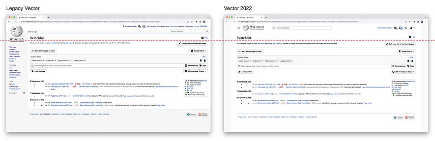


.png)