
佈景主題:Lakeus
 發行狀態: 穩定版 |
|||
|---|---|---|---|
 |
|||
| 作者 | |||
| 最新版本 | 1.2.0 (2024-04-26) | ||
| 相容性方針 | Snapshots releases along with MediaWiki. Master is not backwards compatible. | ||
| MediaWiki | 1.36+ | ||
| 許可協議 | GNU General Public License 3.0 or later | ||
| 下載 | GitHub: |
||
| 範例 | |||
|
|||
| Public wikis using | 3 (Ranked 215th) | ||
| Public wikis using as default skin | 0 | ||
| 翻譯佈景主題(如果佢喺translatewiki.net上提供嘅話) | |||
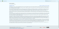
Lakeus係一款旨在提供簡潔而完整體驗嘅佈景主題。 以佢嘅作者之一,Lakejason0嘅小説角色命名。
安裝
- 下載,將佢放置於你
skins/文件夾嘅Lakeus目錄中。 - 將以下代碼添加到你LocalSettings.php嘅底部:
wfLoadSkin( 'Lakeus' );
 Done - 喺你嘅wiki上打開Special:Version,確認佈景主題已經安裝成功。
功能
- 簡潔而完整(起碼大部分功能都可以正常運作)
- 支援停用JavaScript嘅情形下運作。
- 使用CSS變數來實現自訂。
- 響應式設計。 喺桌上設備同埋平板電腦上面嘅顯示應該都係正常嘅。
- 浮動目次。 可能唔穩定。
- 主題設計器。 於偏好設定中啟用就可即時預覽及變更主題。 大多數情形下,只需調整幾個變數,主題設計器就可為你計算生成主題。
- 目前可能存在問題且缺乏穩定,如果你遇到問題,務請向我回報! 如果自動計算結果不及預期,你可隨時將之停用。
註
- 此佈景主題應該同無JavaScript環境相容。 雖然喺無JavaScript情形下,部分便利特性會無法使用。
- 此佈景主題為使用帶有LanguageConverter變體語言〔比如中文(語言代碼為
zh)同塞爾維亞語〕嘅網站提供一個獨立選單。 當網站無語言變種可用時,選單應該會隱藏自身。 - RTL書寫方向嘅支援尚未完全測試,但主要功能已通過相容測試(例如邊欄選單)。
自訂
CSS變數
true來繞過此特性。Lakeus支援使用CSS變數來實現自訂。 以下係製作主題嘅方法示例,如果要將主題結果(應該係CSS代碼)套用,您需要將佢複製到Lakeus.css,可以喺MediaWiki:Lakeus.css(適用於全站用户)或Special:MyPage/Lakeus.css(適用於用户自己)處揾到。
主題設計器
主題設計器可為所有人帶來更方便嘅體驗(希望如此)。 你只需變更幾個基本變數,其餘會自動計算。 你可停用相應嘅自動計算,並按照自己意願進行微調。
如要啟用主題設計器,請前往偏好設定,選擇「外觀/顯示」,選中Lakeus佈景主題後,你就可以見到主題設計器選項。 啟用後,主題設計器會於所有頁面載入。
當中嘅按鈕及表單嘅作用基本都同字面意思一樣,如果有不解之處,就試著用下,睇下所起嘅作用。 當然,依然會有部分變數唔會用到每個頁面上,下面都會列出:
- 介面資訊框。 此類元素會喺類似於以下情況時出現:JavaScript停用時成功更改用户組設定;翻譯頁面編輯提示警告;頁面編輯時MediaWiki拋出嘅異常;Echo或其他通知擴充未安裝時嘅用户討論頁通知。
主題方案集
此處會提供一啲預設主題,供你直接使用。 你亦可以喺討論頁上面分享你嘅主題。 如果此處冇任何內容,請稍後再回來查看。
復古
一個復古主題,最後一次匯出於1.1.7。
| Extended content |
|---|
:root {
    --color-primary: #8e860a;
    --color-secondary: #eeebe7;
    --color-neutral: #a2a9b1;
    --color-warning: #ffcc33;
    --color-error: #dd3333;
    --color-success: #14866d;
    --color-header: rgba(238,235,231,0);
    --color-link: #0645ad;
    --color-secondary--derived: #f8f9fa;
    --border-color-secoundary--derived: #a2a9b1;
    --font-family: 'Roboto', -apple-system, blinkmacsystemfont, 'Segoe UI', 'Oxygen', 'Ubuntu', 'Cantarell', 'Helvetica Neue', sans-serif;
    --font-family-serif: 'Linux Libertine', 'Times New Roman', 'Liberation Serif', 'Nimbus Roman', 'Noto Serif', 'Times', serif;
    --elevation: 0 2px 2px rgba( 0, 0, 0, 10% );
    --background-color-base: #eeebe7;
    --color-link--visited: #001f7d;
    --color-link--active: #5670e0;
    --color-link-new: #dd3333;
    --color-link-new--visited: #a4000c;
    --color-link-new--active: #ff6a5d;
    --color-link-external: #003da3;
    --color-link-external--visited: #001873;
    --color-link-external--active: #5267d5;
    --header-elevation: unset;
    --text-color-header: #000000;
    --icon-filter-header: unset;
    --background-color-search-suggestions: #eeebe7;
    --border-color-search-suggestions: #8c8985;
    --background-color-search-suggestions-current: #8e860a;
    --color-search-suggestions-text: #000000;
    --color-search-suggestions-text-current: #ffffff;
    --background-color-search-input: #eeebe7;
    --border-color-search-bar: #8c8985;
    --background-color-toggle-list: #ffffff;
    --background-color-toggle-list-card: #8e860a;
    --text-color-toggle-list-item: #000000;
    --background-color-toggle-list-item-hover: rgba(0,0,0,0.1);
    --text-color-toggle-list-item-hover: #000000;
    --background-color-toggle-list-item-focus: rgba(0,0,0,0.2);
    --text-color-toggle-list-item-focus: #000000;
    --border-color-toggle-list: #9b9b9b;
    --subheader-color-toggle-list: #6a6a6a;
    --logo-text-color-toggle-list: #ffffff;
    --mask-background: rgba(0,0,0,0.8);
    --background-color-content: #eeebe7;
    --text-color-content: #24220a;
    --background-color-body: #eeebe7;
    --text-color-body: #000000;
    --border-color-content: #bcb9b5;
    --color-accent-header-tab: #8e860a;
    --color-accent-header-tab-selected: #8e860a;
    --color-accent-header-tab-new: #8e860a;
    --border-color-header-tab: #eaecf0;
    --color-tagline: rgba(0,0,0,0.5);
    --font-family-headings: var(--font-family-serif);
    --background-color-edit-options: #eeeeee;
    --border-color-edit-options: #c8ccd1;
    --background-color-toc: #e4e1dd;
    --border-color-toc: #b2afab;
    --color-toc-number: #0d0d0d;
    --border-color-interface-message-box-neutral: #a2a9b1;
    --background-color-interface-message-box-neutral: #e5e7ea;
    --text-color-interface-message-box-neutral: #000000;
    --border-color-interface-message-box-warning: #ffcc33;
    --background-color-interface-message-box-warning: #ffe69a;
    --text-color-interface-message-box-warning: #000000;
    --border-color-interface-message-box-error: #dd3333;
    --background-color-interface-message-box-error: #fae2e2;
    --text-color-interface-message-box-error: #000000;
    --border-color-interface-message-box-success: #14866d;
    --background-color-interface-message-box-success: #d9ebe7;
    --text-color-interface-message-box-success: #000000;
    --border-color-user-message: #ffa500;
    --background-color-user-message: #ffe4b3;
    --text-color-user-message: #000000;
    --background-color-wikitable: #e9e6e2;
    --text-color-wikitable: #030303;
    --border-color-wikitable: #9e9c98;
    --background-color-wikitable-table-head: #dfdcd8;
    --background-color-portlet-body: #ffffff;
    --background-color-portlet-item-hover: rgba(0,0,0,0.1);
    --background-color-portlet-item-focus: rgba(44,44,44,0.1);
    --border-color-portlet-body: #ffffff;
    --background-color-footer: #dad7d3;
    --text-color-footer: #000000;
    --color-footer-link: #0645ad;
    --color-footer-link--visited: #001f7d;
    --color-footer-link--active: #5670e0;
}
|
海洋
淡藍色配色主題方案,最後一次匯出於1.1.15。
| Extended content |
|---|
:root {
    --color-primary: #3366cc;
    --color-secondary: #f4fcff;
    --color-neutral: #a2a9b1;
    --color-warning: #ffcc33;
    --color-error: #dd3333;
    --color-success: #14866d;
    --color-header: #e2f4fe;
    --color-link: #0645ad;
    --color-secondary--derived: #f8f9fa;
    --border-color-secondary--derived: #a2a9b1;
    --font-family: 'Roboto', -apple-system, blinkmacsystemfont, 'Segoe UI', 'Oxygen', 'Ubuntu', 'Cantarell', 'Helvetica Neue', sans-serif;
    --font-family-serif: 'Linux Libertine', 'Times New Roman', 'Liberation Serif', 'Nimbus Roman', 'Noto Serif', 'Times', serif;
    --elevation: 0 2px 2px rgba( 0, 0, 0, 10% );
    --background-color-base: #f4fcff;
    --color-link--visited: #001f7d;
    --color-link--active: #5670e0;
    --color-link-new: #dd3333;
    --color-link-new--visited: #a4000c;
    --color-link-new--active: #ff6a5d;
    --color-link-external: #003da3;
    --color-link-external--visited: #001873;
    --color-link-external--active: #5267d5;
    --header-elevation: var(--elevation);
    --text-color-header: #000000;
    --icon-filter-header: unset;
    --background-color-search-suggestions: #f4fcff;
    --border-color-search-suggestions: #91989b;
    --background-color-search-suggestions-current: #3366cc;
    --color-search-suggestions-text: #000000;
    --color-search-suggestions-text-current: #ffffff;
    --background-color-search-input: #f4fcff;
    --border-color-search-bar: #91989b;
    --background-color-toggle-list: #f4fcff;
    --background-color-toggle-list-card: #3366cc;
    --text-color-toggle-list-item: #000000;
    --background-color-toggle-list-item-hover: rgba(51,102,204,0.1);
    --text-color-toggle-list-item-hover: #3366cc;
    --background-color-toggle-list-item-focus: rgba(35,93,194,0.2);
    --text-color-toggle-list-item-focus: #3366cc;
    --border-color-toggle-list: #91989b;
    --subheader-color-toggle-list: #0955b8;
    --logo-text-color-toggle-list: #ffffff;
    --mask-background: rgba(0,0,0,0.8);
    --background-color-content: #f4fcff;
    --text-color-content: #000000;
    --background-color-body: #f4fcff;
    --text-color-body: #000000;
    --border-color-content: #c1c9cc;
    --font-family-action-bar: var(--font-family);
    --color-accent-header-tab: #3366cc;
    --color-accent-header-tab-selected: #3366cc;
    --color-accent-header-tab-new: #3366cc;
    --border-color-header-tab: #eaecf0;
    --color-tagline: rgba(0,0,0,0.7);
    --font-family-headings: var(--font-family-serif);
    --background-color-edit-options: #eeeeee;
    --border-color-edit-options: #c8ccd1;
    --background-color-toc: #eaf2f5;
    --border-color-toc: #b7bfc2;
    --color-toc-number: #0d0d0d;
    --border-color-interface-message-box-neutral: #a2a9b1;
    --background-color-interface-message-box-neutral: #e5e7ea;
    --text-color-interface-message-box-neutral: #000000;
    --border-color-interface-message-box-warning: #ffcc33;
    --background-color-interface-message-box-warning: #ffe69a;
    --text-color-interface-message-box-warning: #000000;
    --border-color-interface-message-box-error: #dd3333;
    --background-color-interface-message-box-error: #fae2e2;
    --text-color-interface-message-box-error: #000000;
    --border-color-interface-message-box-success: #14866d;
    --background-color-interface-message-box-success: #d9ebe7;
    --text-color-interface-message-box-success: #000000;
    --border-color-user-message: #ffa500;
    --background-color-user-message: #ffe4b3;
    --text-color-user-message: #000000;
    --background-color-wikitable: #eff7fa;
    --text-color-wikitable: #030303;
    --border-color-wikitable: #a4abae;
    --background-color-wikitable-table-head: #e5ecef;
    --background-color-portlet-body: #ffffff;
    --text-color-portlet-item: #3366cc;
    --background-color-portlet-item-hover: rgba(51,102,204,0.1);
    --text-color-portlet-item-hover: #3366cc;
    --background-color-portlet-item-focus: rgba(112,147,255,0.1);
    --text-color-portlet-item-focus: #3366cc;
    --border-color-portlet-body: #ffffff;
    --background-color-footer: #dfe7ea;
    --text-color-footer: #000000;
    --color-footer-link: #0645ad;
    --color-footer-link--visited: #001f7d;
    --color-footer-link--active: #5670e0;
    --background-color-toc-button: #f4fcff;
    --icon-filter-toc-button: unset;
    --text-color-sticky-toc-number: rgba(51,102,204,0.7);
}
|
ArchWiki
模仿ArchWiki嘅佈景主題,最後一次匯出於1.1.18.r11.gdf47be3。
| Extended content |
|---|
:root {
    --color-primary: #0077bb;
    --color-secondary: #ffffff;
    --color-neutral: #a2a9b1;
    --color-warning: #ffcc33;
    --color-error: #dd3333;
    --color-success: #14866d;
    --color-header: #333333;
    --color-link: #0077bb;
    --elevation: 0 2px 2px rgba( 0, 0, 0, 10% );
    --background-color-base: #f6f9fc;
    --color-link--visited: #004c8a;
    --color-link--active: #57a6ee;
    --color-link-new: #bb4400;
    --color-link-new--visited: #840f00;
    --color-link-new--active: #f47334;
    --color-link-external: #006eb1;
    --color-link-external--visited: #004481;
    --color-link-external--active: #559ce3;
    --header-elevation: inset 0px -5px 0px 0px #08c;
    --text-color-header: #ffffff;
    --icon-filter-header: invert(1) hue-rotate(180deg);
    --background-color-search-suggestions-current: #0077bb;
    --background-color-toggle-list: #ffffff;
    --background-color-toggle-list-card: #0077bb;
    --text-color-toggle-list-item: #000000;
    --background-color-toggle-list-item-hover: rgba(0,119,187,0.1);
    --text-color-toggle-list-item-hover: #0077bb;
    --background-color-toggle-list-item-focus: rgba(0,110,177,0.2);
    --text-color-toggle-list-item-focus: #0077bb;
    --subheader-color-toggle-list: #0065a7;
    --logo-text-color-toggle-list: #ffffff;
    --mask-background: rgba(0,0,0,0.8);
    --background-color-content: #ffffff;
    --text-color-content: #000000;
    --background-color-body: #f6f9fc;
    --text-color-body: #000000;
    --color-accent-header-tab: #0077bb;
    --color-accent-header-tab-selected: #0077bb;
    --color-accent-header-tab-new: #0077bb;
    --color-tagline: rgba(0,0,0,0.7);
    --background-color-portlet-body: #ffffff;
    --text-color-portlet-item: #000000;
    --background-color-portlet-item-hover: rgba(0,119,187,0.1);
    --text-color-portlet-item-hover: #0077bb;
    --background-color-portlet-item-focus: rgba(87,166,238,0.1);
    --text-color-portlet-item-focus: #0077bb;
    --background-color-footer: #f6f9fc;
    --text-color-footer: #000000;
    --color-footer-link: #0077bb;
    --color-footer-link--visited: #004c8a;
    --background-color-toc-button: #ffffff;
    --icon-filter-toc-button: unset;
    --text-color-sticky-toc-number: rgba(0,0,0,0.7);
}


#content {
    border: 1px solid var(--border-color-content);
}

@media screen and ( max-width: 720px ) {
    #content {
    	border-left: none; // no left and right border when #content is as wide as viewport; adjust the value if not appropriate
    	border-right: none;
    }
}

#ca-uls .uls-trigger {
    background-image: none;
    padding-left: 0;
}
|
手動修改變數
以下係預設嘅CSS變數,可以修改呢啲設置並將設置結果放到你嘅Lakeus.css中。
| Extended content |
|---|
:root {
  --color-primary: #3366cc;
  --color-secondary: #ffffff;
  --color-neutral: #a2a9b1;
  --color-error: #d33;
  --color-warning: #fc3;
  --color-success: #14866d;
  --background-color-base: var(--color-secondary);
  --background-color-body: var(--color-secondary);
  --background-color-content: var(--color-secondary);
  --background-color-footer: #eee;
  --background-color-toggle-list: var(--color-secondary);
  --background-color-portlet-body: var(--color-secondary);
  --background-color-toggle-list-card: #eee;
  --background-color-toggle-list-item-hover: rgba(0, 0, 0, 0.1);
  --background-color-toggle-list-item-focus: rgba(0, 0, 0, 0.2);
  --background-color-portlet-item-hover: rgba(0, 0, 0, 0.1);
  --background-color-portlet-item-focus: rgba(0, 0, 0, 0.2);
  --background-color-edit-options: #eee;
  --background-color-search-suggestions: var(--color-secondary);
  --background-color-search-suggestions-current: var(--color-primary);
  --background-color-search-input: var(--color-secondary);
  --background-color-toc: #f8f9fa;
  --background-color-interface-message-box-neutral: #eaecf0;
  --background-color-interface-message-box-error: #fee7e6;
  --background-color-interface-message-box-warning: #fef6e7;
  --background-color-interface-message-box-success: #d5fdf4;
  --background-color-user-message: #ffce7b;
  --background-color-wikitable: #f8f9fa;
  --background-color-wikitable-table-head: #eaecf0;
  --background-color-toc-button: #fff;
  --border-color-edit-options: #c8ccd1;
  --border-color-content: #ccc;
  --border-color-toggle-list: #ddd;
  --border-color-search-suggestions: #c8ccd1;
  --border-color-search-bar: var(--color-gray-2);
  --border-color-portlet-body: var(--color-gray);
  --border-color-header-tab: var(--color-gray-2);
  --border-color-toc: #a2a9b1;
  --border-color-interface-message-box-neutral: var(--color-neutral);
  --border-color-interface-message-box-error: var(--color-error);
  --border-color-interface-message-box-warning: var(--color-warning);
  --border-color-interface-message-box-success: var(--color-success);
  --border-color-user-message: #ffa500;
  --border-color-wikitable: #a2a9b1;
  --subheader-color-toggle-list: #6a6a6a;
  --logo-text-color-toggle-list: #000000;
  --text-color-toggle-list-item: #1c1c1c;
  --text-color-toggle-list-item-hover: #3a3a3a;
  --text-color-toggle-list-item-focus: #3a3a3a;
  --text-color-portlet-item: #1c1c1c;
  --text-color-portlet-item-hover: #3a3a3a;
  --text-color-portlet-item-focus: #3a3a3a;
  --text-color-content: #000000;
  --text-color-header: #000000;
  --text-color-body: #000000;
  --text-color-footer: #000000;
  --text-color-interface-message-box-neutral: #000000;
  --text-color-interface-message-box-error: #000000;
  --text-color-interface-message-box-warning: #000000;
  --text-color-interface-message-box-success: #000000;
  --text-color-user-message: #000000;
  --text-color-wikitable: #202122;
  --text-color-sticky-toc-number: #888;
  --icon-filter-header: unset;
  --icon-filter-ooui-icon: unset;
  --icon-filter-toc-button: unset;
  --color-search-suggestions-text: #000;
  --color-search-suggestions-text-current: #fff;
  --color-tagline: var(--color-base);
  --color-accent-header-tab: var(--color-base);
  --color-accent-header-tab-selected: #54595d;
  --color-accent-header-tab-new: #54595d;
  --color-header: white;
  --color-base: #54595d;
  --color-gray: #a2a9b1;
  --color-gray-2: #eaecf0;
  --color-link: #0645ad;
  --color-link--visited: #0b0080;
  --color-link--active: #faa700;
  --color-link-new: #d33;
  --color-link-new--visited: #a55858;
  --color-link-new--active: #faa700;
  --color-link-external: #36b;
  --color-link-external--visited: #636;
  --color-link-external--active: #b63;
  --color-footer-link: var(--color-link);
  --color-footer-link--visited: var(--color-link--visited);
  --color-footer-link--active: var(--color-link--active);
  --color-toc-number: #202122;
  --font-family: 'Roboto', -apple-system, blinkmacsystemfont, 'Segoe UI', 'Oxygen', 'Ubuntu', 'Cantarell', 'Helvetica Neue', sans-serif;
  --font-family-serif: 'Linux Libertine', 'Times New Roman', 'Liberation Serif', 'Nimbus Roman', 'Noto Serif', 'Times', serif;
  --font-family-headings: var(--font-family-serif);
  --font-family-action-bar: var(--font-family);
  --elevation: 0 2px 2px rgba( 0, 0, 0, 10% );
  --header-elevation: var(--elevation);
  --mask-background: rgba( 0, 0, 0, 0.8 );
}
|
例如,要將頂欄嘅顏色改為淡藍色(比如#4FC3F7),噉就寫成:
:root {
  --color-header: #4FC3F7;
}
參數
| 參數 | 類型 | 預設值 | 描述 |
|---|---|---|---|
$wgLakeusShowRepositoryLink
|
布爾值 | true
|
決定是否於頁腳處展示指向此佈景主題倉庫嘅連結。 |
$wgLogos
|
目前,只有icon同wordmark會被使用;其餘鍵名(例如svg、1x、1.5x、2x等)唔會被此佈景主題使用。 請注意,其他佈景主題亦有可能使用由icon提供嘅圖片。與此同時亦會使用其他鍵名,因此請勿用以上鍵名嘗試為此佈景主題提供單獨圖標。
| ||
$wgLakeusSiteNoticeHasBorder
|
布爾值 | false
|
決定是否為站點通知啟用一個由佈景主題提供嘅邊框。 啟用此功能有助於提升純文字通知嘅美觀度,但如果通知內容本身就有邊框,你亦可以選擇保留預設值,不作啟用。 |
$wgLakeusShouldAnimatePortlets
|
布爾值 | false
|
決定是否啟用選單動畫(例如打開同關閉選單時嘅淡出淡入)。啟用後可能會由於z-index問題造成視覺效果嘅瑕疵。 |
$wgLakeusShowStickyTOC
|
布爾值 | false
|
決定是否顯示浮動目次。 |
$wgLakeusCustomIndicators
|
Array | []
|
Experimental. Adds custom skin-wide indicators. This is PROBABLY NOT how you should add page status indicators and therefore experimental. This array consists of data of indicators, and each entry should consist of 3 properties: id, class, html. It is suggested to follow the format of proper indicators added in wikitext, which means:
|
側邊欄圖示
十分遺憾,想要向佈景主題添加圖示而唔喺頁面上載入大量圖像係唔太可能嘅。
如果你能夠忍受載入網路字體圖示所需嘅時間,可以嘗試用以下方式添加圖示。
首先,引入圖示嘅字體(Font face)(本例使用Material Icons)到你嘅CSS(Lakeus.css)中。
你可能喺Lakeus.css以外嘅地方載入過部分字體,此時只需要確保佢哋唔會相互衝突就得。
/* MD Icons */
/* fallback */
@font-face {
  font-family: 'Material Icons';
  font-style: normal;
  font-weight: 400;
  src: url(https://fonts.gstatic.com/s/materialicons/v70/flUhRq6tzZclQEJ-Vdg-IuiaDsNc.woff2) format('woff2');
}
然之後,由於本例使用咗偽元素,我哋會用一啲邊距同埋額外嘅設定來為圖示留出空間。
.toggle-list__list a {
    padding-left: calc(8px + 25px);
}

.toggle-list__list a::before {
    content: '';
    width: 0;
    height: 0;
    display: inline-block;
    font-family: 'Material Icons';
    font-size: 18px;
    transform: translateX(-25px) translateY(3px);
    /* Display Optimizing */
    -webkit-font-smoothing: antialiased;
    text-rendering: optimizeLegibility;
    -moz-osx-font-smoothing: grayscale;
    font-feature-settings: 'liga';
}
依家即可添加實際圖示。 你可以使用開發者工具(右擊網頁,選擇「檢測」來打開)來查看列表項嘅ID,然後設定實際嘅元素(圖示)內容:
/* Navigation */
#n-mainpage-description a::before {
    content: 'home';
}

#n-recentchanges a::before {
    content: 'auto_awesome';
}

#n-randompage a::before {
    content: 'shuffle';
}

#n-portal a::before {
    content: 'forum';
}

#n-help-mediawiki a::before {
    content: 'help_center';
}
本例中,Material Icons支援特定嘅字串(此處所用嘅)同埋一啲字元碼位,可用來展示對應圖示。 Material Icons支援嘅字串同碼位請見- Google Fonts。 你可以隨意為自己嘅站點添加更多規則,例如某位作者嘅站點有個管理員告示板:
#n-adminnoticeboard a::before {
    content: 'groups';
}
#n-...嘅部分同你喺MediaWiki:Sidebar中使用嘅系統訊息相對應。
個人選單圖示
個人選單同上面基本一樣。
| Extended content |
|---|
/* Personal Menu */
#p-personal a {
    padding-left: calc(0.75em + 25px);
}

#p-personal a::before {
    content: '';
    width: 0;
    height: 0;
    display: inline-block;
    font-family: 'Material Icons';
    font-size: 18px;
    transform: translateX(-25px) translateY(3px);
    -webkit-font-smoothing: antialiased;
    text-rendering: optimizeLegibility;
    -moz-osx-font-smoothing: grayscale;
    font-feature-settings: 'liga';
}

#pt-userpage a::before {
    content: 'person';
}

#pt-mytalk a::before {
    content: 'chat_bubble';
}

#pt-adminlinks a::before {
    content: 'admin_panel_settings';
}

#pt-preferences a::before {
    content: 'settings';
}

#pt-betafeatures a::before {
    content: 'science';
}

#pt-watchlist a::before {
    content: 'star';
}

#pt-mycontris a::before {
    content: 'emoji_events';
}

#pt-logout a::before {
    content: 'logout';
}

#pt-login a::before {
    content: 'login';
}

#pt-createaccount a::before {
    content: 'person_add';
}
|
圖庫
-
 Lakeus佈景主題樣張,正在使用海洋主題
 -
 Lakeus佈景主題樣張,正在使用ArchWiki主題

