
Reading/Web/Desktop Improvements/Repository/First Prototype Feedback Report/fr
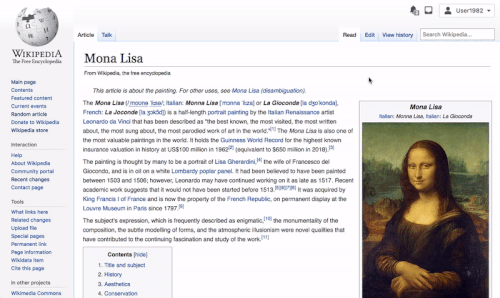
In December, we published a prototype of the first few features of the desktop improvements project for community feedback. The prototype presented a collapsible version of the sidebar, a max-width constraint on the content, and a more prominent location for the language switcher.
We received detailed, thoughtful feedback from over 200 logged-in users, across five languages. The feedback is mostly positive, with the majority of users seeing the changes as an improvement over the current design.
However, there were also some areas of concern. Many of the issues raised were due to bugs in the prototype (particularly with the language switching menu). Regarding other exposed issues, we will iterate on these and/or keep an eye on during development. This report highlights the main points raised, both positive and negative, and our plans going forward in response to this feedback.
Méthode de retour
The prototype was shown to logged-in users using central notice on the following wikis:
- Wikipédia en basque
- Wikipédia en français
- Wiktionnaire en français
- Wikipédia en hébreu
- Wikipédia en persan
- Wikipédia en polonais
- Wikipédia en anglais
- Wikiversité en portugais
Replies were collected using a pre-populated form with specialized questions around the changes that were presented. We also asked for general thoughts and opinions around the changes in the prototype. Responders were also given the option to submit their thoughts via email. The results presented contain both the feedback we received on the page as well as via email.
We received a lot of comments related to bugs in the prototype. In particular, these were related to the language switching functionality and the Universal Language Selector (ULS). We apologize for not providing enough information on the prototype itself and for not catching these issues earlier.
Summary of results
A total of 230 logged-in users gave us feedback on the prototype. The majority of the responses were in English (180), followed by French (38) and Hebrew (7).
Positif
- The majority of the logged-in users preferred the new location of the language selector over the current implementation in the sidebar.
- The majority of editors liked the ability to collapse the sidebar. Specifically, the more focused reading view that results from the sidebar being collapsed and a max-width constraint on the content.
Room for improvement
- There were a number of concerns raised with the language switcher. Most of these were related to language switching requiring two clicks instead of one, the new language switcher being too prominent, and questions around internationalizing the languages names in the list.
- There were some concerns around the amount of white space introduced with a collapsible sidebar and max-width constraint on the content.
Feature requests
- Dark/night mode
- Make the table of contents always available on the page
Résultats
Language Switching
Positif
Overall, most users preferred the new location of the language selector. They reported it was easier to find than the previous location. People who used the language selector often reported that it would be faster for them to switch languages. A number of users also reported that the new location is more intuitive as it follows a pattern that other multilingual sites use.
Room for improvement and iteration ideas
- One-click language switching: currently you are able to switch to a different language wiki with a single click. Depending on your screen height, some scrolling may also be required. In the prototype, it takes two clicks to switch languages (plus potentially needing to scroll as well). Many people noted that the new position of the language switcher was easier to find. They also expressed concern about having an extra click in order to switch languages. It was especially important for cases where people expect to switch frequently. There are two ways we are thinking about this:
- We will be collecting usage data and performing A/B tests on our test wikis. This way, we will determine whether language switching increases, decreases, or stays relatively the same. It is our hope that despite the extra click, the increased prominence of the language switcher will lead to greater discoverability and ultimately more language switching.
- We’ve drafted an option that includes links for switching languages directly on the page, adjacent to the general language selector:

Showing two direct language links next to the language switcher in the article header

Language switching is not relevant to all people. We would have to figure out when to show these direct links. Otherwise, they could be distracting. Perhaps they could appear when someone has switched languages once, or if we think they are likely to switch languages. This may be caused by a incompatibility between the operating system language and the language of the wiki. We have not yet chosen our approach. We plan to revisit this idea once the initial implementation of the language switching is in place. Any feedback on this or the above mockups would be greatly appreciated.
- Issues with finding a given language within the Universal Language Selector (ULS): A lot of users liked the position of the new language selector but expressed concerns with the language selector itself.
- Some of these concerns were around the difficulty of finding a given language within the selector. These were in part due to the following bugs within the prototype itself: the list of frequently used and suggested languages was missing, the language search was broken, and the menu was being rendered too small.
- There were also concerns around the ordering of languages by region, and the spacing between the items within the selector leading to too much scrolling.
We will prioritize the suggestions and issues and are hoping to work with the Language team to make some improvements to the Universal Language Selector. We will update more on this soon.
- Location & prominence: The following concerns were expressed about the location of the language switcher in the prototype:
- Some people preferred the current location over the new location with varying reasons. The main theme seemed to be the difficulty of using the Universal Language Selector and the loss of a one-click access. Both of these are addressed below.
- The new location is too prominent since many people won’t ever switch languages. A main goal of this project is to increase the prominence of frequently used functionality. Currently, the language switching links are the most frequently used links within the sidebar. In addition, we believe that allowing multilingual users to switch languages is a crucial way of promoting less widespread languages. Due to the current location, many are unaware that switching between languages is even possible.
- The new location is good but the button is too big. We have sketched out several other options for the button treatment, shown below:

Four treatments for the interlanguage links menu. Most prominent on the left, least prominent on the right.
- Looks like a translation: According to a couple of users, casual readers may think that when they switch languages, they are merely viewing a translation of the article, rather than switching to a different wiki. These users believe that this may be caused by placing the language selector within the article view. Clarifying the relationship between different language Wikis is important. We are conducting user testing to investigate this and understand if this confusion is occurring, and how much of an issue this would present to readers.

Autres notes
- There were some requests on displaying the English names of languages in addition to the native name (i.e. displaying both Bengali and বাংলা, rather than just বাংলা).
- Translate the word “language”. A number of users mentioned that the word “language” should be translated to the language of the wiki. This was a mistake of the prototype. The interface will be translated into the language of the wiki in the final version.
- Some people mentioned adding some kind of indicator in the sidebar that points people towards the new location of the language switcher. We hope to explore this.
- Some people were wondering what the language switcher will look like on articles with no other languages available. Sketch will come soon.
Collapsible sidebar
Positive
The majority of users who provided feedback liked the collapsed sidebar for personal use, and especially for the purposes of reading. People mentioned that it removes distractions and makes reading more pleasant. One user with reading disabilities mentioned that removing the sidebar makes it easier for them to focus on the content.
Room for improvement and iteration ideas
- Do not collapse by default for logged-out users: Some users did not like the idea of the sidebar being collapsed by default for logged-out users. They expressed a preference to the current state. Their reasoning was that the items in the sidebar could raise interest in editing and the inner workings of Wikimedia projects. We acknowledge that with the sidebar collapsed there are fewer total entry points to editing/contributing related pages. This includes the Recent changes. However, our hope is that by reducing the number of links on the page the ones that remain (Edit, Talk, History, etc.) will be more noticeable. Hopefully, we will see more engagement. We don’t plan on iterating the current design based on this feedback. However, we will be testing A/B clicks on links to the sidebar to compare how a collapsible sidebar compares to a non-collapsible one. We will also be monitoring whether the sidebar changes have any effects on account creation (as a proxy for conversion from readers to editors).
- Collapse by default to everyone: Conversely, a number of users mentioned that they would prefer the collapsed sidebar to be default for readers and editors. Many suggested to remove the sidebar altogether. Currently, we don’t have plans to pursue either of these ideas. We welcome individual communities to discuss sidebar links and their usefulness further.
- Refine and/or relocate the open/close trigger for the menu: Many people commented that the hamburger icon wasn’t an intuitive way to open/close the menu. Only one of the 220+ users wrote were unable to open the sidebar when prompted (link to feedback). The two most common suggestions were: 1) when the sidebar is open the icon should change to something like an “X” or “<<”, and 2) try moving the icon closer to the menu itself, rather than having it in the site header. Sketches for these two ideas are below.
 |
 |
- Don’t hide random: A few users mentioned that the random page link is important to readers and a core part of the Wikimedia wiki experience. We agree that this is an interesting idea. We are exploring moving the link outside of the sidebar and into the search bar.

Showing a Random article button next to search - Collapse the sections within the sidebar as well, or reduce the number of links in the sidebar: Currently the sidebar contains many links that are not frequently used. Some people worry that by collapsing the sidebar, we are ignoring the bigger challenge: to remove the unused links in the sidebar. Some have suggested making the sections within the sidebar collapsible. Others have suggested cleaning up the links. The links in the sidebar are determined on each wiki individually. We agree that the communities should remove unnecessary links from the sidebar.

Open questions, new ideas, and other notes
- Where did the edit button and categories go? A few users mentioned that they were not able to access the edit button and list of categories within the prototype. This was a bug of the prototype. We apologize for not mentioning it in the directions.
Introducing a max-width
Context
One of the bugs in the prototype was that the content had a max-width constraint only when the sidebar was closed. Many people commented on how this was odd, and how much the content jumped across the page when you closed the sidebar. This was a mistake, not how we intended it to be. Please see this updated prototype to understand how the max-width constraint will work: https://di-collapsible-sidebar-5.firebaseapp.com/Tea
Positive
The majority of people responded positively to the max-width layout. The noted that it resulted in a more comfortable reading experience. Several people mentioned that having margins around the content makes it easier to focus. For them, shorter line-lengths were better for reading. This is consistent with professional research that has been conducted.[1]
Overall feedback and other feature ideas
- Build a night mode: A significant part of users made requests for a dark/night mode to be added to the scope of the project. We were not considering this in the initial scope. We realize this is a request we’ve seen multiple times in the past as well. We are currently in discussions on whether we can potentially add dark mode to the scope of the project and how this might affect our timeline. We will update once we know more.
- The table of contents should always remain in view: Many people commented that having access to the table of contents regardless of how far down the page they had scrolled would be (“extremely helpful”). We are planning to explore this functionality as part of this project.
- Build a sticky header: A lot of users expressed interest in having constant access for commonly used actions at the top of the page. Users requested to have access to commonly used pages and actions (talk, history, edit) as well as other functionality such as the search bar. A similar request was the need to return to the top of the page and/or to switch sections in a quick manner. We plan on exploring this option as a part of this project. We would like to introduce a sticky header with commonly used actions as well as a persistent table of contents. Below are some examples of our ideas so far. We’d appreciate any feedback around this you might have.
 |
 |
- Clean up the top bar: There were some thoughts and ideas around cleaning up the links at the top of the page by collapsing them or moving them under dropdowns. This is also something we’re considering for the project.
Consolidated user tools prototype for Desktop improvements project - The logo is too small.

Notre justification de la largeur limitée
Lisibilité
Recherche
Notre objectif principal est d'améliorer la lisibilité des pages des wikis Wikimédia. We decided to work on the width of the content area. Il existe des études qui recommandent sur cette question.
- La page Wikipédia anglophone Line Length contient une bonne vue d'ensemble.
- de même que l'essai de la Professeure Laura Franz[2].
- Optimal Line Length in Reading - A Literature Review (2005), from the peer reviewed journal Visible Language – "studies concluded that moderate line length in between 50 to 70 cpl [characters per line] are the easiest to read and users do not prefer extreme line lengths (very short or very long) while reading from screen. There was no significant effect of line length found on comprehension, though fast readers benefit from narrow columns with short lines due to specific reading patterns (with one contradictory finding)".
- Effects of Surrounding Information and Line Length on Text Comprehension from the Web (2002), from Canadian Journal of Learning and Technology – "Comprehension was affected by whitespace; participants had better comprehension for information surrounded by whitespace than for information surrounded by meaningless information", which is more likely to happen if the text stretches to the edge of the browser.
- The influence of reading speed and line length on the effectiveness of reading from screen (2001), from International Journal of Human-Computer Studies – "A line length of 55 cpl appears to support e!ective reading in terms of both rate and comprehension. However, as the line lengths used in this study were spread across a wide range, there may be a more optimal setting than this. By varying the range and extremes of line lengths in future research, it may be possible to more precisely identify an optimal format and to explore the relative contributions of mechanical and cognitive factors."
- Shorter Lines Facilitate Reading in Those Who Struggle (2013), from PLOS One – "short lines reduce the number of regressions, and generally improve reading speed and comprehension, simply by reducing the probability that crowded text in locations previously fixated can be perceived."
- The Effects of Line Length on Children and Adults' Online Reading Performance (2002), from Software Usability Research Laboratory (SURL) at Wichita State University – "This study examined the effects of line length on reading performance. Reading rates were found to be fastest at 95 cpl. Readers reported either liking or disliking the extreme line lengths (35 cpl, 95 cpl)".
- The Effects of Line Length on Children and Adults' Perceived and Actual Online Reading Performance (2003), from Proceedings of the Human Factors and Ergonomics Society Annual Meeting – "No differences were found for either reading time or efficiency for either adults or children. However, adults preferred shorter line lengths to full-screen line lengths." and "The narrowest line length condition was perceived as promoting the highest amount of reader concentration, while the medium line-length condition was considered to be the most optimally presented length for reading."
- Reading Online Text: A Comparison of Four White Space Layouts (2004), unclear if this was peer reviewed – "Results from this study showed that the manipulation of the Margin white space affected both reading speed and comprehension; participants read the Margin text slower, but comprehended more than the No Margin text. In general, the results favored the use of Margins."
La recommandation populaire est qu'il devrait y avoir entre 40 et 75 caractères par ligne. The findings of multiple studies conclude that "short line lengths are easier to read". Regarding learning and information retention: "Subjects reading the narrow paragraphs had better retention than those reading the wide paragraphs".[1]
Web Content Accessibility Guidelines (WCAG)
- The Web Accessibility Initiative (WCAG) guideline 1.4.8 states that, in order to be accessible to all users, lines of text should be 80 or fewer characters (or 40 or fewer characters if the text is Chinese, Japanese, or Korean)."
Sites populaires avec une largeur limitée
On peut trouver de nombreux sites populaires qui se conforment à ces directives.
- Articles on the online science journal Nature have a max-width resulting in ~76 characters per line.
- New York Times articles are ~64 characters per line.
- Times of India articles are ~100 characters (Hindi).
- Oxford Academic journal articles are ~75.
- Articles on the World Health Organization’s website are ~96 (Latin alphabet), ~46 (Chinese alphabet), and ~85 (Cyrillic alphabet).
- When using reading mode in Safari or Firefox text is rendered at ~73 and ~77 characters per line respectively (Latin alphabet).
Comparaison avec les wikis Wikimédia
Une page de Wikipédia en anglais affichée dans une fenêtre de navigateur à 1280px compte environ 170 caractères par ligne.[3] Ce correspond à l'extrémité inférieure du spectre des tailles d'écran.
Sur Wikimédia wiki, le nombre de caractères par ligne augmente avec la largeur de l'écran. Ainsi, sur la deuxième taille d'écran la plus populaire, 1920px (21% des utilisateurs), le nombre de caractères par ligne est de ~262, soit plus de trois fois la valeur recommandée.[4]
Pourquoi ne pas choisir la solution « la plus simple »
En se basant exclusivement sur la longueur de ligne recommandée, il semble qu'une largeur d'environ 700px soit raisonnable. Pourquoi ne pas limiter la largeur des contenus sur les projets Wikimédia de sorte à coller aux recommandations, comme semblent le faire les autres sites ?
Parce que nos pages sont différentes, et que les internautes les consultent différemment.
- Les pages des wikis Wikimédia sont souvent longues, contiennent de nombreuses informations, et ne sont pas construites ou mises en page de manière uniforme. Par conséquence, les internautes ont davantage besoin de parcourir et d'explorer les pages. This is different than linear reading a typical online article or book. Cet argument est soutenu par notre étude sur le temps de lecture sur Wikipédia.
- Plus le contenu est étroit, plus la page s'allonge. Peut-être c'est plus difficile à survoler aussi, car cela implique plus de scroller, etc. Pour plus d'information sur les différents types d'usages de lecture en ligne, vous pouvez consulter cette étude menée par le groupe Nielsen Norman[5].
- Par ailleurs, il n'est pas aisé d'atteindre un nombre spécifique de caractères par ligne. C'est parce que les pages des wikis Wikimédia contiennent de nombreux éléments qui sont inclus dans les lignes à côté du texte.
 |
 |
Notre design doit prendre en compte ces distinctions et spécificités.
- We should limit the width by some amount to accommodate focused/engaged reading. This means shorter line lengths, and less density.
- At the same time, we should still enable readers to skim and search around, obtaining a visual map of the page without having to scroll too much This is an argument for longer line lengths, and more density.
Comment allons-nous faire?
Notre solution
Il y a deux expériences communes que nous pourrions vouloir envisager.
- Le haut d'un article, généralement composé d'un paragraphe situé à côté d'une infobox
- Le milieu d'un article, un paragraphe de texte sans élément d'interruption
On peut envisager ces deux situations avec plusieurs largeurs différentes, en comptant le nombre de caractères par ligne pour chacune :
| Largeur du contenu | Paragraphe à côté d'une infobox | Paragraphe de plein texte |
|---|---|---|
| 600px | ~30 caractères par ligne | ~94 caractères par ligne |
| 700px | ~59 | ~109 |
| 800px | ~76 | ~125 |
| 900px | ~89 | ~142 |
| 1000px | ~105 | ~154 |
À 1000px de large, un paragraphe de texte ininterrompu compte ~154 caractères, soit environ le double de la limite supérieure de la fourchette recommandée. Il arrive que des éléments flottants soient plus larges que les infobox, ce qui entraîne des colonnes de texte plus étroites à côté d'eux. De plus, il n'y avait pas de largeur maximale. Si certains éditeurs peuvent éditer sur des écrans plus étroits (ou vérifier l'aspect des pages sur des écrans plus étroits), il y a probablement du contenu sur les pages qui ne sera pas (encore) parfait sur une largeur plus étroite, parce que cela n'a pas été pris en compte (par exemple, les grands tableaux).
Une autre approche possible qui peut nous influencer est de se baser sur une mise en page par grilles (grid layout)[6]. Il s'agit d'une approche qui vise à améliorer l'harmonie visuelle de la page et à faciliter les choix techniques en termes d'espacement, de largeur, etc. L'habillage Vector n'utilise pour l'instant pas de grille. Nous pourrions par exemple prendre la largeur de l'infobox comme étalon d'une colonne de grille, et ensuite utiliser un multiple de cette largeur pour déterminer la largeur du contenu.
 |
 |
Créer une expérience de lecture commune
Création d'une largeur maximale aiderait à créer une expérience de lecture commune. Nous espérons que c'aiderait les contributeurs et contributrices dans leurs choix de mise en page.
Note: 1024px is mentioned as a minimum size to consider in the WP:Manual of Style/Layout page. That’s not quite the same thing, though.
Actuellement, un éditeur peut éditer une page à une largeur de 1500 px, tandis qu'un lecteur la lit avec une largeur de 1200 px. En mettant en place une largeur maximale, nous ne supprimons pas complètement cet écart. il y aurait toujours une variation en dessous de la largeur fixe, pour les personnes dont l'écran est plus étroit. Pourtant nous limiterions considérablement la gamme de variations.
Conclusion
Après toutes ces réflexions, nous sommes arrivés à deux conclusions :
- Une largeur maximale de 800 à 1000px semble être un bon point de départ. Nous centrerons le contenu dans la page pour nous assurer que la mise en page soit esthétique, que la barre latérale soit dépliée ou repliée.
- Il paraît pertinent de mener une étude dédiée spécifiquement à la lisibilité des articles Wikipédia. Nous espérons rassembler les ressources pour ce faire.
.png) |
.png) |
Notes supplémentaires
Déstructuration des modèles, contenus, pages spéciales, etc.
Une partie de ce qui fait de Wikipédia, et des autres wikis Wikimédia, un outil puissant de partage des connaissances est qu'il y a très peu de contraintes sur la façon dont les informations sont présentées. Il en résulte une grande variété d'éléments différents sur les pages : tableaux, galeries d'images, diagrammes, images panoramiques, graphiques, formulaires, cartes, boîtes à catégories, etc. We have dealt with the challenges of designing the mobile site, and got the content to look good. C'est pourquoi nous reconnaissons qu'il y aura des situations où le contenu de la page n'aura pas l'air bien, compte tenu de l'affichage maximal. Notre plan actuel est le suivant :
- Travailler avec nos communautés Wiki tests pour identifier les problèmes et discuter de solutions reposant sur les styles de modèles et autres outils existants.
- Ne pas appliquer la largeur maximale aux pages spéciales. Pages spéciales ne sont pas véritablement destinées à être « lues ». Elles fonctionnent davantage comme des listes ou des tableaux de bord. Tant que nous n'aurons pas le temps de travailler sur toutes les implications d'une mise en page plus responsive, nous laisserons ces pages en l'état. Voici un prototype initial montrant comment cela fonctionnerait. Vous pouvez alterner entre « historique » et « lire » pour voir la différence : https://di-collapsible-sidebar-5.firebaseapp.com/Tea
Anciennes discussions
Ce sujet a déjà été discuté par le passé.
N'hésitez pas à ajouter ici des liens vers d'autres conversations antérieures.
References
- ↑ 1.0 1.1 Computer text line lengths affect reading and learning by Peter Orton, Ph.D. IBM Center for Advanced Learning
- ↑ Size Matters: Balancing Line Length And Font Size In Responsive Web Design
- ↑ Pourquoi 1280px ? As of mid-2020, according to StatCounter, the most common computer screen size is 1366px wide, accounting for 22% of users. Imagining a browser window at nearly full width you end up with ~1280px.
- ↑ Nous supposons à nouveau que la fenêtre du navigateur est presque pleine largeur.
- ↑ K. Pernice, K. Whitenton, J. Nielsen, "How People Read Online: The Eyetracking Evidence", 2nd edition
- ↑ Une présentation globale du concept: Building Better UI Designs With Layout Grids