
Wikimedia Apps/Team/Android/Communication/UsertestingJuly2021
Background
[edit]The Android team is working to improve communication systems in the Android app. We currently support all notifications and alerts in the Android app.
However, when users are in the app, notifications are not easy to find. We are planning to make them more obvious.
Our July 2021-September 2021 update will make it easier to find notifications in the app and make them more obvious on the lock screen. By December 2021, we will build an intuitive inbox and interface in the notification home center, with the Android system elements in mind.
July 2021 through December 2021 we will focus on logged-in users that have made at least one edit. We will build on our preliminary work from earlier months to make alert awareness for logged-out users better in the beginning of 2022. We plan to explore onboarding experiences to communication tools for users that are logged out – help them find them. This will be in addition to other positive reinforcements and onboarding workflows for logged-in users.
Before making more changes to notifications and messaging in the app, we want to gain an understanding of intuitive placements, features and workflows for our users in the app. This project page collects initial user research. We ask that participants in our research comment on this discussion talk page with their responses to the protocol below or email us at android-support@wikimedia.org.
Research questions
[edit]- When asking a user to check their notifications, in the app, where do they click?
- Find out about how discoverable the various entry points presented are for notifications (how easy they are to find)
- What flows and actions do users expect when they have push notifications turned on compared to those that have it turned off?
- What are the expectations of what a user will see if they click a bell compared to an inbox and what are the drawbacks of having just one set of notifications instead?
- Do users believe elements of the user talk page should be in the notification center?
Protocol
[edit]1) Discoverability: Imagine that you opened your Wikipedia app to check your notifications. Which version of the app makes it clearest to you that you have a new notification? Please describe where on the screen you would tap to get your notifications. Please rank the variants below by how easy it is to find the notification icon/button.
Variant A 👇


Variant A = Notification bell in the app bar (this is the current design recommendation)
Pros:
- Positioning could be applied for the entire app here
- Consistency with other platforms (Desktop, Mobile)
Cons:
- Search field gets smaller
- Tabs and notifications might be misleading
Variant B 👇


Variant B = Adding a notifications list item to the overflow menu
Pros:
- It is just another menu item in the overflow menu
- Could be expanded with links e.g. Watchlist, User Profile, History or Notifications
Cons:
- Notifications are hidden behind an unclear “More” icon (similar issues as a hamburger navigation icon)
Variant C 👇


Variant C = A consistent app navigation (and removal of the toolbar in the article)
Pros:
- A consistent navigation throughout the app, users always know where to find things
- The “More” menu (at the top right) would only show items related to the thing you're looking at (like Share link, Add to watchlist, View talk page, View edit history for an article)
Cons:
- A bloated “More” menu in the article view (at the top right), similar to Chrome on Android — is hiding everything good information architecture?
- Hesitant to go with this approach as we made major improvements to the article view based on usability tests
2) Iconography: What information would you expect when tapping on each of the three icons below? Please describe your thoughts.
-
 Variant A: Bell iconography 🔔
 -
 Variant B: Inbox iconography 📥
 -
 Variant C: Person iconography 👤
3) To better serve a mobile context, we are considering distinguishing between notification types. What notifications would you consider a priority?
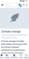
4) The screen below visualizes the idea of separating notifications types. “All” would list all notifications in one place, similar to today. Mentions would list notifications related to user talk pages, and other users tagging your user name on talk pages. What are your general thoughts on this concept of separating notifications in the Wikipedia on Android app in this way? Is the information presented in a way that feels efficient or understandable to you?

5) Looking at the illustration above, would you prefer to see 'All' of your notifications or 'Mentions' as the default tab? Further, is there another way in which you would separate your notification home center?
6) What new functionality for the notifications view would you appreciate? Please rank the following ideas by priority:
- A) A quick way to filter notifications by the language of the wiki (e.g. Swedish Wikipedia, Korean Wikipedia)
- B) A quick way to filter notifications by project (e.g. Wikipedia, Commons, Wikidata)
- C) A quick way to filter notifications by type (e.g. only show mentions)
- D) Grouping of notifications (e.g. if someone received several “Thanks” for an article edit, should it be grouped)
- E) Search functionality for both new and archived notifications
- F) Better notification preferences, e.g. fine-tuning which notifications you receive (see question #7 below)
- G) Notifications for the watchlist
- H) Customizable swipe left / swipe right actions (Example: Gmail → Settings → General settings → Mail swipe actions)
- I) Easy access to archived notifications
7) The current version of the app offers to enable/disable the following notifications: System, Milestone, Thanks, Revert, Talk page, Login and Mentions. Are there any notification preferences you feel are currently missing in the app?
Please see the screen below to see the what it looks like today:

8) We are currently optimizing flows when users receive a notification. The idea is to lead people to the right place without detours. We also plan to provide an easy way to respond to messages right after receiving a notification. In the images below, you’ll see different notification examples with one constant: a reply field to directly get in touch with the user that has sent a message on a talk page or reverted an edit. What are your thoughts around this way to react / respond after receiving a notification? Do you feel as though the information presented would be helpful enough to deliver a reply or would you select need more information?
-
 A user left a message on your or another user’s talk page. The reply field easily let’s you reply to it after tapping the notification.
 -
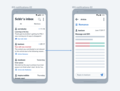 A reply field at the bottom makes sure you can ask questions in regards to a revert.
 -
 Tapping the notification leads users to article talk subject with an instant reply option.


9) We currently plan to incorporate an interface for quick reactions / default replies after tapping the aforementioned “Reply” field. In the screen below, you’ll see one of the explorations representing the concept of quick reactions. We are not planning to use emojis but would like to instead leverage common phrases, similar to how we e.g. have templates for welcoming newcomers in various ways or how admins can choose common reasons to block someone. What are some common replies or phrases you use when interacting with other editors on-wiki?

10) We’re currently working to make sure important Wikipedia notifications are seen inside and outside of the Wikipedia app. We are looking at notification reminders (e.g. receive weekly notification reminders about a revert until the notification is marked as read). Notification reminders will be modifiable through user settings. Please select your reaction to this proposed functionality.
A) Yes, I’d love to see this functionality.
B) No, I don’t like this functionality.
C) I am indifferent.
Results
[edit]We received feedback from an English Wikipedia editor, Arabic Wikipedia editor, and Indonesian Wikipedia editor.
1) Variant A is the winner The first question we wanted to understand which icon was better for discoverability. Our Arabic and English users chose A (Bell Icon top right) as their first choice, and our Indonesian user chose A as their second choice. B (top right overflow menu) was the first choice for the Indonesian user, the second for the English Wikipedia editor and the third choice for the Arabic user. C (Bottom navigation) was ranked second, and the last choice for our Indonesian and English Wikipedia user.
2) Bell Icon is the winner
All three users associate the bell icon for notifications. The inbox was understood as a link to messages. The person iconography was associated with a profile, user page or ping.
3) We are going ahead with our assumptions made in T288064, as the consistent notifications that were prioritized by respondents were: mentions, talk page messages, email from other users, edit reverts and user right changes.
4) All respondents were in favor of the idea of having mentions separately and that mentioned they would appreciate some sort of grouping within the 'All' tab
   The idea of separating the notification types on the Android app is a good one. The information is presented in an understandable and efficient way but the other notifications might be jumbled up under 'All'.
  Quotes from respondents:
That's an excellent idea. However, it would be nice to separate some of the notifications into several categories. The 'All' section is still confusing.
   I think separating notifications is a good idea, but having All might bury important notifications inside, like what's happening with FB, even with the iconography used. Mentions might be merged with emails to give more sense
- Our thoughts:* Grouping could make it easy to miss notifications, so we will see how filtering addresses the organization challenge
5) Two users prefer mentions first and all secondarily. One user prefer all first. To reduce risk we will have 'All' first and review metrics around people clicking on mentions.
Answers:
   “I would prefer all notifications as the default tab. If I had to organize my notification home center, I would have tabs for each notification type and a button/text to 'view all notifications' which would remove/hide the tabs and just show all the notifications in a list.”
   “I suggest adding the 'Edits' section in the notification. This section contains notifications about edit reverts, page links, thanks, and translation. For the default tab, I prefer mentions because when admins give warnings, users can see them instantly.”
   “I'd like to see Mentions and emails merged under one name and then All. But in the All, I want to be able to distinguish easily the list of notifications, maybe use a slightly different color variation for the background + the icon.”
6) Filtering by type: Ranking (point scale from 1-9)
   D (22 points): Grouping of notifications (e.g. if someone received several “Thanks” for an article edit, should it be grouped) [Grouping by Mentions].
   C (21 points):** Filtering by type [action item for design]
   B (17 points):** Filter by project, task created: T288068
   E (14 points):** Search for new notifications: Yes. Search for archived notifications: No (as technically not ready / out of scope)
   H (13 points):** Customizable swipe left and right gestures~~ (No, since design feedback from experienced Android users advocated for one swipe gesture [Mark as read]
   A (12 points):** Filter by language, task created (T288068)
   F (11 points):** Better preferences, task created (T287477)
   G (11 points):** Notifications for Watchlist (Not now, as technically not ready / out of scope)
   I (11 points):** Easy access to archived notifications. New designs have been improved and it’s easy to access it
7) Page links was the only thing mentioned as missing, and it has been added in the designs (T287477) 8) One user said: More context is needed for edit reverts or article talk. Otherwise people are ok with the suggestion 9) "Thank you". "I'll fix that", "I agree", "Thanks for pointing that out" "Well done" "Very good point, it will be updated" (Task created: T288105) 10) People would like to see notification reminders (V2 option)
Research Questions
   When asking a user to check their notifications, in the app, where do they click?
   What flows and actions do users expect when they have push turned on vs. those that have it turned off?
   What are the expectations of what a user will see if they click a bell vs. an inbox and what are the tradeoffs for consolidation?
   Do users believe elements of the user talk page should be in the notification center?
Primary feedback audience
[edit]We welcome feedback from all current and prospective Wikipedia editors.
However, we are especially interested in hearing how our tools potentially impact:
- English Wikipedia editors in India with visual impairments
- Hindi Wikipedia editors
- Arabic and French Wikipedia editors in Morocco, Egypt, DR Congo and Mali
- English Wikipedia editors in Nigeria
- Indonesian Wikipedia editors
- Female and Non-Binary Japanese Wikipedia Editors
The groups above have been selected based on research the team conducted earlier this year about how current audiences and potential growth areas in alignment with the WMF Product Strategy.