Kusoma/Wavuti/Ufikivu wa kusoma/Sasisho
Mei 2024: User testing results, beta feature usage data, and the first version of dark mode now available
User testing results
We have performed usability testing on the Appearance menu. You can see the full results here. In short: in the Appearance menu (previously: Theme menu), the typography, width, and dark mode options are placed. The goal of the testing was to determine whether the menu is easy to use, and whether the names of the different settings are intuitive to most users. From this testing we learned:
- No significant usability issues were found.
- Users generally preferred to refer to a "dark" color scheme or "night" color scheme. As a result, we have changed the name of the feature back to "dark" color scheme or dark mode for short.
- It was difficult for users to find the menu icon once collapsed. As a result, we have added a notice that informs users of where the menu has been collapsed to.
Beta feature usage data
We have been tracking the usage of the new menu as a beta feature. You can see the full results here. In short, we learned that "standard" was the most popular option to select. We also saw:
- About 55% of clicks to the new menu were for a font size that was larger than the default (either standard or large font sizes)
- The majority of the clicks, 46.7%, were for the "standard" font size.
This confirms that most users prefer a font size that is larger than the current default. We previously saw this in the findings from the community prototype testing. We will use this data to decide on the new default settings.
Dark mode is now available
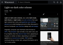
Dark mode is now available to logged-in users on the mobile site (Minerva skin only)! To access this feature, you must be opted into advanced mode for mobile. Then, you can select "dark" from the list of color options. (Note: "automatic" will follow the preference of your device.) See the more detailed message about this change, and go to the FAQ page to see more information about the basics of this project.
Main pages will be displayed at full width
Currently, main pages, like articles, are displayed at limited width. Considering the two-column layout with pictures, and the current typography, the line length there (measured by characters per line, CPL) is acceptable. When the default font size is increased though, CPL becomes a bit too small. This is why we have decided to disable the limited width on main pages by default. Instead, they will be displayed at full width like special pages. For more technical details, see T357706.
Aprili 2024: Early access to the dark mode (mobile web, logged-in)

Habarini nyote, kama ilivyotangazwa mnamo Novemba, timu ya Wavuti katika Shirika la Wikimedia Foundation inashughulikia modi ya giza (wakati fulani pia huitwa hali ya usiku). Sasa, tumezindua kipengele kwa watumiaji walioingia katika akaunti iliyoboreshwa ya simu kwenye miradi yote ya wiki zote kwa madhumuni ya majaribio. Lakini usiogope, kipengele hicho kipya hakisumbui! (Angalia sehemu ya "mapungufu yanayojulikana" hapa chini.) Ni muhimu tushirikiane pamoja nawe kabla hatujakizindua kipengele hiki kwa hadhira pana zaidi. Malengo yetu ya awali kuhusuu usambazaji ni:
- Kuonesha kile tulichounda mapema sana. Kadiri mnavyoshirikiana nasi mapema, ndivyo sauti zenu zitakavyoonekana katika toleo la mwisho
- Kupata usaidizi wenu kuhusu kuripoti hitilafu, masuala mbalimbali na maombi
- Kufanya kazi na wahariri wa kiufundi kurekebisha vigezo na vidude mbalimbali kwa hali ya giza
Nenda kwenye ukurasa wa mradi na Ukurasa wa Maswali yanayoulizwa mara kwa mara ili kuona maelezo zaidi kuhusu misingi ya mradi huu.
Mapungufu yanayojulikana ya toleo lililotangulia
- Kwa sasa, hali ya giza inapatikana tu kwenye simu ya mkononi, kwa watumiaji walioingia ambao wamechagua hali iliyoboreshwa, kama sehemu ya uhuru wa kuchagua mara mtu atumiapo hali hiyo.
- Huenda baadhi ya vifaa visifanye kazi vizuri na hali nyeusi na huenda itabidi kuvisasisha.
- Lengo letu la kwanza ni kufanya hali ya giza ifanye kazi kwenye makala. Kurasa maalum, kurasa za mazungumzo, na nafasi zingine za majina bado hazijasasishwa ili kufanya kazi katika hali nyeusi. Tumezima kwa muda hali nyeusi kwenye baadhi ya kurasa hizi.
Kile ambacho tungependa mfanye (kama jumuiya kwa ujumla)
Ikiwa una maswali - tuulize! Pia, inapofaa, unaweza kujiunga na mjadala kuhusuMapendekezo ya uoanifu wa hali nyeusi kwenye tovuti za wiki za Wikimedia kwenye kurasa zinazoeleza jinsi ya kufafanua rangi katika msimbo. Hivi karibuni, ukurasa huu utasetiwa tayari kwa kutafsiriwa. Tungependa kusisitiza kwamba mapendekezo yanaweza kuzidi kutopokelewa. Kwa sababu hiyo, hatupendekezi kuunda nakala za mapendekezo katika mradi wa wiki yako. Ikifanyika hivyo,wakati fulani, nakala inaweza kuja kuwa tofauti na toleo asilia.
Kile ambacho tungependa mfanye ninyi kama (wahariri wa violezo, wasimamizi wa kiolesura, wahariri wa kiufundi)
Hitilafu nyingi zinapotatuliwa, tutaweza kufanya hali ya giza ipatikane kwa wasomaji kwenye kompyuta za mezani na kwenye simu. Ili hili lifanyike, tunahitaji kufanya kazi pamoja nanyi katika kuripoti na kutatua matatizo.
- Ili kuiwasha hali hiyo, tumia tovuti ya simu ya mkononi na uende kwenye sehemu ya |mipangilio ya menyu yako na uchague kuingia katika hali iliyoboreshwa, ikiwa bado hujafanya hivyo. Kisha, seti rangi iwe hali ya giza. (Baadaye, tutaruhusu mapendeleo ya kifaa chenyewe kuweka hali ya giza kiotomatiki).
- Baada ya hapo, nenda kwenye nakala tofauti na uone kama utapata changamoto zozote:
- Ikiwa umegundua tatizo lolote la kigezo na hujui jinsi ya kulitatua
- Nenda kwenye ukurasa wa mapendekezo na utafute mfano unaofaa
- Ikiwa hakuna mfano unaofaa unaopatikana au huna uhakika wa kurekebisha, wasiliana nasi
- Ikiwa unataka kurekebisha vigezo vingi katika hali ya giza
- Nenda kwenye https://night-mode-checker.wmcloud.org/ na ubainishe vigezo vinavyohitaji kurekebishwa. Zana hii inauwezo wa kuonesha makala 100 bora zilizosomwa zaidi.
- Nenda kwenye ukurasa wa mapendekezo na utafute mfano unaofaa
- Ikiwa hakuna mfano unaofaa unaopatikana au huna uhakika wa kurekebisha, wasiliana nasi
- Ikiwa ungependa kutambua matatizo zaidi ya makala 100 bora.
- Sakinisha kiendelezi cha kivinjari cha utofautishaji cha rangi cha WCAG (Chrome, Firefox) na utembelee baadhi ya makala. Itumie kutambua matatizo
- Nenda kwenye ukurasa wa mapendekezo na utafute mifano inayofaa
- Ikiwa hakuna mfano unaofaa unaopatikana au huna uhakika wa kurekebisha, wasiliana nasi
- Ikiwa una ripoti ya hitilafu ya hali ya giza ambayo haihusiani na violezo
- Piga picha ya skrini ya kile unachotazama.
- Wasiliana nasi. Ikiwezekana, tafadhali andika toleo la kivinjari chako na toleo la mfumo wa uendeshaji.
- Ikiwa umegundua tatizo lolote la kigezo na hujui jinsi ya kulitatua
Asante. Tunatarajia mtazamo na maoni yako!
Desemba 2023: A new beta feature: Accessibility for Reading (Vector 2022)

The Web team from the Wikimedia Foundation launched a new beta feature. The goal is to make reading on desktop more comfortable. The feature is only available to logged-in editors using the Vector 2022 skin. To try it out, go to the "beta" option in the user menu and select "Accessibility for Reading (Vector 2022)". You may also enable it on all wikis using the global preferences.
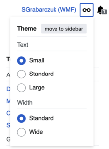
In the new menu, there are three text settings – small, standard, and large. Small is the current default. Large is for users who need additional increase in size. The standard setting may later become the new default. This was recommended by both the literature research and prototype testing. To this menu, we have also added the page width setting. Before, it was available in the bottom corner of the screen. Now, it's easier to find. The menu is pin-able in a similar way to the Tools and Main menus, both placed in the side columns of the desktop interface. When it's not pinned, it's displayed next to the user name.
About the above mentioned prototype testing: in October and November, we shared a prototype with 13 Wikipedia language communities. It allowed editors to experiment with different text settings, and report which configuration was most comfortable for them. We received feedback from 632 users. They were interested in changes and preferred options that fit within three size categories – small, medium, and large. You may learn more about the testing here.
We welcome you all to try the new menu. We will collect your ideas and comments to make this feature better. Please, if you have the time, check it out and give us your thoughts!
Novemba 2023: Prototype testing results and next steps

In October and November, we shared a prototype with 13 Wikipedia language communities and received feedback from more than 600 editors and other logged-in users. The prototype allowed them to experiment with different font sizes, line height, and paragraph spacing, and report which configuration was most comfortable for them.
The majority preferred a slightly larger font size and line height than the current default (around 15 – 17px). A large group showed a strong preference for the current default (14 px), while a smaller group preferred significantly larger font sizes (20–24px). See the full results of the testing.

We learned that editors who decided to take part in the test are interested in changes. We hope that small, medium, and large options to choose between will be received positively.
In the first half of December, on all wikis, we will launch a new beta feature which allows to select the preferred typography. The feature will be opt-in and available in your user preferences. Turning it on will display a new collapsible menu in the right sidebar, which will appear under the Tools menu.
We invite you to look out for it, try it out when it becomes available, and tell us what you think. In the meantime, if you have time – read over the report linked above and take a look at the mock.
Oktoba 2023: Dark mode and a prototype for readability improvements


Introduction to a new project
As the Wikimedia Foundation Web team, we are beginning a project called Accessibility for reading. The goal is to make the wikis more accessible and comfortable for reading. We are starting with the font size and typography for articles. In the next phase, we will focus on color palette customizations, such as dark mode. All these will be available for both logged-in and logged-out users as settings, on both desktop and mobile web.
This project is a consequence of the many requests from volunteers. We would like to thank everyone who has asked about this. On the technical side, dark mode is easier than the font size, but it will need more involvement from the communities. This is why we are asking you to follow our project. Watch the project page and subscribe to our newsletter.
Test out our prototype
Now, we would like to make articles easier to read and scan for casual readers. We aim for:
- Making the default font size bigger (but not too big) to improve readability
- Increasing the information density to improve scanning
- Increasing the space between paragraphs and sections to improve scanning
- Allowing readers (including logged-out users!) to customize the density of text
This will apply to articles in the reading mode and in VisualEditor, but not in the wikitext editor. We are planning these changes to apply across all the wikis. The default may vary based on the language or script of the project.
We have prepared a prototype that allows for various changes in the font size and spacing. To use the prototype, force a banner to appear and click on it. Next, try out different combinations and share what works for you. This prototype is not a reflection of the final design. Instead, we would like to learn what font sizes Wikimedians want to see across languages. We will use this data to determine the proposed default and options. Read more about the test.
