
User:JDrewniak (WMF)/notes/System font stack
System font stack proposal [edit]
In T175877, a proposal was made to change the fonts used on mobile Wikimedia websites. The proposal suggests using fonts that were designed specifically for popular operating systems (Android, Windows, iOS, Mac, Linux). This font stack is commonly known as the "system" font stack. The rationale behind this change is that, because these fonts were designed specifically for the screens and OS's the user is looking at, they offer a better reading experience than the default fonts, which in some cases (e.g.Helvetica) predate the operating system (and personal computing in general) by decades.
The proposed font stack (CSS)[edit]
body {
  font-family: -apple-system, BlinkMacSystemFont, "Segoe UI", Roboto, Lato, Oxygen-Sans, Ubuntu, Cantarell, "Helvetica Neue", Helvetica, Arial, sans-serif;
}
This font stack correlates to the following operating systems.
| font | OS - Browser |
| -apple-system | MacOS / iOS 9 & up - Safari |
| BlickMacSystemFont | MacOS - Chrome, Firefox |
| Segoe UI | Windows 7 & up / Windows Phone |
| Roboto | Android 4 & up |
| Lato | Wikimedia recommended font |
| Oxygen Sans | KDE |
| Ubuntu | Ubuntu |
| Cantarell | Gnome |
| Helvetica Neue | MacOS / iOS 8 & down |
| Helvetica | ? |
| Arial | Window Vista & down |
| Sans-serif | default browser fallback |

Testing methodology[edit]
This report serves to test whether these new fonts actually do provide a better reading experience across the ~300 languages used by Wikimedians today. The proposed fonts should have equal or better language support than the current font, and provide a visually improved reading experience (i.e. are they "more legible" or do they look "better").
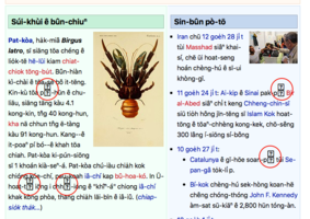
To test this hypothesis, screenshots of the home pages of Wikipedia in every available language were taken and analyzed for differences and potential errors. These screenshots were taken on all popular operating systems and browsers.
See the font stack screenshot table

Implications[edit]
On mobile[edit]
Users of iOS 9 & up, and Windows Phone would see a font change. Android, however, would largely be unaffected. This is because stock Android comes packaged with precious few fonts. On versions 3 & down, stock Android only comes with the "Droid" font family. On versions 4 & up, stock Android comes with the "Roboto" font family as the only sans-serif option. Third-party Android vendors however, sometimes package their own fonts on Android, like "Samsung Sans" and override the default sans-serif font. In this scenario, specifying "Roboto" in the font-stack might gives users a more consistent experience across Android devices[1].
Users of iOS 8 & down would be unaffected by this change since Apples’ system font "San Francisco" was only introduced in iOS version 9. Previously, the default font was "Helvetica Neue".
On desktop[edit]
Although this change is targeted at mobile devices, if implemented on desktop, this change would be significant. Windows users would see the biggest upgrade. The Segoe UI font is significantly more readable than Arial across a wide array of languages, and is being vigorously improved by Microsoft[2]. See Highlights by OS, Windows for more details.
In testing, the only noticeable degradation on desktop was seen on Safari on MacOS (however, these bugs were not reproducible on a stock installation). When testing locally, the San Francisco font was missing a few diacritic characters that resulted in missing characters (squares with question marks) on Safari. On chrome and Firefox however, these missing diacritics fell back to "Helvetica Neue" and remained legible.
Technical Implications[edit]
On the web, fonts play a role not only in text, but sometime in layout. When using the ‘inline-block’ display type for example, the white-space properties of a font can effect the spacing as well as the width of HTML elements. The line-height of fonts can also effect layout. This means that text-inputs can get wider and elements can be misplaced if a font changes. No major changes of this nature were observed in testing, but if implemented on desktop, changes to Visual Editor and other rich applications would have to be examined across a wide range of browser and operating systems.
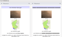
-
 Example of how font change can push down the layout of a page. "San Francisco" font on iOS 9
 -
 Input being widened by "San Francisco" font on iOS 9


Highlights by operating system[edit]
iOS [edit]
San Francisco - Rounder, lighter, wider.
In general the San Francisco font is wider in all directions. It has wider character spacing, larger line-heigh and slightly bigger x-heigh than helvetica. Language support is on-par with Helvetica.


Windows[edit]
Segoe UI - shorter, wider, bolder.
Segoe UI has a smaller x height and larger line-height than Arial. It has better anti-aliasing, making it seem blacker than other fonts on Windows, and the bold version is slightly bolder than Arial. Compared to Arial, Segoe UI has better support for Cyrillic, Greek, additional support for a multitude of south-asian fonts, and a much improved Arabic design.
See Unicode blocks supported by the Arial font vs Unicode blocks supported by the Segoe UI font.


Ubuntu[edit]
Certain flavours of Ubuntu, like "Kubuntu" ship with a wide range of freely-licensed fonts, among them is "Lato", the font preferred by the Wikimedia foundation design team. Lato supports 100+ Latin-based languages, 50+ Cyrillic-based languages as well as Greek and IPA phonetics[3]. It offers better legibility in Cyrillic scripts than the default Ubuntu font.
Mac OS[edit]
NOTE: Missing characters on Safari for Mac OS were only observered on one user's system, due to disabled some east-asian fonts. The missing characters were not reproduceable on a stock Mac OS installation.
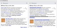
Testing on Mac OS revealed potential issue with missing characters in the proposed font stack change. This issue only appeared on Safari, and only on one personal computer. Manual testing on SauceLabs and Browserstack was unable to reproduce this issue, and user testing on a handful of other Macs did not produce this issue either. In this isolated incident, many Indian language Wikipedias displayed missing characters instead of the fallback font. This bug was spotted only on Safari on Mac, and only on one computer. Other browsers on Mac OS displayed the fallback fonts instead and did not display missing characters.
-
 Missing characters in San Francisco font
 -
 Missing character on Min Wikipedia


-
 Iu.m.wiki
 -
 or.m.wiki
 -
 ti.m.wiki
 -
 xmf.m.wiki
 -
 tcy.m.wiki
 -
 ta.m.wiki
 -
 si.m.wiki
 -
 pa.m.wiki
 -
 my.m.wiki
 -
 ml.m.wiki
 -
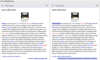 kn.m.wiki
 -
 ka.m.wiki
 -
lu.m.wiki


This bug appears to be an isolated event, since it was un-reproducible on stock Mac OS installations on SuaceLabs and Browserstack.
Conclusion[edit]
The proposed font-stack produced no negative effects on mobile Wikipedia. The changes to iOS were minimal, and no changes were observed on Android devices. Given these observations, it is probably safe to move ahead and implement this font-stack on mobile Wikimedia sites. The effects of this change on desktop Wikipedia were much more varied depending on the OS, and more prone to errors due to users disabling system fonts. Taking into account that it is unlikely a user would disable the fonts for their language, the overall effects of this change would likely be positive on desktop, especially on Windows, where language support would be increased with this change.