
Mobile design/Wikipedia navigation
 | This page is obsolete. It is being retained for archival purposes. It may document extensions or features that are obsolete and/or no longer supported. Do not rely on the information here being up-to-date. |
|
Mobile Nav
A design for optimizing the experience of Wikipedia on mobile devices, in particular within a mobile web browser
|
Wikipedia Navigation UI is a UX design that will be deployed on multiple mobile platforms, including mobile web browsers, WAP browsers, iOS apps, Android apps, and others. There will be differences across platforms and the most comprehensive version will be for mobile web browsers, where all functions not included in basic browser functions must be accommodated in the UI that accompanies Wikipedia.
A related design is known as Athena, which is focused on making the main Wikipedia site mobile-friendly. This design is focused on optimizing the reading experience as well as accommodating contributory functions as they are developed, leading eventually to more complex editing functions. In a sense, Athena is a sort of "destination" for the evolution of this design.
Glaucus is a design that provided input into this design. See the enhancement bug bugzilla:32117.
Design goals
[edit]The main goals of this design are as follows:
- A rational, easy-to-understand framework for the placement of functions related to Wikipedia
- Simple, obvious access to these functions in a way that conserves screen real estate
- Flexibility to add more functions over time in different categories - i.e., extensible without becoming cluttered or non-intuitive
- Compatibility with different mobile platforms and form factors - the minimum versions of this design should include:
- web browser on iPhone
- web browser on iPad
- web browser on Android smartphone
- web browser on Android tablet
- WAP browser on typical Series 40 device
- iPhone app
- iPad app
- Android phone app
- Android tablet app
(tablet versions can be developed later)
Design discussions
[edit]Some areas of this design require more detailed explanation and discussion. Please see the following pages:
Current Navigation
[edit]-
 Dark Main Menu
 -
 Pull Down Tab
 -
 Pull Down Tab Expanded
 -
 TOC
TOC -
 Contributors
 -
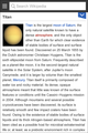
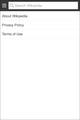 About 1
 -
 About 2


Initial menu
[edit]The initial design goals are:
- to separate the article-specific actions from more general actions
- to provide a flexible and rational way to add new functions going forward
- to not change the way search is prominently displayed and accessible in the current UI
This has been prototyped here, and is intended to be viewed in the standard browser of an Android phone. In addition, the mobile Beta site has an early functional implementation. To access the Beta, go to bit.ly/wmoptin.
There will be four variations of this design for:
- Android browser
- Android app
- iPhone browser
- iPhone app
Of these four, Android browser and iPhone browser will be the same initially, even though iPhone browser displays its own toolbar along the bottom of the screen. All four are shown in rough form here:

In addition, the design must work in a more basic form for feature phones. The basic strategy for feature phones is to eliminate transitions and show screens or toolbars as full screens.
Early design versions are shown below under Design studies.
Feedback and terminology
[edit]Feedback can be viewed and posted here.
In order to simplify communication, let's use the following terminology:
- Article Page
- The view of the article with the search bar across the top
- Search Bar
- The toolbar at the top of the Article Page
- Search Field
- The rectangle where a search is initiated
- Main Menu
- What is revealed as the full-screen menu on the left
- Main Menu Button
- The W that causes the Article Page to slide to the right
- Article Action Bar
- The toolbar that comes down from the search bar
- Submenu
- The screen or step that appears after selecting a menu function
Menu organization
[edit]Menu commands can be viewed as belonging to three general categories:
- article-specific
- nav and general
- user-specific
In the design, the intention is to separate article-specific functions from general and user-specific ones. The article-specific functions are in the Article Action Bar, and the other functions are in the Main Menu.
Site
[edit]Here are the functions to include initially for the mobile site:
- Inter-wiki language links -> submenu
- Table of Contents -> submenu
- Contributors
---
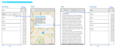
- Home
- Random
- Nearby (when ready)
---
- Desktop / Mobile view (could go in footer, but currently site-specific)
- Settings -> submenu
- Beta opt-in/opt-out
- Disable images
- Font size
- About
Apps
[edit]Here are the functions to include initially for the apps:
- Inter-wiki language links -> submenu
- Table of Contents -> submenu
- Save page
- Share page -> submenu
- Contributors
---
- Back
- Forward
- Save pages -> submenu
- History
- Home
- Random
- Nearby
---
- Settings -> submenu
- Disable images
- App languge
- Font size
- About
"Nearby" and "Save page" are not yet implemented on the mobile site. Also Login will not be needed initially.
Icons
[edit]1. The design partly looks very "Android" (the 'dot dot dot' actions icon, 'highlighting bars' over buttons, interface style in general). This will be a problem with (some) iOS users. It's not alway best to go the 'same design on all platforms' route on cross platform apps. Especially if it's not a niche app, but will be used (hopefully) by millions of users.
2. The "W" button could be problematic. Most of the apps using this slide-in-out-navigation use a "three lines" icon on the button (Path, Facebook, Sparrow). You could even consider it standard by now.
The "W" is part of the logo and identity, the three lines are the icon connected to "show me navigation". So put the W somewhere else (Besides the app icon and the launch screen, maybe inside the search field like the search provider switcher ion in Firefox, into the slide-in navigation, etc) and use the standard one.
I can see the W as the "Home" button of the app, that goes back to a dashboard or even opens a dropdown. There I probably wouldn't feel so strong about it. But showing the slide-in navigation is different. Somehow ;)
When the W is a button that opens a dropdown this makes sense. But for the slide-in navigation this type of indication (small arrowhead) is almost never used, or may be I just never saw it. I always tell my designers that additional arrows, highlights and such stuff often are trying to fix a problem, that is there only because of some more fundamental problem. The functionality should be clear enough without the non-standard/common addition.
- Jan Piotrowski
Now I think about this some more a puzzle piece tends to mean add-ons / extensions so I don't think it would be a suitable choice of icon.
- Jon Robson
I think someone else suggested this, but what about a big down arrowhead? That would correlate with the down arrow in the section headings.
I am also thinking about symbols that imply action, or extending the reading of the article in some way. --Pchang (talk) 21:46, 18 April 2012 (UTC)
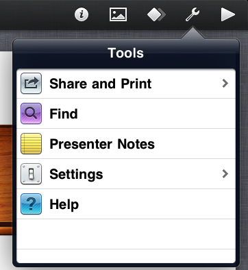
Maybe a tool icon would work. Usually if I can't find some action in an app, I look under tools. Example: http://km.support.apple.com/library/APPLE/APPLECARE_ALLGEOS/HT4088/HT4088_tools-en.PNG - Axel Boldt
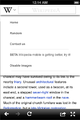
Contributors and View history
[edit]In order to comply with the CC-BY-SA license, there is a need to show the contributors of each article. This can be done via a link to the desktop view of "View history" or a more specific view of the contributors, which would probably be called, "View contributors."
Presentation models
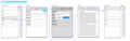
[edit]There are several possible presentation models for this. One is to reveal a menu from the W icon, as the mock-ups above show.
Another is similar to the Facebook menu which is revealed as the page slides to the right, to give the impression that it lies underneath the page. In this case, the menu is a full-screen list organized into sections and the page scrolls as necessary.
A different take on the Facebook approach is to have an icon in the upper right which causes the menu to slide in from the right, which would make it seem like it appears on top of the page.
Feature phones
[edit]The design of the navigation UI must accommodate feature phones, which will lack JavaScript and any form of animation. Or put another way, any UI approach must also work without animation, overlays or other sophisticated forms of presentation.
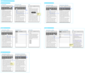
Design studies
[edit]Comparative research
[edit]The following file is a PDF with multiple pages.
-
 Navigation Research

Early design
[edit]This early design illustrates look and feel and the design goals.


Alternate Simple Wireframes
[edit]-
 Search first with suggested content
 -
 Search first and slider style main navigation

Search field open alternatives
[edit]-
 Open search bar with toolbar on bottom
 -
 Open search bar with everything in main menu


Alternate language comps
[edit]


Animated
[edit]
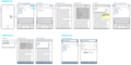
More detailed wireframes
[edit]-
 initial-entry-and-search
 -
 nearby
 -
 saved
saved -
 history
 -
 contact
 -
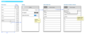 settings
 -
 article actions
 -
 read
read


Style Choices
[edit]


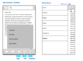
Early ideas
[edit]-
 Minimal header with visible search field (surface box).
 -
 Minimal header with visible search field box and drop menu.
 -
 Minimal header with visible search field (cut-out box).
 -
 Minimal header with visible search field cut-out box and drop menu.
 -
 W button alternatives


Language use
[edit]The use of language is a complex area that is more challenging on mobile devices than on the desktop. Currently, the language conventions differ by mobile platform and app/browser, though Android and iOS will be unified shortly.
On the desktop, the language of Wikipedia changes with the article in most ways. On mobile devices, some consideration must be given to the variables available on phones.
There are four different aspects of language selection:
- Main default language, typically defined as the app language
- Language of the phone
- Language of the article or content
- Language of the keyboard
In the Android app currently, this breaks down into:
- Default language - search language and home page language, based on app language and phone language
- Language of the article, linked from each article
- Keyboard language is somewhat independent
So a major consideration is whether the default language follows the app/phone language or the article language.
Language selection is a core part of the Navigation UI, though it also deserves further treatment as its own project. Here are initial designs:
- Wireframes showing sample workflows as the basis for further discussion:
Functional categories
[edit]The main categories of functions that will be included in the UI are as follows:
- Article-specific, such as inter-wiki language versions, related images
- General to Wikipedia, such as notifications, featured content
- Account-related, such as login, watchlists
- Contributory, such as photo uploads, article feedback
- Editing, such as photo patrolling, proofreading edits, visual editor, new page triage
Examples of these categories are listed below:
Article-specific
[edit]- History (required for copyright attribution)
- Inter-wiki links
- Contributors/View history
- Table of Contents
- Watch this article
- Find in article
- Save page
- Share page, including copy article URL
- Articles near this article
- Related pictures
- Discuss
- What links here
- Email about article to capture notes
General
[edit]- Home
- Random
- Contact us
- Beta opt-in/opt-out
- Disable images (site and app)
- Save pages (app and site)
- Articles nearby (app and site)
- Recent changes
Account-related
[edit]- Login
- Watchlists
- Notifications
- Talk page
- Contributions
- Settings
Contributory
[edit]- Photo upload basic
- Photo upload "articles nearby"
- Article feedback
Editing
[edit]- Photo upload patrol
- Proofreading edits
Illustration of menu growth
[edit]Here is a rough breakdown of what features could appear in cumulative fashion:
| Feb 12 (current UI) | ... | Aug 12 |
|---|---|---|
|
Article-specific
General
|
... |
Article-specific
General
Account-related
Contributory
Editing
|