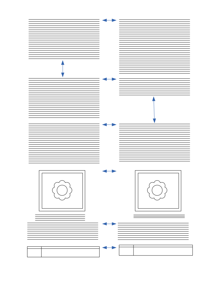
Content translation/Product Definition/Section alignment
The sections in the source and translation columns need to be visually aligned to indicate the connections.
Diagram
[edit]The following diagram illustrates the presentation of content in both translation and source columns. As we can see all sections are top aligned. If a section takes more space in any column, then the other column should have enough padding to align the next sections.
Otherwise, the text you are currently translating could appear too far up/down (either because you are just translating a paragraph in the middle of the article or because target language uses much longer/shorter words than source) that you need to continuously keep scrolling when translating. In addition, it allows to see an overview of which parts of the article are translated already an which ones are not (e.g., if I translate paragraphs 1 and 3, it is good to have the paragraph 2 gap so that I can decide later to translate it).

Sections
[edit]The following html elements are considered as sections
- div, p,
- table, tbody, thead, tfoot, caption, th, tr, td,
- ul, ol, li, dl, dt, dd,
- h1, h2, h3, h4, h5, h6, hgroup,
- article, aside, body, nav, section, footer, header, figure, figcaption, fieldset, details, blockquote,
- hr, button, canvas, center, col, colgroup, embed,
- map, object, pre, progress, video
UX details
[edit]- When user edits the content in translation column, if the section grows, the alignment need to be refreshed. For example, if the translated paragraph is bigger than the source paragraph, the source paragraph should have bottom padding to match the height of translated paragraph
- When the resulting action is to add a paragraph (and only in that case), we need to communicate this better:
- The cursor should be a hand (pointer).
- The "+Add translation" label should be also visible when I hover the source paragraph that can be added.
- Highlighting the whole source paragraph when hovering either the source or translation area will help to indicate that this is going to be processed.
- We should disable the regular link behavior
Scrolling
[edit]From testing, the separations between paragraphs helped to focus on the work at hand but were not big enough to break the article flow. Having two separate scrolls will be adding complexity if they are dealt manually. If they have some kind of automatic syncing it will be hard to do them well too. If we keep the paragraphs next to each other, the differences of length accumulate at the end of the document (I created a schematic illustration of both models below). In the second you cannot compare source to target just by scanning. Aligning them with the current paragraph being edited could be an option to explore but it will force us to have one active paragraph.

