Topic on Talk:Wikimedia Developer Summit/2017

Quiddity (WMF) (talkcontribs)

A few comments:

  • There's a div overlap problem with the current design.
  • Hiding the default H1 header:
    • This is confusing for people (like me) who expect to find it in a consistent location.
    • This creates a problem with the "Gadget-edittop.js" gadget (per my screenshot)
  • I personally prefer a plain or default aesthetic for wikipages, for a few reasons.
    • It makes it easier to edit the contents in both wikitext and visual editor.
    • Aesthetics are subjective, which is part of the reason why the wiki communities have generally used a very simplistic styling. Aka "content is king". Any embellishments purely for aesthetic reason can hence be problematic - either distracting to a subset of users, or subjectively 'ugly' to a subset of users. Plain wikipages might be 'boring' (in some opinions), but they're not actively offputting.
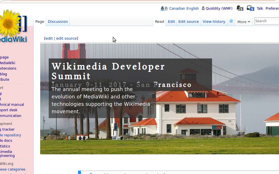
  • Photo:
    • I don't think the current header photo (the building&landscape) is a good, because attendees will be inside most of the day, talking to people. People (and the projects they create) are the focus of the event, and not the location.
    • It's also extra bandwidth to download on mobile, and attendees will likely be checking the page regularly in order to see the schedule, throughout the event.

Ping @Qgil-WMF for feedback. Hope that helps.

Qgil-WMF (talkcontribs)

I have played a bit with the divs. Does it look better now?

The tagline is lost in mobile, but I don't know how to solve it. "Mobile view" in desktop looks fine, but not on an actual mobile device.

Still, I think this is good enough to unblock the opening of registration.

Quiddity (WMF) (talkcontribs)

The div overlap is fixed, at least in my browser. Thanks.

I still object to over-riding the page-title in particular. I suggest putting that back to normal, but leaving the sentence "The annual meeting to [...]" with the fancy overlay styling.

More importantly, the registration cannot open and point to the page until the blue buttons are fixed! (They currently have strikeout styling and lead to irrelevant targets)

Qgil-WMF (talkcontribs)

Those divs need to work well, that is for sure.

The primary target of this page are the people who don't know about the Summit and might have an interest in being there. The intention is to make this page informative and attractive for that people. Having an event landing page that looks as much as possible like an event landing page and not like a Wikipedia article is not a bad thing imho. Most conferences and events sport big images and fonts, yet they seem to be doing quite well. A plain wikitext page can be off-putting indeed, when the impression it gives is that it is some documentation about an insiders' meeting.

Confirmed participants in the event (like you in a few days) will look at this page once or twice, and then rely on Wikimedia Developer Summit/2017/Program for their frequent checks. The landing page will keep being a rather static page to capture new participants.

Extra bandwidth on mobile... These days anybody checking Facebook etc on mobile are downloading a lot more bandwidth every minute, and they don't even notice or care.

@Rfarrand (WMF) @MKramer (WMF) more perspectives are welcome!

Rfarrand (WMF) (talkcontribs)

I really like to image and the new look of the page. It makes it seem more professional and inviting - but thats just my perspective.

Reply to "Page design"