
Talk:Flow/Design/Iteration 4
Oliver's thoughts[edit]
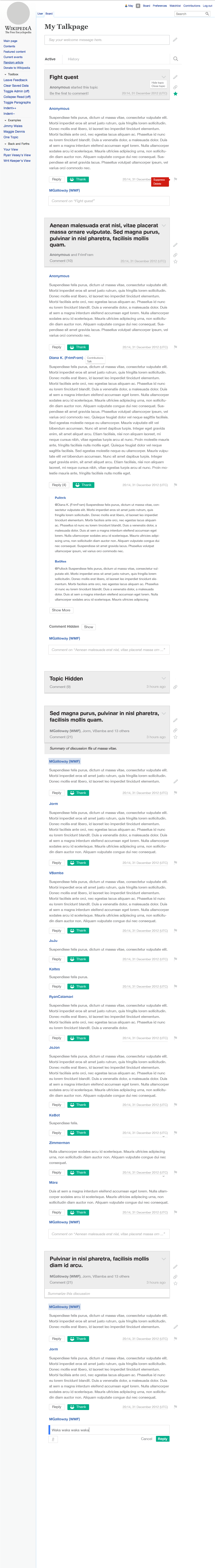
- What's the rationale for having "hide" in a distinct place from suppress and delete?
- From our last discussion, we talked about how we want to encourage the editing title behavior whenever possible instead of suppressing/deleting. Cus what if there was already comments and replies, it'd be better to edit than delete/suppress. When there isn't comments yet and is inappropriate and no one knows a better way to edit it, we hide it. What do you think, I cannot remember all the details why we chose that route. May Galloway (talk)
- Should the watchlist icon (I assume that's what the green star is?) be available on your own talkpage? Surely any thread/post directly sent to you is one you should be notified of, etc.
- That makes sense, but what if you chose to unwatch from a few? May Galloway (talk)
- "Anonymous started this topic" - is the plan to not display IP addresses?
- There were talks about using "Anonymous User" with IP in rollover or flyout that we need to talk to James about. May Galloway (talk)
- "Topic hidden" should presumably be in addition to rather than instead of the actual topic name - otherwise it's impossible to tell what it's about without opening it up, or to distinguish multiple hidden threads/reference it without linking.
- True, but what if it's completely inappropriate? Something we should talk about next. May Galloway (talk)
- I think "Topic hidden" is that sample topic's title, not literal text that appears when a topic is collapsed. -- S Page (WMF) (talk) 19:15, 1 October 2013 (UTC)
- OtherUser - onclick
- Actually this was purposeful, since if you are hiding a topic its likely because it is either unfixable (you couldn't edit the title to make it ok) it or none of the content of the topic is acceptable/redeemable, so it was hidden. Therefore the title is hidden because its likely the the title itself may be the issue. Jared Zimmerman (talk) 23:28, 1 October 2013 (UTC)
- We might want to discuss placement/visibility of the talk and contributions links: we're building a system to improve communication that hides the ability to communicate.
We should. There is a flyout when a user hovers over a username. If someone wants to go another user's talk page do we think that they wouldn't make the effort to at least hover over their username? We also want to be as clean as possible on this layout so we want to make sure this is indeed that important to display upfront. May Galloway (talk)
- Closed discussions (I assume that's what summarised discussions are?) should have some kind of colouration, and not allow new comments.
- Summarizing discussion text field show after a certain number of comments/replies, not necessarily to close. But I agree when closing, we should have a color-coding going on. Editing on here is a pain, I need Flow. May Galloway (talk)
- Okeyes (WMF) (talk) 17:35, 1 October 2013 (UTC)
Participant algorithm[edit]

The topic card for each discussion contains a list of name of users participating in that discussion it is visualized as
Username, Username, Username, and XX others
Where the First/Bold username is currently the original topic creator(OP).
I (JZimmerman (WMF)) would like to work with the community to come up with the best way to sort and display the remaining names. During our design review we came up with a few options:
Option 1 - chronological[edit]
- 1st position = OP
- 2nd Position = 2nd Poster
- 3rd Position = 3rd Poster
- 4th Position = , and XX others
Option 2 - by number of topic level posts[edit]
- 1st position = OP
- 2nd Position = Poster with most topic level responses (comments, not tangents)
- 3rd Position = Poster with second most topic level responses (comments, not tangents)
- 4th Position = , and XX others
Option 3 - by total size of posts[edit]
- 1st position = OP
- 2nd Position = Poster with highest level of contribution (bytes)
- 3rd Position = Poster with second highest level of contribution (bytes)
- 4th Position = , and XX others
Option 4 - by mixture of 2 and 3 and total posts[edit]
- 1st position = OP
- 2nd Position = Poster with highest topic contribution metric (weighted mixture of top level of comments, tangents, bytes)
- 3rd Position = Poster with second highest topic contribution metric (weighted mixture of top level of comments, tangents, bytes)
- 4th Position = , and XX others
The goal would be to decide a sort and display method that best shows at a glance the makeup of the participants in a conversation. —The preceding unsigned comment was added by JZimmerman (WMF) (talk • contribs) 18:30, 1 October 2013 (UTC)
Sentence capitalization[edit]
I think UI elements should use sentence capitalization consistently, so
- [Load more] and [Show more] , not [Load/Show More]
- Comment hidden, not Comment Hidden
-- S Page (WMF) (talk) 19:27, 1 October 2013 (UTC)
- Sure -- May Galloway (talk)
Visual details[edit]
Button inconsistency with vs. Agora spec[edit]
The plain white [Reply] buttons and others don't match the [Other actions] sample in "BUTTONS" spec on page 3 of File:Agora_specs.pdf:
- Agora spec has slightly thicker bottom edge
- Agora spec has bold text
The colors of the green [:)Thank] button don't match the green [Save changes] sample here, and again it's not bold text
-- S Page (WMF) (talk) 19:41, 1 October 2013 (UTC)
- I will clarify this in another spec doc. But styling will follow original Agora style, except for the button size. -- May Galloway (talk)
Topic title area rendering[edit]
The big images like File:0_My_Talkpage_Landing.png show the gray talk page area with an inset line curled up at the corners at the bottom, looking like a "double rule". But File:Specs.png has simply a thicker bottom line. I assume the latter is more correct. -- S Page (WMF) (talk) 19:54, 1 October 2013 (UTC)
- Not sure if I know what you're trying to say. But hopefully I've smoothened out some problems here: https://www.mediawiki.org/wiki/Flow_Portal/Design/Iteration_5-- May Galloway (talk)
Light blue background?[edit]
What does the light blue background behind some of the dark blue "MGalloway (WMF)" links in File:2_OtherUser_Mouseover.png signify? -- S Page (talk) 19:59, 1 October 2013 (UTC)
- S Page (WMF), It's May's board, so her posts are called out Jared Zimmerman (talk) 21:02, 1 October 2013 (UTC)
- Aha. It's the only background highlight that isn't a button, so it seems out of place; instead could bold the name on your own posts and leave the others regular font, as I did above^^.
Also, is there any behavior on mouseover of a username, e.g. reveal "Talk page | show contribs" links? -- S Page (WMF) (talk) 22:57, 1 October 2013 (UTC)- talk for the mentioned user names, thats still iterating, but I think we can move forward with something like we have. for the talk/contribs you can see this on the hover page https://upload.wikimedia.org/wikipedia/commons/6/6e/3_OtherUser_OnClick.png for user Diana K Jared Zimmerman (talk) 23:08, 1 October 2013 (UTC)
- Aha. It's the only background highlight that isn't a button, so it seems out of place; instead could bold the name on your own posts and leave the others regular font, as I did above^^.