
Growth/Personalized first day/Variant testing
Starting in December 2019, the Growth team started testing variants of features against each other -- instead of just building one version of a feature and seeing whether it does or does not increase new editor retention. Testing variants will help us learn and iterate faster. This page contains running lists of variants we want to test for our different features, which we'll draw from when planning tests going forward. The lists are long and exhaustive, but we expect to test under 10 of these per year.
Newcomer tasks variants[edit]
Below is the list of feature variants we would be interested in testing for newcomer tasks. Competed tests have summarized results in the table and full results in the section below.
| Name of test | Component | Variant 1 | Variant 2 | Question/Result | Status |
|---|---|---|---|---|---|
| Initiation | Start module | Users click a button in the start module to initiate the suggested edits module, and proceed through overlays | Suggested edits module is already present on the homepage the first time a user visits. | Variant B yields more interaction, navigation, and clicking, but only on desktop. On mobile, the variants perform the same, with Variant B leading to less clicking. Subsquent analysis showed that Variant A led to more users editing on mobile. | Deployed 2019-12-13 in cswiki, viwiki, arwiki, kowiki. Analyzed 2020-04-06. Switched all newcomers to Variant A on 2020-06-08. |
| Homepage takeover | Suggested edits models | Pre-initiated module has clear call-to-action that opens overlays | Pre-initiated module has two buttons that each open up an overlay | Variant C yields more interaction, navigation, and clicking on both platforms. It yields more edits on mobile, but Variant D yields more edits on desktop. | Deployed 2020-10-19 in 17 Wikipedias. Analyzed 2021-12-21. Switched all desktop users to Variant D and mobile users to Variant C on 2021-03-18. |
| Task list | Suggested edits module | Suggested edits module shows one suggestion at a time | Suggested edits module lists many suggestions at once | Is it better for the user to be focused on one task at a time? Or see each suggestion in context of the others? | |
| Mobile initiation | Mobile | Suggested edits is initiated from inside the start module | Suggested edits can be initiated via its own card on the mobile homepage | Variant C yields more interaction, navigation, and clicking on both platforms. It yields more edits on mobile, but Variant D yields more edits on desktop. | Deployed 2020-10-19 in 17 Wikipedias. Analyzed 2021-12-21. Switched all desktop users to Variant D and mobile users to Variant C on 2021-03-18. |
| Start module | Start module | Have only one start module, with several ways to get started | Split the start module into "profile" and "editing" start modules | Will it make more sense to newcomers to further organize the start module? Or will it make it confusing where to start? | |
| Affordance | Suggested edits module | Normal sized homepage module | Suggested edits module takes up more of the screen as an overlay or separate page | Variant C yields more interaction, navigation, and clicking on both platforms. It yields more edits on mobile, but Variant D yields more edits on desktop. | Deployed 2020-10-19 in 17 Wikipedias. Analyzed 2021-12-21. Switched all desktop users to Variant D and mobile users to Variant C on 2021-03-18. |
| First suggestion | Suggested edits module | First suggestion is copy edit | First suggestion is add links | Do different task types have different levels of attractiveness? | |
| Personalization | All | Language is personalized to newcomer's stated goal throughout (e.g. "add a photo") | All newcomers get generic messaging | Does our personalization of language increase or decrease engagement? | |
| User profile | Start module | Suggested edits is initiated from the start module | Suggested edits is pre-initiated, and the start module instead contains the original user profile call to action. | When users are given the option to either do suggested edits or work on their user profile, which do they choose and in which order? | |
| Edit mode | Guidance | Newcomers arrive on an article in read mode | Newcomers arrive on an article in edit mode | Will newcomers learn to click "edit" for themselves if they arrive in read mode? Or should we get them right into the editing context? | |
| Help media | Guidance | Newcomers read text about how to complete their tasks | Newcomers see videos or animations about how to complete their tasks | Are non-textual media a better way for newcomers to learn how to edit? | |
| GuidedTour for module | Suggested edits module | Newcomers learn the suggested edits module on their own | A GuidedTour points out different parts of the suggested edits module | Can newcomers figure out how the suggested edits module works just from its design? Or do they benefit from having it pointed out to them? | |
| GuidedTour for guidance | Guidance | No GuidedTour | A GuidedTour can be initiated from the help panel to point out things like a maintenance template or the "link" button | Can newcomers understand how to edit just from the text of the help panel, or would they benefit from pointing things out? | |
| Suggested edits everywhere | All | Normal newcomer tasks workflow | The help panel contains suggested edits, and is openable from anywhere in the newcomer's experience, on any page. It could open if the newcomer is trying to edit an article without a maintenance template, to suggest a different article. | Should we centralize all newcomer tasks in the homepage? Or can users start them from just the smaller help panel? | |
| Call to action | Suggested edits module | Newcomer must click on article to start editing it | A clear call to action like "Start editing" is in the suggested edits module | Will newcomers know they are supposed to click an article to edit it? Will an encouraging call to action promote that behavior? | |
| Initiation button | Start module | Call to action says "See suggested edits" | Call to action says "Try an edit!" | What text will be most honest and persuasive to get newcomers to try suggested edits? | |
| Mentor notification | All | Normal newcomer tasks workflow | When a newcomer makes a suggested edit, notify their mentor automatically, encouraging the mentor to check the edit and/or thank the user. | Can we productively add mentors to the newcomer tasks process? |
General homepage variants[edit]
Below is the list of feature variants we would be interested in testing for the newcomer homepage.
| Name of test | Component | Variant A | Variant B | Goal |
|---|---|---|---|---|
| Avatars | Mentorship module | No images or avatars of mentors | Mentors can add an image or photo to represent themselves | Will increasing the "personal touch" of mentorship improve and increase interactions with mentors? |
| Customize homepage | Homepage | Normal homepage | Allow newcomers to remove or move modules from the homepage | Will newcomers use their homepage more if they can customize it to only contain the modules they want? |
| GuidedTour for homepage | Homepage | Newcomer figures out how to use the homepage on their own | Newcomer gets a GuidedTour pointing out the different homepage modules | Will newcomers understand the homepage based on its design, or do they need guidance? |
| Mentor calls to action | Mentorship module | Normal mentorship module | Offer other ways for a newcomer to contact their mentor, as opposed to just "Ask a question", such as "Introduce yourself" or "Ask for a review of your edits" | Will newcomers engage better with mentors if they have specific calls to action? |
| Hi to mentor | Mentorship module | Normal mentorship module | Send notification to user encouraging them to say hi to their mentor. | Will encouraging this connection cause it to occur and endure? |
Results[edit]
Initiation Part 1 (A vs. B)[edit]
- Summary
- Variant A: suggested edits is initiated from the start module, and then the user receives mandatory onboarding screens.
- Variant B: suggested edits is pre-initiated when the user arrives on the homepage, and there is no onboarding.
- Hypothesis: having the visual suggested edits module on arrival will be attractive to users, and they will be more likely to interact with it and do more edits.
- Result: though Variant B did cause more interaction, it did not cause more edits. We believe that the onboarding of Variant Ahelps the users understand what to do once they arrive on an article, leading them to be more likely to complete edits.
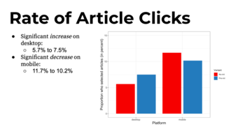
- On desktop, Variant B yields double the interaction (clicking on anything in the suggested edits module), 60% more navigation (clicking on arrows to navigate to different suggested articles), and 30% more clicking on suggested articles.
- On mobile, the variants perform the same for interaction and navigation, but Variant B leads to 15% less clicking on suggested articles.
- On mobile, Variant A leads to 40% more newcomers editing than Variant B, but the edit rates are statistically the same on desktop.
- Takeaways:
- Making the suggested edits module more prominent on the homepage gets more users to interact with it.
- Neither Variant A or B successfully made the module prominent on mobile.
- Though the overlays were not present on Variant B, they may still play an important role in giving the user context for what they're supposed to be doing with the module. It's possible that this is reflected in the data in two ways:
- Variant A yields 40% more newcomers editing on mobile than Variant B.
- The increases between Variant A and B on desktop is lower with each successively "more engaged" type of engagement. In other words, simply interacting with the module is increased by 100%, but navigating between articles is only increased by 60%, and selecting an article is only increased by 30%. This may show that users don't have sufficient context to understand that they are supposed to navigate between and select articles.
- Next steps: we turned Variant A on for all newcomers while we build Variants C and D. This is because it is shown to yield more newcomers completing edits.
- We'll use these learnings to design Variants C and D, with work happening here.
-
 Flow of "Variant A" on desktop
 -
 Flow of "Variant A" on mobile
 -
 Flow of "Variant B"
 -
 Interaction was higher for Variant B on desktop
 -
 Navigation was higher for Variant B on desktop
 -
 Article clicks were higher for Variant B on desktop and lower on Variant B on mobile
 -
 Edit success was higher on mobile


Initiation Part 2 (C vs. D)[edit]
- Summary
- Variant C
- Desktop: suggested edits is pre-initiated and takes up half of screen. Onboarding is optional through a popup.
- Mobile: suggested edits is task card shown directly on homepage. Onboarding is optional through a popup.
- Variant D
- Desktop: suggested edits module takes up half of screen, but contains mandatory onboarding materials inside before displaying suggestions.
- Mobile: suggested edits is a call-to-action card that leads to mandatory onboarding.
- Hypothesis: making the module much more prominent will lead to more interaction and edits in both variants, but we're not sure which variant will be the winner.
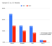
- Result: both variants led to higher interactions and edits than Variants A and B. Variant D led to more edits on desktop and Variant C led to more edits on mobile.
- Variant C
- On both desktop and mobile, Variant C led many more users to interact with the suggested edits module. This makes sense because in that variant, the module is active and visual upon arrival.
- Those higher levels of initial interaction for Variant C cascaded down to higher levels of navigation and clicking on tasks on both platforms.
- When it comes to edits being saved, the results are mixed:
- On desktop, Variant D leads to 2.5% of account creators saving a suggested edits, whereas Variant C leads to 2.2%.
- On mobile, it's the other way around, with Variant C leading to 2.0% of account creators saving a suggested edits, whereas Variant D leads to 1.7%.
- Next steps: we'll deploy the winning variant on each platform to all newcomers via T272754. All desktop users will get Variant D, and all mobile users will get Variant C. We'll revisit these learnings when we work on the next set of variants.
-
 "Variant C" on desktop
 -
 "Variant C" on mobile (popup not shown)
 -
 "Variant D" on desktop (banner was not used in production)
 -
 "Variant D" on mobile (banner was not used in production)
 -
 Mobile results showing higher editing numbers for "Variant C"
 -
 Desktop results showing higher editing numbers for "Variant D"
_of_newcomer_homepage_2020-04-09.png)
_of_newcomer_homepage_2020-04-09.png)
_of_newcomer_homepage_2020-04-09.png)
_of_newcomer_homepage_2020-04-09.png)

