
Extension talk:Media Viewer/About/Archive02
What do you like about Media Viewer?[edit]
Clarity[edit]
- I like that I can see all the most relevant information about the image in one page only and the graphic display. --Daniele Pugliesi (talk) 06:29, 9 November 2013 (UTC)
- I like that it is possible to watch more details present on a picture, exactly text explaining what a part or a component of some graph means, so eliminates some confusion of not being sure what is on that picture. Cornel24 (talk) 17:53, 10 November 2013 (UTC)
- Hello, it's a very good idea : now we can have a look on the picture without having to go to Commons and then click again to see it in a larger size. It is quite clear, also : we easily and quickly see the picture and the information, and all the links we need are there. Thank you for this new feature ! Best regards, --Daehan (talk) 10:06, 22 November 2013 (UTC)
- Very good all round. Being able to just click on images to see data without having to leave the page or open another tab on my browser is very useful. It's also far smoother than most similar functions on other sites. A big thumbs-up from me. --ProtoDrake (talk) 11:52, 25 November 2013 (UTC)
- It's very good that such an application is being updated by the Wikimedia team. It really helps to save time and in the mean time shows a clarified image. --Shalini Ghose (talk) 2:43, 3rd December 2013
Context[edit]
The Media Viewer is a good idea for viewing pictures at a larger size without having to jump away from a page with their file description content. It loads rather slowly, which could be improved, but it is nice I can enlarge thumbnails without having to go to another page to see the bigger picture. Arcane21 (talk) 06:34, 5 November 2013 (UTC)Arcane21
More intuitive[edit]
- I think that this is a more intuitive experience for the casual reader than the current behaviour of clicking on a link which takes you to a page about the image.--NHSavage (talk) 22:40, 18 December 2013 (UTC)
- I find this to be a much more efficient way of viewing content than leaving the main article or taking up space in my generally overcrowded tab bar. Why didn't anyone think of this earlier? --Yea55 (talk) 18:46, 19 December 2013 (UTC)
What would you change in Media Viewer?[edit]
By wording[edit]
- The smily face in front of "by X" is strange to me, especially with the word "by". Either have a upload symbol so the row can be interpreted as "Uploaded by X" or remove the "by" So it reads as "User X". --Ainali (talk) 09:07, 2 November 2013 (UTC)
- I suggest to replace the smily face with an icon showing an arrow going in a box, similar to this one: File:Crystal Clear app ark2.png. --Daniele Pugliesi (talk) 06:29, 9 November 2013 (UTC)
Size links[edit]
- I'm quite a fan of the links which quickly allow you to switch among image sizes. Small or full screen are not exactly my favorite formats :) --Elitre (WMF) (talk) 14:15, 4 November 2013 (UTC)
Talk page[edit]
- TALK PAGE! - Wikipedia is all about read-write capability and when I have this option enabled it makes it LESS write and MORE read. A button that links to the existing talk page ANYWHERE would be nice, otherwise I think this is a great tool. Victorgrigas (talk) 04:00, 25 November 2013 (UTC)
- Related to my suggestion to link to Commons more prominently. Local file talk pages are probably not needed. —Gryllida 10:05, 7 March 2014 (UTC)
No good as default (we redirect to Commons directly, in french Wiktionary)[edit]
- Cool but don't force this to be the default setting without let the option to the user to deactivate it. I'm from the Wiktionnaire (french wiktionary) and on our project click on image redirect automatically to Commons, and it's kind of practical when we are contributors. Vive la Rosière (talk) 01:45, 22 November 2013 (UTC)
- Thanks. —Gryllida 10:05, 7 March 2014 (UTC)
Closing the window[edit]
- Not sure if someone said it but you guys need to leave the X visible, a user shouldn't be hovering the mouse around to close an image. That's just plain bad design --Camilo Sanchez (talk) 15:34, 10 December 2013 (UTC)
- I agree with this, at first I was not sure how to close the window with the image in. I resorted to using the escape key, which worked, but I think that to roll it out for general use, you probably need the way to close the window to be very clear.--NHSavage (talk) 22:49, 18 December 2013 (UTC)
- ...and if you use a touchscreen and no keyboard, you're trapped... I'm using a tablet, and had to go to this current page and conversation to understand there is a cross appearing on mouse hoover. Generally, events triggered by mouse hovering with no alternative (such as menus who can't be clicked) should be avoided, due to the generalization of touch screen devices. Epok13 (talk) 22:55, 28 December 2013 (UTC)
Licensing and attribution[edit]
I have several problems with the media viewer:
- The "Use this file on another website" has a relative link to the image description page - "/wiki/File:Donna Shalala - Knight Foundation.jpg". That link is not going to work if you are using the image on another website.
- Many images are not suitable for reuse on every conceivable website. For example, fair use images should definitely not have anything encouraging people to reuse them. And even some of our licensed images - if it's not public domain and not creative commons, then we shouldn't encourage someone to use it without reading the detailed licensing information. If you just embed a GFDL image, for instance, you are probably not in compliance with the terms of the license.
- It's not obvious which thing on the popup is the author. Unless you already know who the author of a particular image is, you're going to think that the uploader is the author and would incorrectly attribute that person.
- We've been telling photo contributors that if someone clicks on an image, it will take them to the description page, which will show their license, attribution information, etc. Now, that's not necessarily true any more.
- It doesn't actually do anything useful for the reader - they are already one click away from viewing an enlarged version of the image ... you've just made the click do something different.
--B (talk) 13:51, 22 November 2013 (UTC)
- This is absolutely vital. Any software hosted by Wikimedia should meet not only the legal requirements of attribution, but should provide an example that respects the spirit of the licenses by providing meaningful and easy to find attribution. The summary page does not name the author or link to their user page. The software shouldn't go out of beta until this is added. -Pete F (talk) 23:31, 30 November 2013 (UTC)
- +1, and then some! The new viewer is very attractive, but unfortunately it optimizes the graphic display by making the attribution information less visible. We need to compensate for this by adding an image credit section along with the references on the article page. Can adding an image credit section to articles be automated somehow as a part of this project?
- We need to be proactive about making image attribution visible because it is so important to image donors! The software should not go out of beta without consulting with our donor partners on this question. Djembayz (talk) 06:50, 1 December 2013 (UTC)
I love this but it's not for me[edit]

This is a tremendous gadget, and I honestly can see it being deployed as the default with very few changes from how it is now. I would ask, however, that if this does become the default, there is a way to turn it off. As someone that works with files, when I click on an image, I want to go directly to the local file description page (i.e. as it functions now), because the work that I'm doing with files happens on that page (and because my internet is so bad right now that the extra loading time for the large versions of images will be problematic.) So yeah, I think that for 99% of the people that use Wikipedia, this is a great thing. But for the 1% of people that spend a lot of time in the File namespace, doing the behind the scenes stuff, please make sure that there's a way to skip the lightbox. Sven Manguard (talk) 03:34, 23 November 2013 (UTC)
- Why not add a modifier key to the click, that would bypass lightbox and take you straight to the description page. Easy to do, simple to learn for advanced users, doesn't bother the rest of the users. TheDJ (talk) 18:03, 26 November 2013 (UTC)
- Adding an off switch also doesn't bother the rest of the users. I don't like modifier keys, because I prefer to do as much as possible with the mouse. It's also very tedious for someone that, on some days, will view 200, 300 images in rapid succession, to have to constantly use a modifier key. Sven Manguard (talk) 19:57, 26 November 2013 (UTC)
- Why not add a modifier key to the click, that would bypass lightbox and take you straight to the description page. Easy to do, simple to learn for advanced users, doesn't bother the rest of the users. TheDJ (talk) 18:03, 26 November 2013 (UTC)
- I also would like a possibility to turn off this option. I more often want to see full description page than to see bigger image. BartekChom (talk) 00:36, 10 January 2014 (UTC)
- Thanks Sven, others, for thoughts on this. As we look toward a global release out of Beta Features, we'd absolutely love to get more community feedback about if/how to provide an option to disable and/or go right to the file. Tell a friend to let us know :) Keegan (WMF) (talk) 06:23, 27 February 2014 (UTC)
- Keegan (WMF) - If I have to right click and open in a new tab, I have to right click and open in a new tab. In all honesty, the ability to disable this is purely a convenience. The interruption to my workflow is, in most situations, quite minimal. I'd like to be able to bypass it, but it's not serious. That being said, I would definitely reach out to the Commons community before any deployment there, as the people on that project have very different workflows and very different needs when it comes to working with files. Galleries on Wikipedia are mainly there for visual effect. Galleries on Commons are there either 1) so that someone can find the image that they want, then click on it to pull up the full file name, and cut/paste that into a page on another project, or 2) large collections of images that are gathered together in a non-public facing page for either a tracking or an administrate/maintenance purpose. Any change to how files are pulled up will impact the workflow on Commons much more than it will on other projects. Sven Manguard (talk) 00:59, 1 March 2014 (UTC)
- Great, thanks for the detailed feedback about workflow for you. Important information to have. We'll definitely explore the workflows of others. Keegan (WMF) (talk) 05:25, 1 March 2014 (UTC)
Would be nice to have a bypass option or a link underneath the image to the image description page. It's especially bothersome when viewing pages like this where a lot of thumbnails are located and you want to select a photo to be included in an article on Wikipedia. I mostly use galleries to select good photos, as good shot have been pre-seelcted and I don't need to browse through a category of say 2,000 images. But anytime I click on an image, I get the viewer, and it drives me nuts. The viewer is perfect for end users and people who want to download and reuse images elsewhere but it is a nuisance to WIKIPEDIANS who work with images to improve the encyclopedia articles. Please try to develop the gadget in a way that it would be beneficial to both end users AND editors of Wikipedias. Thanks for the hard work. Teemeah (talk) 13:49, 3 March 2014 (UTC)
Problem with location maps[edit]
One thing I have just noticed is that location maps where a background image has dot added on to it to indicate locations does not work well with this feature as it only shows the background map. See for example en:List of monastic houses in Devon. This is probably tricky to fix as you have the same problem at the moment - clicking on the image only shows the background map as that is the actual image.--NHSavage (talk) 16:10, 2 January 2014 (UTC)
Regression with where clicking an image goes...[edit]
With a note that people may react negatively to change, including one of positive nature, please understand that clicking an image took me to the image page, before, with author and licensing information. Now, the behaviour suddenly changed... --Gryllida 02:58, 30 January 2014 (UTC)
- Thank you, Gryllida. It will be a big change, and it will surprise people. Particularly the hundreds of thousands to millions of users/editors/contributors that don't subscribe to mailing lists, check local Village Pumps (or equivalent), or participate in any of the social engagement side of Wikimedia projects. We will develop a Media Viewer that will look different, but should not feel different as far as the file information that the Viewer displays. It's important to have the core functionality and your feedback below has been wonderful. I'll be working as a Community Liaison part time on this project to help ingest feedback like yours over the coming months as Media Viewer is deployed. My apologies for us not having much Wikimedia Foundation presence here over the past couple months as we were early on in Beta Features. This is a high priority product and as we enter the second half of the current development cycle Fabrice and I will be here :) Keegan (WMF) (talk) 07:17, 27 February 2014 (UTC)
What do you think of these new features?[edit]
We'd be grateful for your feedback on some of the new or updated features we are working on for our upcoming release of version v0.2. Please add your feedback in the third 'Feature comments' section below, as we would like keep the first two sections above as simple listings we can update regularly, rather than use them as discussion areas.
Ready for testing[edit]
- Show Location
- Show Categories
- Show File usage
- Preload the next and previous images
- Show thumbnail while loading the image
- Full screen update
- Show Permissions
You can test recent features of Media Viewer v0.2 on this MediaWiki.org this test page, as outlined in these testing tips. (If you feel adventurous, you can also check the latest features on this slower beta site).
Coming soon[edit]
- Use/Share this file
- Embed this file
- Download this file
- Show Metrics Dashboard
- Per-site configuration for enabling Media Viewer
- Client-side configuration option to disable Media Viewer
- User opt-out for disabling Media Viewer
- Show shared images in Media Viewer for all users
- Zoom feature for v0.3
We invite you to check those specifications before requesting features that may already be included in those tickets.
Feature comments[edit]
Please add your comments about the above features in this section (we would like keep the first two sections above as simple listings we can update regularly, rather than use them as discussion areas).
- Show Location - didn't notice this Gryllida 10:13, 7 March 2014 (UTC)
- Show Categories - didn't notice this Gryllida 10:13, 7 March 2014 (UTC)
- Show File usage - didn't notice this Gryllida 10:13, 7 March 2014 (UTC)
- Preload the next and previous images — I like the feature! Great addition. Gryllida 10:11, 7 March 2014 (UTC)
- Show thumbnail while loading the image — OK, but it flickers a bit. Gryllida 10:11, 7 March 2014 (UTC)
- Full screen update - didn't notice this Gryllida 10:13, 7 March 2014 (UTC)
- Show Permissions — Very good. Gryllida 10:11, 7 March 2014 (UTC)
- Use/Share this file - didn't notice this Gryllida 10:13, 7 March 2014 (UTC)
- Embed this file - didn't notice this Gryllida 10:13, 7 March 2014 (UTC)
- Download this file - didn't notice this Gryllida 10:13, 7 March 2014 (UTC)
- Show Metrics Dashboard Gryllida 10:13, 7 March 2014 (UTC)
- Per-site configuration for enabling Media Viewer — please do, but as part of beta features. Beta features should be enabled or disabled per-wiki. Gryllida 10:11, 7 March 2014 (UTC)
- Client-side configuration option to disable Media Viewer — midly tolerable, see also meta:Discrimination against unregistered contributors (pardon my harsh word choice here (suggestions welcome)). Specifically cookie auth section. In my view it should be implemented and enabled with 'Not you? Register an account with a password' warnings as necessary, to have IP contributors access beta features and participate in feedback. Gryllida 10:11, 7 March 2014 (UTC)
- Per-user configuration for disabling Media Viewer — I'm not sure what this is about. Registered contributors already can do this in beta features. Is this for when it's out of beta, or for unregistered contributors? Gryllida 10:11, 7 March 2014 (UTC)
- Show shared images in Media Viewer for all users — not sure. Gryllida 10:13, 7 March 2014 (UTC)
- Zoom feature for v0.3 — I like the idea. Gryllida 10:11, 7 March 2014 (UTC)
What new Media Viewer features would you like to see?[edit]
Text Message/GpS Tag[edit]
Zoom[edit]
Hi guys, Based on your requests below, we’ve started design work for the upcoming Zoom feature in Media Viewer.
Here’s a first prototype for your review.
A more detailed [https://wikimedia.mingle.thoughtworks.com/projects/multimedia/cards/167 specification is outlined here.
What you think? These first designs were prepared by Pau Giner and and Kaity Hammerstein and they’d love to hear your feedback.
Once we hear from you, we’ll start development in a few weeks, and hope this feature can make a lot of users happy! Fabrice Florin (WMF) (talk) 17:07, 28 February 2014 (UTC)
- Zooming would be useful. --FocalPoint (talk) 16:26, 6 November 2013 (UTC)
- +1 --Daniele Pugliesi (talk) 06:34, 9 November 2013 (UTC)
- +1--Saehrimnir (talk) 19:05, 23 November 2013 (UTC)
- +1 --Stu Phillips (talk) 18:03, 28 November 2013 (UTC)
- Links to several resolution versions, as exists on the current media page, might be preferable -- see my comments below at #Image resolution, downloads, and license. -Pete F (talk) 18:33, 26 December 2013 (UTC)
- Thanks, guys. Based on your feedback, we are starting work on this Zoom feature, which we hope to include in v0.2, if time allows. Fabrice Florin (WMF) (talk) 09:11, 19 February 2014 (UTC)
- FocalPoint, Daniele Pugliesi, Saehrimnir, Stu Phillips, Peteforsyth: I filed this bug a while back. You can follow the mingle card or the bug for updates. It'll be out soon :) Keegan (WMF) (talk) 07:37, 27 February 2014 (UTC)
- Thanks, guys. Based on your feedback, we are starting work on this Zoom feature, which we hope to include in v0.2, if time allows. Fabrice Florin (WMF) (talk) 09:11, 19 February 2014 (UTC)
Pre-loading[edit]
- Pre-loading the next image(s) would facilitate the navigation. Currenttly, loading the next image is only done when the next arrow is pressed. Pre-loading is invisible to the user and greately increase the loading perception time. --Pannini (talk) 13:43, 22 January 2014 (UTC)
- Thanks for this suggestion. We are now working on this feature to preload the next and previous images. Fabrice Florin (WMF) (talk) 09:11, 19 February 2014 (UTC)
Slideshows[edit]
- It could be nice a function to see a slideshow of the images in the same Commons category or in the same Wikipedia page, showing the next image after few seconds. It could be great a tool to create a personalized list of pictures, then see the slideshow and to save it as a .ppt file, so it can be used to create easily and quickly some presentation to use offline (for example by the teacher in a school during a lesson). --Daniele Pugliesi (talk) 06:45, 9 November 2013 (UTC)
- Thanks for this recommendation. We have included View files in slideshow mode for the next version v0.3, tentatively scheduled for next quarter. Fabrice Florin (WMF) (talk) 09:11, 19 February 2014 (UTC)
- -1. Too confusing. It's simple: nobody requested or needs this at Wikipedia or sister projects, and it's getting in the way.
- When I'm viewing a file at Wikipedia or another sister project, have no arrows.
- When I click a file from a Commons gallery, it's ok to have arrows or do a slideshow.
- —Gryllida 00:29, 9 March 2014 (UTC)
Annotations[edit]
- Annotations, for images like File:1911 Solvay conference.jpg. See Commons:Help:Gadget-ImageAnnotator --Jarekt (talk) 19:33, 8 November 2013 (UTC)
- Is it possible to display the image notes like on commons? --Hans Haase (talk) 01:07, 22 November 2013 (UTC)
- You probably mean annotations? If so, we have a bug open for that: 56666 --MarkTraceur (talk) 01:19, 22 November 2013 (UTC)
Other features[edit]
- When paging with the arrows trough images on a page, use short css transformations to go from one image to the next. That would give the change less of a 'pop' effect when there are Aspect Ratio changes. TheDJ (talk) 13:47, 14 December 2013 (UTC)
- -1, annoying 129.94.239.191 05:54, 10 February 2014 (UTC)
- -1. Adds a wait, as I understand? Gryllida 00:32, 9 March 2014 (UTC)
- Support for multiple page documents (Djvu, PDF, PPT, etc). For some inspiration you can take a look to the IA Book reader.--Micru (talk) 01:19, 5 November 2013 (UTC)
- +1, the reader should have as consistent an experience as possible, and having a Media Viewer for some kinds of image files but not others would be confusing. I also agree that the Internet Archive/Open Library people would be great to consult with on this, they have been doing great stuff in this arena with free software. -Pete F (talk) 18:33, 26 December 2013 (UTC)
- +1, 129.94.239.191 05:54, 10 February 2014 (UTC)
- Yes please. Gryllida 00:32, 9 March 2014 (UTC)
What bugs or issues have you found with Media Viewer?[edit]
Some more feedback[edit]
- It takes much longer (10 seconds or more) than normally to load/view an image. Normally i open files in a new tab which is quicker.
- The date given is wrong. For example "Erstellt am -2147483629. Dezember 1969" (=photo taken december 1969) when you view the photo commons:File:Hattingen - Rathausplatz - Rathaus 03 ies.jpg on commons:Ennepe-Ruhr-Kreis. I don't know from where the media viewer could have taken this information. The photo was made in 2010 see its information template and the exif informations. Holger1959 (talk) 21:32, 7 November 2013 (UTC)
- This date shown (in December 1969) is in fact 2010 seconds before 1 January 1970 00:00 UTC, which seens to be used like the base date for Unix timestamps (or the
time()andlocaltime()API's and similar in standard C language libraries). - "2010" alone is not interpreted as a year, but as an Unix timestamp (Unix timestamps are not used in image description page for the date field, dates containing only digits, possibly without any separators as in this case where there's only a year) should be interpreted using ISO parsing rules). Additionally the display format used to render it should not add any unspecified precision (here we just have a year, but NO month, NO day of month, NO day of week, and NOo time of day in hours, minutes, seconds). Parsing should be done like date properties in Wikidata.
- Verdy p (talk) 20:10, 5 January 2014 (UTC)
- This date shown (in December 1969) is in fact 2010 seconds before 1 January 1970 00:00 UTC, which seens to be used like the base date for Unix timestamps (or the
Jiggle when resizing the window[edit]
Resizing the window (e.g. by going to fullscreen mode) makes the UI jiggle around a bit (Firefox). Skalman (talk) 07:21, 22 November 2013 (UTC)
Hangs my Internet Explorer Browser[edit]
I've given up on the Media Viewer, every time I tried to use it, it hangs my browser. Using Windows Explorer 9. Wee Curry Monster (talk) 10:30, 1 February 2014 (UTC)
Scrolling broken in Monobook[edit]

In Monobook, the information scrolls up beyond the bottom of the screen (see screenshot). Monobook, Firefox 26, Windows 7 Jay8g (talk) 20:14, 9 February 2014 (UTC)
Link[edit]
Hi, the link on images says "Learn more on Wikipedia", but links to Commons. Thanks, Matty.007 (talk) 20:25, 4 February 2014 (UTC)
- Seems to be fixed, but in ruwiki it requires grammar:prepositional while seems to be grammar:genitive. Ignatus (talk) 19:12, 7 February 2014 (UTC)
Media Viewer bug[edit]
Hello, When Media Viewer is activated we can't play a diaporama. I tested it here. 92.89.123.3 12:10, 12 December 2013 (UTC)
- Thank you for the feedback, I filed a bug for this enhancement here. Keegan (WMF) (talk) 22:56, 21 December 2013 (UTC)
Image resolution, downloads, and license[edit]
The media viewer currently does not indicate to the viewer that other (specifically higher) resolutions may exist, or how to download them. Since reuse is an important value of the Wikimedia movement, some useful information about downloads should be available on the main screen. As it currently stands, clicking on "use this file" also does not indicate that there are higher resolutions available; one has to know to click "Learn more on Wikimedia Commons" in order to find them.
To somebody not familiar, "Learn more on Wikimedia Commons" is not a very appealing link -- this is the kind of language that many sites use to link to a very generic "about us" or "about this site" page, not specific information tailored to a specific image (as is the case here). I am concerned that an Internet savvy (but not Wikimedia savvy) audience will completely overlook this highly useful link.
The "CC BY-SA" (or other) license abbreviation looks like a Martian language to most readers. It should be introduced with text like "You are free to reuse this image in accordance with this license" (which should automatically detect when the file is Public Domain, and say something more like "You are free to reuse this image, to which nobody has ownership rights.") Also, this text should probably be next to the "Use this file" link -- the license is currently in a different part of the UI.
- Some parts of this, but not all, are addressed in v2, available on mediawiki.org. -Pete F (talk) 23:41, 4 January 2014 (UTC)
Personality rights are currently not addressed in the UI. The WMF board and many community members have expressed that it's important for files to indicate clearly, where needed, that the subject has consented to its broad publication. This tool should reflect that desire.
Longtime readers of Commons and other MediaWiki-based sites may be very used to the idea that clicking the image itself brings you all the information available about the file. In this case, once one is in the Media Viewer, clicking on the photo itself does nothing. In order to respect the principle of least astonishment (as an idea, not a policy), this should be altered so that the second click on the photo (i.e., the first click within the Media Viewer) takes one to the expected place, i.e. the full Commons description page.
The following issue is addressed in v2, visible on Mediawiki.org. -Pete F (talk) 23:41, 4 January 2014 (UTC) Finally, a small detail: the "X" used to close the box is in a slightly different place than on sites like Flickr and Facebook. Conforming to evolving design consensus seems like a good idea. On those sites, the "X" is in the upper right corner of the window, not the upper right corner of the image. (Nice to see that the escape key works as expected, though.) -Pete F (talk) 18:13, 26 December 2013 (UTC)
addendum This last one might not seem significant depending on what file you're looking at -- I suggest a narrow, portrait-oriented photo like File:Washington County Fair drop ride 3 - Hillsboro, Oregon.JPG. (The dark background also contributes to the difficulty finding the X.)-Pete F (talk) 18:54, 26 December 2013 (UTC)
- Hi Pete F, we are now developing a brand new version of 'Use this file', which will address many of the issues you raise above. The key specifications for this improved feature are included in these three Mingle tickets:
- We appreciate all your detailed suggestions above, and are taking them into consideration. This doesn't mean, however, that we will implement them all. I would be happy to discuss them with you in greater detail in our upcoming IRC 'office hours' chat on Fri. Feb. 21 at 10am PT -- or set up a separate call to go over this, since you have so many ideas that would take too long to respond to individually in this discussion. Cheers. Fabrice Florin (WMF) (talk) 09:11, 19 February 2014 (UTC)
Attribution in a little more depth[edit]
It seems like some improvement has been made around attribution since this discussion was started (but it's hard to tell what has changed, I haven't seen any response on this from the dev team?)
As it currently stands, the name of the "author" appears below the file name. This is a good place for it, but in many cases it is not apparent that this is attribution to the author/photographer etc. Many of these will be Wikimedia usernames, which at first glance might not appear to represent a person. We also have readers and authors from many different cultures, so a name is not always recognizable as such.
I'm not sure what the best way to resolve this is, because in some cases "photographer" might be the best title, in others "producer," etc. But it seems to me we have used "Author" pretty consistently on Commons, and it works OK. So I think unless somebody has a better idea, the name should be preceded by "Author: "
-Pete F (talk) 19:20, 31 December 2013 (UTC)
- Thanks, Pete F. Our current plan is to add a 'By' label in front of the author name, which should clarify that this person is responsible for creating that image, without taking up any more space than needed. This is also consistent with the attribution practices of Creative Commons, and therefore with other parts of our user experience. Fabrice Florin (WMF) (talk) 09:11, 19 February 2014 (UTC)
Transparency[edit]

The lightbox doesn't really work that well with transparent images. Might I suggest:
.mlb-image img { /* or using :hover */
 background: url("//upload.wikimedia.org/wikipedia/commons/5/5d/Checker-16x16.png") repeat;
}
or
.mlb-image img {
 background-color: white;
}
or
.mlb-image img {
	background-color: white;
}
.mlb-image img:hover {
	background: url("//upload.wikimedia.org/wikipedia/commons/5/5d/Checker-16x16.png") repeat;
}
- Thanks for the feedback. I'll pass it along to development and we'll see if it helps. Keegan (WMF) (talk) 20:47, 17 February 2014 (UTC)
Android 4.0.3 and the stock browser[edit]
It does not work for me. I use Android 4.0.3 on Asus Eee Transformer tablet (TF101) with the sock browser. The only thing I get is a black and white screen with 2 links - to the about and bugs pages. There's something like the close button (unusable) as well. Kpjas (talk) 10:48, 23 February 2014 (UTC)
Click 'full screen' icon reduces image size[edit]
The image is then downsized to a small thumbnail and stays that way even after clicking same icon again to leave full screen mode. I use Windows 7, Chrome 33.0.1750.117, screen resolution 2560x1600 Erik Zachte (talk) 09:38, 28 February 2014 (UTC)
- +1 (Mac OS 10.9, Chrome Version 33.0.1750.117, Retina Display --Sebaso (talk) 10:50, 1 March 2014 (UTC)
- I put this into Bugzilla. That's not expected behavior :) Keegan (WMF) (talk) 21:57, 3 March 2014 (UTC)
"more info" drawer[edit]
The drawer concept is really nice. But it could be better used: The "more info" drawer should work on mouseover, not on click. "tags" aka categories should be visible without any further action. The link to the commons image should be under title, the link under CCBYSA should link to some kind of "yes, you can use this"-explanation, not to the commons page. --Sebaso (talk) 10:57, 1 March 2014 (UTC)
- Great feedback. Sebaso. To clarify your last point: As I see it the CC-BY link goes to the .png commons file. You're suggesting it should go to a page like reuse, correct? That would be a good thing to incorporate in some way to the licensing. Keegan (WMF) (talk) 07:41, 4 March 2014 (UTC)
- yes. but it should be a new page with a claar "invitation to reuse". --Sebaso (talk) 08:28, 16 March 2014 (UTC)
Breaks back button[edit]
I like a lot of things about this new viewer. The appearance is better, the ability to click to the next or previous image is great, the quick access to the meta data works well. I'm having a problem though with my back button. After viewing some pictures, the back button in my browser will take me back through the pictures then to the original page, but won't take me back to where I was before I got to that page. Right clicking on the back button and picking from the list still works. I'm using Firefox 27.0.1 on a Windows 8.1 machine. SchreiberBike (talk) 17:20, 2 March 2014 (UTC)
- Thanks for the report. I filed a bug to see if we can fix that :) Keegan (WMF) (talk) 21:52, 3 March 2014 (UTC)
Team Updates[edit]
Thanks for your great feedback![edit]
Thank you all for your wonderful feedback, everyone! Especially Daniele Pugliesi, Cornel24, MarkJurgens, Ainali, Elitre, Micru, Ragesoss, Jarekt, Holger1959, Barcex, Raymond and Julian Herzog, to name but a few. Your detailed feedback is absolutely invaluable to us -- and much, much appreciated :) We are passing on to our development team recommendations to address the issues you raised. Some of these issues were already on our to-do list, but your comments are helping us give these tasks a higher priority. We are now fixing the most urgent bugs, and will be rolling out more tweaks and new features in coming weeks, with our next release due on 21 November, and more updates in December. If you have any more suggestions or questions, you are welcome to post them here, and/or on this Media Viewer discussion page. I am out of office until 19 November, but you can contact our community liaison Keegan (WMF) or lead developer Mark Homquist with any urgent requests. Thanks again for your amazing suggestions, and for all that you are doing to help improve this tool as a collaboration between the community and the foundation! Fabrice Florin (WMF) (talk) 03:11, 12 November 2013 (UTC)
- Fabrice, can you clarify when you are planning on making the new beta live on Commons and other sites? I think the version there is still "v1"-- it looks very different from the "v2" on this site. Was there ever an update in November / December? Has it been pushed back? -Pete F (talk) 23:33, 4 January 2014 (UTC)
- Hi Pete F, we push new versions of Media Viewer every Thursday, so all wikis should now have version v0.2. However, the latest version takes a couple weeks to reach all wikis, because we use the 'platform train' that works roughly like this: we test new features on beta for about a week, then new accepted code merged on a Wednesday gets deployed to MediaWiki.org and test sites on the next Thursday, then to Commons and 'sister projects' the following Monday, then to all wikis the following Thursday. So if you want to see the most recent features, check them out on this beta test site (with slow performance) or this test page on MediaWiki.org (faster, but several days later). Hope this helps. Fabrice Florin (WMF) (talk) 09:11, 19 February 2014 (UTC)
Update on Version v0.2[edit]
Thank you all for your thoughtful comments about the Media Viewer v0.1! Your suggestions are really helpful to our multimedia team, and we have been acting on many of them already in the new version v0.2 which we are now developing.
Some of your key recommendations have been outlined in this feedback section of our main product page, then turned into concrete action items for version v0.2 and v0.3 on our Mingle project management system.
For example, requests for a larger image size (by MarkJurgens, Daniele Pugliesi, Frank Schulenburg) and a darker background (Ragesoss, Another Believer, equazcion, Daniele Pugliesi, Cornel24, Kelvinsong) have already been addressed in the current version. Concerns about slow image load (by (Mono, Arcane21, Ragesoss, Another Believer, Daniele Pugliesi, Cornel24, Holger1959) have been the focus of a couple development sprints devoted to improving performance in a variety of ways (see #154, #155, #126 or #146, to name but a few possible solutions). We're also taking to heart the many recommendations that we improve the 'Use this file' panel to attribute files correctly, with a quick summary of author, source and license (Amada44, Elitre, Church of emacs, Rsocol): these are being addressed in this new 'Use this file' panel which includes attribution-friendly Embed, Download and other functions. Requests for a Zoom feature are now being designed on this card. Other requests for a pop-up explaining the license terms are now under development (see cards #118 and #197); and we're preparing a whole new batch of features to support slideshows and other file formats, as described in this updated 'Next Version' section of our overview page for Media Viewer.
These are just some examples of how your insights are being incorporated in our release plans. We're also reviewing your longer-term recommendations, which will take more time to implement, but are under consideration nonetheless. Our focus this quarter is on completing the current version v0.2 and starting work on the next version v0.3 of the Media Viewer, to provide a better viewing experience for all users.
Sorry if we haven't been more responsive on this page in recent weeks: we have all been busy improving the product, based on your earlier feedback. In a few days, we will invite your comments on an updated beta version v0.2, which we are about to release shortly. As that date approaches, we will start archiving many of the comments above which have been addressed, to reduce clutter and to invite us all to focus on the new features and improvements. To keep up with our work and participate in our conversations, we also invite you to subscribe to our multimedia mailing list. And if you're feeling adventurous, you can test the latest features before they are released, on this beta site, but performance will be much slower on that site (you will also need to create an account, then enable Media Viewer in your Beta preferences).
Thanks again to everyone who has already contributed so productively on this page: keep your great insights coming! Keegan, MarkTraceur, other team members and I will do our best to answer your questions (for a faster response, you are welcome to mention our user name in your comments, so we are notified and can get back to you more quickly). But even if don't always respond right away, rest assured that we are reading your comments and considering every suggestion carefully. :) Fabrice Florin (WMF) (talk) 21:35, 9 February 2014 (UTC)
- Thanks! A half of my suggestions weren't there. I've added them in. --Gryllida 05:55, 10 February 2014 (UTC)
- I'm particularly surprised that 'make preview bigger' and others are on the list, while I didn't expect it to occupy the whole page. Previously the preview shown on image click (without media viewer) was rather small. Having a small preview benefits the reader as he sees that he did not leave the article and didn't enter a weird new full-screen app. Some might think was "was I hacked?" or "where did I come?". --Gryllida 06:04, 10 February 2014 (UTC)
- Thanks, Gryllida. We're reviewing your suggestions and will respond to them once we've heard from team members. As a rule of thumb, we tend to implement features which are requested by large number of users, rather than individual requests by a single community member. For example, I understand you are a big proponent of a proposed 'Preview' function, though I'm not hearing this as being a priority feature from other team or community members. I should also point out that this proposal doesn't match best practices on other top multimedia sites we've been studying for this upgrade. So I am not optimistic that this particular feature would be implemented in the near-term, though we will give it careful consideration for future releases. On the other hand, I'm happy to let you know that we plan to implement other features you are advocating, such as making the link to the file repository more prominent, as well as support for multiple page documents. Thanks again for your interest in this project. Fabrice Florin (WMF) (talk) 01:03, 11 February 2014 (UTC)
- It'd be interesting to learn that websites have a best practice of ... occupying a whole page with a preview, with black non-transparent background. I'll watch the presentation, expect it to be interesting. :-) Again thanks for the detail. Gryllida 05:45, 11 February 2014 (UTC)
Release Plans[edit]
Towards enabling the Media Viewer by default[edit]
It appears likely to me that, whenever the time comes, enabling the Media Viewer by default will be rejected by the Wikimedia community, for reasons deriving from our shared vision for all people to freely share in the sum of all knowledge. I think that would be unfortunate, considering all the good work that has gone into it, so I'd like to point out the high-level issues I see. I hope Fabrice and the engineering team will take a step back as well, and consider adjusting feature priorities accordingly. (Maybe this is already part of the plan; but recent communications make it appear that it's getting missed.)
According to the engineering team, the Media Viewer aims for three goals:
- Provide a richer multimedia experience
- Display images in larger size
- Reduce confusion
These are worthy goals, and I'm sure all serious Wikimedians would support them. When the question gets raised, though, of whether to replace the current default view with the MV, less lofty considerations will come into play: does this new feature sufficiently meet the basic requirements already, more or less, met by the current default view? I think the answer is a decisive "no," and am skeptical about whether the apparent plan for refining the Media Viewer will change that.
What requirements am I talking about? I would summarize them as follows:
- Are all copyrights and personality rights adequately protected?
- Have we met the minimum legal standard?
- Have we met the expectations of rights-holders sufficiently that they will feel good about contributing to Wikimedia projects?
- Are (potential) reusers shown a clear path forward?
- Are they given sufficient guidance in overcoming practical obstacles to reusing materials presented by the Media Viewer?
- Are they given sufficient guidance in meeting relevant legal obligations?
- Are they given sufficiently convenient access to the right links, including a file download link?
- Have we appropriately exposed the strengths of Wikimedia Commons to our users? For instance:
- Commons provides strong assurances that all its content is freely reusable, with minimal requirements, unlike Flickr and other repositories. Is that expressed clearly?
- Commons is more organized than media repositories like Flickr (eg, category system).
- Commons invites anybody to contribute materials that serve its educational mission.
While my list above may or may not be complete, I am pretty sure it more or less reflects what most Wikimedians will have in mind, when considering whether or not the Media Viewer should be enabled by default. Whether the Media Viewer has exciting and worthwhile new features is certainly important, but it is subordinate to meeting the minimum standard of reflecting our shared values, at least as adequately as the current default media view does.
Current efforts to refine the Media Viewer seem (to me) to be missing the significance of these basic considerations. I would expect that, unless the engineering team prioritizes feedback relating to basic adequacy (reflected, more or less, by my numbered list above) more highly than feedback about improving functionality, the Media Viewer will not (and should not) be approved as a default feature by the Wikimedia community. -Pete F (talk) 04:36, 16 February 2014 (UTC)
- I'm not a developer of this project, but do know quite a bit about it where it's coming from and I can tell you that at least the first consideration is high on the visibility list of the team. HOWEVER. it is also the most difficult problem to solve and requires a lot of technical work. This work is taking place, but it is not directly visible to most users. This frontend is using a new API to get the information that you are pointing out, and that will be developed specifically to meet these goals. BUT there is still a lot of work to do there and in the way we register licenses and copyrights of files. This project is being used as the driving force to develop this new API. I too would suggest not to enable this for ALL anonymous users until that goal is met, but having it as beta will help garner the feedback that is required to develop the backend systems for license/copyrights/authors.
- I have recently met this team and I have great confidence in them. But I too support your statement that the team needs to watch out for the above concerns. Especially the Commons and top 5 wikipedia projects are sticklers for correctness when it comes to legal requirements and EDUCATING users regarding licensing. These aspects need to be extremely well thought out and balanced, so any development would at some point have to be validated against these basic community principals. TheDJ (talk) 11:40, 17 February 2014 (UTC)
- Hi Pete F, thanks again for your thoughtful recommendations above, which we are reviewing. We are now hard at work on addressing the first two points you raise above about copyright protection and appropriate tools for re-users. Regarding your third point, Media Viewer already links to Commons in many places, and we will consider making those links even more prominent, while still aiming to reduce confusion for users. We would be happy to discuss your advice in greater detail in our upcoming IRC 'office hours' chat this Fri. Feb. 21 at 10am PT -- and am also open to a separate call to go over this 1:1, if you like. Thanks again, and regards as ever. Fabrice Florin (WMF) (talk) 09:11, 19 February 2014 (UTC)
- Thank you both for your thoughts on this. @Fabrice, I appreciate your offer to chat and am happy to if the opportunity presents itself -- but it seems to me at the moment that there's a need for public consideration about the high level goals and impacts of this feature. So for the moment let me add a few thoughts here:
- On copyright, I think there is room for improvement beyond the minimum legal requirement, to ease the process of Wikimedia volunteers advocating to content owners for CC licensing. My bigger concern, though, isn't copyright, but personality rights. There has been a great deal of discussion lately about the way we (don't) deal with personality rights, and related software features. For instance, @Sj, a WMF board member, recently suggested adding a feature to the upload wizard to gather information relevant to personality rights. If this Media Viewer were to get presented as a complete feature to the community without any regard to personality rights, I think that repeat a mistake that was made in 2010 when the Upload Wizard was released. Hopefully it's possible to do better this time.
- As for reusers, I think a good number of suggestions have been made above, but it's not clear to me that they have been given strong consideration. (Perhaps they have, it's hard to tell for sure what you consider high priority and what you don't.) But to me the most glaring is that when one clicks "use this file" there is no link to even get the file -- that is, no download link. (Also, "use this file on another web site" provides a pretty specific HTML link, which is not what's needed on many modern web sites like Facebook or Wordpress -- a simple link to the file is much easier to use in those cases, but is not made prominent in the beta Media Viewer.)
- As to showcasing the strengths of Wikimedia and Commons, this is a much more nuanced issue than simply the number of links. Again, I think good suggestions have been made above; I'm not looking to rehash them all here. But I don't think you're likely to get to the right solution if your main criterion is how many votes each suggestion gets. -Pete F (talk) 17:17, 22 February 2014 (UTC)
- Thank you both for your thoughts on this. @Fabrice, I appreciate your offer to chat and am happy to if the opportunity presents itself -- but it seems to me at the moment that there's a need for public consideration about the high level goals and impacts of this feature. So for the moment let me add a few thoughts here:
Hard to scroll for the more detail (i'm missin a queue)[edit]
- With the newer layout, where you need to scroll below the 'fold' to read the more information, i'm missing a queue that this is an action I should take. My mac doesn't draw scrollbars, unless I'm scrolling, so i'm not being visually informed of the presence of this information, and even if i put scrollbars to render always, it's still not very visible. Suggest downward facing arrows somewhere in the bar above the fold to indicate that there is more content, i need a queue to be made aware of this 'pagination' action that is expected of me. TheDJ (talk) 18:11, 26 November 2013 (UTC)
- I think adding a "View more" button on the bottom right of the bottom toolbar, which would automatically scroll you down, would work well. I agree that this isn't very obvious right now. --Nicereddy (talk) 01:39, 3 December 2013 (UTC)
- What queue? —Gryllida 10:05, 7 March 2014 (UTC)
- I meant cue. TheDJ (talk) 20:56, 7 March 2014 (UTC)
- OK, I support this idea. The additional details should be more prominent in some way. Gryllida 00:34, 9 March 2014 (UTC)
- Noted, thanks for the input. We'll see if there's a different design for that. Keegan (WMF) (talk) 01:29, 12 March 2014 (UTC)
- I like it...though as The DJ said if you don't have a scrollbar it's not really obvious. Though it's not a problem for me.
- Noted, thanks for the input. We'll see if there's a different design for that. Keegan (WMF) (talk) 01:29, 12 March 2014 (UTC)
- OK, I support this idea. The additional details should be more prominent in some way. Gryllida 00:34, 9 March 2014 (UTC)
- I meant cue. TheDJ (talk) 20:56, 7 March 2014 (UTC)
Title of image should link to information page (and license should link to license details)[edit]
- Title of image should link to information page, Copyright title ("CC BY-SA 3.0" for example) should link to information on what that specific license entails. Even better would be if, when clicking the copyright license title, a simple dialog appeared describing what the license permitted. Currently, the license links to the image's dedicated wiki page and the title of the image does nothing. Personally, I think this is confusing for the common user. Image showing what part I'm referring to (imgur link because I didn't want to go through the trouble of uploading to Wikimedia, apologies): http://i.imgur.com/4RTPayo.png --Nicereddy (talk) 02:28, 3 December 2013 (UTC)
- Agree with the title idea. —Gryllida 10:05, 7 March 2014 (UTC)
Mention partnership[edit]
- On the Media Viewer, images uploaded by partners (GLAM for example) or during a partnership do not have a visible mention of the partnership. The uploader may not be the partner (upload by a bot) And nobody will click on the "Learn more on Wikimedia Commons" link to see if a partner uploaded it or released it. Trizek (talk) 13:42, 18 December 2013 (UTC)
- An ok idea. Gryllida 10:05, 7 March 2014 (UTC)
- Thanks. This has been brought up recently by email as well. We're exploring ways to denote partnership contributions. Keegan (WMF) (talk) 01:31, 12 March 2014 (UTC)
Touch screen image swipe[edit]
- Touch screen image swipe would be a great feature on mobile devices! The < > arrows are small on a phone. (Until Apple makes a bigger screen for me)
Also, the 'x' seems a little too small to touch on a phone. It takes me a few attempts to close the window. MarkJurgens
Caption or title at the bottom?[edit]
I would have thought that the title of the image is less useful than the caption that was there before the image was enlarged. Particularly for a scientific article, the cation often annotates features of the image. This would be a genuine improvement over the old system whereby you could either look at the caption or the enlarged image but never both at once. Evolution and evolvability (talk) 11:42, 9 December 2013 (UTC)
- This could be a nice enhancement, Evolution and evolvability. I've filed a Bugzilla enhancement request. You're welcome to create a Bugzilla account and track it! Keegan (WMF) (talk) 07:29, 27 February 2014 (UTC)
Nice first steps, but needs a lot of work[edit]
My initial thoughts after using this for a little while:
- Desperate need for a throbber. When i click on an image i get a black window with a small white area below it, for quite a while. Not even the browser's favicon does its loading-animation!
- The 100% black could be toned down a bit, made a bit transparent, so you get to see the underlying page (look at the facebook viewer). This gives people the feeling that they are still on the same page, not taken to some other place.
- Added to that, give the images a bit of breathing space, and if it's only 10px on either side. Right now there is no sense of style to the viewer.
- The clickable area of next/previous is far too small. Again, look at facebook: pretty much the entire image-area brings you to the next one. Granted, it's not as important here, but at least you could make the entire right/left edges of the screen clickable. Likewise, clicking on the transparent black background closes the viewer. All of this is very convenient.
--Rotane (talk) 00:03, 28 February 2014 (UTC)
- Great feedback, Rotane, thank you. Most of these enhancement notes are in the works. Keep an eye out for updates! Keegan (WMF) (talk) 05:25, 5 March 2014 (UTC)
Details format[edit]
Some comments about the details section of the viewer:
- I like the overall style: white background, grey boxes, black text, blue links. A small change could be to link the author name only, not the whole like.
- The grey icons are way too small to be readable. It's like the recent Gmail and Yahoo interfaces, those icons are completely useless. They would be easier to recognize if they were coloured (like the 1990s MS Office) or huge. Both things would ruin the interface. Anyway, each line has a decent description, so there's no confusion at all about what each line means - except with "tags".
- I don't think that the "used in X pages" section is useful for readers.
-- NaBUru38 (talk) 03:46, 28 February 2014 (UTC)
- NaBUru38, we appreciate your time to look over Media Viewer. It's good to hear you like the style. How you would suggest to stylize the icons is quite helpful. And as always, the content to contain in the viewer is something we're constantly evaluating with each design to make sure we're displaying what's succinct and important for media use and reuse. With input like this we can work toward community satisfaction. Stay tuned. Keegan (WMF) (talk) 05:29, 5 March 2014 (UTC)
[edit]
- I would love if I have the buttons to click and share the media easily to twitter or Facebook. Moreover it took a little time to load for the first time. --Jayabharat (talk) 04:12, 28 February 2014 (UTC)
- That has proven to be controversial on English Wikipedia. Several proposals to add share buttons have been made, but the community falls roughly 60/40 against such an addition. If social media integration was a built in feature with Media Viewer, there are segments of the Wikipedia community that would view it as the Foundation bypassing the consensus process and ignoring the wishes of the English Wikipedia community. Of course other projects feel differently, but it's certainly not a change I'd make without having a conversation about it with the projects that haven't adopted social media integration. Sven Manguard (talk) 01:21, 1 March 2014 (UTC)
I heard that social media integration is problematic because of the way share and like buttons work, namely because of privacy issues that might be against the Wikimedia privacy policy. I'm not a legal or technical expert though, just have rad this several times, also when the topic came up on huwiki, this was the reasoning against it. Teemeah (talk) 14:09, 3 March 2014 (UTC)
- Yeah, it's a common argument, but also somewhat flawed. They can be implemented in a way that would avoid the privacy problems, it's just that most websites don't care about your privacy. The problem is usually more that people think it is a form of 'sponsoring' commercial platforms. (I don't really get it, since we do the same for maps, but whatever). TheDJ (talk) 19:51, 3 March 2014 (UTC)
Better Font or bigger size for description[edit]
For images with large description, the scroll-bar gets enabled. I don't know why, but it doesn't feel great to scroll and read in that box. For example, you may try : https://en.wikipedia.org/wiki/Main_Page#mediaviewer/File:Wes Brady, ex-slave, Marshall edited.jpg . --Jayabharat (talk) 04:12, 28 February 2014 (UTC)
I agree I might find the text too small. My operating system has a high "DPI" setting with 16px font in all menus, which does not reflect on the media viewer. It's also not exactly black. It seems quite difficult to read. —Gryllida 09:59, 7 March 2014 (UTC)
- Seconded. Please stick to the standard font size. I noticed this with Flow designs recently as well: please don't make any fonts smaller than the current default, unless the goal is to hide that text. (Such as user-selected superscripts or subscripts or hidden divs noting an ignorable aside.) Sj (talk) 01:15, 15 March 2014 (UTC)
Orientation (or lack thereof): Needs more user awareness of Commons (and what a sister project is)[edit]
It is really really hard to understand where the file is. Keep an equivalent of "This is a file from the Wikimedia Commons. The description on its description page there is copied below." somewhere below the image please, before I scroll. —Gryllida 10:01, 7 March 2014 (UTC)
- I really don't agree with this. I think the average person really couldn't care less about 'organizational' details like that. The difference between wikipedia's and Commons communities is our problem. A problem that we created ourselves. We shouldn't bother others with it too much. Once they get into the community they will notice soon enough. (i'm sure one of our communities will give them a scolding one way or another). TheDJ (talk) 20:54, 7 March 2014 (UTC)
- TheDJ, What worries me is that in my view the architecture of the Wikimedia movement should be as clear to end users as possible. It took me 2 years to learn what sister projects exist, and to fully understand their role (and role of the WMF). I wouldn't actively promote such idea, but I do dislike when steps are taken which are a regression, removing some information which was available before. Gryllida 00:37, 9 March 2014 (UTC)
- Right, I get what you're saying. Our end goal is to provide an accessible and positive way to lead someone to the original file hosting on Commons. Once on the Commons file page, it's up to Commons to make it clear what the site is for. I don't think that's something we can promote with Media Viewer to the level that actually fixes a problem that might exist due to other problems in movement communication. Keegan (WMF) (talk) 01:17, 12 March 2014 (UTC)
- TheDJ, What worries me is that in my view the architecture of the Wikimedia movement should be as clear to end users as possible. It took me 2 years to learn what sister projects exist, and to fully understand their role (and role of the WMF). I wouldn't actively promote such idea, but I do dislike when steps are taken which are a regression, removing some information which was available before. Gryllida 00:37, 9 March 2014 (UTC)
Feedback on Opt-out Feature[edit]
| Thanks for your helpful comments about the Opt-out Feature for Media Viewer! Based on your good feedback on this talk page and via email, we now plan to provide an ‘enabled' user preference (option A). This seems to be the favorite solution for community and team members who responded to this question. Gryllida, thanks as well for preparing other possible design directions, which we will consider for future versions. Next, we would appreciate your feedback on Links to Commons, as described in the next section. Cheers. Fabrice Florin (WMF) (talk) 23:46, 10 March 2014 (UTC) |
|---|
|
Our goal is to enable Media Viewer by default on all wikis when it the tool is ready. But as recommended by many in this discussion, we would also like to provide a way for users to disable Media Viewer on a given site, so they can opt-out from this feature if they don't want it (see Mingle card #264). To that end, we are considering these different options:
Provide a preference checkbox with Media Viewer enabled by default (e.g.: 'Show images in Media Viewer'). To disable MV, users can uncheck this preference.
Provide a preference checkbox where Media Viewer can be disabled (e.g.: 'Disable Media Viewer'). To re-enable MV, users can uncheck that preference.
Provide a site-wide gadget (or personal JS script) that would let users disable Media Viewer.
|

Feedback on Links to Commons[edit]

Many folks have raised concerns in our various discussions that the current link to Commons is not prominent enough to help power users go to Commons — or to make new users aware of what Commons is. Right now, that link to the Commons file info page is located below the fold, at the top of the right column in the meta-data panel; the current label is “Learn more on Wikimedia Commons."
As recommended by many in our onwiki, email and IRC discussions, we have been exploring different ways to make this link to Commons more prominent, as outlined in this Mingle card #270.
This link is trying to solve the needs of two very different user groups:
- Advanced users need a quick link to edit the Commons description page and perform other related editorial tasks for that image.
- New users want to know more about the image, and also need information on what Commons is and why they should go there.
To address these issues for each user group, we are considering different design solutions, prepared by our designer Pau Giner:
A. Simple 'Edit’ button:
Provide an ‘Edit’ tool above the fold, so that advanced users can quickly go to the Commons description page to edit it. Restrict this to logged-in users only?
- Pros: gives editors a much-needed edit tool, in a compact format that is easy to understand (pencil icon), making it easier for them to do their work
- Cons: readers could get confused by this tool, which takes them to a completely different site (so we may want to not show it to them at all).
B. 'Edit’ button with tooltip:
Provide the same ‘Edit’ tool above the fold, but show a tooltip on hover, to explain to new users what it does. Show the edit tool to everybody.
- Pros: gives editors the same useful, compact tool, to help them do their editing work quickly
- Cons: readers should like the tooltip, but it may annoy some editors (don’t show the tooltip to advanced users?)
C. 'More details on Commons’:
Provide a call to action inviting new users to check more details on Commons, explaining what it is and how to get there. Shown below the fold, after key details.
- Pros: Clarifies what Commons is and why users might want to go there: to get more details and share free media. Larger panel makes it easier to find.
- Cons: Below the fold position means many users will not see it. Consider using it in combination with Options A or B above?
We would appreciate your advice on which of the options above would be most helpful for both new users and power users. Note that we may want to use some of these design ideas in combination (e.g.: Option B + C), to offer different solutions to meet the specific needs of each user group.
Later this week, we will ask your advice about adding a button on Commons to open an image in Media Viewer. Thanks as always for your constructive advice — and speak with you soon! Fabrice Florin (WMF) (talk) 23:46, 10 March 2014 (UTC)
Comments
- I would perhaps prefer C, as other options expect user to be interested in editing. They are often not. Gryllida 09:21, 11 March 2014 (UTC)
- I think that a combination of B and C is the best solution: an edit button for advanced users that leads directly to commons without scrolling needed with a small explaining tooltip (that is, imho of power user, not annoying) and a "More details on Commons" area for readers that are looking for all metadata of the file. Tpt (talk) 18:31, 11 March 2014 (UTC)
- I'd like to vote for a combination of B and C, too. It's easier for power user to look after a link toward Common. B will give the instinct help for others. --Fantasticfears (talk) 13:27, 12 March 2014 (UTC)
- B is important. I agree that B and C are independent; C would also be useful. Sj (talk) 01:10, 15 March 2014 (UTC)
- A is mysterious, B and C can both be useful (with some tweaks to the confusing wording of the text). None solves the problem of giving a link which is visible (rather than outside the screen) and actually seems a link, let alone a link to where the file actually is. I still have no idea why the file title would not be a link, as seems most obvious; the pencil icon can convey part of the meaning/satisfy part of the use cases; for the others, if for some reason we're forced to use an icon separate from the title, perhaps the clearest icon possible is a "permalink" icon, a variant of the chain kind I suppose (permalink is a concept known in most websites). --Nemo 12:15, 22 March 2014 (UTC)
- Agree that none are ideal -- agree that this information should be more prominent. Gryllida 11:36, 16 April 2014 (UTC)
Location maps[edit]
OK, somewhat complicate to detect and work with, I'm sure, but due to the discussion about maps, I noticed that the MMV doesn't really like locator maps. Take for instance en:Template:Location_map+ and for instance the example on en:Template_talk:Geobox/test1. These are common use cases in the Wikipedia's, and the code should be able to at least do something predictable with them. (instead of showing the overlays in separate views). TheDJ (talk) 08:21, 7 March 2014 (UTC)
- I've filed this as an enhancement bug request since it might be difficult to accommodate. Thanks, TheDJ. Keegan (WMF) (talk) 19:26, 12 March 2014 (UTC)
Remove the arrows and view of other images in the article[edit]
Quite often an article has images which are not representative of the subject, alone, and without a relevant clear label, clicking the arrows is confusing. With old system, I didn't miss this feature, and with the media viewer, I don't use it, but it occupies space and gets in the way.
It's simple: nobody requested or needs this at Wikipedia or sister projects, and it's getting in the way.
- When I'm viewing a file at Wikipedia or another sister project, have no arrows.
- When I click a file from a Commons gallery, it's ok to have arrows or do a slideshow.
—Gryllida 00:29, 9 March 2014 (UTC)
- Totally agree. There's a template for climate that has some icons, those icons are shown as if they are related to the article on the viewer.--Pertile (talk) 21:54, 17 March 2014 (UTC)
- I disagree, if I am looking on a gallery in an article on Wikipedia, the arrows are extremely helpful and save me a lot of clicks. Please keep them. --Ainali (talk) 11:29, 18 April 2014 (UTC)
- Yes, if you're looking at a gallery in a Wikipedia article, fine. I totally support a better Media viewer for article galleries! But what is the point of clicking through to this: https://en.wikipedia.org/wiki/Walvis_Bay#mediaviewer/File:Namibia_location_map.svg ? And how do you get back to the point you were initially reading in the article?
- Re: "nobody requested or needs this at Wikipedia or sister projects", the Media viewer risks turning Commons into a dead place. In french and german Wikipedia, now, you are directed to commons immediately when you click on a picture, this traffic will disappear. Nobody (except Wikimedians) clicks on the tiny commons symbol at Media viewer, that's just an alibi. Actually the media files in the commons category for the article should get more prominence, should become more accessible for readers, but the Media viewer will lead to the opposite: Wikipedia readers no longer visit and see Commons and commons categories. --Atlasowa (talk) 13:57, 30 April 2014 (UTC)
- IMO creating artificial traffic on Commons by forcing the user to go there just to get a decent look of the image was a bug, not a feature. But anyway, I don't see how this is related to having the prev/next arrows. According to the statistics, on average people look at about 2.5 images per lightbox session, so the prev/next feature does get used a lot. (Note that everything down from "metadata open" on that chart is not actually measure yet so those numbers are not real.)
- And how do you get back to the point you were initially reading in the article? -- you should be able to do that simply by exiting MediaViewer. If that does not work, could you describe what exactly happens? --Tgr (WMF) (talk) 19:14, 30 April 2014 (UTC)
- I disagree, if I am looking on a gallery in an article on Wikipedia, the arrows are extremely helpful and save me a lot of clicks. Please keep them. --Ainali (talk) 11:29, 18 April 2014 (UTC)
Please do not go full screen[edit]

Please don't go full screen. It's confusing as the reader doesn't understand that he/she is still on the same site. I included a drawing of what I would expect instead. Gryllida 00:25, 9 March 2014 (UTC)
- Hmm, interesting. Thanks for the mock-up. Keegan (WMF) (talk) 19:11, 12 March 2014 (UTC)
- I agree. This is the only place in our interfaces where your screen and menu bars are overwritten, and you have to find and use a small "X" in a corner to close the screen you landed on. I'm not particularly keen on that design, but most of all it's inconsistent. If we start using "click X to go back" in lots of interfaces, readers may get used to it. For now, I would suggest not creating overlays that make the standard nav stop working. Sj (talk) 01:13, 15 March 2014 (UTC)
- +1 the black background after the first click on the image could be "nearly fullscreen", but you should see the article page on the edges behind the media overlay. (unkess the users clicks "full screen".--Sebaso (talk) 08:35, 16 March 2014 (UTC)
- I agree. This is the only place in our interfaces where your screen and menu bars are overwritten, and you have to find and use a small "X" in a corner to close the screen you landed on. I'm not particularly keen on that design, but most of all it's inconsistent. If we start using "click X to go back" in lots of interfaces, readers may get used to it. For now, I would suggest not creating overlays that make the standard nav stop working. Sj (talk) 01:13, 15 March 2014 (UTC)
- The intent of media viewer is to give images space to be viewed, understood and enjoyed. This mock-up displays the image at the same size as the image in the article, making it a metadata pop-up, not a media viewer. I think there's something to be said for metadata pop-ups, but they're more useful as a delayed hover action rather than a click action which is an affirmative step to get a larger view. See Beta Features/Hovercards (which is inspired by the navigation popups gadget) for ideas in the direction of surfacing relevant information on hover.--Eloquence (talk) 05:51, 16 March 2014 (UTC)
- I love the option to go full browser width (on galleries) or fullscreen --Subfader (talk) 13:24, 16 March 2014 (UTC)
- I would perhaps consider having a "default to full-screen" tick box, and a "go full-screen" button, on a metadata pop-up. Otherwise it's really difficult to match a user's expectations: he/she expects to see something more about the image while stay on an article, and going full-screen directly doesn't meet such expectation. Gryllida 00:14, 30 March 2014 (UTC)
- One would think that is the user expectation and experience, but it turns out that it is not :)
- There are some fundamental problems from the user experience standpoint to make the image not go full screen in Media Viewer. The most prominent is a user figuring out the controls and how to exit the viewer. When presented with a pop-up style box for an image there is not a clear expectation of how to close the viewer. However, when we make Media Viewer full screen, users find it much more navigable and a much more pleasant media viewing experience overall. It becomes a much more immersive experience, which is what we want out of the Media Viewer. A full screen display of some sort is the standard experience on most of the other major sites as well, including Google Images, Facebook, flickr, for instance. There are more examples.
- Overall providing a full screen for Media Viewer accomplishes the goal of a rich viewing experience as well as the clarity of control and ease of exit in functionality. Pop-ups do not provide this necessary functionality as well as the full screen. Keegan (WMF) (talk) 16:51, 1 April 2014 (UTC)
- I would perhaps consider having a "default to full-screen" tick box, and a "go full-screen" button, on a metadata pop-up. Otherwise it's really difficult to match a user's expectations: he/she expects to see something more about the image while stay on an article, and going full-screen directly doesn't meet such expectation. Gryllida 00:14, 30 March 2014 (UTC)
- I love the option to go full browser width (on galleries) or fullscreen --Subfader (talk) 13:24, 16 March 2014 (UTC)
┌─────────────────────────────────┘
Sj, if you have some time you might be interested in watching two of the design sessions where the current X/close for Media Viewer developed from in part: Design session #5 and Design session #10. Even in the early prototypes users were able to identify and execute how to close the viewer. There's some great other design tidbits in there as well (thanks, Pau!). Keegan (WMF) (talk) 21:00, 1 April 2014 (UTC)
- Hello Keegan, thanks for the deeplinks! That's cool to see. Though I'm not convinced that this implies 'full screen improves clarity of control', and I wouldn't describe "almost-full screen" as a "pop-up". As for immersiveness: I'd feel less trapped by the current design if there were more & clearer interactions available... clicking on the image, showing sets of related images, clicking outside the image.
- Re:examples of full-screening on other web sites:
- Facebook makes the background semitransparent: you can still see the page behind it. With a large screen, you can see the full FB border-interface you are used to. And clicking on the background outside of the image takes you back to where you were.
- Google Images doesn't quite go fullscreen: it expands to the width of the screen but above & below you can see you're still in the screenful of image search results.
- Flickr doesn't really have a "non-Image-viewing" core function. However, every major Flickr-page that might take you to an image-focus page is linked prominently "above the fold": a link back to the user-page of the uploader, and any album it's a part of.
- Regards, Sj (talk) 02:54, 2 May 2014 (UTC)
- Comment I find grabbing the full browser width on video content really annoying. Take a look at this Wikinews article from February, or this far-older example from back in October 2009. Closing the viewer for a still might-well be appropriate, but this is multimedia content a user may wish to have running whilst reading other parts of these articles. --Brian McNeil (talk) 13:08, 14 April 2014 (UTC)
- Comment Could an option be to make the black background slightly semitransparent, so you could still view the article? And that clicking the background would close the modal? Danmichaelo (talk) 10:13, 27 April 2014 (UTC)
- +1 (per FB as well) Sj (talk) 02:54, 2 May 2014 (UTC)
- Thanks, these are salient points that I will raise. A semi-transparent background seems like a much more feasible approach. Keegan (WMF) (talk) 16:19, 7 May 2014 (UTC)
- +1 (per FB as well) Sj (talk) 02:54, 2 May 2014 (UTC)
Accessibility[edit]
I was just realizing that due to the lightbox nature of this project, it's really important to do at least the minimal amount of accessibility testing with screen readers on this feature, before it is released. I'm sure screen readers don't naturally understand overlays like this and need some ARIA love. This feature is also going to be on every page, and seriously affect the experience of people with assistive technology. TheDJ (talk) 07:40, 7 March 2014 (UTC)
- Accessibility is always an important consideration; the blurred image while loading can be controversial for those with visual impairment, for example. We'll take screen readers into account. Keegan (WMF) (talk) 19:12, 12 March 2014 (UTC)
With the latest https://www.mediawiki.org/wiki/Talk:Typography_refresh#Latest_release all hints (icons, frames) around pictures disappeared - so now its really hard to understand that you can click on pictures for a larger version/more information. --Sebaso (talk) 08:55, 16 March 2014 (UTC)
"Collection"[edit]
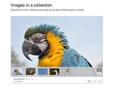
What is a collection? [1] was mentioned in bugzilla:5383#c5 but only links a page now redirecting to this page, which doesn't explain the term despite using it twice. I didn't find an explanation in this talk either. --Nemo 08:07, 11 March 2014 (UTC)
- Hi Nemo. I archived and redirected the other talk page last week so we don't have split communications. You can find the archive linked at the top of this page :)
- The relevant section seems to be this one. It seems that a "collection" is synonymous with a "gallery" in this context. Keegan (WMF) (talk) 18:16, 12 March 2014 (UTC)
- Thanks for your question, Nemo. In our design work for Media Viewer, we have been using the word 'collection' as a generic term to describe any group of media files which could be displayed in a sequence in the Media Viewer. For example, all images or media files in an article can be viewed as a collection; so can all images in a gallery, or a category -- or even a PDF slide show. We aim to provide a consistent user interface for interacting with such collections, regardless of their specific forms. Here are our first design slides, which illustrate how we envision this collection user interface to work. And here is a first development ticket for a collection navigation strip, one of the core components of this UI. We plan to start this development work in late spring or early summer, once we are caught up with other high priority tasks. Hope this helps. Comments welcome. :) 07:52, 13 March 2014 (UTC)
- Was this new terminology documented somewhere? Please avoid using undocumented jargon. --Nemo 15:24, 31 March 2014 (UTC)
- I'm still looking for a dictionary to understand the multimedia team efforts. Thanks, Nemo 11:38, 16 April 2014 (UTC)
- Was this new terminology documented somewhere? Please avoid using undocumented jargon. --Nemo 15:24, 31 March 2014 (UTC)
- Thanks for your question, Nemo. In our design work for Media Viewer, we have been using the word 'collection' as a generic term to describe any group of media files which could be displayed in a sequence in the Media Viewer. For example, all images or media files in an article can be viewed as a collection; so can all images in a gallery, or a category -- or even a PDF slide show. We aim to provide a consistent user interface for interacting with such collections, regardless of their specific forms. Here are our first design slides, which illustrate how we envision this collection user interface to work. And here is a first development ticket for a collection navigation strip, one of the core components of this UI. We plan to start this development work in late spring or early summer, once we are caught up with other high priority tasks. Hope this helps. Comments welcome. :) 07:52, 13 March 2014 (UTC)
Scrolling problems[edit]
I have noticed two problems when using Media Viewer. Screenshots can be produced if desired. I am using the latest version of Safari for Mac.
- When scrolling up to reveal the lower portion of the image label, the label goes behind the image for a moment, before jumping to the front as it should be.
- After using the fullscreen view and then returning to regular view, I am able to scroll the label so far down that it is not shown at all. It can also be scrolled back up onto the screen.
Very nice work overall. JamesDouch (talk) 09:24, 13 March 2014 (UTC)
- I'm not sure if this post has been seen yet or not. Anyway, the first problem I mentioned no longer occurs with the current version of Media Viewer. JamesDouch (talk) 12:59, 4 May 2014 (UTC)
Looks like we missed this comment; sorry about that! Could you add browser/OS details? --Tgr (WMF) (talk) 17:43, 4 May 2014 (UTC)
- Eh, read first, write later. We'll look into it. --Tgr (WMF) (talk) 17:44, 4 May 2014 (UTC)
Discuss this image[edit]
Firstly, lovely work on the viewer: it is a much better viewing experience, and will be simply great for browsing as well once you can see related files, like the category boxes at the top of old-style Commons pages.
A link to the Commons talk page would be useful. People often need a way to leave a comment about an image. A link in the main metadata saying "Discuss this image" or "Discuss" may do the trick.
Else readers may edit the description field for lack of a more appropriate link :-) Sj (talk) 01:18, 15 March 2014 (UTC)
- Dear Sj: Thanks so much for your kind words about the Media Viewer, which mean a lot to us :)
- We're already considering adding 'Discuss this file' for the next release, as outlined in this Mingle ticket #225. I'll ask Pau what he thinks about including it sooner.
- In the meantime, we are including two features to make it easier for folks to access the Commons page:
- Edit this file - #206 - above the fold, for power users (see mockup thumbnail)
- Prominent link to Commons - #207 - below the fold, for new users
- So for now, either of these tools will provide an easy way for people to join discussions on Commons. Fabrice Florin (WMF) (talk) 01:27, 18 March 2014 (UTC)
Upload a new version[edit]
This is a useful link on current Commons pages. Please include that in this design. This can be shown to both logged-in and logged-out users; the logged-out users simply need to sign in first. (Compare how the mobile site encourages edits even if you're not logged in, but gets you to log in en route to making the edit). Sj (talk) 01:18, 15 March 2014 (UTC)
- hmm, i don't think we should just slap a button/link in there. Contribution workflow is important, but mobile also started with reading before taking on more complicated problems. TheDJ (talk) 15:11, 15 March 2014 (UTC)
- Yeah, this needs to be thought through in the context of the overall contribs flow.--Eloquence (talk) 05:56, 16 March 2014 (UTC)
See full resolution / multiple resolution links[edit]
Large images are thumbnailed. On the old description page, clicking on the image or on a "full resolution" link would take you to it. In addition, a number of thumbnail resolutions are offered.
These are important options for reusers. Sj (talk) 01:19, 15 March 2014 (UTC)
- Fullscreen is in the works. I'm not sure at the moment if this includes full resolution. Fabrice? Keegan (WMF) (talk) 04:49, 16 March 2014 (UTC)
We have a fullscreen feature (I don't think there are any pending parts), but the only thing it does is give you a screen-sized thumbnail (instead of a browser-window-sized one). Forcing the user to view the image just to be able to download it is poor UX (Commons has lots of huge images which will probably crash your browser if you try viewing them); we have plans to offer downloads in a more user-friendly way. --Tgr (WMF) (talk) 02:04, 17 March 2014 (UTC)
- Absolutelly agree on that. Now I do feel like I am obliged to downlod the image, to see any details on it. (crap!)
- If viewing some map (for example), You need to go in much higher resolution then the height of your screen allows!!
- --Reo On (talk) 15:15, 4 April 2014 (UTC)
- Plans... You shouldn't implement this kind of change before it has essential features like that ready.
- Full resolution and scaled down versions are really missing. -- Lord van Tasm (talk) 17:00, 13 May 2014 (UTC)
- Plans... You shouldn't implement this kind of change before it has essential features like that ready.
More visible "Close" button, or close on click outside of the viewer[edit]
The X in the upper-right hand corner is not obviously a hotspot for closing the media viewer. Something much more visible would be appropriate, particularly for an initial rollout. "Close (X)" or a much larger button would help.
Even better and clearer: a version of the viewer like Gryllida proposed above, which doesn't take over the entire screen, leaves the top and side menus and the article title visible, and closes when you click anywhere outside of it. Sj (talk) 01:26, 15 March 2014 (UTC)
- Hello Sj. This is a complicated issue from the user experience standpoint for a couple of reasons.
- In general we avoid the word "Close" because it's another point to be translated; specifically, the English word "close" and its connotations and denotations are widely diverse for translation options. In other words, the word "close" is not as easy to translate as it would be expected. X, thanks to operating systems and browsers, is pretty universal as a symbol for what you want to do.
- The issue with the X in the upper right corner has to do with a split in operating systems/browsers. Unix/Linux/Mac OS and Safari browser users look for an X in the left corner. Windows OS and IE, Chrome, and Firefox browser users look for an X in the right corner. It's not easy to solve, and it gets more complicated when we consider RTL language browser conversions.
- As for Gryllida's design, it will be up to the design team and Fabrice to look at that option for a smaller window. Personally, I quite like it :) Keegan (WMF) (talk) 04:14, 16 March 2014 (UTC)
- Sj: The purpose of the media viewer is to give images the space they need to be understood, viewed and enjoyed. Confining them again into a tiny pop-up would defeat that intent entirely. It's a media viewer, not a metadata pop-up. That is not to say there isn't a place for better metadata tools.
- Pau just announced the latest round of user tests; so far I'm not seeing any evidence that users are confused by the lightbox view. I do notice that user is trying to close by clicking on the backdrop (in part because the close button is hidden by the usability testing widget). Gilles said in https://gerrit.wikimedia.org/r/#/c/118667/ that there are accessibility issues with a close that's triggered by clicking on the backdrop, but it might be worth testing that a bit more if that's not been done already.--Eloquence (talk) 05:47, 16 March 2014 (UTC)
- I would never propose confining the glory of media to a tiny pop-up. But an overlay that covers 90% of the screen instead of 100%, yes that I might. An overlay that is sensitive to people clicking on images, or backdrops, to provide zoom or close interactions: could be interesting too. :-) Sj (talk) 16:48, 23 March 2014 (UTC)
- @Sj: We talked about this a bit in the recent quarterly review. I asked Fabrice (who is currently on a much-deserved vacation) and Pau to see if we can user test the close behavior a bit more. If users are confused by the close behavior, or just intuitively attempt to click on the backdrop, we can experiment more to see if we can introduce that action without diminishing accessibility. Re: size of the lightbox, I think it's ideal to be close to full-screen for images that warrant it to really enable the user to see all the detail of the image without distraction; it might be worth optimizing the behavior in the case of images that are tiny (lots of fair use examples), but it might be more confusing than useful.--Eloquence (talk) 20:51, 25 March 2014 (UTC)
Preview of the previous / next items[edit]
I just tested Lightbox_demo and I missed a preview for the items. A row with the previous and next items would be nice so you can skip items etc.
[prev] [prev] [prev] [prev] [prev] [current] [next] [next] [next] [next] [next]
It seems the "collection" has such a feature.
--Subfader (talk) 13:21, 16 March 2014 (UTC)
- This is a great suggestion and it's one that we're looking at (Mingle #172) in the collections feature, as you mentioned. This is still in the idea phase for design, but it's something we think Media Viewer should have as well. Keegan (WMF) (talk) 22:54, 17 March 2014 (UTC)
Bigger image when you get the mouse over the image[edit]
Great job! In my opinion if you get the mouse over the image the image should get bigger without hiding all of the article, and with a legend saying "click me to get bigger". It could be annoying for some people specially if the image is big on the article, but more people would know about this functionality, and will be easier to convince editors they use "thumb" option in size.--Pertile (talk) 21:54, 17 March 2014 (UTC)
- Thanks for the feedback, Pertile. While we do not have plans to make the image get bigger when you mouse over, we do have plans in the works with the upcoming zoom feature that integrates a similar concept to the "click me to get bigger" idea that you mentioned. Specifically, "the overview thumbnail allows the user to zoom-in ( + ), zoom-out ( - ) and reset the zoom level (an expand button that appears on a corner of the thumbnail when the user hovers it)." You can find out more with mockup illustrations at the link I provided above to zoom feature. Keegan (WMF) (talk) 22:59, 17 March 2014 (UTC)
Link to Media Viewer on Commons[edit]

Greetings everyone!
As the Multimedia team finishes up this cycle of Media Viewer development, we’d appreciate your feedback on some of its final features, such as the proposed link to Media Viewer from Commons file description pages.
Currently, viewing media on Commons either shows an image standardized on the file description page, or you can click on the image to view it in full resolution. Offering a link to open the file using Media Viewer will allow for a richer media experience, as the viewing size is increased, while still providing useful information, as well as prominent tools for file sharing and reuse.
We propose a "View expanded" link below the image on Commons pages (see mockup thumbnail to the right). This will enable users to open the image in Media Viewer, without making it the standard viewer for file pages. Additionally, if the user clicks "share this file" and it opens in Media Viewer and then the user exits out, they cannot return to Media Viewer without such a link.
You can find more information and comments from the designers on the Mingle card #199 and you can view this mockup of what the button will look like below the file.
Thank you for your time and feedback! Keegan (WMF) (talk) 22:26, 17 March 2014 (UTC)
- As usual, the button is hard to notice, and it's hard to understand that it's a button doing something, because it's light grey over white.
- Other than that, it seems quite cluttering, easy to click by mistake instead of "original file" (or vice versa), confusing when opposed to the stockphoto gadget bar at top (or right).
- It should be one of the buttons above the image, or not be on the file description at all. If that requires integrating stockphoto into the extension, all the better: satisfying the needs of communities shown by default gadgets, and reducing the workload of volunteer gadget authors who have to compensate the inadequacy of MediaWiki, is always a good endeavour.
- Thanks for the thoughts as always, Nemo. Comments from others are still more than welcome :) Keegan (WMF) (talk) 23:01, 27 March 2014 (UTC)
- @Keegan (WMF): Curious, why not just improve the top bar (Download, Use this file, Email, etc.) and add it to that? I think that'd be more intuitive and could have a lot more potential than the inevitable addition of buttons with no obvious place for their inclusion. Remove the "X", combine "Use this file" into a dropdown with three choices (Use on web, use on wiki, Email), make "Information" less vague. You could also replace the icons with new ones that match the style of the rest of the new Media features and move the "Add a note" button into the bar. Perhaps change the "Other resolutions" into a simple dropdown and put it in the bar as well? I realize this is kind of "Hiding features behind more clicks", but I think it's highly beneficial to lower the text heaviness (which is very heavy on image pages right now), especially since these pages are very confusing to new users and contributors.
- Holy tangent, Batman! Sorry, I got a bit carried away I suppose. I just hate the current File pages, they're ugly and unintuitive! Point is, I think the problem isn't where you're placing the "View expanded" button, but the current organization of pages in the "File" namespace being a horrible mess that needs to be more modular. --Nicereddy (talk) 04:12, 30 March 2014 (UTC)
- Yeah, the button as it is currently implemented seems rather "bolted on". I'm not sure we need another layer of zoomed image on the file description page. We already have the click on the preview image to bring up full size (and we also have the ZoomViewer gadget for super large images). Having yet another function to view the image at a larger size seems like a bad UI move to me (interface clutter, user confusion). --Dschwen (talk) 20:31, 15 April 2014 (UTC)
- In my eyes it does make sense to have a link to the more beautiful (black background, no toolbars, …) fullscreen view Media Viewer offers, but it should be a direct link as the Media Viewer itself is clearly not meant to be accesed from a file description page (strangely, by clicking on Expand view you get to a copy of the page you are on and there are even two links to the file description which is already there in the background (unnecessary reloading)). Also, I don't like the fact it's a button, a link in the
File File history File usage on Commons Metadata barTools section of the sidebar would definitely be a better solution. FDMS4 (talk) 22:16, 15 April 2014 (UTC)
I like the button (and Media Viewer) but I don't like the position of the link. Maybe it would be possible to put it into one line with "add a note" so that it doesn't take so much space and makes the file page longer? At the moment you just have to scroll more to see description and categories. --Indeedous (talk) 22:14, 15 April 2014 (UTC)
- Hi Nemo, Nicereddy, Dschwen, FDMS4 and Indeedous: Thanks for your thoughtful comments about the Media Viewer button on Commons. We will pass them on to our designer Pau Giner when he flies in from Europe tomorrow, and will get back to you with some possible improvements based on your feedback. We are not married to this particular implementation, and I am sure we can find a good solution together. In the meantime, you can read more about the rationale for this feature on our development ticket. Stay tuned ... Fabrice Florin (WMF) (talk) 01:05, 16 April 2014 (UTC)
- This is not a design question. You're adding technical debt to Commons. Stop immediately. --Nemo 11:28, 16 April 2014 (UTC)
- I don't think this is a fair statement Nemo, the multimedia team is trying to do the exact oposite of that. They are trying to play catchup to improve the user experience for our re-users. I think nobody had any illusions that this would not mean stepping on the toes of hardcore powerusers at some point. It is up to us to find a reasonable way to please both ends of the spectrum. And a simple "Stop immediately" doesn't seem like a productive way forward. --Dschwen (talk) 15:48, 16 April 2014 (UTC)
- This is not a design question. You're adding technical debt to Commons. Stop immediately. --Nemo 11:28, 16 April 2014 (UTC)

- Update: Hello again, everyone! Since the last post on this thread, we have had a number of discussions on this topic, including this office hours chat on IRC. Dschwen has proposed a very reasonable solution, which is supported by our designer Pau Giner and other team members, and which we've outlined on this ticket: #463 - Click on Commons Files to open Media Viewer.
- This new solution would be to simply open up the Media Viewer when you click the preview thumbnail on the Commons file page (like it pops up when clicking article thumbnails). This design approach is more consistent with current behavior in articles, galleries and category pages -- and matches user expectations more closely, as well as best practices on the web. To make this even clearer, a tooltip could say 'Open this image in Media Viewer' when you hover over the image preview. To address the needs of power users, a special icon would appear over the image to let you access the original size, as illustrated in this mockup (see thumbnail to the right). Anyone can open that link, even if they are logged out or do not have Beta Features turned on - except if the user has disabled Media Viewer in their preferences (so users could disable this feature if they really hate it).
- What do you guys think? This seems like a more elegant solution than adding a button to an already cluttered interface on the Commons file pages. We'd love to reach a consensus for this simpler solution, so we can implement it next week, before we wrap up feature development on Media Viewer. Otherwise, we would need to keep the current ‘View expanded’ button, as described in this ticket #199, for two reasons: 1) if a user wants to see an image in Media Viewer from a Commons file page, they need a practical way to open it with Media Viewer; 2) if a user views an image in Media Viewer over a Commons file page, then closes it, they need an easy way to re-open Media Viewer (all our shared/embed links go to the Commons file page, where they open the image in Media Viewer, so this could happen to a lot of users).
- Thanks in advance for your constructive feedback, so we can reach a prompt resolution on this issue :) Fabrice Florin (WMF) (talk) 00:41, 24 April 2014 (UTC)
- Oppose: This would make it much harder to get to lager images, as images in Media Viewer are pretty much the same size as on the Commons description page (often smaller, actually), and clicking on the image is the standard/obvious way to get to a larger (full-size) image. Really, I don't get the point of getting to the Media Viewer from Commons pages anyway, as they already have the description/info and large images, and the whole point of Media Viewer is getting to large images and the description/info. Jay8g (talk) 03:44, 24 April 2014 (UTC)
- I like that solution. It is consistent and intuitive. I wonder why you even need the button to open a file in its original size on the image. After all, there already is an easily accessible "original size" link directly below the image. Putting an extra button on the image adds a bit of extra clutter and people could misclick it by accident. The link below is easier to hit in any case. --Srittau (talk) 10:52, 24 April 2014 (UTC)
Add the extension to my wiki[edit]
How can I add the Extension:Media Viewer to my wiki under Beta-preference?
--Suriyaa Kudo (talk) 17:02, 18 March 2014 (UTC)
- Glad you want to try it out, Suriyaa Kudo. On any Wikimedia wiki that you are logged into you can either click on the "Beta" label at the top of your screen, where you have links to your userpage, talk, preferences. The other option is to go to
Special:Preferences#mw-prefsection-betafeatureson any wiki when logged in. Let me know if you need any further details or explanation. Be sure to let us know what you think! Keegan (WMF) (talk) 17:31, 18 March 2014 (UTC)- It's ok. :-)
- Suriyaa Kudo (talk) 15:37, 19 March 2014 (UTC)
- Suriyaa Kudo, I might have misunderstood. Were you asking how to install the extension on your own wiki? Keegan (WMF) (talk) 17:34, 18 March 2014 (UTC)
- Suriyaa Kudo, if the question is, "After I have installed the MultimediaViewer extension on my local wiki, how do I add it to my local BetaFeatures extension?" Then the answer can be found here, Using new hooks in your extension. Hope that helps. Keegan (WMF) (talk) 17:41, 18 March 2014 (UTC)
- Is this right:
- Suriyaa Kudo, if the question is, "After I have installed the MultimediaViewer extension on my local wiki, how do I add it to my local BetaFeatures extension?" Then the answer can be found here, Using new hooks in your extension. Hope that helps. Keegan (WMF) (talk) 17:41, 18 March 2014 (UTC)
- Suriyaa Kudo, I might have misunderstood. Were you asking how to install the extension on your own wiki? Keegan (WMF) (talk) 17:34, 18 March 2014 (UTC)
// MultimediaViewer.php
$wgAutoloadClasses['MultimediaViewerHooks'] = __DIR__ . '/MultimediaViewerHooks.php';
$wgHooks['GetBetaFeaturePreferences'][] = 'MultimediaViewerHooks::getPreferences';
// MultimediaViewerHooks.php
class MultimediaViewerHooks {

    static function getPreferences( $user, &$prefs ) {
        global $wgExtensionAssetsPath;

        $prefs['my-awesome-feature'] = array(
            // The first two are message keys
            'label-message' => 'beta-feature-message',
            'desc-message' => 'beta-feature-description',
            // Path to an image that represents the feature
            'screenshot' => $wgExtensionAssetsPath . '/MultimediaViewer/images/screenshot.png',
            // Link to information on the feature - use subpages on mw.org, maybe?
            'info-link' => 'https://mediawiki.org/wiki/Extension:MultimediaViewer',
            // Link to discussion about the feature - talk pages might work
            'discussion-link' => 'https://mediawiki.org/wiki/Extension_talk:MultimediaViewer',
        );
    }
}
?
MultimediaViewer does include those hooks though, so if you have installed both it and BetaFeatures, things will just work. (This also means that if both MediaViewer and BetaFeatures are installed, there is no way to make MediaViewer work outside of beta. This is not ideal, and will change soon, so for forwards compatibility, you should set $wgMediaViewerIsInBeta = true; in LocalSettings.php, although it has no effect at the moment (you are in beta whatever you set as long as BetaFeatures is installed). --Tgr (WMF) (talk) 19:57, 18 March 2014 (UTC)
- Thanks.
- Suriyaa Kudo (talk) 15:37, 19 March 2014 (UTC)
- Great, Tgr (WMF), thank you for the explanation. I'll look into clarifying the documentation. Keegan (WMF) (talk) 16:33, 19 March 2014 (UTC)
- Just tried it. Installed BetaFeatures and MultimediaViewer. The MultimediaViewer didnt show up on the beta preference page before I changed "$wgMediaViewerIsInBeta" from false to true in MultimediaViwer.php. (version wmf17) Christian75 (talk) 20:34, 22 March 2014 (UTC)
Comment (shortcut, and use on en wiki, and ...)[edit]
- It would be nice if f switched full screen (on/off).
- It shouldt say "use this file"; when the file is non-free
- The box which opens when pressing "use this fil" doesnt use the full screen (I can only see part of the file title to use) - ask for screen shut...
- As said before, its not easy to find the description page. I do not expect to learn about the file, when I see a wikipedia logo and "learn more" - then I expect to learn more about wikipedia...
- The "Used in xx pages" doesnt work when the file is local (it counts different images, from other wikis)
- When I see "CC BY-SA 3.0" I expect to come to the licens page when I click, not to the description of the file.
- External links should be marked as external links, like link
- Maybe right click should open a box which say where to copy the image from
My two cent, but I like the viewer :-) Christian75 (talk) 11:05, 21 March 2014 (UTC)
- And we appreciate your two cents, Christian75. Thanks for detailing
$wgMediaViewerIsInBetain the section above as well. Most (if not all of) what your comments above are about are still being finalized before the global release. Always good feedback to have. Keegan (WMF) (talk) 18:06, 24 March 2014 (UTC)
Please consider the various users[edit]
Hello,
What is "modern" is not always useful.
The needs of those who write are not the same than for simple readers.
Maybe a simple click opens the picture for a better seeing, a double click opens directly the Commons page for working.
Best regards,
Jean-Jacques MILAN (talk) 13:49, 23 March 2014 (UTC)

- I really like the new media viewer, and I will certainly not turn it off and I will use it as my default view. But when editing articles the media viewer slows down my progress considerably. Now, instead of just clicking on an image to go to the image details page, I have to 1. click the image, wait for the overlay to open, wait for the Commons link icon to appear, navigate my mouse to the icon and click. One easy solution is to have a commons icon appear overlaid over an image when you hover the image. This would provide a direct link to the commons description page. --Srittau (talk) 02:05, 19 April 2014 (UTC)
- You should be able to right click and "open in new tab" on any file that's embedded in the page, if that's faster for you. --GeorgeBarnick (talk) 02:21, 19 April 2014 (UTC)
- That's actually a very good hint. Mid-click also does work. My workflow won't suffer. :) Now the only concern I have is that this feature is not very discoverable. --Srittau (talk) 03:19, 19 April 2014 (UTC)
How do you find Categories, galleries etc.?[edit]
Am I just not seeing something? Usually I want to see what else is in the category, what other categories it's in and such. Is there a way to do this, or is ditching the Media Viewer a necessary step to get this info? Otherwise, it's great for looking at pictures, but not so good for researching, imo. Parabolooidal (talk) 22:31, 24 March 2014 (UTC)
- Thanks for the feedback, Parabolooidal. Categories are not currently shown as the Multimedia team was working out how to best display them. There is a plan now to show categories as tags. Galleries will be supported in the near future as well. Keegan (WMF) (talk) 17:32, 30 March 2014 (UTC)
- Categories are the basic tools i need for my work with commons. They are one of the fist things i look at after opening an image. so without categories theres no way for me to use the viewer for my daily work. -- Lord van Tasm (talk) 17:03, 13 May 2014 (UTC)
[edit]
The category section of Media Viewer is often polluted with irrelevant categories, typically hidden categories (ie Category:Uploaded with UploadWizard). These are rarely, if ever, relevant to the picture, and should not be displayed so as to not confuse inexperienced editors/readers, the people who Media Viewer will be most important for, and so as to make the real categories be emphasized. Jay8g (talk) 03:01, 25 March 2014 (UTC)
- Indeed ; this is tracked at bugzilla:62277. Jean-Fred (talk) 20:06, 25 March 2014 (UTC)
"Public domainPublic domainfalsefalse" bug[edit]
The license template has the garbage text "Public domainPublic domainfalsefalse" in it. Please see File:Annotated screenshot of bug in Media Viewer's license display.png for an annotated screenshot of the bug. Sven Manguard (talk) 06:59, 26 March 2014 (UTC)
- Thanks, Sven Manguard, really appreciate your bug report and helpful screenshot. I believe this bug is fixed now, though it may not yet be deployed on your home wiki yet. But you should be able to test it on this beta test page, if you don't mind slow performance - or try it on this MediaWiki.org test page, where we deploy every Thursday. Either way, please let us know if the issue has been addressed to your satisfaction, and thanks again for your thoughtful feedback! Fabrice Florin (WMF) (talk) 00:47, 24 April 2014 (UTC)
Show progress bar while an image is loading[edit]
I would like to suggest showing a progress bar instead of a blurry image. Otherwise it gets difficult on eyes and I (on a slow internet) don't know when to expect it to finish. Gryllida 00:11, 30 March 2014 (UTC)
There is a progress bar, at the bottom of the image. --Tgr (WMF) (talk) 06:08, 30 March 2014 (UTC)
HTML code for embedding: add a link to the license[edit]
For example, for this picture, the HTML code for embedding is:
.jpg)
<p>
  <a href="https://commons.wikimedia.org/wiki/File:Fran%C3%A7ois_Hollande_(Journ%C3%A9es_de_Nantes_2012).jpg">
    <img src="https://upload.wikimedia.org/wikipedia/commons/0/07/Fran%C3%A7ois_Hollande_%28Journ%C3%A9es_de_Nantes_2012%29.jpg" height="145" width="91">
  </a>
  <br>
  „François Hollande (Journées de Nantes 2012)“ von
  <a rel="nofollow" class="external text" href="http://www.flickr.com/people/44790477@N05">
    Jean-Marc Ayrault
  </a> - <a rel="nofollow" class="external text" href="http://www.flickr.com/photos/jmayrault/6730212809/">
    François Hollande et Stéphane Hessel aux Journées de Nantes
  </a>. Lizenziert unter cc-by-2.0 über Wikimedia Commons.
</p>
In my opinion, cc-by-2.0 should be a link to the license text as required by the license. (Vice versa for the other licenses that require a link to the license text.) Regards, --Ireas (talk) 08:42, 2 April 2014 (UTC)
This was omitted due to technical problems and should work in the version deployed today. (Wikimedia Commons will also become a link.) --Tgr (WMF) (talk) 22:03, 3 April 2014 (UTC)
- @Tgr (WMF): Thanks for dealing with this. Yet I stil don’t get a link; neither on dewiki nor on Commons. Regards, --Ireas (talk) 22:36, 5 April 2014 (UTC)
ːThere was no deployment this week, for reasons unrelated to MediaViewer, so add one more week. (Even if there was one, it wouldn't effect Commons or dewiki yet; there is half a week and one week delay, respectively, in deployments to those sites. mediawiki.org is always the best place to check for new things.) --Tgr (WMF) (talk) 23:58, 6 April 2014 (UTC)
 Done. Works for me; thanks! --Ireas (talk) 22:22, 18 April 2014 (UTC)
Translation[edit]
Hello,
Where can I change the Hebrew translation? There are couple mistakes in it. Neukoln (talk) 16:28, 8 April 2014 (UTC)
- Translations for Media Viewer (and all of MediaWiki) are done on translatewiki. If you do not have an account there - it's not a Wikimedia wiki - then you need to register one through the simple three step process. After you have your account, you can help with the translation for Media Viewer here. Let me know if you have any further questions about translating, Neukoln. Keegan (WMF) (talk) 18:27, 8 April 2014 (UTC)
- Thanks, I have an account in translatewiki, but I didn't find the messages, so I ended up here :) (I've searched for the translation without taking into account the possibilty of $1). Is there a way to view all pages that use one of the messages? specifically "More details on $1". The translation of this one depends on the context. it can be either "פרטים נוספים על" (the current translation) or "פרטים נוספים ב" (the right translation if $1 = wikicommons, and the meaning is more info about the file. If the meaning is more info about wikicommon the project, than the first translation is fine after all). Neukoln (talk) 07:43, 9 April 2014 (UTC)
- Add
?uselang=qqxto the url of the page (before the # if already in the lightbox) to see the names of the displayed messages. This makes it easier to then find it in translatewiki. /31.211.223.187 20:33, 10 April 2014 (UTC)
- Add
- Thanks, I have an account in translatewiki, but I didn't find the messages, so I ended up here :) (I've searched for the translation without taking into account the possibilty of $1). Is there a way to view all pages that use one of the messages? specifically "More details on $1". The translation of this one depends on the context. it can be either "פרטים נוספים על" (the current translation) or "פרטים נוספים ב" (the right translation if $1 = wikicommons, and the meaning is more info about the file. If the meaning is more info about wikicommon the project, than the first translation is fine after all). Neukoln (talk) 07:43, 9 April 2014 (UTC)
Exit lightbox, goes to top of page[edit]
I'm fine with the lightbox ... but every time I hit 'X' and exit the lightbox, I end up at the top of the page. This is annoying when I'm going through e.g. the test page and trying lots of different images and image types. "As a user, I would like exiting the lightbox not to change my position in the page, so that I do not find the experience unduly annoying." - David Gerard (talk) 21:37, 10 April 2014 (UTC)
- BTW, the video at the bottom of the test page doesn't do this - David Gerard (talk) 21:38, 10 April 2014 (UTC)
- Right, I see what you mean. Good catch, David Gerard. I think at this point I've opened it up so much I don't even notice that inconvenience. We'll pass this along to see if it can be rectified reasonably. Keegan (WMF) (talk) 22:19, 10 April 2014 (UTC)
- This is a regression. Created card 439. --Tgr (WMF) (talk) 22:42, 10 April 2014 (UTC)
- ...so that's why it wasn't a problem that I noticed before. Thanks, Tgr. Keegan (WMF) (talk) 23:13, 10 April 2014 (UTC)
- This is a regression. Created card 439. --Tgr (WMF) (talk) 22:42, 10 April 2014 (UTC)
- Right, I see what you mean. Good catch, David Gerard. I think at this point I've opened it up so much I don't even notice that inconvenience. We'll pass this along to see if it can be rectified reasonably. Keegan (WMF) (talk) 22:19, 10 April 2014 (UTC)
Statistics on image viewing[edit]
Are any logs kept when images are viewed through Media Viewer? It would be useful to be able to look at viewing statistics, especially since Media Viewer will probably replace many views of file description pages. Data on the referring page (if any), the date/time, and the resolution viewed would be useful IMO. (The last two might need to grouped before any public release.) --Avenue (talk) 05:25, 11 April 2014 (UTC)
- Hi Avenue. Thanks for your good suggestion. We hadn't planned to provide detailed viewing statistics for every image served in Media Viewer; but if enough people want this feature, we'd be happy to put it in the backlog for future releases. In the meantime, you may be interested in these metrics dashboards for Media Viewer, which show how this tool is being used in the aggregate. Please let us know if you have any questions. All the best. Fabrice Florin (WMF) (talk) 23:19, 14 April 2014 (UTC)
- Thanks Fabrice, the aggregate stats are interesting. I do think detailed image viewing stats would be even more useful, especially if we can enable people to easily access and compare viewing stats for all images in a particular article. For now, my main concern is whether the necessary data is being collected. How exactly it would be made accessible can be sorted out in due course. --Avenue (talk) 00:43, 20 April 2014 (UTC)
- You're very welcome, Avenue. Your suggestion makes really good sense to us, and we will consider it for future releases. For now, I have filed this ticket so we don't forget. Thanks for this good idea :) Fabrice Florin (WMF) (talk) 00:59, 24 April 2014 (UTC)
my comments[edit]
the tool is nice. but i have few comments:
- there should be a way to access the source page, for editors and readers. and i mean in Wikipedia (for me its he.wiki) not only in Commons.
- an option to turn it off would be nice - people have their habits and preferences so would be nice to have control, and for editors that's important - so at list for editors.
- the background color (black) is too contrastic (in reference to the white BG it opens from) so i suggest a lighter color or preservation of white.
tnx, Dalilonim (talk) 14:03, 11 April 2014 (UTC)
- Thank you for the comments, Dalilonim. We'll see what can be addressed about your first comments. As for the second comment, there is an option to disable Media Viewer by unchecking the "Enable new media viewing experience" box in your preferences:
Preferences -> Appearance -> Files -> Uncheck "Enable new media viewing experience". Your third point is a good suggestion, but all usability studies and industry best practices use a black background to reduce eye strain and enhance color and detail in photos. Let us know if you think of anything more and thanks again. Keegan (WMF) (talk) 22:14, 12 April 2014 (UTC)- Could you at least make that background translucent, like all the other sites following industry best practices do?[2] The current solid black background loses all context of the page at which it's embedded. Diego Moya (talk) 16:24, 17 April 2014 (UTC)
File usage links[edit]
A list of pages on which the image is used is displayed, but it appears to ignore namespaces when displaying the title of those pages. So "Talk:Philadelphia" shows up as just "Philadelphia". The link goes to correct namespace; it's just the display that's misleading. LtPowers (talk) 17:36, 14 April 2014 (UTC)
- Great find, LtPowers. I filed a bug to fix that. Keegan (WMF) (talk) 18:41, 14 April 2014 (UTC)
- File usage Links make no sense in my mind, when only a few are displayed. Which are chosen? I see only 6 of 30 and for the rest I have to go to an extra page. This makes ist even more complicated as the original commons page where I had everything in view just by scrolling the page once. -- Lord van Tasm (talk) 17:09, 13 May 2014 (UTC)
Off switch[edit]
I don't mind the implementation of this new tool if there's the option to not use it. Even if Media Viewer is the new default, will "switch Media Viewer off" be an option? If not, why not? DragonflySixtyseven (talk) 19:48, 14 April 2014 (UTC)
- Hey DragonflySixtyseven, we agree with you. You can easily turn off this feature in the 'Appearances' tab of your preferences, then uncheck 'Enable media viewing experience'. Try it out here on MediaWiki.org and let us know how it works for you. Cheers :) Fabrice Florin (WMF) (talk) 23:14, 14 April 2014 (UTC)
- Hej, can you help me with that? I cannot find this in my preferences (I found Media Viewer turned on on my Sewdish wiki account. Note, that I have usurpated Macuser account on most wikis I use, but on mediawiki someone else is using it, and my appeal to give it to me is still waiting, so that I can not log in as Macuser on Mediawiki. 78.73.55.57 15:20, 9 May 2014 (UTC)
- should be at sv:Special:Inställningar#mw-prefsection-rendering the option “Aktivera en ny multimediaupplevelse” --se4598 (talk) 15:35, 9 May 2014 (UTC)
- Thank you very much, it was really helpful. I cannot understand why would one put efforts in developing such a strange thing. 78.73.55.57 18:32, 9 May 2014 (UTC)
Media Viewer Launching Soon[edit]

Greetings! We would be grateful for your help to prepare for the upcoming release of Media Viewer, a new tool for browsing multimedia content on Wikipedia, Commons and other Wikimedia sites.
We now plan to gradually release this tool in coming weeks -- starting with a few pilot tests this month, followed by wider deployments next month, as described in this release plan.
As we approach release, we would like to know what you think of this tool, so we can address any critical issues, based on your feedback. If you haven't already, we invite you to try the tool in beta as described here, then share your comments here.
We are particularly interested in comments on these features:
- Use/share this file (screenshot)
- Embed this file (screenshot)
- Download this file (screenshot)
- License Info
- Permissions
- Edit this file link to Commons
- Prominent link to Commons
- Media Viewer Link on file pages
To learn more about this release, please join our next IRC chat, on Wed. Apr. 16 at 18:00 UTC at Wikimedia's Office IRC Channel. Hope to see you there! Fabrice Florin (WMF) (talk) 01:05, 16 April 2014 (UTC)
- The first three look like you're re-making Stockphoto. How do you plan to integrate the two on Commons? --Nemo 11:19, 16 April 2014 (UTC)
- [3] is a dead link. I still don't see the gain in making links so obscure, see #Feedback on Links to Commons. --Nemo 11:27, 16 April 2014 (UTC)
- [4] is a lot of work for no gain that I can think of. What's the purpose of transcluding and reformatting all that information, when it's invisible anyway (outside the screen when you load the image, see also #Please do not go full screen or the community rebellion for the similar decision Flickr made recently)? Why can't you just trasclude the file description as we've always done? Or, if you want to people to actually see select information, put it somewhere visible in the screen. --Nemo 11:27, 16 April 2014 (UTC)
- Yes, please, include file author, license, and description in the viewer. Gryllida 11:34, 16 April 2014 (UTC)
![[3]](https://www.dropbox.com/s/yrhdjtsnz18bci6/commons_gray.svg)
Fabrice Florin (WMF), can we please have a feature freeze for a couple weeks at least and ask for community feedback on the existing version? Gryllida 11:37, 16 April 2014 (UTC)
Fabrice Florin (WMF), there are some issues, such as not going full screen, showing metadata more prominently, which are requested by community but not addressed. Please don't deploy yet. Gryllida 11:39, 16 April 2014 (UTC)
I'm testing the Media Viewer, and I've found several critical errors that are showstoppers.
- When clicking on an image a very blurry version of the thumbnail is shown maximized, and it can be there for up to ten or twenty seconds. As there isn't any spinning wheel animation indicating that the actual high resolution image is being loaded, it simply looks like the image is broken. In some cases there is a (very difficult to see) progress bar below the image, but it doesn't show always, and it doesn't display progress while it's stalled and waiting to load on a slow connection; a continuous animated .gif would work much better to indicate the "loading" status.
- If the background loading process breaks, there is no indicator that this happened, and the blurry version does remain in place as the only broken version ever displayed, with no obvious way to access the file page to see the original. I've found this happening with File:Clementine_0.6_in_Windows.png in en:Amarok (software). Clicking on the image should go to the File page for it - it works much more reliably.
- When closing an image, I lose my reading point an the page is scrolled to the top, forcing me to scroll down again to the place where the image is located. This is unacceptable for a supposedly "easy to use" tool.
The thing doesn't look ready for mass deployiment. Shouldn't you first fix critical errors, then decide a release schedule? Sorry but your release plan seems backwards. Diego Moya (talk) 16:22, 17 April 2014 (UTC)
- There's also no way to pan&zoom into the image with the browser's zoom feature, not even in full screen mode. This one is not a showstopper for most the common cases, but it's quite inconvenient, and prevents users from watching details in the image. All these problems should have been not too hard to catch, by testing how users recover from errors (you are testing users under harsh conditions of unreliable connections and slow computers, and not just in lab rooms in California, right? ;-) That's Wikipedia's target audience). Diego Moya (talk) 16:52, 17 April 2014 (UTC)
- Someone else from the team will speak to your first two points, but as for the third: losing your place in the page when closing an image will be fixed in today's deployment. It was an unfortunate regression that happened after last week's update. We now have a test going out to prevent this regression from reoccurring.
- As for the zoom feature, it is in the works for v0.3. Hope this helps. Keegan (WMF) (talk) 17:58, 17 April 2014 (UTC)
- (edit conflict) From the usage videos you linked to above, it seems like you're testing how the media viewer works as a tool for slideshows; but I've seen no use cases to test how it interacts with the encyclopedia - maybe you should also create some cases for these (including more variety of the images - not merely landscapes but diagrams, application screenshots, old newspapers...), with some cases of images whose detail is coordinated with the text around it. The Media Viewer does not even show the image's caption text above the fold, for heaven's sake.
- As for the Zoom Feature; I'm looking at the design you link. I don't want to use a zoom's button, I want to use the standard zoom features in my browser over which I have more control than with page scripts. Will that work with the mouse wheel and Ctrl +/-, pinching on mobile, and showing vertical/horizontal scroll bars for panning? It's OK if it works by dragging and pressing on visible controls too, but the basic browser functions should not be broken. (I.e. I already have a very good zoom feature that I like and know how to use, why won't you just let me use it?). Diego Moya (talk) 18:08, 17 April 2014 (UTC)
- Same problem here: it takes too much time (many seconds) until the non-blurry image appears. This is a lot worse than going to the traditional description page (see screencast on bugzilla:64135). And I confirm it is loosing the scroll position when the viewer is closed. Helder.wiki 13:21, 19 April 2014 (UTC)
Some more data in case it helps. I've been testing a bit more the two first errors. I've noticed that not seeing the progress bar is because, in the first image I click on any page, the entire float bar does not show at all. I'm testing this on Firefox and Chrome, on the English and Spanish Wikipedias and with two different user accounts (the English one has many gadgets and widgets; I think that's why :File:Clementine_0.6_in_Windows.png didn't finish to load. The Spanish account has most default configurations). I reiterate that, even when I can see it, the progress bar is often too subtle to notice. 2.136.173.188 19:03, 17 April 2014 (UTC)
Hi Diego,
- we are aware of the loading bar issues and looking for a better way to make it clear the image is loading.
- we do have an error page for when loading the image breaks. We had a bug where, if you stopped the image loading by closing the lightbox, and the reopened it, it did not reload, and you got the blurry image. Maybe you ran into that one? It should be fixed by today's release. Otherwise, it is not inconceivable that both the image loading and the error page display break in some specific situation, but we would need reproduction steps, or at least an error message from the browser console, to be able to fix such a bug. The example you cited works fine for me.
- as Keegan said, we now have multiple tests to make sure restoring the scroll position does not break again.
- I haven't followed the user tests, but for internal testing, we use this suite. If you have suggestions about different kinds of images to include, we would be happy to hear them.
--Tgr (WMF) (talk) 20:57, 17 April 2014 (UTC)
- I'm missing images of the following kinds, where the detail is important and they're placed within an article section explaining their content. It would be good to have a representative sample of the following (most of these are from computing-related articles, it would be good to have them from several other fields of knowledge):
- File:DATAR trackball.jpg
- The tabbed ribbon as introduced in Microsoft Office 2007
- HyperTIES authoring tool under NeWS window system
- Sketchpad
- Screenshot of a typical RISC OS 3.7 session


Diego Moya (talk) 10:41, 18 April 2014 (UTC)
- Update: Hi Nemo, Gryllida and Diego Moya: Thanks for your detailed feedback and thoughtful suggestions. Many of your recommendations have already been solved or are being addressed, as other team members have pointed out in this thread. Overall, the feedback we are getting from the many other voices in our worldwide community suggests that this product is getting ready for wider release, even if it is not perfect. The key remaining issues are being addressed, such as the image load times, which now seem to be on par with the current file page load times, as shown in this metrics graph. Our gradual release plan seems like an effective way to incrementally test this tool in more and more pilot sites, and we carefully review pilot results each week before proceeding with the next step. So it appears that we are proceeding on the right track, and do not see a need to stop everything as has been suggested by some. Thanks again for your continuing feedback, which is invaluable to us: even if we can't act on every suggestion we get, we read everything, and prioritize tasks to match their overall urgency and team capacity. Onward! Fabrice Florin (WMF) (talk) 02:36, 24 April 2014 (UTC)
Extremely annoying issue with embedded video in news reports[edit]

Since my remarks in the "please don't go fullscreen" discussion thread seem to have been overlooked, I've created screenshots to show where there is a most-annoying, and reader-unfriendly, aspect to how video is being displayed.
First, we have a news article — with video clips included — where no clip is playing. Second, and below it, with the clip playing.

Where is the point in even bothering to arrange the video within the text? I can't keep reading once I press play; all I can do is abandon watching the video, or sit back and and nitpick over the player controls cutting off the bottom of the actual uploaded video.

When I created this article, I'd estimate that I spent at least couple of hours looking for an option on [[File:foo]] to leave the damn video playing embedded, where I wanted it. Still haven't found one.
Video can be more than a supplement to an encyclopedia article, sat in a gallery at the foot of the text, which seems the primary purpose of handling it in this manner. I've looked, and can't find a single news source which has video take control away from the user in this manner; nowhere that other text in a report is treated as second-class the second you press play. Sure, I can hit escape and it goes away — that's not the point! This turns "multimedia" into "monomedia". That's fine if you want to take a closer look at a still or diagram, not where text and video are meant to complement each-other.
I assume this is the "Lightbox view", but I did not click on the 'thumbnail'; I clicked on the video's 'play' button. Like every other site on the Internet, I'd expect to then click a fullscreen or 'larger player' button to get this view. The image on the right illustrates the same issue on Wikipedia, where the embedded video is the exact same size as the 'thumbnail' displayed in the static version of the article. It, too, seriously detracts from the experience of reading the article when the media player takes over the browser window. --Brian McNeil (talk) 12:01, 16 April 2014 (UTC)
- Fair point, but this is completely unrelated to MediaViewer. Is this a recent change in behavior? --Tgr (WMF) (talk) 18:00, 16 April 2014 (UTC)
- Hey Brianmc - This was caused by gerrit:91342. Previously the pop up thing only happened if the video thumbnail was really small (<200px wide). After that change it happened for any video < 800px wide. The setting can be changed on a per wiki basis, so to change it back on Wikinews, just needs some show of consensus on the WC. To change it on all wikis would require some sort of wide discussion probably. Bawolff (talk) 18:52, 16 April 2014 (UTC)
- Hi Brianmc, thanks for reporting this issue, even though it's not related to Media Viewer. As a long-time TV producer and documentarian, I feel much as you do about the importance of video and its lack of support on our sites. We were hoping to address some of these video issues this quarter, but are running out of time before our next assignments. So unfortunately we had to push video further out on our roadmap, until we are caught up with more urgent tasks like Upload Wizard and Structured Data on Commons. It breaks my heart to tell you this, but sometimes we have to make tough decisions. :( However, rest assured that we really want to address the issues you brought up, as soon as we can. For now, here's a sneak peak at the new user interface designs we're considering to integrate video and audio in Media Viewer, sometime in the next fiscal year. Be well ... Fabrice Florin (WMF) (talk) 01:24, 24 April 2014 (UTC)
[edit]
If you are scrolled down on a long page and open the media viewer to look on a file and then close it, I expect to be on the same spot on the page. But instead I am taken to the top of the page. This is very frustrating and unexpected. Closing the media viewer should put you in the same spot as you were when entering it. --Ainali (talk) 07:13, 18 April 2014 (UTC)
- This was fixed with yesterday's deployment. I just checked and could not reproduce the issue. Is anyone else still encountering this issue? Keegan (WMF) (talk) 16:10, 18 April 2014 (UTC)
Categories[edit]
It seems that only three categories are being shown (not even dots to indicate more); and the category order is being scrambled by putting the cats into alphabetical order. Both of these choices would appear to be undesirable. Jheald (talk) 07:55, 18 April 2014 (UTC)
- Agree ; I reported a connex bug some time ago under bugzilla:62277. Jean-Fred (talk) 10:22, 18 April 2014 (UTC)
- Thanks, Jheald and Jean-Fred. We had initially intended to show a 'More' link after the first three categories and this requirement fell through the cracks: I just filed this ticket #499 to fix that problem. I also agree with Jean-Fred's proposal to ignore hidden categories, and have filed this separate ticket #498 to address that issue. I can't promise we can fit all these fixes right away, but they are now high on our list. Thanks again for these good suggestions :) Fabrice Florin (WMF) (talk) 01:40, 24 April 2014 (UTC)
- I don't see any category on any image. And I need categories. -- Lord van Tasm (talk) 17:05, 13 May 2014 (UTC)
- Thanks, Jheald and Jean-Fred. We had initially intended to show a 'More' link after the first three categories and this requirement fell through the cracks: I just filed this ticket #499 to fix that problem. I also agree with Jean-Fred's proposal to ignore hidden categories, and have filed this separate ticket #498 to address that issue. I can't promise we can fit all these fixes right away, but they are now high on our list. Thanks again for these good suggestions :) Fabrice Florin (WMF) (talk) 01:40, 24 April 2014 (UTC)
"Created on 1828"[edit]
Should be "Created in" if no day of the month is specified
![[5]](https://commons.wikimedia.org/wiki/File:Dinosaurs_fighting_-_The_World_before_the_Deluge_%281865%29,_plate_XXI_-_BL.jpg#mediaviewer/File:Dinosaurs%20fighting%20-%20The%20World%20before%20the%20Deluge%20%281865%29,%20plate%20XXI%20-%20BL.jpg)
![[6]](https://commons.wikimedia.org/wiki/File:Sagittarius_-_Cicero%27s_Aratus_%28mid_11th_C%29,_f.37_-_BL_Cotton_MS_Tiberius_B_V.jpg#mediaviewer/File:Sagittarius%20-%20Cicero%27s%20Aratus%20%28mid%2011th%20C%29,%20f.37%20-%20BL%20Cotton%20MS%20Tiberius%20B%20V.jpg)
Jheald (talk) 07:58, 18 April 2014 (UTC)
For creator, Artist field should be preferred to Author field if both are present[edit]
CC0 (CC-zero) should be recognised as a public domain license[edit]
Just showing the CC icon for all CC licenses is somewhat unhelpful. A CC icon specific to the relevant license should be displayed. Jheald (talk) 08:10, 18 April 2014 (UTC)
- Agree. Another instance of Media Viewer removing important info from view in a confusing manner.--Paracel63 (talk) 12:39, 26 April 2014 (UTC)
Multiple creators[edit]
The viewer doesn't appear to be handling cases where there are multiple {{Creator:}} templates being used for "Artist", only showing the first -- eg cases of Engraver after Original Artist, [8] Jheald (talk) 08:28, 18 April 2014 (UTC)
![[8]](https://commons.wikimedia.org/wiki/File:Stair_Case,_Buckingham_House_-_The_History_of_the_Royal_Residences_%281819%29,_opposite_7_-_BL.jpg#mediaviewer/File:Stair%20Case,%20Buckingham%20House%20-%20The%20History%20of%20the%20Royal%20Residences%20%281819%29,%20opposite%207%20-%20BL.jpg)
Images being picked up from templates on Commons file description pages[edit]
eg: [9]
![[9]](https://commons.wikimedia.org/wiki/File:Marley%27s_Ghost_-_A_Christmas_Carol_%281843%29,_opposite_25_-_BL.jpg#mediaviewer/File:Marley%27s%20Ghost%20-%20A%20Christmas%20Carol%20%281843%29,%20opposite%2025%20-%20BL.jpg)
The images of the artist (John Leech) and the current location of the work (British Library) make little sense outside their original templates, so probably should not be shown in any slideshow. Indeed it's not clear why any other image should be shown in such a slideshow, for a file from a Commons image description page. But particularly when there is no explanation of where these other images may have come from, nor what may be their relationship to the original image. Jheald (talk) 08:35, 18 April 2014 (UTC)
Make clearer what has to be done for re-use[edit]
Hello, I enjoyed seeing the new media viewer very much. A major problem of Commons is, in my opinion, a lack of clarity for the non Wikimedia user how to re-use a file. The media viewer could be still a little bit clearer on what someone has to do if he wants to reuse the image on his own website. I see now the title of the image together with the name of the license on one line, and the name of the creator on the second one. Why not putting name creator name and license on one line, maybe even in quotation marks, and the title on the other? By the way, I would leave away the CC-logo, it is only adding confusion (except for those who already know about the difference between the copyright-sign and the CC-logo, and about the pun intended). Kind regards Ziko (talk) 11:54, 18 April 2014 (UTC)
- Agree. A one-line solution presenting a correct (the simplest variant) attribution would be most welcomed. Many thanks in advance.--Paracel63 (talk) 12:41, 26 April 2014 (UTC)
Page jumps to top after closing the media viewer[edit]
If I scroll down a page, open the media viewer and then close it, the page scrolls back to the top. --Ireas (talk) 22:20, 18 April 2014 (UTC)
- This should be fixed on mediawiki.org. We'll backport on Monday. --Tgr (WMF) (talk) 22:44, 18 April 2014 (UTC)
Mark icons for gallery exclusion[edit]
It should be possible to mark utility files and images as "icons". These are excluded from the gallery view and clicking on them opens the description page directly. It doesn't make sense to have a gallery view for those kinds of icons. If you really want to view them this way, you can always go to the description page and use the enlarge button there. --Srittau (talk) 02:07, 19 April 2014 (UTC)
Adding a metadata class to some ancestor of the image does that. --Tgr (WMF) (talk) 06:04, 19 April 2014 (UTC)
- I would really prefer Wiki syntax to achieve this, for example [[File:foo.png|meta|Flag of Fooland]] (where meta could probably be replaced by a better word). Using CSS classes is a power-user feature. Also writing <span class="metatdata">[[File:foo.png|thumb|right]]</span> to achieve this in one-of situations is hard to write, hard to read, and hard to understand for ordinary editors. --Srittau (talk) 16:14, 19 April 2014 (UTC)
- @Srittau: Tgr Also, metadata should exclusively be used for elements that are not considered part of the 'content proper'. This flag IS part of the content. Let's start with a more fundamental question. Why Srittau, do you think it should NOT be visible in the viewer, can you think of other images that should not be visible (but are part of the content and can you think of similar images that you would want to see, but are otherwise a lot like this flag. Let's see what is needed, before we start adapting the code. TheDJ (talk) 16:38, 19 April 2014 (UTC)
- I think, images with "icon" character should not be displayed. Also, there are some special cases, where viewing an image using the media viewer doesn't make sense. Let's have a look at the Namibia article on en.wikipedia. In my opinion the following images should not be displayed in the media viewer: (Please note that some of the examples I am listing are already missing from the media viewer. I am listing them for completeness sake.)
- The earth icon next to the location in the country box. (Already suppressed.)
- Same for the "up" arrow icon next to the population number. (Already suppressed.)
- In the "Administrative division" section is a map that uses CSS tricks to add labels. The map without lables is not very useful and should be suppressed. Also, even if the labels were part of the image, viewing it out of context would arguably not make much sense, because it is already shown at full size. (This would be different if it was a detailed SVG or higher resolution map, like the shaded relief map further up in the article.)
- In the "Religion" section there is a diagram. This particular diagram is made up using HTML & CSS, but for other simple SVG or raster diagrams having them in the gallery list would not make much sense.
- The "See also" section has three icons for portal. These should not be included. This particular case could be solved with "class=metadata" or something similar, but this is not very intuitive as mentioned above.
- The "External Links" section also has various icons and flags that do not belong in the viewer (and are already suppressed).
- --Srittau (talk) 17:44, 19 April 2014 (UTC)
- I think, images with "icon" character should not be displayed. Also, there are some special cases, where viewing an image using the media viewer doesn't make sense. Let's have a look at the Namibia article on en.wikipedia. In my opinion the following images should not be displayed in the media viewer: (Please note that some of the examples I am listing are already missing from the media viewer. I am listing them for completeness sake.)
- @Srittau: Tgr Also, metadata should exclusively be used for elements that are not considered part of the 'content proper'. This flag IS part of the content. Let's start with a more fundamental question. Why Srittau, do you think it should NOT be visible in the viewer, can you think of other images that should not be visible (but are part of the content and can you think of similar images that you would want to see, but are otherwise a lot like this flag. Let's see what is needed, before we start adapting the code. TheDJ (talk) 16:38, 19 April 2014 (UTC)
- Oh, another example from this very page: The "archive box" icon from the top of the page. --Srittau (talk) 17:45, 19 April 2014 (UTC)
We can add another class besides metadata that disables MediaViewer for the contained images (there are some things like mixed HTML/image maps which are not going to work with MediaViewer but are not really metadata). Any suggestions about the name?
Srittau: changing the parser just so CSS classes can be set via wikisyntax would be the wrong approach, pretty sure we are not going to that. (You can use [[File:foo.png|link=File:foo.png|Flag of Fooland]] right now as a horrible hack to achieve the same effect, but no guarantees about that working in the future.) You can use templates to make the syntax somewhat more user-friendly, but really people should not mess with which images are displayed, unless they are authoring templates, in which case they probably won't be scared off by a CSS class. "Meta" images should not be included in the article's source code directly. --Tgr (WMF) (talk) 02:03, 25 April 2014 (UTC)
- Most icons, flags, etc are distinguished by being small - it's rare to see a non-content image which is >100px and equally rare to see a content image which is <100px. Would a simple size-based cutoff work for deciding what to put in the gallery view? Andrew Gray (talk) 11:51, 2 May 2014 (UTC)
- This was suggested at bug 64520. As I mentioned there, this might work most of the time, but there will always be exceptions, while marking up non-content images would be useful outside of MediaViewer as well. (Also, define non-content. Is the main image of Template:Evolutionary_biology (200px) content or not? Those type of >100px images, which belong to an article group but not a specific article, are not so uncommon.) --Tgr (WMF) (talk) 18:29, 2 May 2014 (UTC)
Goes back to the top of the page...[edit]
First off: this is a great feature, way easier than hitting "back" and waiting for it to load. But: when I'm about halfway down the page...and click on a picture...and look at it in media viewer...and close media viewer...it leaves me at the top of the page...so then I have to scroll all the way down again. This gets on my nerves. A lot. I'm no techie though, so don't ask me to help.
Thank you! Eman235 (talk) 07:19, 19 April 2014 (UTC)
- eh, ignore this...just noticed someone else saw it. Glad to know someone share my sentiments. Eman235 (talk) 07:20, 19 April 2014 (UTC)
changes - hate 'em[edit]
im afraid from changes, is there anyway for easy disable? thnx Yoav Nachtailer (talk)
- Hi Yoav Nachtailer, we feel your pain. Change is scary -- for all of us. I personally think that becoming comfortable with change is our greatest challenge as a species -- now that everything is changing faster and faster. Fortunately, we have a great solution for you in this case: you can simply turn off this feature in the 'Appearances' tab of your preferences, then uncheck 'Enable media viewing experience'. Try it out and let us know if it makes you happier :) Fabrice Florin (WMF) (talk) 01:06, 24 April 2014 (UTC)
- Thanks from me too. I am indeed happier without Media Viewer. Change only for the sake of change is a not a reason, so please spare us the sarcasm. Many thanks.--Paracel63 (talk) 21:09, 27 April 2014 (UTC)
- Then why make changes to articles ? TheDJ (talk) 10:52, 28 April 2014 (UTC)
- Thanks from me too. I am indeed happier without Media Viewer. Change only for the sake of change is a not a reason, so please spare us the sarcasm. Many thanks.--Paracel63 (talk) 21:09, 27 April 2014 (UTC)
- thank you very much! Yoav Nachtailer (talk) 13:06, 24 April 2014 (UTC)
- Hi Yoav Nachtailer, we feel your pain. Change is scary -- for all of us. I personally think that becoming comfortable with change is our greatest challenge as a species -- now that everything is changing faster and faster. Fortunately, we have a great solution for you in this case: you can simply turn off this feature in the 'Appearances' tab of your preferences, then uncheck 'Enable media viewing experience'. Try it out and let us know if it makes you happier :) Fabrice Florin (WMF) (talk) 01:06, 24 April 2014 (UTC)
Media Viewer Launches on More Pilot Sites[edit]
Greetings!
I’m happy to announce that we just enabled Media Viewer by default on nine more pilot sites: Czech, Estonian, Finnish, Hebrew, Polish, Romanian, Thai, Slovak, and Vietnamese Wikipedias.
1. Overview
We’re releasing Media Viewer gradually, a few wikis at a time, to test it carefully before deploying to the next batch of sites. So far, the tool has been well received on our first pilot sites: Catalan, Hungarian and Korean Wikipedias, as well as on English Wikivoyage, as outlined below. Next Thursday, we plan to deploy to some of our first large wikis, including: Dutch, French, Japanese and Spanish Wikipedias. Learn more about this release.
2. Metrics
We’re now logging about 336,000 image views per day on a global basis, as shown on this graph. About half of these views are coming from the Hungarian Wikipedia, and the rest from Wikimedia Commons, English Wikipedia and other pilots. More metrics dashboards are available for selected sites on this page.
3. Performance
We are now tracking image load performance globally, and first results suggest that images take over a second to load on average (50th percentile), but can take up to 5 seconds when looking at worst case for most users (90th percentile), as shown in this graph. We’re also encouraged by early comparisons of the time it takes to open an image with Media Viewer versus on a Commons File, the current default: the mean load times for these two methods seem to be very close, on the order of 2-3 seconds on a cold cache, as shown in this preliminary graph.
4. Surveys
We are now running surveys in multiple languages, to validate whether or not this feature is useful to readers and editors alike. Overall response so far is generally favorable. Here are the current results:
- English Survey: 64% find the tool useful, 12% don’t find it useful, 24% are not sure (50)
- Hungarian Survey: 48% find the tool useful, 46% don’t find it useful, 5% are not sure (271)
- Catalan Survey: 62% find the tool useful, 15% don’t find it useful, 23% are not sure (13)
We’re also starting new surveys in French, German and Portuguese. Here are links to live results and comments from these surveys.
5. Usability
For the past few months, we have been running a series of usability studies, with positive results. Testers are typically able to complete most common tasks successfully, and they have helped us find new ways to improve the user experience for features they found confusing. Here are the updated results of our usability tests.
6. Your feedback
How can we improve Media Viewer? Are there any critical issues that should be addressed for this first release? Please let us know what you think of this tool here on this discussion page. We’d also be grateful if you could take this quick survey, to let us know how Media Viewer works for you. It only takes a minute and means a lot to us :)
Many thanks to all the team and community members who are making this launch possible! Enjoy ... Fabrice Florin (WMF) (talk) 23:22, 24 April 2014 (UTC)
New is not always better[edit]
I was hoping we would stop programming for programming's sake. This image viewer is terrible and I noticed I couldn't view the pictures the way I wanted to straight off. The original display page contained data in a format I used frequently. I don't see any EXIF data now, I have to scroll to get what little extra information I can, and the image sizes to my screen the way the viewer wants - not the way I have my browser set. Please stop "updating" "features" just to say you are "new and improved" as this is not an improvement. Sometimes less is just less and not more. Mrcomputerwiz (talk) 01:09, 5 June 2014 (UTC)
[edit]
The share button is a non-obvious place to place the link to the Commons page. We clicked everywhere before finding the link hidden there. And even after clicking the share button, we thought this link was not the link to the Commons page, just the raw jpg file. And we were also dumbfounded at first to not find a clickable link. Only after I copy-pasted the link I had the idea that the chain icon could be clickable... Very frustrating experience to search everywhere for a link that was just weeks before the direct link from the image.
All in all, the feature is maybe in need of user testing along the usual paths of users (my friends is used to go to a WP page, identify interesting images and then go and download them on Commons)
- I see. Thanks for sharing what frustrated you about the experience. The design is not 100% final, so we'll see what happens there. Keegan (WMF) (talk) 05:25, 18 May 2014 (UTC)
There are two links to the Commons file page: in top right corner of the scrollable metadata panel (in the part which is always visible - this link only appears when logged in), and in the right-side information column of the metadata panel (it even has a big logo and distinctive border and background to jump out more).
The share link has a different purpose, it goes to Commons but also opens MediaViewer there. It is really only meant for sharing the MediaViewer view of the image - basically it is a replacement for sharing the current URL that MediaViewer creates when you pop up an image over some article. Sharing that URL would be problematic, since the image could be removed from the article at any time, so the URL is not permanent - so we offer a link to the image's "home page" instead.
Also, MediaViewer tries to remove the need to go to the article page for really basic stuff like downloading the image - you can do that in the same menu which has the share link. --Tgr (WMF) (talk) 23:05, 18 May 2014 (UTC)
This feature is very inconvenient for research where as much information as possible on each image is needed. Its relationship to Wikipedia, a valuable information source, should carry over as much as possible to images and media captioning. Because the new media feature is imposing itself (gradually, apparently, but out of the blue and very inconveniently for me)as a default, it discourages people who post images from telling as much as they could about the images, because the full information does not show in the viewer. In short, the viewer makes an information + image source into an image showcase like Flickr. But Flickr already exists. We do not need another one.
Another related disadvantage to the MediaViewer is that it does not offer the scaled images sizes of the old viewer. It is useful to be able to access and use images at lower resolution for some purposes, and high ones for others. The MediaViewer should include this option--- and all the information in the earlier mode of display. Until/unless it does, it is merely frustrating and useless for getting images for teaching or research. For those plummeted into it, there should be an easy-to-see OFF button. I hope we will always be able to have the option to turn it off.
How can I have data on all the languages of comment[edit]
Some pictures are commented in various languages. For example this one. I can not see the comments in all languages with the new visioner. So I might add a comment in a language that already exists.
How can we solve that problem?
--Lucyin (talk) 11:14, 16 May 2014 (UTC)
- Lucyin, I'm not sure what you mean. I'm not seeing a description for the file in anything other than English, and I don't see commentary on the gallery placement. Could you please explain a bit more? Keegan (WMF) (talk) 05:24, 18 May 2014 (UTC)
Why the captions are omitted?[edit]
Well, I'll try to be constructive this time. I don't understand why the cutlines/captions are omitted. I mean, without them, the most of the images from an encyclopedia are meaningless, since they are used for improve the explications and not just for decoration. Besides, many of them are diagrams or pictures with numbered parts like this that must have a caption. ¿Why not to include them? Thanks. Albertojuanse (talk) 00:26, 26 April 2014 (UTC)
- +1. I noticed the same big problem. Most of all a serious lack into comparative galleries. --Salix (talk) 16:30, 27 April 2014 (UTC)
- They are only omitted on galleries (that bug has been fixed, but the fix has not been rolled out yet). If you do not see the caption for any image that is not inside a gallery, could you provide a link? --Tgr (WMF) (talk) 06:59, 28 April 2014 (UTC)
No, I mean, this is not a bug report, Tgr. What I mean is that I tried the "beta" on esWiki and, when I clicked on an image, there was not the caption of the picture, the explanation of it. Of course, there was the file description and copyright mark, etc; but no the explication which is under the image in the "normal" MediaWiki view.
My point is that without these captions, the explanation of that image, this software is "useless" for a project like Wikipedia, in which the explanations/captations of the image are needed for understand it (maybe not for other proyects, of course, talking about Wikipedia). Thanks. Albertojuanse (talk) 15:20, 28 April 2014 (UTC)
- Albertojuanse: I think Tgr point was that the no-caption in galleries was a bug which has been fixed since.
- Unless you feel (like Salix) that the caption should be displayed without scrolling down to the hidden metadata panel, which is tracked on bugzilla:64132. Does the bug report accurately describes what you are expecting? Jean-Fred (talk) 16:46, 28 April 2014 (UTC)
- ¿Is it scrollable!!!!!? Then, sorry, Jean-Fred and Tgr, the captions are shown properly when you scroll it.
- Then, you have to find a way for making people know that the page is scrollable!!! I have no even notice that, so I guess other people won't either. Thanks. Albertojuanse (talk) 11:32, 29 April 2014 (UTC)
Media Viewer problems[edit]
Another negative opinion: trying to download SVG file but instead of easy access there are only PNGs served by viewer. Not acceptable. Problem only to be solved via right clicking image, showing in new tab, editing href path - cut out 'thumb/' and parameters following original filename, hit enter, now you've got the SVG that is possible to download. 95.171.99.171 10:54, 25 May 2014 (UTC) And hate that I have to separately register on each Wikipedia PL/EN/.../Wiki Commons.......... Lack of basic functionality is the most irritating. 95.171.99.171 11:00, 25 May 2014 (UTC)
Hi! My experience with Media Viewer has so far been mostly negative. Here are some points:
- It presents a cleaner interface, but at the same time it hides a lot of valuable information from view.
- It seems to have a very different interface compared to the normal Commons experience, which may be confusing.
- I've witnessed at least two instances, where another user could not escape out of Media Viewer in an easy and straightforward manner (no menus etc visible).
- It seems Media Viewer has gone default on some Wikipedias – including plwp. My preferred browser (Mozilla Camino 2.1.2) doesn't seem to be compatible with Media Viewer, and I'm not proficient enough in Polish to be able to deactivate Media Viewer in my plwp account. This is not good.
If any or all of these things could be addressed, I'd might be more positive to its implementation. But as for now it's a big no-no for me.--Paracel63 (talk) 12:28, 26 April 2014 (UTC)
- I now found the deactivation command info in the discussion above. Thanks for that.--Paracel63 (talk) 12:48, 26 April 2014 (UTC)
- BTW, there doesn't seem to be a way of deactivating Media Viewer "in advance"? Next week, I still want to be able to reach Commons, with my preferred brower, through any of these Wikipedias "Dutch, French, Japanese and Spanish". Best of wishes. :-)--Paracel63 (talk) 12:56, 26 April 2014 (UTC)
"Normal Commons experience" is a bit of an oxymoron. Commons file description pages are disorientating jumbles of random information, looking at a cleaner interface after getting used to them might be a bit like taking off the reversing glasses in the perceptual adaptation experiments :-) Yes, change is always confusing, but there is no way to avoid that if we want to transition to a saner user interface.
I've witnessed at least two instances, where another user could not escape out of Media Viewer in an easy and straightforward manner (no menus etc visible) - do you mean that they could not figure out how to exit, or that the normal methods of exiting (X mark, Esc key) did not work? If the latter, can you reproduce that?
Do you have any specifics of how MediaViewer breaks on Camino? Do you get a javascript error, or does it work but look ugly?
--Tgr (WMF) (talk) 07:18, 28 April 2014 (UTC)
- Hi! Thanks for getting back to me. Yes, Commons of today is a mixed experience, which clearly could need an overhaul, bringing the composition of the content a lot clearer (like an easily accessible standard attribution line for each license and a lot less bulky license presentation).
- However, what I've seen of Media Viewer does not seem guided towards (active) users of Wikipedia but as a standalone image viewing environment. It's a media viewer per se, but getting important info out of view has its cons. The lack of visible navigation aids is not for me.
- Those two instances of failed escaping out of lightroom were with the same user, who used MSIE (a later version) on Win7 (or Win8), itself a menu-less experience that is far from my idea of an easy-to-use computer working environment. The whole setup may have been unstable in at least one of the instances, where we resorted to having to restart the whole computer. In the other, earlier instance we were not prepared nor instructed of how to navigate in lightroom.
- Yes, on Camino I get a JS error: "Error loading Media Viewer: Module oojs has failed dependencies".
- Sorry if I'm misunderstanding some things with Media Viewer. As I spend my Wikipedia days 99.9 percent of the time through Camino, I may have missed some good points. Now looking at it through Firefox and plwp, I can appreciate the clean interface. But the cons are the same: lots of valuable info hidden out of view. As a contributor to Commons and Wikipedia this thing just isn't for me, and I'm wondering why the current Commons interface couldn't have found a – somewhat less radical – design change instead? MV looks too much like a gadget, and IMHO it should have stayed that way. The oft-repeated explanation around Media Viewer that "change is always confusing" is sounding like a political statement, so I'm not going to comment on this further. Best of wishes--Paracel63 (talk) 13:52, 28 April 2014 (UTC)
- Tracking the Camino issue as bugzilla:64562.
- If by "not guided towards active users" you mean it does not have editing features, it would be very hard to present an interface to change data with the way currently things are stored, in big blobs of wikitext; and it would be a waste of time, sine that is planned to change soon, at least for images hosted on Commons, with the introduction of Wikidata. After that happens, it is possible that MediaViewer will get some editing features.
- That said, we did make some changes based on the needs of power users (the image page link in the bottom right corner that's accessible without scrolling, for example), so if you have more suggestions, please share them.
- Commons file pages have just way too much information for their own good. We might be showing less then ideal for a power user (mostly because extracting them from the file page is a lot of effort), but any user-friendly redesign of how readers access file metadata has to start with hiding a lot of it.
- There were several reasons why not to redesign the file page itself: it would break established workflows (if you don't like MediaViewer, you can just skip it and go to the file page; if the file page itself would be changed, you would be probably much more unhappy); it is a based on a wiki page so it has a lot of baggage from step 0; it is on a different wiki, and that presents a lot of usability problems (lack of cross-wiki preferences, notification, identities...); loading a new HTML page per image is a horribly ineffective way of navigating images.
--Tgr (WMF) (talk) 18:45, 28 April 2014 (UTC)
- Thanks for the explanation. As long as I can avoid Media Viewer and have a well known, editable workspace, that's enough for me. I notice at Bugzilla that the bug won't likely be followed up upon, as Camino is no longer being developed. If anyone can point me to a modern browser that has a 1+1-button (= easy one-hand access to all the standard editing/tab interfaces) access key standard ([10]) on OS X, I'd be willing to pay quite a handsome sum of money. The very best of wishes.--Paracel63 (talk) 15:30, 10 May 2014 (UTC)
It takes my time, I hate it[edit]
New viewer may have some positive features for viewers, but I found it irritating. As editor I switch to Commons to use the file, edit page or find information on usage of my photo on other wiki. This new viewer is ugly, uploads slowly and needs another click to find what I am looking for. I want to disable it, but did not found how (it is a default feature on cz:wiki)--NoJin (talk) 10:11, 27 April 2014 (UTC)
- + 1. Many files take more than 5 seconds to focus, and I have a very good fiber Internet connection ! --Salix (talk) 16:35, 27 April 2014 (UTC)
- + 2 ! A real pain. FredD (talk) 20:35, 17 May 2014 (UTC)
As a fellow editor, can I ask something ? Are both of you aware of shift/command/middle/right clicking an image to open in a new window ? For me clicking links like that is 2nd nature, but I know many users are not used to that. I have warned before about how many editors we have who might not be used to accessing images that way and predicted friction regarding this with the mediaviewer. I think that makes it a good case to give people an easier opt out (ask auto confirmed users on first click, and disable the feature with JS, if the user thinks it is undesirable). TheDJ (talk) 10:50, 28 April 2014 (UTC)
- I hate it too
, how can I turn it off?--Korvatunturi (talk) 09:11, 16 May 2014 (UTC) - Hate it. Previous method was easier to use. Mannanan51 (talk) 17:49, 28 May 2014 (UTC)
- +1.. hate it too. --Stobaios (talk) 13:44, 30 May 2014 (UTC)
Description is not very understandable[edit]
MediaWiki:Multimediaviewer-pref-desc currently says (my comments in brackets): "Improve your multimedia viewing experience with this new tool [So far, so good, but what does it do?]. It displays images in larger size on pages that have thumbnails [Hm, so it expands the thumbnails, making them a little larger?]. Images are shown in a nicer [nicer than?] fullscreen [full-window?] interface overlay, and can also be viewed in full-size [full-screen? full-size being 100 % (with scrollbars if necessary)]."
What about "Improve your multimedia viewing experience with this new tool. When thumbnails are clicked, a larger version will be shown in a nice-looking overlay, which can be expanded to full screen if desirable. Media on the same page can easily be navigated." ? Danmichaelo (talk) 09:54, 27 April 2014 (UTC)
Error loading MediaViewer: localStorage is null[edit]
When clicking on image, error "Error loading MediaViewer: localStorage is null" is displayed. --Ragimiri (talk) 13:46, 27 April 2014 (UTC)
Hi Ragimiri, what browser/OS are you using? Could you try adding ?debug=1 to the URL before opening MediaViewer, then opening the browser's error console (F12) and copying the error message here? --Tgr (WMF) (talk) 18:12, 27 April 2014 (UTC)
I am using Firefox 28 on Windows 7. I hope, this is it:
"Use of "mwCustomEditButtons" is deprecated. Use mw.toolbar instead." load.php:10015
Výpis zásobníku z load.php, funkce mw</<.log</log.warn, řádek 10017. load.php:10017
"Use of "addOnloadHook" is deprecated. Use jQuery instead." load.php:10015
Výpis zásobníku z load.php, funkce mw</<.log</log.warn, řádek 10017. load.php:10017
"User clicked on thumbnail to open lightbox." load.php:11931
"localStorage is null" load.php:10015
Výpis zásobníku z load.php, funkce mw</<.log</log.warn, řádek 10017. load.php:10017
--Ragimiri (talk) 18:24, 27 April 2014 (UTC)
Might be bugzilla:64525 --Tgr (WMF) (talk) 07:35, 28 April 2014 (UTC)
Of course I have DOM storage disabled. But there is no reason to use DOM storage to viewing images on wiki. --Ragimiri (talk) 08:37, 28 April 2014 (UTC)
The reason is to avoid annoying users with the same notification endlessly. There is no reason a disabled localStorage should cause a JS error, of course - we are feature-detecting it the wrong way. --Tgr (WMF) (talk) 18:13, 28 April 2014 (UTC)
Superfluous[edit]
The Media Viewer is a superfluous, unnecessary and harmful tool, which makes work harder. Commons is not a gallery but tool for work. When we go to the commons, we don't want watch and delight pictures, but obtain information necessary for writing of articles. --Matrek (talk) 04:22, 28 April 2014 (UTC)
- Media Viewer is meant to work differently on Commons than the other wikis since viewing file pages on Commons is part of the work flow and is much more important than the visual experience we are trying to provide. If you feel that there are ways that Media Viewer can be better integrated into Commons so that it does not interfere with workflow by all means toss out your ideas here. There is always room for improvement for integrating with Commons. Keegan (WMF) (talk) 21:47, 29 April 2014 (UTC)
- The Media Viewer should be an option, not the default. I don't like all these trials to look fancy (The Media Viewer here, lightbox on tumblr) that worsen the user experience. Ok, it's cool the first time but after that it's annoying. Fabio --2.112.192.13 14:01, 4 June 2014 (UTC)
How this off[edit]
I dont know, how it function off.--Toma646 (talk) 17:48, 28 April 2014 (UTC)
- If Media Viewer is already enabled for all, like it is here, you can disable it in your appearance section of your preferences. If Media Viewer is not enabled for all and is still in Beta Features on your wiki, you can disable it in Beta Features. Keegan (WMF) (talk) 18:48, 29 April 2014 (UTC)
What about most users who do not have an account? how can they turn it off as most will want to?--Michel le tigre (talk) 20:55, 12 May 2014 (UTC)
- Like any feature in Mediawiki that someone does not like, they can register an account and adjust their preference to suit their needs. Keegan (WMF) (talk) 18:26, 15 May 2014 (UTC)
Alternative[edit]
I've had this script enabled for some time now, and I feel like it's a much better alternative than Media Viewer. I'd much rather stay on the same page and just click again when I'm done with the picture, video, etc, rather than having to go to a new page then hitting the Back button and waiting for the page to load again. Supernerd11 (talk) 14:32, 2 May 2014 (UTC)
Useless and annoying[edit]
My first word would be "What the fuck ?" Before, when you would see an image at a 100% scale (typically maps in SVG format), it was simple : click on the image, you got on the file page, another click on the image and then you had it in your browser. And now ??? With this media viewer it's impossible to have the file at 100% in the window... The "full screen" button ? Totally useless. The "download" options ? Impossible to download the source SVG, PNG only is available ! But Firefox can display SVGs ! Worst evolution of Wikipedia EVER. I'm not english so excuse my syntax. Bob Dean 2014-05-02 21:29 UTC Edit : Okay, you could get the file on Wikimedia Commons two other clicks away... Still boring.
- 100% agree. Most idiotisk plug-in. Wonder why people would put any efforts in a such a useless thing. Image should give clear and direct access to just two options: text information (caption, copyright, categories) and 100% and/or fullscreen view. If these options are obscured - it is just an annoying obstacle.78.73.55.57 18:39, 9 May 2014 (UTC)
- PS will you instead do something usefull, e.g. this : Project:Requests#Requests for renames, so I will appear myself? 78.73.55.57 18:44, 9 May 2014 (UTC)
- Agree also. Uncomfortable, slow, buggy. Switched to fullscreen when i wantedt to read some text on an image. Firefox was blocked for one minute. Switching back to non-fullscreen => browserwindow now stays in front of task-bar and all other windows. I Hope after restarting firefox the window behaves normal again!!
From Russian Wikipedia:
- Incorrect translation, 'learn more at wikiemdia commons' as 'подробнее на скада', should be "подробнее на складе", other tense of the noun, I tried to find at translatewiki and there is the 'подробнее на $1' bit but not the 'склада';
- how to link to a mediaviewer preview from wikilink. [[PageName#mediaviewer.2F.D0.A4.D0.B0.D0.B9.D0.BB:MediaviewerInBrowser.png]] tries to find a heading, and fails.
-Gryllida 15:18, 3 May 2014 (UTC)
- You can translate here and here. Usually this sort of stuff is done with
{{GRAMMAR}}({{GRAMMAR|nominative|$1}}or something like that - what options GRAMMAR has depends on the language, I don't know how it is used in Russian). - The link format is
[{{fullurl:PageName}}#mediaviewer/(rest of the URL, copied verbatim from the addess bar) open me in MediaViewer]. You can use{{urlencode|WIKI}}in templates:[{{fullurl:Lightbox demo}}#mediaviewer/{{urlencode:File:அணில்-3-தென்னையின் வளர்நிலை.jpg|WIKI}} link]will result in link. (We should probably put this in a FAQ somewhere.) Read this mail if you are interested in how this format came to be.
--Tgr (WMF) (talk) 17:53, 3 May 2014 (UTC)
Multiple licenses[edit]
The Media Viewer has a confusing experience for multi-licensed images. For example, File:Populus angustifolia CO.jpg is multi-licensed under CC BY-SA 3.0 as well as the GFDL. When viewing this image in the Media Viewer, however, the image name is accompanied by a CC logo and the text "CC BY-SA 3.0". However, this text is linked to the GFDL:

This image is tagged with {{self}}, which takes multiple licenses. In this case, the page has the CC BY-SA 3.0 metadata followed by the GFDL metadata. It would be much less confusing if the viewer would consistently pick a license when more than one is found, and ideally it would show all of them.
– Minh Nguyễn (talk, contribs) 21:38, 3 May 2014 (UTC)
- Hello Minh Nguyễn: Thanks for bringing up this issue, which is now high on our priority list. Here is our development ticket for handling multiple licenses. We are working with our designer Pau Giner to come up with a simple solution to let users know there is more than one license without cluttering up the user interface: for example, we might show an ‘other license’ link next to the first license label, linking to the License Details where that second license would be shown in full. We're open to other approaches, as long as they are easy to develop and can displayed in a compact way to users. Thanks for taking the time to report this issue. :) Fabrice Florin (WMF) (talk) 17:55, 13 May 2014 (UTC)
Please roll it back[edit]
It's not pleasing nor useful, in my opinion. I liked it just the way it was before. Changing things just for the sake of 'advancement' is entering the road to oblivion. I'm sure there are other useful inventions that could be implemented. Put resources on that. Please. --OSeveno (talk) 22:10, 3 May 2014 (UTC)
A supprimer d'urgence[edit]
C'est nul, c'est moche, ça ne sert à rien, un retour en arrière sur l'ancienne fonctionnalité serait une décision intelligente.Piso17 (talk) 11:23, 5 May 2014 (UTC)
Sorry, most maps become illegible[edit]

The new Media viewer is a big setback for maps on Wikipedia. The reason: there's no "zoom to 100%" feature in the new media viewer. As most maps are contributed on high resolution, the maps become illegible. In fact, I get messages from users asking if I have changed my maps. No, I haven't; a poor viewer has been installed and here's how you turn it off: go to your preferences, select the tab "appearance" and disable "Media viewer" under the "files" section. Wikipedia team: please turn this viewer off by default, or add a zoom feature in the new viewer. 82.157.194.130 16:46, 5 May 2014 (UTC)
- This is planned in a future release (can't tell which, the URL does not load for me, which I hope is just a problem with my connection). Gryllida 10:30, 6 May 2014 (UTC)
- Thanks for bringing up this issue, which many of pointed out to us as well (a zoom feature is by far the most frequent request in our surveys). To address this problem, we are now working on this simple link solution (#588)], which we hope to release in coming weeks. It would either link to the original image outside of the Media Viewer, or to the ZoomViewer gadget, developed by Dschwen. If we have more time later this year, we may be able to develop a built-in solution inside Media Viewer, such as this Basic Zoom feature (#504) -- or the more labor-intensive Full Zoom feature (#167) cited by Gryllida. Either way, we will provide a simple zoom capability shortly, as it is clearly needed (see Gerrit #132133). Thanks for your patience. Fabrice Florin (WMF) (talk) 17:18, 8 May 2014 (UTC)
- to give an different example, also texts become illegible. to open the original file and use the browser or operating system image viewer to view the image it takes 5 clicks, instead of 2 before. --ThurnerRupert (talk) 13:12, 10 May 2014 (UTC)
- You can click on the commons/site icon to go to the file page directly, so it is only +1 click. Also, you can use "Use this file" > "Download" > "preview" which is 3 clicks but probably actually faster than the old 2 click method because you don't need to wait for the file description page to load. --Tgr (WMF) (talk) 21:30, 16 May 2014 (UTC)
- it is _only_ plus one click for billions of users???? i do not think this is the right attitude to tackle problems, minus one click should be the goal, +1 is +30% in this case ... --ThurnerRupert (talk) 04:18, 17 May 2014 (UTC)
- According to our tests, MediaViewer displays the first image about three times faster than clicking through to the the file page did - and at the same time in a significantly larger size. The subsequent images are displayed basically instantly if you click through them in order, while the old method of navigating back and doing another file page load for every image was extremely cumbersome. So the changes benefit users greatly for the huge majority of images; there are a small number of outliers like maps where scaling the image to the size of the window is not good enough, and MediaViewer makes viewing the image slightly more complicated than it used to be. On the whole, that's a good trade-off.
- It would be great if we didn't have to make trade-offs and just made it work well in all cases instead. While that's technically possible, practically - as Fabrice said - it's not. It would require a big time investment, and with the same effort we can make changes which are much more helpful to editors (such as fixing some of the brokenness around file uploads). So for a while we'll have to live with MediaViewer only improving the user experience of image viewing for most images, not all of them :) --Tgr (WMF) (talk) 02:42, 19 May 2014 (UTC)
This 'feature' completely kills user page rescaling to see detail on images and requires multiple clicks to circumvent, In fact as of 6/4/2014 it appears it can't be circumvented at all except by going to the original source image link... the viewer is a disaster if we can't simply scale an image sufficiently to make it legible... it's not a trade-off if it's unusable.... --Clietus Black (talk) 22:14, 4 June 2014 (UTC)
License link[edit]
In lightbox mode, a license is shown next to the file name, below the image. Unfortunately the license links to its English text, even though I am viewing on Russian Wikipedia, and I had set Russian interface language on both sites (Russian Wikipedia and Commons). Gryllida 10:12, 6 May 2014 (UTC)
We rely on license templates to get the links. If the template is localized, this might be a bug (depending on how it was localized - there are several methods and we don't support all of them), otherwise MediaViewer just does not have access to the right information. --Tgr (WMF) (talk) 15:49, 6 May 2014 (UTC)
Full-screen button[edit]
The documentation mentions a full-screen button (two arrows) at the right of an image, but I don't see such button in Media Viewer (not on Russian Wikipedia nor here). Gryllida 10:14, 6 May 2014 (UTC)
- The button is not displayed if your browser does not support the Fullscreen API. If it does support it, and you think this is a bug, please add browser details. --Tgr (WMF) (talk) 15:52, 6 May 2014 (UTC)
When speaking of the «Use this file» tool, the documentation says «Also, please include all required credits and links to comply with those terms: these credits are included in the Download panel, where you can copy and paste them for your purposes.». However I do not see such information included in the Download panel (not here nor on Russian Wikipedia). Gryllida 10:27, 6 May 2014 (UTC)
- That part has not been implemented due to lack of time. --Tgr (WMF) (talk) 15:52, 6 May 2014 (UTC)
- Hi Gryllida, thanks for reporting this issue about the lack of attribution info in the Download panel. I have filed this ticket for it, so we don't lose track of this requirement: #598 Show attribution credits in download tool. Due to our limited bandwidth, we may not get to it right away; so for now, I recommend we change the FAQ to have folks look for that attribution info in the Embed panel, which I will do later today. Thanks again for bringing this up! All the best :) Fabrice Florin (WMF) (talk) 21:55, 14 May 2014 (UTC)
How to justify the text[edit]
I know this is not the place but if you can help me... I would like to set in my preferences the old feature "justify the text". How can I do it? --Circuit-fantasist (talk) 18:07, 8 May 2014 (UTC)
CC BY SA with GFDL link[edit]
For images like File:"After Franz Hals" by Lawrence Saint.jpg which are dual licensed, media viewer shows license as CC BY-SA 3.0 with a link to GFDL (CC BY-SA 3.0) while accessing from the Wikipedia article. Jee 16:32, 9 May 2014 (UTC)
- Same issue as #Multiple licenses. --Tgr (WMF) (talk) 17:09, 13 May 2014 (UTC)
Link title to the source page in Commons[edit]
Why not link the title to the source page in Commons? It is the "best practice" to satisfy the attribution requirements as in the most prominent location. Jee 15:35, 14 May 2014 (UTC)
- I think of the title of the file is similar to how you see File:FileName at the top of the page except now it's at the bottom, and there's a link to the Commons page. I'm fairly certain our layout satisfies the attribution requirement. Keegan (WMF) (talk) 20:50, 14 May 2014 (UTC)
- It's OK, if you think so. I just pointed the CC recommendation as we already provided a link to the license just right of the title. CC recommends, "title" with a link to source + "license name/icon" with a link to the license deed/legal code. (You can see here how I implemented it in a very prominent location.) Jee 02:16, 15 May 2014 (UTC)
Did not understand it, turned it off - no exif information[edit]
I like to see exif information, I might not be a good photographer but I enjoyed seeing that information. I tried to see it using the new interface but couldnt. Therefore I created an account to be able of turning it off. I use Google Chrome but assume the functionalities of the feature is fully harmonized with that browser
- You can disable Media Viewer by (while logged in) un-select your "Enable new media viewing experience" under Files. You have to do this for each wiki. After that you'll be taken to the file page directly. Hope that helps. Keegan (WMF) (talk) 07:24, 15 May 2014 (UTC)
- It is not ready. Another VisualEditor type implementation. Titodutta (talk) 16:25, 16 May 2014 (UTC)
Disabled[edit]
I couldn't see or add categories in Commons, disabled it immediately as I do a lot of file organisation. HelenOnline (talk) 21:14, 15 May 2014 (UTC)
- Thank you for letting us know how Media Viewer did not mesh with your workflow. I'll be sure to contact you should we enhance category support in the future. Keegan (WMF) (talk) 23:21, 15 May 2014 (UTC)
- I have disabled too. Titodutta (talk) 16:23, 16 May 2014 (UTC)
- Titodutta: I appreciate you letting us know. Was it for the same or similar reasons as HelenOnline, or another reason or two? Feedback for what didn't work for you would be great. Keegan (WMF) (talk) 23:24, 16 May 2014 (UTC)
- Above I see you say that it is not ready. What needs improved? Keegan (WMF) (talk) 00:08, 17 May 2014 (UTC)
- Keegan (WMF), there are many issues. See this file for example
- at first look, I find no details on file size, file resolution, options to see in other resolutions,
- For external attributions, now mediwaviewer URL parameter is capturing a portion of the URL, which need to be removed manually. Yes, "Use this file" works, but using Ctrl L browser shortcut is easier.
- No heading for Description section
- License is not properly highlighted
- templates not working (see the Ukrainian template in general view),
- Lang code in description is not working
- click on the "use this file arrow", and then click on the link, it'll select the entire link, but in Wikipedia(s), we need the last part File:. . . only,
- Again "Use this file" is incomplete, the first link is just the fileURL, it could be easily copied using Ctrl L Ctrl C so far (browser keboard shortcut), why should I scroll down, click on "use this file" icon to get the link.
- arrows are confusing, no title text clarifying "next" "previous" image of which series?,
- zoom is confusing and is not actually working as zoom,
- more details may be linked to #Summary, as visitor has already seen the file in MediaViewer and there are many more issues. Titodutta (talk) 20:39, 24 May 2014 (UTC)
- Thanks for going into detail, I can now see where your discontent is coming from. I think it's safe to say that there is no way Media Viewer can display all information in the ways that people want it to or, probably more significantly, are used to. I think a lot of opportunity to rectify this will come with work, starting this summer with the Wikidata team, to integrate structured metadata on Commons. Media Viewer pulls the metadata that it is instructed to, but I think we're aware that as of now Commons has no standard in use for every single file. There's thousands of images from 2005 that still don't have {{Information}}, for example. "Use this file" is being worked to make it more usable as this version is wrapped up, and we all agree that the zoom function leaves a lot to be desired. We're looking for community input on how to best work-around zoom for now by providing easy access to the original file resolution. Completely fair criticism that we're working to resolve, and again thanks for sharing it. I think that you might be pleased with how Media Viewer will develop in its next iteration based on feedback like yours. Keegan (WMF) (talk) 20:58, 24 May 2014 (UTC)
- Then why did you roll it out as a non-beta feature if it wasn't finished? Why didn't you get together with the editors on Commons and get that stuff fixed before rolling out the change? Commons images are the only images where this sort of thing is even remotely useful, since fair use images are just large enough to fit in the articles and are not intended for casual viewing. (In fact, doing that would violate fair use.)
Heck, if you'd thought ahead, you could have designed new templates that you could pull up directly so that the community could work on what information is essential. That way you preserve the Wiki spirit of community. See, all these suggestions that could have been made and discussed if only the average user knew about it. That's the strength of the community. Trlkly (talk) 04:36, 29 May 2014 (UTC)
How to disable MediaViewer for some images[edit]
We’ve been discussing on the multimedia and commons mailing lists various ideas for disabling Media Viewer for some images that are confusing to users. For example:
- metadata images (e.g. small icons, flags), which are not related to the page's topic;
- other images that do not render well, making them unsuitable for Media Viewer (such as maps using weird CSS/JS tricks, or images which use a clipping template).
We initially discussed the idea of creating a special CSS class (e.g. class="noviewer") to mark these images and prevent them from showing up in Media Viewer, as proposed on [this ticket #511]. But after exploring this idea on the mailing lists for a while, we didn't hear a strong consensus, with a lot of diverging responses -- which may suggest that this original proposal to use a separate class may not be the best solution for addressing this issue. We're also getting increasingly concerned that using a separate class (e.g. ’noviewer’) that it could introduce more confusion for our users, due to inconsistent usage (with some editors disabling certain images in some places, but not in others).
So we would like to propose a simpler approach, which would be to use existing methods to disable Media Viewer for some images, such as adding a "metadata" class or a link parameter, as proposed in the FAQ draft below.
What do you guys think of that approach? Is there a more practical solution we haven't thought of? If this new proposal works for you, would you recommend any changes to the wording of the FAQ? Fabrice Florin (WMF) (talk) 17:58, 16 May 2014 (UTC)
PROPOSED FAQ
(To be added to our 'Help FAQ Page' once we reach consensus.)
- How can I disable Media Viewer for unrelated or unsuitable images?
Sometimes, Media Viewer displays images that are confusing for our users. This includes metadata images (e.g. small icons, flags), which are not related to the page's topic; other images do not render well and are not suitable for Media Viewer (such as maps using weird CSS/JS tricks, or images which use a clipping template).
We invite editors to prevent these images from appearing in Media Viewer, using one of these two methods:
- For metadata images, simply add this "metadata" class for unrelated images like icons or flags:
<span class="metadata">[[File:Foo.jpg]]</span>
- For images that are not metadata, but which don’t really render well in Media Viewer, consider using a 'link parameter' to disable them in Media Viewer:
[[File:Foo.jpg|link=]]
To enable users to access file information, consider adding a link in the file’s caption, so people can still access its file information page:
|[[:File:Foo.jpg|Learn more]]
Other methods may be available to exclude images in Media Viewer, but we encourage community editors to start marking metadata images right away, using the first method above, since that is work that should be taking place anyway.
(End of proposed FAQ)
________________________
Comments[edit]
- I've read the mailing list discussion and I was surprised to see that nobody had mentioned link=|, so I'm glad that's covered above: as I understand, that disable mediaviewer, right? Is there any evidence that using link= is not enough to solve most problems? --Nemo 18:12, 16 May 2014 (UTC)
- One problem with link=| is that it blocks the path to Commons, which is is how we often find the images. I do not think we want to block link to commons only to the Media Viewer. One of the issues with blocking the link to Commons is that many images are shared on CC licenses which require the user of the image to attribute the image creator. Right now that requirement is fulfilled by the link, but without link (or the attribution text on the page) those files become copyright violations. --Jarekt (talk) 18:58, 16 May 2014 (UTC)
- Thanks, Nemo and Jarekt. Nemo, I'm glad you think link=| might work for this purpose, but share Jarekt's concern about linking to the file page, so people can see attributions and license info. This is why I proposed adding that link in the caption, so people can still access that info. This could be done with a script like:
[[File:Foo.jpg|link=|[[:File:Foo.jpg|Learn more]]]]. I realize that this is not the most elegant solution, but in rare cases where this is needed, it would do the trick. If that's not good enough, we could consider a new class like 'noviewer', but wanted to explore all currently available solutions before introducing more complexity. Fabrice Florin (WMF) (talk) 20:30, 16 May 2014 (UTC)linkonly works with thumbnail formats which do not have a visible caption, IIRC. For non-PD images it's possible to do horrible things like[[File:Foo.jpg|link=File:Foo.jpg]]but I would rather not go there. The main use case for this is tricky CSS-using templates, I think (position map, labeled map, clipped image etc) and it possible to add the link as a part of the template there. Usually much less disruptive than sending the user to the file page on any image click, too. --Tgr (WMF) (talk) 21:26, 16 May 2014 (UTC)
- Thanks, Nemo and Jarekt. Nemo, I'm glad you think link=| might work for this purpose, but share Jarekt's concern about linking to the file page, so people can see attributions and license info. This is why I proposed adding that link in the caption, so people can still access that info. This could be done with a script like:
- Using link destroys our attribution path. You cannot abuse it for that. TheDJ (talk) 16:20, 19 May 2014 (UTC)
- Thanks for your good insights, TheDJ, Tgr (WMF), Nemo and Jarekt. Given the issues with using
linkwhich you report above, should we go ahead with our original proposal for a 'noviewer' class, so people can use it to disable images in Media Viewer for special use cases? I'm starting to lean in that direction, because the alternatives we explored above do not seem practical, and we need to provide that function, IMHO. Fabrice Florin (WMF) (talk) 21:55, 20 May 2014 (UTC)- I feel this would be the best idea, as |link= is problematic and "metadata" is too specific as to what it is used for and too vague as to what it does. Jay8g (talk) 00:54, 21 May 2014 (UTC)
- I once created a definition of the .metadata class on en.wp: Used to mark elements in articles that are considered not to be part of the proper content of the article. These are annotations, maintenance templates, navigation links, media controls etc. These elements are often filtered out of 'alternative' views of the content, like CD-ROM editions, bookprint, webpage print, mobile views etc. Note that it explicitly states articles, so it is about metadata of the content of the wiki, that we 'author' inside the actual content. When printing for instance, it only works in ns-0 for en.wp. TheDJ (talk) 09:18, 21 May 2014 (UTC)
- Hi Nemo, Jarekt, TheDJ, Jay8g, Tgr (WMF) and MarkTraceur: Thanks for your good insights on this topic. For now, I have added this entry to our Help FAQ, to document the ‘metadata’ solution, with the caveats recommended by TheDJ. Based on your guidance, that FAQ item now discourages editors from using the ‘=link’ option to disable Media Viewer for images. At this point, it seems that we should implement the ‘noviewer’ class idea, if we have consensus that it’s needed as an alternative to the metadata solution. Could you please let us know if you recommend that option or not? Thanks! Fabrice Florin (WMF) (talk) 21:07, 29 May 2014 (UTC)
- I once created a definition of the .metadata class on en.wp: Used to mark elements in articles that are considered not to be part of the proper content of the article. These are annotations, maintenance templates, navigation links, media controls etc. These elements are often filtered out of 'alternative' views of the content, like CD-ROM editions, bookprint, webpage print, mobile views etc. Note that it explicitly states articles, so it is about metadata of the content of the wiki, that we 'author' inside the actual content. When printing for instance, it only works in ns-0 for en.wp. TheDJ (talk) 09:18, 21 May 2014 (UTC)
- I feel this would be the best idea, as |link= is problematic and "metadata" is too specific as to what it is used for and too vague as to what it does. Jay8g (talk) 00:54, 21 May 2014 (UTC)
- Thanks for your good insights, TheDJ, Tgr (WMF), Nemo and Jarekt. Given the issues with using
How is this excluding supposed to work for the little flag within the infobox at https://de.wikipedia.org/wiki/The_Rolling_Stones? It's a template and when I put this template in place of the file name <span class="metadata">[[File:Foo.jpg]]</span> the flag wasn't shown anymore in the preview. So I didn't edit the page. --Miss-Sophie (talk) 09:46, 20 June 2014 (UTC)
My use cases for Wikipedia and Commons[edit]
I generally like the concept of Media Viewer used on Wikipedia; however it makes little sense to me on Commons, where most of the time when we click on a file is because we want to see or edit its metadata or categories. None of those tasks can be done well with the viewer, which is not able to show data stored in more advanced infoboxes like c:template:Artwork (go to c:Category:Mona Lisa and click on one of the images), and which is not able too show/edit categories. I think it should be disabled by default on Commons. My main purpose of clicking on images on Wikipedia is to:
- enlarge the photograph
- see the metadata (see above),
- ensure the image is properly categorized,
- find matching category with other related images (Commons have interwiki links to Wikipeia, but Wikipedia does not have interwiki links to Commons :( ; some articles use en:template:Commonscat but it is hard to find on the large pages), or
- check if image have annotations identifying people or objects.
Only first task is helped by the current version of Media Viewer, but I think it is more useful than current going to the wikipedia clone of the commons file page, which often does not handle commons templates well. So with or without Media Viewer, most of the time it takes me 2 clicks to get where I want to go to. However to be fair, I think it is perfect for average Wikipedia user who is not involved in the projects. --Jarekt (talk) 18:50, 16 May 2014 (UTC)
- Yes, I agree on Jarekt’s opnion: descriptions in {{Artwork}} are shown quite incorrectly.
- And, yes, the Media Viewer is in whole useless for an editor. May be, it would be liked by non-editing readers. But... It seems to me, that the Media Viewer can transform the informative, encyclopedic Commons into one of numerous photo hostings, just into a storage of nice pictures... Dmitry Ivanov (talk) 19:54, 16 May 2014 (UTC)
- Thanks for letting us know how Media Viewer fits (or doesn't, should I say) into your work on Commons. Currently the Viewer is designed and built to help you consume what you are seeing. I can see why it wouldn't be helpful to work on Commons because it's not for working, it's for viewing. Perhaps we can work in some editing functionality in the future, but that's not on the table at the moment. I hope that you do get the opportunity to use Media Viewer when you want to just look through images :) Keegan (WMF) (talk) 21:05, 16 May 2014 (UTC)
- Keegan, The needs of the infrequent "visitors" are very different than needs of experienced editors and very few tools will be equally useful for both. That is to be expected, and I think Media Viewer is a fine tool for "visitors", from whom it is unlikely you will hear on this page. As for tool for "when you want to just look through images", I hate to say it but I prefer the GallerySlideshow gadget: it starts when I want it (and not otherwise), shows basic metadata (like Media Viewer), but also categories and license info. Also I do not think there is this long delay before the blurry image gets sharp. --Jarekt (talk) 04:18, 18 May 2014 (UTC)
- Absolutely noted. Keegan (WMF) (talk) 04:59, 18 May 2014 (UTC)
- Keegan, The needs of the infrequent "visitors" are very different than needs of experienced editors and very few tools will be equally useful for both. That is to be expected, and I think Media Viewer is a fine tool for "visitors", from whom it is unlikely you will hear on this page. As for tool for "when you want to just look through images", I hate to say it but I prefer the GallerySlideshow gadget: it starts when I want it (and not otherwise), shows basic metadata (like Media Viewer), but also categories and license info. Also I do not think there is this long delay before the blurry image gets sharp. --Jarekt (talk) 04:18, 18 May 2014 (UTC)
- I agree completely with Jarekt. As a Commons Admin, when I click on a thumbnail, I don't want to see a big, slow-to-load, image -- I want to see all of other information on the upload page. Media Viewer puts me a second click away from where I really want to be, and wastes several seconds loading, even on a 10 megabit connection.
- More to the point, how do we turn it off? The help page says it must be enabled under my Beta link, but it doesn't even appear there. It suddenly appeared this morning and I certainly don't want it. Jameslwoodward (talk) 11:10, 17 May 2014 (UTC)
- I also agree completely with Jarekt. It's useless for editors on the Commons. It also makes it harder to edit Wikipedia. It's very annoying not to have the name of the file, its categories and other information readily apparent. Parabolooidal (talk) 16:53, 17 May 2014 (UTC)
- Thank y'all, Parabolooidal and Jameslwoodward, for taking the time to come over hear and let us know you agree with Jarekt. I hope we can make it more useful for you in future development. Keegan (WMF) (talk) 02:36, 18 May 2014 (UTC)
- I think that an effort to accommodate the needs of Admins on Commons would be wasted. The fundamental problem is that the tool is intended to show off the image in a large size. We don't need full size images, so the several seconds they take to download is wasted. On an active day, I may look at 300-500 images, so two seconds a each is 10+ minutes of wasted time. We do need all of the other information on the image's page, not all of which the tool provides correctly. While the latter could be fixed, the former cannot.
- Maybe there is a something. I note that it is possible, if you choose to use the tool, to opt out on a case-by-case basis by pressing CTRL-SHIFT while clicking on an image. Perhaps you could provide for the opposite -- to be able to opt into using the tool on a case-by-case basis. Jameslwoodward (talk) 10:24, 19 May 2014 (UTC)
- Thank y'all, Parabolooidal and Jameslwoodward, for taking the time to come over hear and let us know you agree with Jarekt. I hope we can make it more useful for you in future development. Keegan (WMF) (talk) 02:36, 18 May 2014 (UTC)
- I also agree completely with Jarekt. It's useless for editors on the Commons. It also makes it harder to edit Wikipedia. It's very annoying not to have the name of the file, its categories and other information readily apparent. Parabolooidal (talk) 16:53, 17 May 2014 (UTC)
other versions cannot be seen easily[edit]

This is an example introduced recently for GLAMs. Many pictures will be uploaded in original quality coming out of the scanner. To easier display, they will be overwritten with a smaller, autoconverted version. Automatic conversion reaches good quality not in all cases, so the idea is that users are aware of the original and do a manual, better, conversion. Could you provide a link to the original resp others versions please? --ThurnerRupert (talk) 04:31, 17 May 2014 (UTC)
- ThurnerRupert: The current design allows a simple click through to get to the file page where they can get to a higher resolution. Instead of providing yet another link in the interface, I think the better approach will be tackled when Media Viewer is revisted in v0.3 and there's a nicely integrated zoom feature. If we add too many more elements to the Media Viewer experience then we've just jumbled it up as much as the file page :) Keegan (WMF) (talk) 02:33, 18 May 2014 (UTC)
- Also, we do have the option to view fullscreen in Media Viewer. Keegan (WMF) (talk) 05:06, 18 May 2014 (UTC)
I assume this request is about the other_versions field of the info template? The use of that field is just too diverse to include it in the interface, IMO. You can always just add a link in the image description, though. --Tgr (WMF) (talk) 23:08, 18 May 2014 (UTC)
- No. It is about seeing earlier versions. It is praxis in some cases to overwrite originals with modified versions, better for ordinary viewing. The file description page automatically shows thumbnails of earlier versions, with the comment provided at time of overwriting and a link to the old version.
- I think this is an other case showing editors need the real file description page and should have the media viewer disabled most of the time (i.e. activated manually only for some images).
It's horrible! How do I disable it?[edit]
Good for viewing, but a complete pain for editing and using images. I hate it. How do I make it go away, only to be used if selected? I can't relate Keegan's comments above ("If Media Viewer is already enabled for all, like it is here, you can disable it in your appearance section of your preferences. If Media Viewer is not enabled for all and is still in Beta Features on your wiki, you can disable it in Beta Features. Keegan (WMF)" (talk) 18:48, 29 April 2014 (UTC)") to my Preferences on Wikimedia Commons - neither option seems to work there. Whose bright idea was it to impose this? Johnbod (talk) 12:32, 17 May 2014 (UTC)
- Johnbod, go here, and you've find the box underneath "Files." Keegan (WMF) (talk) 00:22, 18 May 2014 (UTC)
- Please add this information (up to "Enable new media viewing experience") to some manuals. Ain92 (talk) 18:10, 18 May 2014 (UTC)
- What a coincidence - I've just this minute managed to do it, and amended the Commons page to make clear that you have to untick the highly cryptic "Enable new media viewing experience". Really, you guys! Hopeless. Johnbod (talk) 22:20, 31 May 2014 (UTC)
Feedback[edit]
Hi, I really, really like the current version of the new Media Viewer. Its great to see it has made such great process since the first beta! And its great to have a much more image friendly viewing experience now. But it has some bugs I'm sure you are aware of, but just in case....
- As the viewer is great for, uhm, viewing - its really hard to find out as user that you could and should re-use the images you are looking at. Maybe the icon should be replace with a big button "re-use this file"
- "Use this file"-tabs: order should be "embed", "download", "share" - I guess its more often used to embed a file in a wiki page or blog than to share it without any context
- Sharing link: Its broken on Twitter (you would to need support https://dev.twitter.com/docs/cards I guess) and quite ugly on Facebook - so its not really useful right now for sharing
- Link to file: should be near the image (so I could go to the commons page directly from the page a picture is embedded) and in media viewer should the link be visible instead of the commons logo (which is not a barrier-free visual sign for "here is the link to the original file with all information about it")
- The "more information" drawer should be open on mouseover, as it's the place for very useful meta data
- Exif information should be shown in the drawer
- If the media viewer is not in full screen mode it should indicate that it is an overlay of a wikipage and how you could get back to this page
--Sebaso (talk) 16:19, 17 May 2014 (UTC)
- Dear Sebaso: Thank you so much for your kind words and for your invaluable feedback! I really appreciate your recommendations for improvement, which are well thought-out and very reasonable. We will discuss them in our next design meeting with Pau Giner and other team members -- and we will file new tickets based on your recommendations.
- If we could only do a couple of these improvements, which ones do you think are most critical? Keep in mind that we are looking at a long list of other requests, shown on this board for our current cycle. Realistically, we can only address a few more of these issues right away, as we are wrapping up feature development for this release in a few weeks. So it would be really helpful if you and others could help us prioritize them -- and I will post an invitation for this next week. Rest assured that important requests that cannot be addressed for this cycle will definitely be considered for the next upgrade. Thanks again for your help in improving this product! Fabrice Florin (WMF) (talk) 19:03, 17 May 2014 (UTC)
- If you still have a ton of changes that need to be made, you shouldn't have rolled it out in the first place. I know I'm getting repetitive, but that's how important I think it is to hammer this in. You shouldn't be rolling out software by default when it is still in beta. There's no harm in rolling back your implementation dates until you are finished. This is the same reason people had problems with both of the other big changes, Visual Editor and Style refresh. You keep rolling things out before they are finished. Trlkly (talk) 04:45, 29 May 2014 (UTC)
- If we could only do a couple of these improvements, which ones do you think are most critical? Keep in mind that we are looking at a long list of other requests, shown on this board for our current cycle. Realistically, we can only address a few more of these issues right away, as we are wrapping up feature development for this release in a few weeks. So it would be really helpful if you and others could help us prioritize them -- and I will post an invitation for this next week. Rest assured that important requests that cannot be addressed for this cycle will definitely be considered for the next upgrade. Thanks again for your help in improving this product! Fabrice Florin (WMF) (talk) 19:03, 17 May 2014 (UTC)
Media-viewer ignores credit-line template[edit]
It is very bad that Media Viewer does not utilize (aka ignores) the credit information presented by the "Credit line" template, which was created on Commons and is used especially to make it easier for re-users to properly credit images which require attribution. See for example File:Arena AufSchalke Innen bei Konzert.jpg which is used en:Veltins-Arena or File:MeinKarl2014 Aachen 8349.jpg which is used in en:Charlemagne. In both cases the information that was put into the credit-line entry is not presented by the Media Viewer. This may lead re-users to wrongly crediting the author and consequently comitting a license violation, which may expose them to litigation. --Túrelio (talk) 18:03, 17 May 2014 (UTC)
- 183,901 transclusions for that template is no small number. I've filled a bug report for it. Fabrice Florin, something to look into here. Keegan (WMF) (talk) 00:32, 18 May 2014 (UTC)
These are just my random thoughts, but this might be something we want to revisit after Wikidata has been integrated. There are just too many ways of requested attribution right now (license template, credit line template, permission parameter of the info template), they are used inconsistently, we cannot assume anything about the format or syntax of how they are used (could be anything from a simple name to a huge HTML table with decorative colors and all). Readers deserve better than recreating the mess of file description pages in the viewer. --Tgr (WMF) (talk) 23:15, 18 May 2014 (UTC)
- I would think that if anyone deserves anything, it would be the author of a file, who has the legal right to specify how their work is credited. That the several existing templates to specify an attribution request are used inconsistently on Commons simply does not justify omission of such fields in the viewer. Strictly speaking this probably constitutes a license violation. Wutsje (talk) 18:00, 19 May 2014 (UTC)
The Commons File page is the primary source of information, not a "More details" page[edit]
The Media Viewer needs to display the file name as a blue link to the image File page at the top of the info section (at the bottom of the Media Viewer page). It should be the first thing provided in that section. The "More details" button should discarded. The editable File page is the primary source of information about any image on Commons and should be readily accessible. The Media Viewer is a non-Wiki add-on and should not try to hide or replace the File page. It almost seems opposed to the basic Wiki concept, since the Media Viewer makes it obscure and difficult for users to find and edit the File page. --Robert.Allen (talk) 04:31, 18 May 2014 (UTC)
- Thank you for the detailed feedback, Robert.Allen. It will be taken into account when reviewing final design improvement before final release. Do keep in mind that any and all issues can be revisted during the next cycle of Media Viewer development. Keegan (WMF) (talk) 05:17, 18 May 2014 (UTC)
- I have come to the conclusion that linking this viewer from image thumbnails is a very poor idea. This is especially true for thumbnails in galleries (whether on a Gallery page in Commons or on a File page, where galleries are added for other versions), where the linked file name is not present. The Media Viewer as now implemented has become an obstacle, rather than a help, preventing editors from quickly reaching and editing the page on Commons which presents the standard Wikipedia format for editing the image description, and viewing the edit history, and the image upload history. The current "More details" button in the Media Viewer is too obscure, and the whole process of getting past the viewer to the File page is very annoying. The thumbnails should link directly to the File page. The "Expand view" button on the file page is more than sufficient for users to find and use this tool. --Robert.Allen (talk) 09:27, 25 May 2014 (UTC)
Please stop this project![edit]
Thank you not to impose your useless gadgets. They waste time and especially important information captions. Please stop this project! --Archaeodontosaurus (talk) 12:41, 18 May 2014 (UTC)
- Caption integration is still in development. I hope you find it more useful then, so check back in a few weeks and see if it helps your experience. Keegan (WMF) (talk) 20:51, 18 May 2014 (UTC)
- Why o why didnt WMF and WMDE coordinate so that the Media Viewer was released after the metadata for Commons Media pages was migrated to Wikidata, instead of WMF building its own Commons Media page parser...? I suspect this will be a very large timesink for volunteers and paid staff alike. ;-( User:Keegan (WMF), perhaps it might be possible to convince the powers that be to *only* enable the media viewer for an image if the image page parser *correctly* (100%) understands the image page contents. John Vandenberg (talk) 14:14, 19 May 2014 (UTC)
- File pages will need to be parsed in the process of the migration; any tool that supports that is probably already not really wasted.
- Local images on non-Commons wikis probably won't have Wikidata integration, so they need a lasting metadata parsing solution.
- The metadata parser was actually a surprisingly small part of the work; it was developed last fall and barely changed since then.
- --Tgr (WMF) (talk) 14:36, 19 May 2014 (UTC)
- That very little time has been spent on it isnt a feature. My point was that it isnt working correctly, and may require a never ending amount of work to support every variation of image page(s), and may also cause the community to do a lot of 'busy work' fixing the image pages so that they can be parsed by this parser. e.g., the front page of en.wp includes File:Sitta_europaea_wildlife_2_1.jpg right now, and the parser doesnt understand it. There are so many strange cases; e.g. en:File:Wikipedia-logo-v2.svg is used on en:Wikipedia, and the Media Viewer doesnt correctly understand it. The description should be obtained from commons:File:Wikipedia-logo-v2.svg. I am surprised that nobody tested this software on the logo of the Wikipedia page about Wikipedia. doh!
- The api created may be used in the migration to wikidata, but that may also be the source of many headaches. There are many bots already written which have very good understanding of image page syntax variations and will be likely what should be used.
- Local uploads on many wikis are full of copyright violations; displaying them at high res, out of context, and without displaying the detailed fair use rationale is probably a bug rather than a feature...not just from a legal perspective but also the communities position on fair use. Enjoy. John Vandenberg (talk) 15:40, 19 May 2014 (UTC)
- Why o why didnt WMF and WMDE coordinate so that the Media Viewer was released after the metadata for Commons Media pages was migrated to Wikidata, instead of WMF building its own Commons Media page parser...? I suspect this will be a very large timesink for volunteers and paid staff alike. ;-( User:Keegan (WMF), perhaps it might be possible to convince the powers that be to *only* enable the media viewer for an image if the image page parser *correctly* (100%) understands the image page contents. John Vandenberg (talk) 14:14, 19 May 2014 (UTC)
Definitely No![edit]
- You offer to download the files without to show important things about the license. Especially whitout additional information about the conditions for using the files given by the author on the project page.
- The project page is hardly to find.
--Hockei (talk) 18:52, 18 May 2014 (UTC)
- Hockei:How would you improve the download experience with regards to that information? Keegan (WMF) (talk) 20:53, 18 May 2014 (UTC)
- I cannot solve this problem. It cannot be that you open this mediaviewer by default without to show all important information. When using files outside they have to write my name and the licence in the way as I say. But you ignore it with this mediaviewer now? Nobody will read it, not even the basic information. Furthermore mediaviewer is awkwardly to use. It is sensless in my opinion. --Hockei (talk) 10:48, 20 May 2014 (UTC)
I think I will stop to give new pictures as long as WMF flouts the license with this mediaviewer. You say accept it or let it be. Apparently you don't matter. --Hockei (talk) 14:48, 25 May 2014 (UTC)
Useless to editors[edit]
I do not like the new Media viewer. It loads slow, does not provide the information I want, and in short is an extra click for me to the actuall information page. As an active editor on several Wikimediaprojects, I now have to shut down this media viewer on several projects I work on seperately. This is a waste of my time.
Next time announce this type of change more before introducing it, so people that actually work on the projects can explain the obvious flaws beforehand. Next time give active editors the option to opt out on their first experience sp they dont have to get annoyed to the point they have to ask how to shut it down.
I think it comes across rude to introduce this to projects without people having the feeling they could have some say in its introduction. This is not a small change. I am a bureaucrat on the Dutch Wikipedia, I can easily say that this viewer came unexpected. The general opinion among editors is not favorable. People are discussing in our general talkpage that the editors no longer count to Wikimedia. Obviously this is not your intend, but it makes the sentiment you create clear. This is simply not a good way to treat the people that volunteer to create the project. They feel mistreated. Feedback on the projectpages is not answered. Simply not a good introduction on the Dutch Wikipedia!
In the end it will get introduced in some way or another, that is clear, but more thought beforehand and discussion with the involved projects would have made the change easier. Taketa (talk) 19:21, 18 May 2014 (UTC)
- /nod/ Understood. It's unfortunate that our outreach on the Dutch Wikipedia did not find <edit>you</edit> and I look forward to hearing how you think we can better engage the Dutch community. I'm already following the discussion you mentioned on the Dutch Wikipedia. Thanks. Keegan (WMF) (talk) 20:39, 18 May 2014 (UTC)
Catégories[edit]
Pourquoi toutes les catégories ne figurent-elles pas à droite dans la liste ? L'utilisateur qui n'a pas de compte ne peut plus utiliser WIKIMEDIA correctement.
Ralph Hammann (talk) 06:19, 19 May 2014 (UTC)
Sorry, not acceptable[edit]
Please stop the viewer immediately! It violates the licenses. The files are offered in the download section without the licence or an indication of how the licence is specified. Licenses offered are sometimes quite disregarded. That's not acceptable!
Additional a lot of necessary information is missing: FoP, personality rights, trade marks, permissions. That is not acceptable too!
The repository page is the main page. There is no hint for this page and the link is very hard to find. "Learn more" is bewildering. And there is no hint for using the image and the licence conditions.
Other useful information is reduced or missing too: full list of categories, hints for assessements, information about other versions and so on.--XRay (talk) 06:54, 19 May 2014 (UTC)
- It's really difficult with the licence hint. No one can see the necessary license notice. It's to easy, just download, no respect to the author and the licence. Please change this behaviour and show the licence term as the author wrote on the repository page.--XRay (talk) 17:04, 19 May 2014 (UTC)
Where can I see the maximum resolution now? O.o[edit]
I can't choose other sizes for the images now. This new Media Viewer is flop.
- Viewing at max. resolution is something I miss as well. I do not think the Media Viewer is a flop, quite the contrary. Alex P. Kok (talk) 16:13, 19 May 2014 (UTC)
Image page parser[edit]
Could someone point me to the image page parser used by Media Viewer? John Vandenberg (talk) 13:58, 19 May 2014 (UTC)
Some remarks about this new viewer[edit]
With all due respect for those who have put their time and energy in the creation of this viewer, after having been confronted with this "new media viewing experience" on nl:wiki for a few weeks now, I'd like to make some remarks about it. Not necessarily in order of importance:
- Not the uploader of a file should be mentioned, but its author: it's normally the latter who owns the copy rights to it (when applicable). Above that, the uploader and the author are not necessarily the same person. Mentioning just the uploader increases the risk that they are wrongly credited as the author of the file, even if they're clearly not.
- The contents of any Attribution field is ignored, so even if the author of a file has explicitly specified how it should be credited (as some licenses allow), this is not shown: there is just a link to the general license conditions. Legally this does not seem correct to me. It also increases the risk that a re-used file is not properly credited.
- Even if a file is published under a dual license (e.g. CC-BY-SA and GFDL), only one of them is shown, which I don't think is legally okay either.
- With regard to images specifically: I really, really dislike the fact that those can't be easily seen in full resolution anymore, which used to be possible with one simple mouse click. Even if an image is very large and shows lots of details, most readers just won't notice, because the possibility to zoom in on it easily has disappeared. The viewer does not even mention the file size, so there is no indication how large and detailed an image actually is. The link to the Commons page on which an image is published is in fact too well hidden to be actually helpful in this respect (its text should be changed to something like More information about this file on Wikimedia Commons or even better, there should be a View image in full resolution link). Over the past six years I've uploaded quite a lot of sometimes rather large photos to Commons, but I'm now considering publishing any future work on Flickr, where anyone interested can indeed easily see any image in full resolution.
- Any information in the Other versions field is not shown, so even if there are possibly useful other versions of a file, the reader won't see them.
- Some of the icons used in the viewer are quite confusing for text-oriented readers, for instance: that a small square with a smiley is supposed to signify the contents of the Author field, or some kind of suitcase label (?) the Categories in which a file can be found, is certainly not self-explanatory. These icons should i.m.o. be replaced by text.
- If a file is listed in more than one Commons category, to avoid confusion those should be separated by anything other than a comma: a comma is very often part of Commons category titles too.
- On nl:wiki the viewer only shows descriptions in Dutch, even if those in other languages contain much more information. If there is no description in Dutch at all, as is very often the case, nothing is shown, although the vast majority of Dutch speaking people are quite capable of reading descriptions in languages like English, German or French. I'm quite sure the same is true for native speakers of other smaller languages.
- There may be more problematic aspects to this new viewer, I haven't taken a look into how movies and audio fragments are displayed, but it probably won't come as a surprise that even just the points mentioned above alone have already brought me to the decision to disable this new media viewing experience in my local prefs on all wikis on which I'm regularly active. In its present form I consider this viewer to be a serious step backward: it reduces Commons from a serious publication platform for freely usable images to a mere picture book facilitation site. That this viewer has been implemented on nl:wiki by default for every reader, without any form of consultation of the local community, is something to be deeply deplored and afaic that decision should be revoked immediately.
Wutsje (talk) 17:30, 19 May 2014 (UTC)
- I agree with your statements. So the viewer should be stopped now. The development should be finished with respect to the requirements before starting again. It's a good idea, but it does not respect the authors work, the authors themselves and the licence conditions. I'm really not happy. --XRay (talk) 18:08, 19 May 2014 (UTC)
- Wutsje: It's unfortunate that you did not see any of the outreach and consultation we had with the Dutch Wikipedia (Romaine's announcement, for example). What would you suggest that is something that you would notice? As for the rest of your feedback, thank you for the time writing out such detail. Fortunately most, if not all, of what you've found to not work for you is being actively finished up (Multiple licenses is just up this page, for example). I'm sorry you were disappointed by the experience. Keegan (WMF) (talk) 18:20, 19 May 2014 (UTC)
- Keegan,there is a talkpage at w:nl:Overleg Wikipedia:Mediaviewer where people give feedback on the mediaviewer on the Dutch Wikipedia, not sure if you have seen it. Wutsje posted his comments there two weeks ago. Just in case, here is the French feedback and German feedback. Sincerely, Taketa (talk) 19:20, 19 May 2014 (UTC)
- I had seen but thank you for providing links for others. Any and all issues with how Media Viewer displays licensing is of concern and is going to be listened to.
- Here's what needs to be considered: I can ask 100 different people what they think should be including in licensing, reuse, where and how to present it, and I will get 100 different answers. When that is the case the best we can do is synthesize what community members are requesting, legal obligations to the creator(s) and end-user(s), and the needs of the half a billion people a month that use Wikimedia projects to learn. If we do not synthesize but instead incorporate everyone's ideas, then we wind up recreating the file page experience all over again. A mixed-up page of confusing and sometimes conflicting licensing information that wildly varies upon how much information is on the file page and detracts from the media in question. We're keeping all required legal notices and as much additional information as we can provide while still making an enhanced image viewing experience. If you want to continue working with all available file information to help curate, you'll still have to go to the file page. Media Viewer is not going to change that. Keegan (WMF) (talk) 22:24, 19 May 2014 (UTC)
- Keegan,there is a talkpage at w:nl:Overleg Wikipedia:Mediaviewer where people give feedback on the mediaviewer on the Dutch Wikipedia, not sure if you have seen it. Wutsje posted his comments there two weeks ago. Just in case, here is the French feedback and German feedback. Sincerely, Taketa (talk) 19:20, 19 May 2014 (UTC)
Title[edit]
I click on an image to copy its title 99 times of 100. So, please, put the title back at the top in big letter as it was before. Don't make me scroll down. I will hate it. Sometimes I want to enlarge. Happens mostly with maps. But this has been discussed here. Please, put the title at the top. Big easy letters. --93.72.155.13 22:35, 19 May 2014 (UTC)
I assume you are copying the title to either link to the image or include it in some page, so this sounds like it should conceptually belong to the share/reuse dialog. I wonder if there are ways of making that more useful to you? --Tgr (WMF) (talk) 18:12, 20 May 2014 (UTC)
- Put the title at the top in big letters, please, as it is now. You'll save tons of seconds and clicks for me and others. --194.44.219.225 09:43, 21 May 2014 (UTC)
- No need to have big letters, but yes, copy/paste is a basic function, which many people know how to use. Needing to go through dialogues (or to scroll) is just frustrating for those of us who know how to use the file name. --LPfi (talk) 07:05, 23 May 2014 (UTC)
Preferences link[edit]
At the bottom of the media viewer is a set of links "About Media Viewer | Discuss this feature | Help | Preferences". 'Preferences' placed here suggests that the mediaviewer may be customised, whereas the link only allows the user to disable it. John Vandenberg (talk) 02:21, 20 May 2014 (UTC)
- There are not many ways to slice it, John Vandenberg. Users (editors) would like a link to enable or disable Media Viewer actually in the viewer and this is found in preferences. We can't call it "Settings", that would be worse. We can't say "Disable" because it's also meant for people to link to re-enable Media Viewer. Following that, "Disable/Enable" doesn't work because people will expect a toggle. What would your suggestion be, keeping in mind it should be one word that's compatible with internationalization? Keegan (WMF) (talk) 04:09, 20 May 2014 (UTC)
- I am not seeing why 'Disable' wouldn't work. It could be an AJAX automatic pref change, as was suggested by Daniel Schwen in the thread "[Wikitech-l] Deployments of new, radically different default features", and it could then be a toggle to Enable it again if the user suddenly has a change of mind. If the user has disabled Media Viewer previously, they will not reach this UI component, as it isnt possible to get there except maybe by hand-crafting a URL. John Vandenberg (talk) 04:36, 20 May 2014 (UTC)
- Interesting point with the AJAX. That is beyond my ken, though, the developers will have to weigh in on that. Semantically, "Disable" can also be confused with "close" after it has been translated which leads to users inadvertently disabling Media Viewer. As far as "it isnt possible to get there..." this isn't the case. The "Expanded view" option on every file page opens up Media Viewer. It's not inconceivable for someone to disable it, forget about it, and then have that viewing option allow them to re-enable it :) Keegan (WMF) (talk) 04:59, 20 May 2014 (UTC)
- @John Vandenberg: Hi! I've talked with Keegan about this briefly, and I have to say the solution is much more elegant than our current one. Sadly, I think the UI work we'd have to do, particularly to avoid accidental disable button clicks and making sure the user knows how to re-enable if they want to later on, would be more than we have capacity for. We're starting to shift our priorities to UploadWizard, TimedMediaHandler, and more core issues like the image scalers. I'm going to start tracking the progress for this on Mingle, but it's not something we can schedule in the near future. If any community developers (or WMF staff with spare time) feel like picking it up, we'd be happy to help them through the process. Thanks for the idea, I hope we get to bring it to conclusion soon! --MarkTraceur (talk) 21:36, 20 May 2014 (UTC)
- No worries. This isnt really important, otherwise I would have put it into bugzilla. I expect the developers will soon be drowned in real issues very soon. John Vandenberg (talk) 00:17, 21 May 2014 (UTC)
- I am not seeing why 'Disable' wouldn't work. It could be an AJAX automatic pref change, as was suggested by Daniel Schwen in the thread "[Wikitech-l] Deployments of new, radically different default features", and it could then be a toggle to Enable it again if the user suddenly has a change of mind. If the user has disabled Media Viewer previously, they will not reach this UI component, as it isnt possible to get there except maybe by hand-crafting a URL. John Vandenberg (talk) 04:36, 20 May 2014 (UTC)
View Terms button[edit]
I've noticed that MV puts a "view terms" button that displays the licensing information if the license tags are in the "Permssions" field of the Information template (e.g. File:'Hawaiian_Canoes_on_the_Shore_at_Waikiki'_by_Hugo_Fisher,_1896,_watercolor.JPG or File:Frances_Perkins_TIME_FC_1933.jpg). However, if the image has the tags in the Licensing section these are not displayed with a "view terms" button. As an example, see File:"L'Absinthe", par Edgar Degas (1876).jpg; the fact that the re-use of this image might be restricted in jurisdictions that allow copyright for photographs that reproduce a two-dimensional public domain work is not displayed. More topically, File:Perón_Funeral.jpg, which is identified by MV as "public domain" and displayed with no "view terms" button, does not display the license tag that warns it might not be PD in the United States. This is annoying, inconsistent, and can result in important information not being shown. I think the proper solution is to parse, extract, and combine the content from the "Permissions" field, the Licensing section, the Commons {{Credit line template}}, etc. and display all of these when you click "Terms". —RP88 (talk) 10:10, 20 May 2014 (UTC)
.jpg)
Page view statistics[edit]
If a reader is on the English Wikipedia front page, will viewing a Commons image in the Media Viewer register as a page view against the Commons file page? John Vandenberg (talk) 12:39, 20 May 2014 (UTC)
- @John Vandenberg: No request is made to Commons except for the userinfo API call, and a few DB calls for image information that are pretty likely to be cached by enwiki. Is it important to track views of each image? Could we accomplish this by some other means, perhaps? --MarkTraceur (talk) 21:40, 20 May 2014 (UTC)
- Tracking Commons file page views is a very broken method anyway. Compare enwiki and Commons file page views for the current main page news section image - about 2% of the users who visit the file page follow through to Commons. --Tgr (WMF) (talk) 22:10, 20 May 2014 (UTC)
- @MarkTraceur and Tgr (WMF): , my apologies, I should have asked whether it will register as a hit against either the commons file page or the en.wp 'copy' of it. But it sounds like the answer is 'no'.
- I expect that if you ask stakeholders, you will receive a very resounding 'yes, we care about page views'. That especially applies to front page material, as tracking page views for any item on the front page is a measure of impact and impact is why people invest so much time in perfecting the content so it is ready for the main page and in working through the relevant community process to have their work featured on the main page. This is especially relevant for w:WP:POTD, which has no other 'page' to track clicks against. However it also applies to the featured pics in the other sections of the front page, and the same principle applies to every image used on a content page on any project - without pageviews, the uploader doesnt have a way to see how valuable the media is. I know a few photographers who take a lot of pride in the fact that their work receives not just pageviews on the content page, but is good enough that people are regularly clicking through to see the file page. Also I have include file page pageviews to GLAMs after content donations, so they can see their donation is being seen by the public (the content page doesnt say "donated by xyz"; only the file page says that). John Vandenberg (talk) 00:13, 21 May 2014 (UTC)
- @John Vandenberg: What is the use case for tracking views (as opposed to the current workarounds)? That is, if you had a crystal ball which could track any user action, what would you count? How often people see an image? How often they try to download? How often they check where the image comes from? --Tgr (WMF) (talk) 14:56, 23 May 2014 (UTC)
@Tgr (WMF): The two links you are asking me to compare above are giving the same data.-TonyTheTiger (talk) 08:13, 24 May 2014 (UTC)- I figured it out.--TonyTheTiger (talk) 08:15, 24 May 2014 (UTC)
- For everyone else; the 'enwiki' link above should be http://stats.grok.se/en/latest30/File:Narendra_Damodardas_Modi_(cropped).jpg John Vandenberg (talk) 09:01, 24 May 2014 (UTC)
- I figured it out.--TonyTheTiger (talk) 08:15, 24 May 2014 (UTC)
- I gave a use case; GLAMs counting who has seen the metadata which shows that they donated the media to Wikimedia Commons. Which roughly equates to impact, or at least visibility of their impact. John Vandenberg (talk) 08:26, 24 May 2014 (UTC)
- I believe GLAMs would be interested in knowing how many (unique or accumulated) visitors gave meaningful attention to images they contributed on Wikipedia articles, such as by clicking it or stopping for some duration in the slideshow view (as opposed to just scroll over in .1 sec). They might also want to know how many clicked further to visit their source website (if linked), but this can be tracked on their own server. I'm not sure how much they are interested in knowing how many visited the file description pages either on Wikipedia or on Commons. whym (talk) 08:43, 24 May 2014 (UTC)
- I can confirm that I have been in discussions about providing these figures to GLAMs - so yes they are interested, and indeed AIUI the availability of these figurers can be a deciding factor in motivating a donation. Rich Farmbrough 14:20, 25 May 2014 (UTC).
- I can confirm that I have been in discussions about providing these figures to GLAMs - so yes they are interested, and indeed AIUI the availability of these figurers can be a deciding factor in motivating a donation. Rich Farmbrough 14:20, 25 May 2014 (UTC).
- I believe GLAMs would be interested in knowing how many (unique or accumulated) visitors gave meaningful attention to images they contributed on Wikipedia articles, such as by clicking it or stopping for some duration in the slideshow view (as opposed to just scroll over in .1 sec). They might also want to know how many clicked further to visit their source website (if linked), but this can be tracked on their own server. I'm not sure how much they are interested in knowing how many visited the file description pages either on Wikipedia or on Commons. whym (talk) 08:43, 24 May 2014 (UTC)
- @John Vandenberg: What is the use case for tracking views (as opposed to the current workarounds)? That is, if you had a crystal ball which could track any user action, what would you count? How often people see an image? How often they try to download? How often they check where the image comes from? --Tgr (WMF) (talk) 14:56, 23 May 2014 (UTC)
- Tracking Commons file page views is a very broken method anyway. Compare enwiki and Commons file page views for the current main page news section image - about 2% of the users who visit the file page follow through to Commons. --Tgr (WMF) (talk) 22:10, 20 May 2014 (UTC)
.jpg)
.jpg)
This is a GLAM Metadata Disaster[edit]
I'm working as a Wikipedian in residence with a GLAM institution, and one of the parts of my job is to ensure that the images I'm releasing for the institution have appropriate templates describing their metadata and correctly attributing the image in ways that recognize the donor that donated an image/object to the institution, the collection that it is part of, the photographer who took a picture of it, the institution contributing that image to Wikipedia, the licensing agreements/conditions that apply.... long story short, lots of complicated information that is VERY important to the Gallery, library, archive or museum that is agreeing to share the information, and essential in correctly describing and attributing it from a metadata point of view. NONE OF IT IS VISIBLE UNDER THIS ... reworking ... of Commons. Nor is it in any possible way making my work easier -- I intended to upload some images today, but I think I'll look at my to-do list and find something else to do. It does NOT help me to make commons look like a flickr knockoff. PLEASE roll this back. PLEASE. PLEAAAAAAAASE. Hear my dying pleas... (descent into melodrama detected) Mary Mark Ockerbloom (talk) 18:13, 20 May 2014 (UTC)
- I hear your dying pleas, Mary Mark Ockerbloom. Thank you for your WiR work and spending your time developing cultural partnerships. I love these endeavors :)
- Please keep up your work with uploading files and organizing metadata, it's certainly vital to our mission. Media Viewer doesn't have to get in the way of your workflow, you can disable it if you have not already. Media Viewer is primarily going to be a tool for non-editors, or for editors to use when they are just in reading-and-looking mode. It is not going to replace File pages or any of the important information that those pages hold. You'll be getting more support for your work in the near future with UploadWizard development being picked back up, as well as looking to support Wikidata for media metadata. Keegan (WMF) (talk) 22:00, 20 May 2014 (UTC)
- "Media Viewer is primarily going to be a tool for non-editors" : But metadata isn't just important for editors. We put it up, but it's there because we believe it's of value to everyone viewing the images. It's really a serious concern to me that this viewer obscures the metadata that is such an important part of establishing context for GLAM images. For some examples, see Canonical Examples Mary Mark Ockerbloom (talk) 08:51, 21 May 2014 (UTC)
- The structured metadata work needs to be completed before that can work for MMW. That's step 2 of the MMV development process, in my mind it should not have been released to the general public without that work finished, but on the other hand I can understand that it is problematic to have code waiting for usage for a year. TheDJ (talk) 09:34, 21 May 2014 (UTC)
- "Media Viewer is primarily going to be a tool for non-editors" : But metadata isn't just important for editors. We put it up, but it's there because we believe it's of value to everyone viewing the images. It's really a serious concern to me that this viewer obscures the metadata that is such an important part of establishing context for GLAM images. For some examples, see Canonical Examples Mary Mark Ockerbloom (talk) 08:51, 21 May 2014 (UTC)
Best way?[edit]
Hi! I suppose the Media Viewer is not (temporarily) suspended ... So I will update all my repository pages (if necessary) with the best informations. (Don't worry: They actually already fits well.) Please tell us the best way to show informations of the image from the repository page. Especially this informations:
- Attribution (Name, Licence)
- Categories (only non hidden categories but all non hidden categories)
- Author
- Licence conditions
- Title
- Assessments
One key feature is the information template. Another the self template. Is there any other recommended way?--XRay (talk) 18:38, 20 May 2014 (UTC)
- Media Viewer pulls its file metadata from the Commons {{Information}} template, as you mention. As long as your information is as complete as possible the proper file information should be shown. Keegan (WMF) (talk) 01:36, 21 May 2014 (UTC)
How Can This Feature Get Turned Off?[edit]
This feature has disabled my ability to download SVGs. Would like it off.
How will the 5.2 billion daily visitors (who don't have accounts) turn this off?
Terrible feature... Has stripped away functionality. Epic. Fail.
- You can turn off Media Viewer on Commons in your preferences. Media Viewer cannot be turned off if you do not have an account, which is not as big of a concern considering that readers find Media Viewer most useful and the tool was built for them. I hope you can find a way to use it to enjoy images and not just work with them. Keegan (WMF) (talk) 01:26, 21 May 2014 (UTC)
That's like saying, "More people like top 40 music so we're making it impossible for people to listen to classical." The problem here is this "added functionality" is really just an attempt to make the site look more modern and reduces peoples' ability to access different file types (e.g., SVG). Gaining access to these file types is now more difficult for the average user and (in my opinion) goes against what wiki is really about and sadly was done for the sake of adding sex appeal rather than actual functionality.
- Well, your assertions are categorically not why Media Viewer was developed, as outlined here, but you are certainly welcome to your own assumptions. Keegan (WMF) (talk) 02:41, 21 May 2014 (UTC)
- I think you need to reread that page. "Provide a rich multimedia experience" corresponds to his "add sex appeal." "To match user expectations" matches up with "look more modern." Trlkly (talk) 05:02, 29 May 2014 (UTC)
The "Use file"->"Download" feature should support this workflow, but there is a bug in the MMV implementation, I have filed a bug report about it. TheDJ (talk) 09:31, 21 May 2014 (UTC)
The Media Viewer severely hurts power users, people uploading high quality images and viewers of these images[edit]
I'm a power user that uploads lots of high resolution, high quality images to Wikimedia that are used extensively in certain Wikipedia subjects. My experience so far with the media viewer has been very negative, as it has offered little improvements and managed to obfuscate many commonly used features. It's easier to make a list of my problems and suggestions, so here it is:
- Full-size downloading needs to be clear and upfront. My images are massive and saved at the highest quality JPG files, but the media viewer ruins this. If the average person is seeing the massive image from the viewer, they're going to think that's the best image, when it's actually a lossy and smaller version of the original. Right-clicking and saving this file also names it as the original file, giving no indication that it isn't the original. There needs to be a very large and clear icon with text (not hover text) that says something like "download original, full size version". This is the one of the most important aspects of Wikimedia and you guys buried it, guaranteeing almost no one will be saving the original file from the viewer.
- Remove the magnifying glass if it isn't going to go to the original size Mostly said in the reason above, but it makes no sense that this wouldn't display the original image. Right now it gives me a nonsensical 3000px version that is still down-converted from the original file.
- Media viewer removes a lot of information for no good reason The idea that you would force most people to look at a stripped and dumbed-down version of files' pages while hiding the original makes little sense. Metadata, exif info, user-created templates and more are removed and hid away where most people will never see them. Even community-appointed templates like "valued image" are gone!
- Media viewer should be a tool enabled by users for galleries, not forced over everything It would make the most sense that the media viewer be a tool that could be enabled in galleries, and that could be controlled to create a richer experience. By forcing it on all users as a default, it removes all of the care that went into creating gallery pages and detailed page info in all of the years up to this point. The media viewer could be a great thing, but it certainly isn't better or more useful for much of the site's current content.
- Needs ability for user-created templates When you have images that come from certain sources, like museums or personal collections, there is usually a template or box that the institution wants on the page. The purpose of this is to provide information about the collection and the institution and serves to enrich the user. Also, many of the highest valued images on Wikimedia use special templates. The media viewer removes all of this, but could be bettered by allowing a user to create a box that appears within the viewer.
- Don't be Windows 8 In its current state, the media viewer is like Windows 8, which tries to bend too heavily to casual users and a "simple" interface at the cost of usability, but ends up being too obtuse for all users. The choice of non-text icons for important features and the useless rebranding of things, where the command "go to info page" becomes the nonsensical "learn more - the free media repository" brought me to a standstill. The old style might be seen as being scary and overwhelming to casual users, but everything is still laid out clearly on the page, where it can be found by just looking at it. Also, the current media viewer seems intent on locking you into the viewer, making getting to the original info page very difficult. If I have to struggle and look up how to get to the info page, then that's a massive problem. It's not an issue of me "just needing to learn the new way."
To sum up, I find the media viewer in its current state (and being forced across the entire site) to be a detriment to Wikimedia. If the media viewer makes it difficult to even identify and download the original image, then it's already got big enough problems that should prevent it from being implemented. That, combined with the problems where it strips insane amounts of information from most of the images already on Wikimedia, makes it something that needs a lot of reconsideration. Evan-Amos (talk) 12:39, 21 May 2014 (UTC)
- Hello Evan-Amos, and thanks for your candid feedback. I'm sorry you are not happy with Media Viewer, and really appreciate that you took the time to clearly point out the issues you have with this tool. This level of detail is very helpful to us. :)
- Here are my comments on the points you raised:

- - Full-size downloading needs to be clear and upfront:
- We appreciate that you would like people to be able to view your images in full resolution -- and we have received similar requests from users that wanted that feature as well. To address this reasonable request, we would like to propose a new feature for Media Viewer: "View Original File", and would be grateful for your thoughts about it.
- This feature would let you access the original file from Media Viewer, so you can examine it in your browser, and easily edit/re-use it. To view that original file, you would simply click on a new "View original file" button next to the image, as shown in this mockup. This would open the original full-size image in the same browser window, as happens now when you click images in file description pages on Commons. Your browser’s back button would return you to the Media Viewer. In short, "View Original File" would provide the same core functionality you are used to on file description pages. It would enable you to operate on files (convert/edit them), and also give you the ability to zoom on common file types in modern browsers.
- What do you think? Would this approach work for you? If you have a moment, we invite you to add your comments this discussion thread.
- - Remove the magnifying glass if it isn't going to go to the original size:
- The magnifying glass is an experiment we did last week to see if it would address the issue above. We developed this Simple Zoom Link as a quick hack, for discussion purposes; and the intent of the 3000px version was to prevent people from opening gigantic files that might crash their browsers. But we agree that this implementation provides a poor user experience in its current form, and plan to remove it from Commons on Tuesday. We also considered a Basic Zoom and a Full Zoom features. But these implementations require more development time than we have right now. So we hope that the "View Original File" option can support your needs, without requiring a major development.
- - Media viewer removes a lot of information for no good reason:
- The goal was to remove some of the visual clutter that makes current file pages overwhelming for the 500 million readers whom we serve. Most of these readers do not want that much information, which is why we selectively picked the most important items and included them in the metadata panel. We also provide two prominent links to the file page on Commons, where users can read more if they like. This approach has been well received by over seven thousand survey respondents around the world, 70% of whom find the tool useful, on average. Over time, we are prepared to add more information into the metadata panel, but would like to get more user feedback before we overload it with more data than casual users need.
- - Media viewer should be a tool enabled by users for galleries, not forced over everything:
- Best practices in user interface design are to provide a consistent experience, that works the same way in a variety of settings. Users are likely to get confused if Media Viewer opens when they clickon some thumbnails, but not others. The goal here is to avoid that confusion and provide a consistent viewing experience across our sites.
- - Needs ability for user-created templates:
- We appreciate that museums or personal collections wish to provide information about their institution. That information will continue to be available on the file description page. If they wish to include it in Media Viewer as well, one possible option would be to add it in the description, as a special paragraph. We are also considering adding this partnership information in future versions, which could be used for this purposes you describe. But it doesn't seem practical to require Media Viewer to display any template a user might want to create. As we start to implement structured data on Commons in coming months, we recommend focusing on the most important templates for tools like these, and aim to migrate data from lesser used templates into shared fields, to provide better database support. More on this later.
- - Don't be Windows 8:
- I'm not convinced that your Windows 8 analogy is accurate. While the Media Viewer is not perfect in its first implementation, extensive usability studies so far suggest that Media Viewer provides a better experience, right where people expect it. They tell us they can see the images more clearly, without having to jump to separate pages -- and that the interface is more intuitive, offering easy access to images and metadata. We provide two separate links to the file info page, both above and below the fold, and only a few users have reported the types of issues you describe, out of thousands of feedback posts we've reviewed to date.
- Evan-Amos, I hope that over time, you will come to appreciate the value of this new tool, which already provides a better experience for the majority of users we've heard from. While you are correct that Media Viewer still has flaws, we are working hard to address the most critical issues (e.g. the "View Original File proposal above"). And as more improvements are made in coming months, we expect that the benefits of this richer multimedia experience will outweigh the temporary discomfort which you are experiencing right now. Thanks again for your patience, and for your courteous and thoughtful observations, which we will take to heart as we continue to improve this tool based on your feedback. Be well :) Fabrice Florin (WMF) (talk) 00:12, 23 May 2014 (UTC)
- I will concede that there is a use for the media viewer, but I will state that it hurts more than helps in certain places. Some users have spent hundreds of hours uploading and working on content for Wikimedia, being the relatively few who provide a lion's share of the site's content. The media viewer guts a lot of the information that these users have spent much time and effort producing, so that their work can be reduced to a picture and a caption. To say it chaffs is an understatement.
- If there was any one thing that I'd like for the media viewer, it would be the option for it to be disabled on the page level to all users. For instance, I would be able to add to my Wikimedia gallery page (mediaviewer="off"), so that when people view images on my page, it doesn't initiate the media viewer. Right now the media viewer wrecks the design of my Wikimedia gallery, on my own userpage, and would require a massive overhaul to compensate for it. I could put in all of that work in the future, but until I do, I'd like to be able to present the work as it was designed before the media viewer was implemented. I'm sure that many people with extensive personal collections would like this option as well. Evan-Amos (talk) 17:32, 25 May 2014 (UTC)
- I have to agree with Evan on this one. I sometimes upload 50 megapixel architectural panoramas, and there should be a mid-way between thumbnail view and 40 megabytes of image file (especially when the user is on a slow connection). Looking at the Commons POTD, it appears that this image supports viewers much more than editors. There's nowhere to change categories, for instance, and the side-bar for uploading new versions or for cropping or deleting (or pretty much anything) is covered up. Yes, we can do all these things by clicking the (tiny) Commons symbol, but why make us have to click twice for something we can do with one click now? I hate Flickr's new design, and this mimics it way too much; I'll be sticking with the original design.Crisco 1492 (talk) 08:39, 24 May 2014 (UTC)