
Mobile design/Wikipedia navigation/Whiteboard
This is a place to post items related to UI prototype and beta development.
Tuesday, May 29, 2012:[edit]
Today Jon did the following:
- hide underline on main menu (see https://gerrit.wikimedia.org/r/#/c/9234/)
- fixed problem with two on/off switches appearing next to beta opt-in in Settings (Android 2.3.6)
- removed Login from Settings
(see https://gerrit.wikimedia.org/r/8343)
Back button:
- allowed flicking between overlays and article using browser back and forward buttons
https://gerrit.wikimedia.org/r/9243
Languages:
- implementing add this text to the top of the article language submenu:
- This article is written in [X] languages
(see https://gerrit.wikimedia.org/r/9241)
Reviewed language page (Didn't find your language? See more.) and decided that this was too much to achieve in the current time frame and should be implemented at future time (about same length of time as was required for settings page)
Menu and Action buttons:
- The buttons need updating in general, and it is clear from all user tests so far that the Action icon is not intuitive
- Heather provided some overall input that is helpful:
- the visual focus is currently on the top left corner, so we could move the W in gray to the right side of the search field
- it is not obvious that Action refers to the article - a visual cue could help
- currently the Menu and Action icons are dissimilar - one is a pure symbol and the other is a metaphor
- current proposal in the design team is to use the horizontal bars for Menu and three vertical dots for Action
- This Action icon should be grayed out (or not selectable) when no sub-actions (ie- language, table of contents) are functioning for that page
-
 Bar icon asset
 -
 Dot icon asset
 -
 W Beta asset
 -
 Wikipedia asset
 -
 Pointer asset
 -
 Mobile action icon A1 revision May 29
 -
 Mobile action icon A2 revision May 29
 -
 Mobile action icon A3 revision May 29


Friday, May 25, 2012:[edit]
Outstanding:
- items in Main Menu don't need to be links - minor point and your suggestions is fine
- I think they should be. 1) for accessibility reasons. Some screen readers will expect them to be links to know they are actionable 2) on older browsers without touchscreen it is important to signal they are clickable
- (we could hide the underline on the link and rely on the hover though if this is what is disliked!!)
- two on/off switches appearing next to beta opt-in in Settings (Android 2.3.6)
- remove Login from Settings
Back behavior:
- going back from submenus should go to the article view, not the menu open view
- Back button from Contents and Languages should do the same as the back arrow - reveal the same article (currently first click of Back does nothing and second click goes to the previous article)
Language:
- let's mimic the site and have any language change carried across the board; this also creates consistency between the mobile site and the desktop site
- add this text to the top of the article language submenu:
- This article is written in [X] languages
- add this text to the bottom of the article language submenu:
- "Didn't find your language? See more. [more is a link to the Language setting in the Main Menu]"
- add Language showing the current language to the top of the Main Menu
- add this text to the top of this Language list:
- "Wikipedia is available in 285 languages, choose one:"
- If the article is not in the chosen language, show the home page of that language version

If time:
- fix beta opt-in - possibly due to external problems
Wednesday, May 23, 2012:[edit]
Outstanding:
- Placeholder text missing in Contact / Technical problem subject and message fields
- This has me very confused.. on my location instance the placeholder text is there but for some reason it doesn't show on the Wikipedia site..
- items in Main Menu don't need to be links
- I think they should be. 1) for accessibility reasons. Some screen readers will expect them to be links to know they are actionable 2) on older browsers without touchscreen it is important to signal they are clickable
- (we could hide the underline on the link and rely on the hover though if this is what is disliked!!)
- Contact should adopt the same screen layout as Contents or Language (title in top bar with back arrow on the left, etc.)
- I disagree.. it is not a page specific function. It is a special page. Just like login/logout and eventually the settings page.
- Back behavior in Contact seems inconsistent
- Further information required.
Done:
- References broken in beta
- fixed in https://gerrit.wikimedia.org/r/8766
- Featured and Contact should close the menu upon selection (no animation)
- back behavior sometimes opens menu (is the same as the above)
- Why does Contact not show any languages?
- "Close this section" instead of "Jump back a section"
- bugs in Korean and Opera Mini regarding Action Bar icons (no bugs filed yet)
- landscape view problems in Mobile Safari, Opera Mobile, Opera Mini and Android (no bugs filed yet)
Open issue:
- beta opt-in solution needed for user testing and general release (beta URL works as teaser)
Friday, May 18, 2012:[edit]
- clickable rows in Main Menu
- "Close this section" instead of "Jump back a section"
- close Action Bar when going to an action, like Contents
- back behavior should keep screen as before (including Action Bar being open)
- disable Contents and Language if no sections or only one language
- beta opt-in solution needed for user testing and general release (beta URL works as teaser)
Keep going with second steps as in the wireframes below.
Monday, May 14, 2012:[edit]
Some minor tweaks from before:
- highlight of rows in Contents and Search should be consistent
- "Back to top" instead of "Jump back a section"
- Main Menu - height of row needs to match height of search bar
- Main Menu - needs solid border on left edge
- from Contents, jump to section should open the section
Go ahead with second steps as in the wireframes below. It would be great to see three or four of those done this week.
Friday, May 11, 2012:[edit]
iOS App Detailed Sub-steps[edit]
-
 Set 1
Set 1 -
 Set 2
Set 2 -
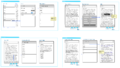 Set 3
Set 3 -
 Reading/Subfunction Diagram


Mobile Browser Detailed Sub-steps[edit]
-
 Set 1
Set 1 -
 Set 2
Set 2 -
 Set 3
Set 3 -
 Set 4
Set 4


Thursday, May 10, 2012:[edit]
- Demo 3 can be moved to the beta site
- Remove "Read" from the Main Menu
- Swipe from the Contents sub-screen can open the Main Menu, as seen in this video:
Some minor tweaks:
- highlight of rows in Contents and Search should be consistent
- "Back to top" instead of "Jump back a section"
- Main Menu - height of row needs to match height of search bar
- Main Menu - needs solid border on left edge (or right edge)
- from Contents, jump to section should open the section
Wednesday, May 9, 2012:[edit]
Next steps on alternate prototype[edit]
- We need two new prototypes, both of which will put the W as an emblem inside the search field:
- Both buttons together on the left (or right)
- Buttons as they were, on the left and right, but using the new icons
In order to confirm this direction, Lindsey will prepare a brief survey of button placement in other sites and apps, with the understanding that search as a central function together with a main menu and other buttons is fairly unique to Wikipedia.
Since Jon has time before this survey is ready, it may be useful to see three alternatives in demo form:
- Both buttons together on the left - the Main Menu button would be on the left edge, and the menu would slide in from the left
- Both buttons together on the right - the main menu button would be on the right edge, and the main menu would slide in from the right
- The main Menu button on the left, search field in the middle, and Action Bar button on the right
The icons to use are below, under May 8.
Tuesday, May 8, 2012:[edit]
Next steps on alternate prototype[edit]
- User testing feedback has indicated that the W and Action buttons are not discoverable and seen as part of the search box
- New action and menu buttons to be moved to the right side of the nav bar
- Main menu to slide in from the right side (opposite of the previous prototype)
- W logo to be moved into the search box for visual branding only
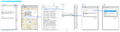
-
 Design
 -
 New Icons
 -
 W Logo

Some minor tweaks:
- highlight of rows in Contents and Search should be consistent
- "Back to top" instead of "Jump back a section"
- Main Menu - height of row needs to match height of search bar
- Main Menu - needs solid border on left edge (or right edge)
- from Contents, jump to section should open the section
- Action button up/down orientation keeps flipping (but if this is a big deal, skip it)
New open issues[edit]
- Search behavior in general needs to be addressed
- search suggestions (Opensearch API) are sometimes slow
- full-screen search shows a blank screen on opening, and when no suggestions match what the user typed
- full-text search is currently not working when the Search button is tapped on the keyboard
- "Did you mean" is not implemented on the site
- Article text search has never been implemented in the site or apps
Friday, May 4 and Monday, May 7, 2012:[edit]
Next steps on prototype[edit]
http://jonrobson.me.uk/wikipedia/experiments/nav/demo.html
- Action button is upside down
- Search field in full-screen view is still wider than search field in article view
- Is the color of the top bar in Contents the same as the color of the search bar in article view? (should be)
- Let's change "Jump back a section" to "Back to top" and link to the top of the page
- New W and Action buttons are posted here for the second prototype
Some detailed design tweaks:
- Search bar and main menu rows both need to be 45px in height. I think they are around 40 right now.
- Text labels for the main menu should be regular font weight, not bold.
- Spacing between all elements on the search bar should be 7px.
- Align search result text with search input text
- Lighten search bar drop shadow to #6d6d6d
- Lighten article action menu background to #757575


Next steps on design[edit]
- Primarily second sets for browser and iPhone app flows
- WLM photo upload flow
- starting page for Android app beta
Open issues[edit]
Top and persistent Contents
- As noted above, we will change "Jump back a section" to a "Top" link. Question: "Top" on one side and "Contents" on the other - or a persistent way to surface Contents?
- "Top" was suggested by Erik after he saw a user testing video
- possibly this will be the initial solution for the browser in terms of access to the top bar
- there are currently some strange characters at the beginning of "Jump back a section"
Initial view of apps
- What should appear initially?
- there is a usability issue around the fact that it takes some time to download an article and the user may not perceive the possibility of searching immediately, especially in the apps where a spinner is very obvious as the page downloads
- show the article spinner separately from the search spinner
- a static screen showing links to some popular destinations, or instructions
- the featured article or initial content of the home page with some obvious indication that search is available
- the last viewed page, ideally from cache
Summon toolbar
- persistent icon
- tap anywhere (except a link)
- scroll up
Comments from Trevor[edit]
- animations are better done as CSS transforms on iPhone to take advantage of OpenGL
- opening sections should not rely on URL, and JS should say false, so that Back functions intuitively
- swipe down to open Action Bar, and swipe up to close
Weekly meeting on May 3, 2012:[edit]
Next steps on prototype:[edit]
- Use index-final2.html
- Use a real article as the content
- of medium length with normal number of sections
- make sure Contents reflects the actual sections
- Keep top bar in fixed position
- Minor tweaks
- change Contacts to Contact
- move the W button slightly to the left
- move the search field left too, to align with search suggestions in full-screen search
- make the search field on the full-screen search page exactly the same width as on the article page (and same position)
- add a drop shadow under the search bar on the article page, exactly the same as under Search in full-screen Search and under Contents in the Contents submenu
- Another prototype
- to test another version of the W and Action buttons, could you create another prototype exactly the same as above, but with the W and A that Lindsey will post on this page today
- the new style is flat, meaning the buttons are not 3D, and the background color of the bar may be lighter
- just go with what Lindsey posts here
- Graphic assets
- use hi-res graphics - when Lindsey posts them
Next steps on design:[edit]
- Detailed submenu flows for browser and iPhone app
- can start with 3 menu commands
- Settings to include Beta opt-in
- Finalize W and Action buttons
- including pressed state
![]()
![]()
![]()
- Determine language selection with Pau
- last flow to be designed
Open issues:[edit]
- Resolving zoom behavior in iPhone browser (also applies to iPad)
- Nearby requires geo query service - renew GeoNames, determine state of internal service
- Back behavior from Nearby in apps
- Featured name could be configurable by language